Text Components Explained: The UX Secret to Better Apps & Websites
What are text components? Learn how buttons, labels & error messages shape user experience. See real-world use cases, best practices, and how to build a consistent design system.
Ever paused to think about that little button you click, the search bar you type into, or the error message that pops up? These aren't just random pieces of text on a screen. They’re Text Components—the unsung heroes of every app and website you use. And mastering them is the difference between a clunky, frustrating interface and a smooth, addictive user experience.
Think about it. The last time an app felt "intuitive" or a website just "made sense," you probably weren't marveling at the fancy animations. You were effortlessly guided by clear labels, helpful hints, and buttons that did exactly what you expected. That's the power of well-designed text components working behind the scenes.
As someone who's been deep in the trenches of design systems, I can tell you this isn't just about picking pretty fonts. It's about creating a consistent, accessible, and scalable language for your entire digital product. Let's break down this invisible art and see how it can make or break your next project.
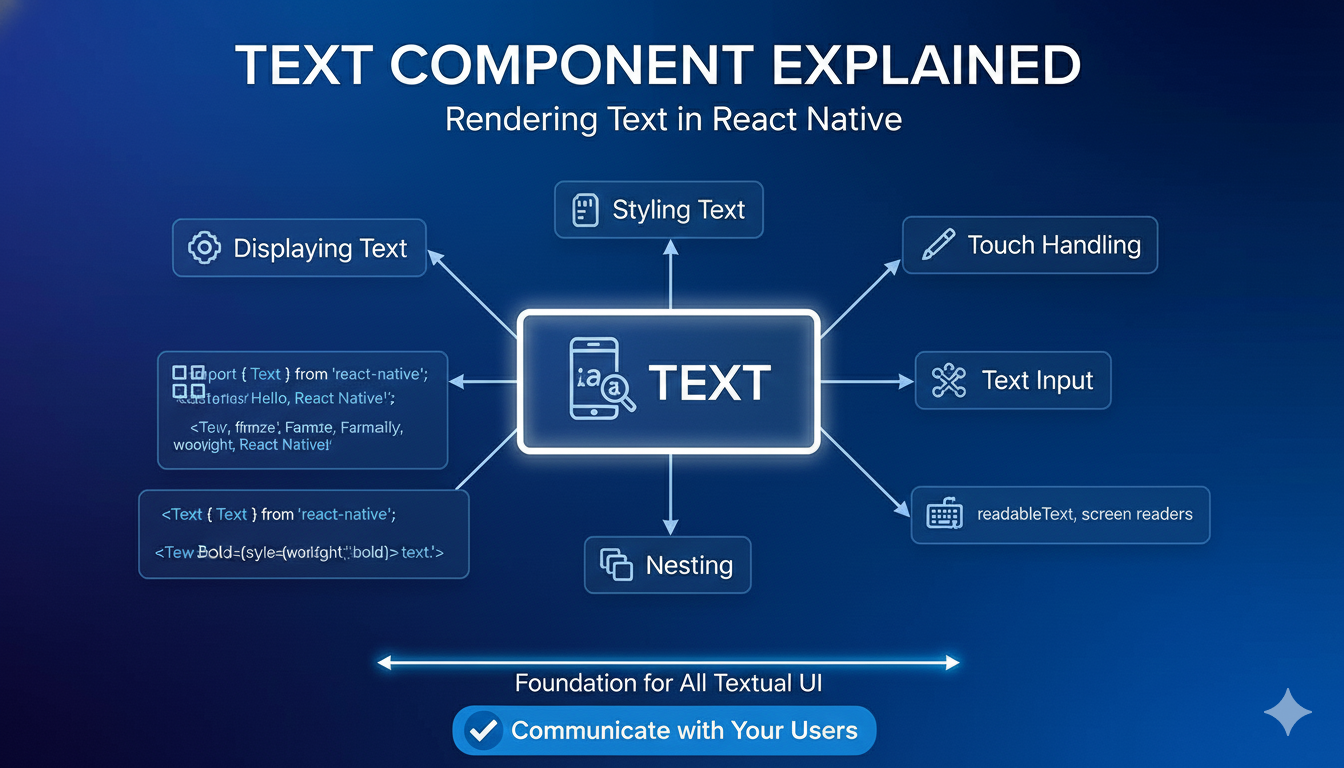
What Exactly Are Text Components?
Let’s cut through the jargon. In the world of UI/UX design, a component is a reusable building block—think of a Lego brick. A text component is a specific type of brick that’s built to handle words.
It’s any standardized UI element whose primary job is to display or capture text. This includes:
Static Text: Headings, labels, body copy, captions.
Interactive Text: Buttons, links, menu items.
Input Fields: Search bars, text boxes, form fields.
System Messages: Notifications, error messages, status alerts, tooltips.
The magic isn't in the individual element, but in the system. When you define a "Button" component, you're not just choosing a color. You're documenting its purpose (what it does), its anatomy (all possible text states), and strict rules for when and how to use it. This creates a shared language for designers and developers, slashing confusion and speeding up the entire build process.
Why Bother? The Real-World Impact
You might think, "It's just text, how hard can it be?" But in practice, fuzzy text components create chaos. Here’s what happens without them:
Inconsistent User Experience: Is it "Submit," "Send," or "Proceed"? A user sees all three in one app and has to stop and think each time. That's cognitive friction.
Development Headaches: Every new button is a debate. Developers waste time figuring out what a designer meant, leading to bugs and slow rollouts.
Accessibility Nightmares: Unclear labels break screen readers. Poor color contrast on error text makes it unreadable for many users.
Scaling Becomes a Mess: What works for an English login screen might completely break the layout for German, where words are on average 30% longer.
A great case study: The team behind the BNP Paribas Real Estate QuickForm app faced this with action buttons. Instead of vague "Yes/No" dialogs, they designed specific text components with clear action verbs like "Move" and "Copy." The result? Users instantly understood the consequence of their click without confusion. This is text component thinking in action.
Best Practices: Building Text Components That Don't Suck
So, how do you build these components right? Based on industry practices and hard-won lessons, here’s your checklist:
1. Start with the Smallest Screen.
Always design for the tightest space first (usually a mobile phone). This forces you to prioritize the most critical text and actions. Scaling up to a tablet or desktop is easier than cramming things into a small screen later.
2. Design for the World.
English is concise. German is longer. Arabic reads right-to-left. Your text containers (buttons, headers) must be flexible. Use adaptive sizing, allow for multiple text lines, and always, always test your truncation (that "..." when text is cut off) in every language you support.
3. Clarity Over Cleverness.
Use strong, action-oriented verbs. "Delete Photo" is infinitely better than "Are you sure?" followed by "OK." Be specific. As the experts at Evenly advise, "A button should just say what it does".
4. Leverage the Whole Space.
Empty states, placeholder text in search bars, and form field hints are golden opportunities to guide users. The BNP QuickForm app, for example, used the placeholder text in a search field to explain its purpose, saving the need for a separate label.
5. Integrate Accessibility from Day One.
This isn't a polish phase. Think about VoiceOver and TalkBack from the start. Written text is shorter than spoken words—should everything be read aloud? Plan for it. Use platform-native accessibility features; they create a more seamless experience than custom solutions.
From Theory to Practice: A Use Case in Action
Let’s make this concrete with a social media "Live Stream" feature.
Primary Actor: A user who wants to broadcast.
Goal: Start a live stream for followers.
Key Text Components & Rules:
Button: "Go Live" (Always use this exact action phrase. Variant: "Schedule Live" for future streams).
Permissions Alert: System-native alert text requesting camera/mic access.
Status Indicator: "LIVE" (in a consistent, bold red pill component at the top of the stream).
End Button: A prominent "End Stream" button in the control panel (not a hidden swipe gesture).
Notification: Followers receive a push alert: "[Username] is live now!" (Short, personal, actionable).
By defining these components upfront, the designer knows exactly what to build, the developer knows what to code, and the user gets a predictable, reliable experience every time. This is the blueprint that prevents disjointed, messy features.
Your Toolkit and Next Steps
Getting started is easier than ever. Tools like Storybook and UXPin are built for this. They let you build isolated component libraries with live demos and auto-generated docs, keeping everyone in sync. For managing text across languages, platforms like Phrase are game-changers.
Begin with an audit. Open your app and catalog every place text appears. Group them. How many "button" styles do you really have? You'll be shocked, and then you'll be ready to build your system.
Building great software is about more than just writing code; it's about crafting exceptional experiences. A deep understanding of fundamental concepts like text components, user experience design, and system architecture is what separates a functional developer from a sought-after professional.
To learn professional software development courses that cover these essential front-end and back-end principles, such as Python Programming, Full Stack Development, and MERN Stack, visit and enroll today at codercrafter.in. Master the art of building complete, user-centric applications from the ground up.
FAQ
Q: Do text components really affect my app's speed?
A: Indirectly, but yes. Well-documented components reduce back-and-forth between teams and prevent "one-off" code that’s harder to maintain and optimize. Consistency in development leads to cleaner, more performant code.
Q: We're a small startup. Isn't this overkill?
A: It's the opposite—it's foundational. Starting with good component habits prevents "design debt." It’s much harder to retrofit consistency into a messy, grown app later. Start small with just your buttons and form fields.
Q: How do I handle technical or brand-specific terms?
A: Create and maintain a glossary as part of your design system. Define each term and mandate its consistent use. This is crucial for both user understanding and internal team clarity.
Q: Who "owns" the text components?
A: It’s a shared responsibility. Designers define the rules, developers implement them faithfully, and content strategists or product managers often govern the actual words used. Regular cross-team reviews are key to keeping everything in sync.
The next time you use an app that feels effortless, take a moment to look closer. You’ll start to see the carefully crafted text components at work—the clear labels, the consistent buttons, the helpful guides. They are the silent conductors of the user experience orchestra. By giving them the attention they deserve, you’re not just designing interfaces; you’re building trust, one word at a time.