Neumorphism in React Native: A 2025 Developer's Guide to Soft UI
Want soft, tactile mobile apps? Learn how to implement Neumorphism in React Native. We cover libraries, code examples, best practices, and accessibility tips. Enroll in expert dev courses at CoderCrafter.
Let’s be real. After years of dominating flat design, don’t you sometimes crave a bit of depth and tactility in your mobile apps? If you’re nodding your head, then you’re in the right place. Today, we’re breaking out of the 2D box to explore Neumorphism in React Native. This design trend merges the clean simplicity of flat design with the subtle physicality of skeuomorphism, creating interfaces that feel soft, touchable, and uniquely modern.
But is it just a passing aesthetic fad, or can you actually build accessible, functional apps with it? We'll cut through the hype, explore practical implementations, and give you the tools to decide when this "soft UI" trend is right for your next project.
What Exactly Is Neumorphism?
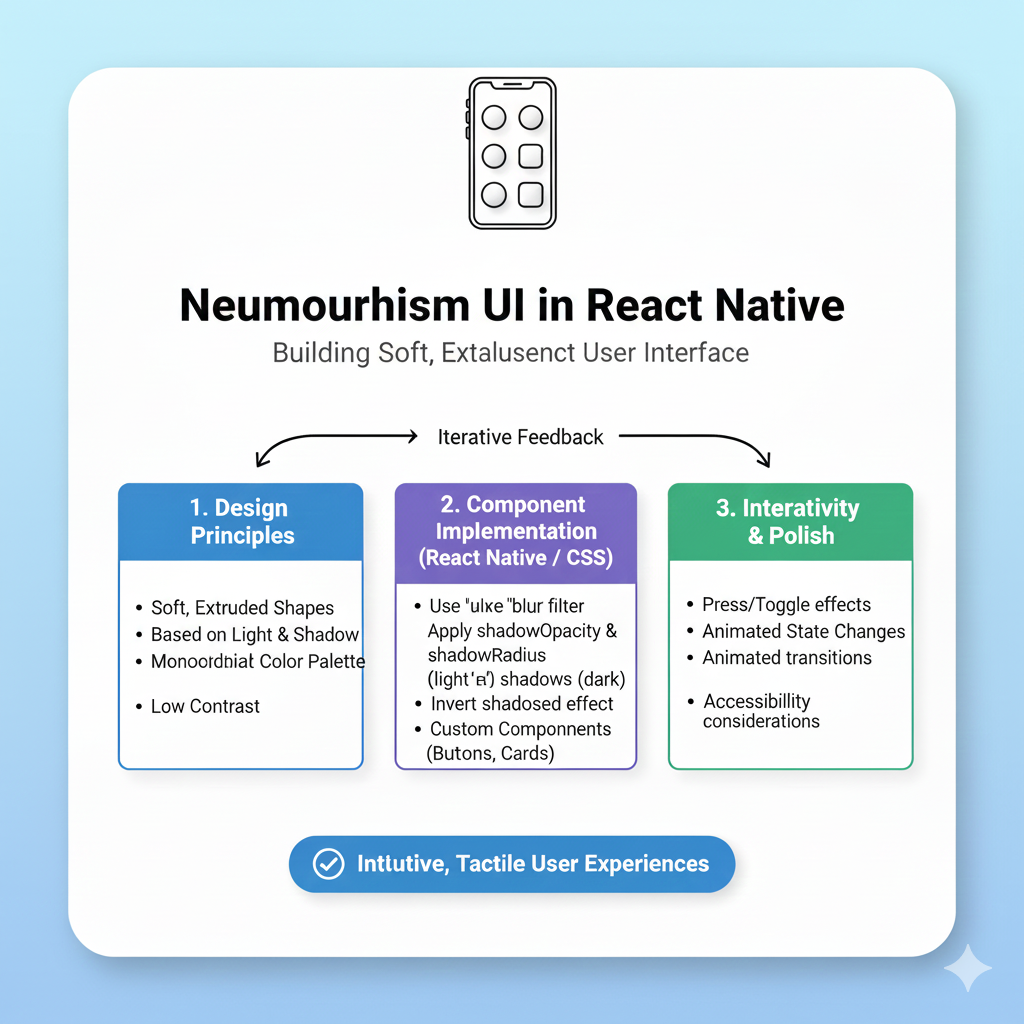
Neumorphism (sometimes called "soft UI") is a design style that uses subtle shadows and highlights to make UI elements look like they are gently extruded from the background or pressed into it. Think of it as the sleek, minimalist cousin of the old, hyper-realistic skeuomorphic designs. It's all about suggesting a soft, plastic-like material.
The core visual trick is using two light sources: one casting a light shadow and another casting a dark one. This creates the illusion of depth without heavy gradients or complex textures. The result is a clean, monochromatic look that feels both futuristic and strangely familiar.
Why Neumorphism? The Pros and Cons
Like any strong design choice, neumorphism comes with its own set of trade-offs. It's not a one-size-fits-all solution, and understanding its strengths and weaknesses is key to using it effectively.
The Allure (The Pros)
Aesthetic Freshness & Memorability: In a sea of identical flat UIs, a well-executed neumorphic design immediately stands out. It gives your app a distinctive, premium, and tactile character.
Visual Harmony: By using a cohesive, muted color palette, neumorphism creates a deeply integrated and harmonious interface where elements feel like a natural part of the canvas.
Enhanced Tactility: The subtle 3D effect can, when done correctly, make buttons and switches feel more tangible and satisfying to press, potentially improving the user's sensory connection with the app.
The Pitfalls (The Cons)
Accessibility Challenges: This is the biggest criticism. The low-contrast, monochromatic nature can make it difficult for users to distinguish interactive elements from the background or read text. It often fails basic accessibility contrast ratios.
Confused Visual Hierarchy: When everything is soft and blended, it's hard for users to instantly understand what's clickable and what's not. This can lead to a frustrating user experience.
Performance Considerations: While generally lighter than using many images, implementing complex, layered shadows requires careful optimization to avoid impacting app smoothness, especially on lower-end devices.
Implementing Neumorphism in React Native: A Hands-On Guide
Now for the fun part: how do you actually code this in React Native? Unlike CSS for the web, React Native's StyleSheet has some limitations with shadow properties, especially on Android. Let’s look at your options.
Method 1: The Native Way (with Limitations)
You can try using React Native's built-in shadow properties for iOS and elevation for Android. However, achieving the signature dual-shadow effect (both a light and dark shadow) is notoriously tricky and inconsistent across platforms.
Here’s a basic, platform-specific attempt:
javascript
import { StyleSheet, Platform } from 'react-native';

const neumorphicStyle = StyleSheet.create({
  container: {
    backgroundColor: '#e0e5ec',
    borderRadius: 20,
    padding: 20,
    ...Platform.select({
      ios: {
        shadowColor: '#ffffff',
        shadowOffset: { width: -6, height: -6 },
        shadowOpacity: 0.8,
        shadowRadius: 10,
        // Adding a second shadow for iOS is complex
      },
      android: {
        elevation: 5, // This gives a single, uniform shadow
      },
    }),
  },
});
As noted in a Stack Overflow discussion, this approach often leaves developers "completely clueless" when trying to get the perfect neumorphic look. The elevation property on Android is particularly limiting for this style.
Method 2: Using a Dedicated Library (The Recommended Way)
To save time and ensure a consistent, high-quality effect on both iOS and Android, your best bet is to use a community-tested library.
The most popular and powerful choice is react-native-neomorph-shadows. This library uses SVG under the hood to render precise, customizable inner and outer shadows that perfectly mimic neumorphism.
Here’s how simple it becomes:
javascript
import React from 'react';
import { View, Text } from 'react-native';
import { Neomorph, Shadow } from 'react-native-neomorph-shadows';

const NeumorphicButton = () => {
  return (
    // A raised element
    <Neomorph
      swapShadows // Swaps light/dark shadows for a "pressed" state
      style={{
        shadowRadius: 8,
        borderRadius: 25,
        backgroundColor: '#E0E5EC',
        width: 200,
        height: 50,
        justifyContent: 'center',
        alignItems: 'center',
      }}
    >
      <Text>Press Me</Text>
    </Neomorph>
  );
};
For inner shadow effects (inset elements), you can use the Shadow component from the same library. This approach gives you pixel-perfect control and solves the cross-platform headache.
Best Practices for a Usable Neumorphic Design
If you decide to implement neumorphism, follow these rules to keep your app beautiful and usable:
Use It Sparingly as an Accent: Don't build an entire app with neumorphic elements. Use it for key interactive components like primary buttons, toggle switches, or cards to add tactile emphasis without overwhelming the user.
Prioritize Accessibility: Always check your contrast ratios. Ensure text has sufficient contrast against its background, even if the UI elements themselves are soft. Provide clear visual feedback (like changing shadow direction) for pressed states.
Maintain a Consistent Light Source: Imagine a single light source (usually from the top-left). All highlights and shadows in your app should align with this direction to maintain a believable sense of depth.
Pair with Clear Typography and Iconography: Since your backgrounds and elements are low-contrast, use bold, clear fonts and easily recognizable icons to guide the user.
Test Extensively on Real Devices: Shadows and blurs can render differently across various screen densities and operating systems. Always test the visual result and performance on multiple physical devices.
When to Use Neumorphism in Your Projects
Given its pros and cons, neumorphism shines in specific contexts:
Productivity & Lifestyle Apps: Think meditation timers, minimalist note-taking apps, or smart home dashboards where a calm, integrated interface is desirable.
Portfolio & Conceptual Work: It's fantastic for showcasing design skills in a portfolio or for a design-forward concept app.
Targeted Micro-Interactions: Using it just for a custom slider, a unique volume knob, or a stylish toggle switch can add a memorable touch without compromising overall usability.
It's less suitable for information-dense applications like complex dashboards, e-commerce sites, or anything where accessibility and speed of comprehension are the top priorities.
Want to build stunning, production-ready mobile apps with the latest UI trends? Mastering tools like React Native is just the beginning. To learn professional software development courses such as Python Programming, Full Stack Development, and MERN Stack, visit and enroll today at codercrafter.in.
FAQs on Neumorphism in React Native
1. Is neumorphism still relevant in 2025?
While not the dominant trend it was a few years ago, neumorphism has evolved into a niche, refined style. It's often used in hybrid interfaces, combined with other trends like glassmorphism for specific components, proving that good design elements have staying power when used thoughtfully.
2. Does neumorphism affect app performance?
It can. Heavy use of complex shadow effects, especially if not optimized, can impact rendering performance. Using efficient libraries like react-native-neomorph-shadows and limiting the effect to key elements helps mitigate this.
3. Can I create a "dark mode" neumorphic design?
Absolutely! The principle remains the same. Use a dark base color (like #2A2D3E) and calculate your light and dark shadows relative to that base. The light shadow will be a slightly lighter tint of the base, and the dark shadow will be a slightly darker shade.
4. What are some alternatives to Neumorphism?
If you like depth but neumorphism seems risky, explore:
Glassmorphism: Uses background blur and transparency to create frosted-glass panels. It's often more accessible as it allows for stronger color contrasts in foreground text.
Material You: Google's dynamic design system uses color and light in a more bold, accessible, and personalized way.
Final Thoughts
Neumorphism in React Native is a powerful tool for creating distinctive, tactile interfaces. It reminds us that digital experiences can have a sensory dimension. However, its successful implementation requires a developer's mindful balance: a respect for aesthetics must always be weighed against the uncompromising demands of accessibility and usability.
Don't just follow trends—understand them. Use neumorphism not because it's cool, but because it meaningfully enhances the experience for your specific app and your specific users. Start by experimenting with a single button or card in your next project. You might just create something that feels as good as it looks.