UI/UX Design for React Native Devs: Stop Coding, Start Designing (2025 Guide) | CoderCrafter
Master UI/UX design in React Native! Get actionable tips, best practices, and real-world examples to build beautiful, user-friendly mobile apps. Elevate your skills today.
Let's be real. As React Native developers, we live in a world of useState, useEffect, and custom hooks. We can make an app work flawlessly. But can we make it feel flawless? That’s the million-dollar question.
You can have the most powerful, feature-packed app in the world, but if the user interface (UI) is clunky and the user experience (UX) is confusing, people will bounce faster than you can say "npm install."
So, how do you bridge the gap between a functional app and a phenomenal one? By thinking like a designer while you code. This isn't just about making things pretty; it's about making things intuitive, efficient, and an absolute joy to use.
In this deep dive, we're going beyond the basic "use Flexbox" advice. We're talking about the core principles, the little details, and the actionable tips that will transform your React Native apps from "meh" to "magical."
UI vs. UX: It’s Not Just Semantics
Before we jump in, let's clear the air. UI and UX are not the same thing, and understanding the difference is step one.
UI (User Interface) is the look and feel of your app. It's the buttons, the colors, the typography, the spacing. It's the aesthetics. Think of it as the car's interior—the leather seats, the dashboard, the steering wheel.
UX (User Experience) is the overall experience a user has while interacting with your app. It's how easy it is to complete a task, how fast it feels, how it handles errors. It's the functionality and emotion. Think of it as the actual driving experience—how the car handles, how smooth the ride is, how it makes you feel.
A beautiful UI with a terrible UX is like a stunning sports car that breaks down every 10 miles. A great UX with a poor UI is like a reliable but ugly minivan—it gets the job done, but no one is excited about it. You need both.
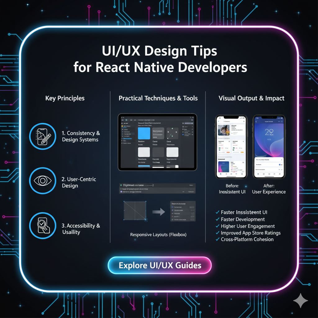
The React Native Developer's Guide to Killer UI/UX
1. Master the Foundation: Layout & Spacing
This is the bread and butter. A cluttered layout is the #1 killer of a good UI.
Consistency is Key: Use a spacing system. Define a base unit (e.g., 8px) and stick to it. Your margins and paddings should be multiples of this unit (8, 16, 24, 32). This creates a rhythmic, harmonious layout. Libraries like
styled-systemcan help enforce this.Embrace Flexbox: You already know this, but are you using it effectively? Use
flex: 1to allow components to fill available space. UsealignItemsandjustifyContentreligiously to control alignment. A misaligned element is like a crooked picture frame—it subtly screams "unprofessional."The Power of White Space: Don't be afraid of empty space! White space (or negative space) gives your content room to breathe. It reduces cognitive load and guides the user's eye to what’s important. Cramming everything together makes your app feel cheap and stressful.
Real-World Use Case: Look at the Airbnb app. Notice how much space there is around each listing card? It feels clean, premium, and easy to scan.
2. Navigation That Doesn’t Make Users Lost
Navigation is the backbone of your UX. If users can't find what they're looking for, they're gone.
Platform Conventions Matter: Respect the platform guidelines. On iOS, a tab bar is usually at the bottom. On Android, a navigation drawer is common. The React Navigation library is your best friend here, as it handles a lot of these platform-specific nuances out of the box.
Keep it Simple & Predictable: Don't get overly creative with navigation. The user should always know where they are, how they got there, and how to get back. Use clear labels and intuitive icons.
Deep Linking: This is a pro-move for UX. Allow users to open a specific screen in your app from a link (e.g., from an email). It’s a seamless way to guide users directly to the content they care about.
3. Microinteractions: The Secret Sauce of Delight
Microinteractions are the small, functional animations that provide feedback and make an app feel alive.
Feedback on Tap: When a user presses a button, it should visually respond. A slight opacity change, a scale transform, or a ripple effect. This confirms the action.
javascript
// A simple press animation with React Native's Animated API
const animatedValue = new Animated.Value(1);

const onPressIn = () => {
    Animated.spring(animatedValue, {
        toValue: 0.95,
        useNativeDriver: true,
    }).start();
};

const onPressOut = () => {
    Animated.spring(animatedValue, {
        toValue: 1,
        useNativeDriver: true,
    }).start();
};

// Then use it in your style
<Animated.View style={{ transform: [{ scale: animatedValue }] }}>
    <TouchableOpacity onPressIn={onPressIn} onPressOut={onPressOut}>
        <Text>My Button</Text>
    </TouchableOpacity>
</Animated.View>
Skeleton Screens: Instead of showing a blank screen or a spinner while data loads, show a skeleton screen—a wireframe version of the content. It manages user expectations and feels much faster than a traditional loader.
Meaningful Transitions: Use subtle transitions when navigating between screens or when content changes. It visually connects the two states and prevents a jarring, jumpy experience.
4. Accessibility (A11y): Building for Everyone
This isn't an optional "nice-to-have"; it's a core part of good UX. Millions of users have disabilities, and an inaccessible app locks them out.
Use
accessibleandaccessibilityLabel: Describe what a UI element is for screen readers. Don't rely on visual context alone.javascript
<TouchableOpacity
  accessible={true}
  accessibilityLabel="Add item to shopping cart"
  onPress={addToCart}
>
  <Icon name="shopping-cart" />
</TouchableOpacity>
Support Keyboard & Voice Control: Ensure all interactive elements can be accessed without a touchscreen.
Sufficient Color Contrast: Make sure your text has enough contrast against its background. This helps users with low vision. Use online tools to check your contrast ratios.
5. Handle the Edge Cases Gracefully
A great UX is defined by how you handle things when they go wrong.
No Network? Show a friendly, custom offline screen with an option to retry, not just the browser's default error page.
Empty States: A new user's list of favorites is empty. What do they see? A blank white screen? No! Design a helpful empty state with an illustration and a message like "You haven't saved any favorites yet" and a button to start exploring.
Error Messages: Don't show "Error Code 500." Show a human-readable message: "Oops, something went wrong on our end. Please try again in a moment." Empathy in error handling builds trust.
FAQs: UI/UX for React Native Developers
Q: I'm a developer, not a designer. Where do I start?
A: Start by studying well-designed apps you love (Spotify, Duolingo, Headspace). Deconstruct why they feel good to use. Use established design systems like Material Design (for Android) or Human Interface Guidelines (for iOS) as your blueprint. They provide pre-vetted components and patterns.
Q: What are the best React Native libraries for UI/UX?
A: For component libraries, React Native Paper (Material Design) and React Native Elements are fantastic starting points. For navigation, React Navigation is the industry standard. For animations, look into React Native Reanimated and Lottie for beautiful, complex animations.
Q: How important is performance for UX?
A: It's everything. A laggy, janky app is a bad UX, period. Use the Performance API and the Flipper debugger to monitor your app's performance. Optimize your re-renders with React.memo, useMemo, and useCallback. Remember, 60 frames per second is the gold standard.
Q: How can I test my app's UX?
A: The simplest way? Give your phone to a friend who has never seen the app before. Don't help them. Just watch where they struggle. This is called usability testing, and it's the most effective way to find UX flaws.
Conclusion: Code with Empathy
Transitioning from a pure coder to a developer who crafts experiences requires a shift in mindset. It's about empathy. You have to constantly put yourself in the user's shoes and ask, "Is this clear? Is this easy? Does this feel good?"
Every pixel, every animation, every error message is a conversation with your user. Make it a good one.
The journey to mastering both the technical and design aspects of development is challenging but incredibly rewarding. If you're looking to solidify your foundation and build production-ready, user-centric applications, structured learning is the key.
To learn professional software development courses such as Python Programming, Full Stack Development, and MERN Stack, visit and enroll today at codercrafter.in. Our courses are designed to turn you into a well-rounded developer who can not only build things but build things people love to use.
Now go forth and build something beautiful!