Master Responsive Design in React Native: A Complete Guide for 2025
Stop your React Native app from breaking on tablets & phones! This in-depth 2025 guide covers Flexbox, responsive libraries, best practices & real code examples for perfect UIs on all screens.
Ever built a React Native app that looks perfect on your phone, only to have it look like a hot mess when a friend opens it on their tablet? Text is too small, buttons are squished, and the layout is completely broken. We've all been there. It's frustrating, but here's the truth: it's completely avoidable.
Responsive design in React Native isn't just a nice-to-have feature anymore; it's an absolute necessity. With devices ranging from small smartphones to large tablets and foldables, your app needs to adapt. The good news? React Native gives you the tools to build UIs that look and feel perfect on every screen. Let’s dive into how you can master this essential skill.
Why Bother? The "Must-Do" of Responsive Design
Think about the apps you use daily. You expect them to work flawlessly whether you're on your phone during a commute or on a tablet at home. A responsive app does just that, and it comes with serious benefits:
User Experience is King: A smooth, consistent experience keeps users engaged and satisfied, which directly impacts retention and success. Just look at industry leaders like Airbnb and Walmart, which significantly improved their app performance and user experience by embracing responsive design principles.
Development Efficiency: Write your layout logic once, and it works across a multitude of devices. This means you don't need separate codebases for different screen sizes, saving you time and resources.
Future-Proofing Your App: New screen sizes and form factors (hello, foldables!) are always emerging. A responsive app is prepared for them from day one.
If you're serious about building professional-grade mobile applications, mastering responsive design is non-negotiable. To learn professional software development courses such as Python Programming, Full Stack Development, and MERN Stack, which all emphasize these crucial real-world skills, visit and enroll today at codercrafter.in.
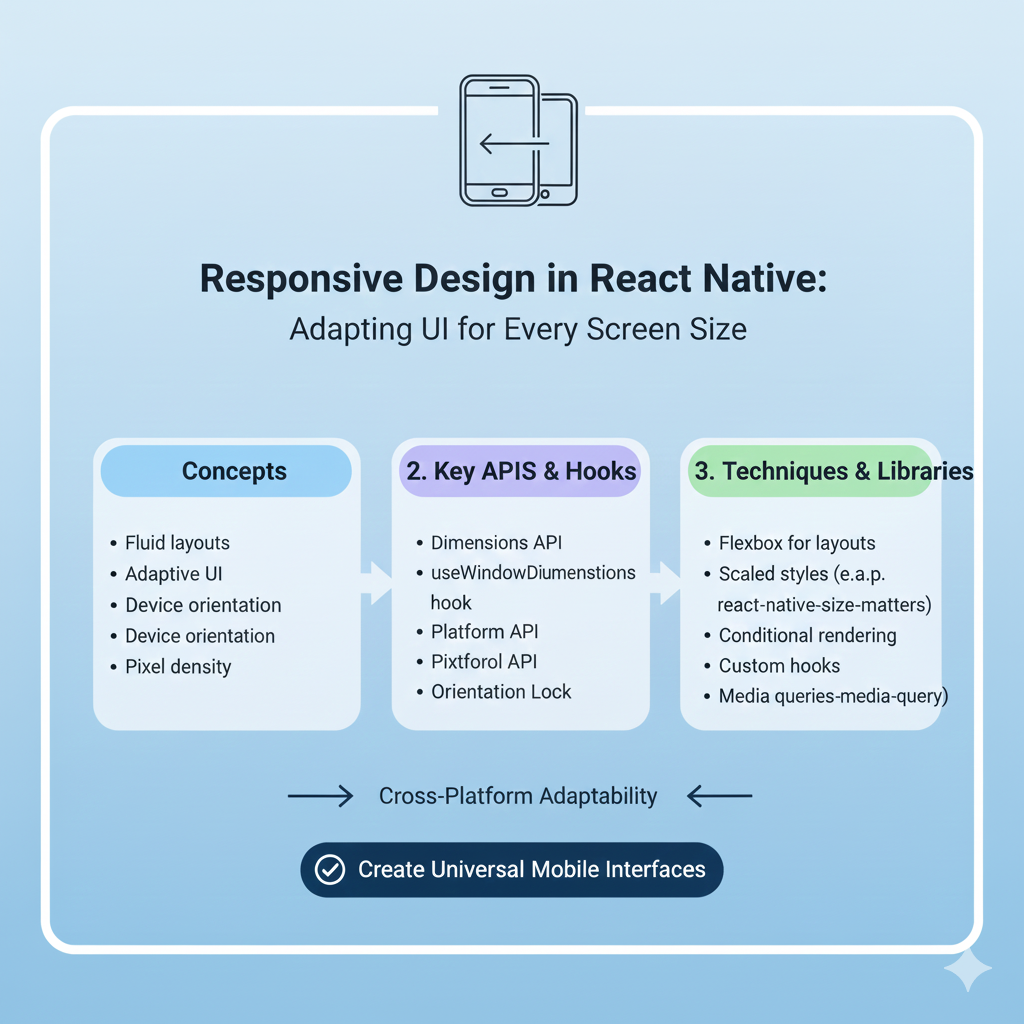
Your Responsive Design Toolkit: Core Techniques Explained
Let's move beyond theory and get into the practical tools React Native provides. These are the building blocks for any adaptive layout.
1. Flexbox: Your Layout Superpower
Flexbox is the default layout engine in React Native, and for good reason. It's designed to provide a consistent layout across different screen sizes. Instead of thinking in fixed pixels, you think in proportions and relationships.
The key is the flex property on child components. A component with flex: 3 will take up three times the space as a component with flex: 1. This is perfect for creating headers, content areas, and footers that scale beautifully.
javascript
<View style={{flex: 1, flexDirection: 'column'}}>
  <View style={{flex: 1, backgroundColor: 'gray'}}>
    <Text>Header</Text>
  </View>
  <View style={{flex: 8, backgroundColor: 'lightgray'}}>
    <Text>Main Content Area</Text>
  </View>
  <View style={{flex: 1, backgroundColor: 'gray'}}>
    <Text>Footer</Text>
  </View>
</View>
2. The Dimensions API & useWindowDimensions Hook
To make decisions based on the actual screen size, you need to know what that size is. The Dimensions API and its more React-friendly counterpart, the useWindowDimensions hook, are your go-to solutions.
javascript
import { useWindowDimensions } from 'react-native';

function MyComponent() {
  const { width, height } = useWindowDimensions();
  const isTablet = width > 600; // A common breakpoint
  const isLandscape = width > height;

  return (
    <View style={{ flexDirection: isTablet ? 'row' : 'column' }}>
      {/* Your adaptive content here */}
    </View>
  );
}
3. Percentage-Based and Calculated Sizing
Ditch hard-coded pixel values like width: 300. Instead, use percentages or calculate sizes based on screen width.
javascript
// Percentage-based - scales with parent container
<View style={{ width: '90%', height: '20%' }} />

// Calculated based on screen width
<View style={{
  width: width * 0.8, // Takes 80% of screen width
  padding: width * 0.05 // Responsive padding
}} />
4. Responsive Text and Images
Text and images need special attention to prevent scaling issues.
Text: Scale font sizes dynamically. A simple method is to base them on screen width.
javascript
<Text style={{ fontSize: Math.max(16, width * 0.04) }}>Readable on all screens</Text>Images: Use
aspectRatioandresizeModeto maintain proportions. For critical assets, consider providing different resolution versions (@1x,@2x,@3x) for different screen densities.javascript
<Image
  source={require('./hero.jpg')}
  style={{ width: '100%', height: undefined, aspectRatio: 16/9 }}
  resizeMode="cover"
/>
Leveling Up: Libraries and Advanced Patterns
While the built-in tools are powerful, these community libraries can supercharge your workflow.
react-native-responsive-screen: Provides simple functions likewp('50%')andhp('25%')to set dimensions based on a percentage of the screen's width or height.react-native-size-matters: Offersscale(),verticalScale(), andmoderateScale()functions for consistent scaling across devices. It's great for fonts, margins, and padding.Media Query-like Behavior: While React Native doesn't have CSS media queries, you can replicate the pattern using
useWindowDimensionsto conditionally apply styles.Orientation Changes: Remember that screen dimensions can change at runtime (e.g., rotating the phone). Listen to changes with
Dimensions.addEventListener()or use a library likereact-native-responsive-uito handle it gracefully.
Best Practices & Pitfalls to Avoid
Here’s how to ensure your responsive design is robust:
Test Relentlessly. Don't just test on the iOS Simulator. Use Android emulators, and if possible, test on real devices with different screen sizes and pixel densities. Tools like Expo Go make this easier.
Start with a Flexible Mindset. Design your layout with
flexand percentages from the beginning. Retrofitting responsiveness onto a layout built with fixed values is painful.Create a Responsive Helper Hook. Centralize your logic. A custom hook can provide device type flags (
isPhone,isTablet) and scaling functions, making your components cleaner.Avoid Common Traps:
Hardcoded Values: The root of all evil for responsiveness.
Absolute Positioning: Use it sparingly, as it often breaks flexible layouts.
Ignoring Platform Conventions: Use the
Platformmodule to apply OS-specific styles where it makes sense for the native feel.
FAQs: Quick Answers to Common Questions
Q: Is Flexbox enough for all my responsive needs?
A: Flexbox is the essential foundation and handles about 80% of layout challenges. For finer control over text scaling, pixel-perfect spacing across many devices, and orientation changes, you'll want to combine it with the Dimensions API or helper libraries.
Q: How do I handle fonts for accessibility?
A: Respect the user's system font size settings. You can use PixelRatio.getFontScale() to adjust your base sizes. Libraries like react-native-responsive-fontsize can also help.
Q: My app looks good but feels slow on older devices.
A: Over-rendering on dimension changes can be a culprit. Ensure your useWindowDimensions logic is efficient, and consider debouncing rapid updates. Also, optimize image assets for different densities.
Conclusion: Build for Everyone, Everywhere
Responsive design in React Native is the bridge between a good app and a great, professional one. It's about respecting your users and ensuring they have the best possible experience, no matter what device is in their hand.
By mastering Flexbox, embracing relative sizing, leveraging the right tools, and adopting a mobile-first, flexible mindset, you can build applications that are not only functional but truly delightful across the entire spectrum of devices. Remember, the effort you put into responsiveness pays off in user satisfaction, retention, and the overall polish of your product.
Ready to take your development skills to the next level and build professional, production-ready applications? The principles of clean, adaptable code are at the heart of modern software development. To learn professional software development courses such as Python Programming, Full Stack Development, and MERN Stack, which provide a structured path to mastering these skills, visit and enroll today at codercrafter.in.