Master React Native Multi-Theme Support: Dark Mode & Beyond
A complete, step-by-step guide to implementing scalable multi-theme support (dark/light mode) in React Native. Includes code examples, best practices, and pro tips for a polished app. Learn more at CoderCrafter.in.
Alright, let's be real. In today's app-driven world, a single, static look for your application just doesn't cut it anymore. Users expect personalization. They want dark mode for those late-night scrolling sessions, maybe a high-contrast theme for readability, or even just to pick their favorite color. This isn't just a nice-to-have—it's a core part of modern UX. And if you're building with React Native, you need to know how to handle this gracefully.
So, grab your coffee (or matcha latte), and let's break down Multi-Theme Support in React Native from the ground up. We're going beyond just useColorScheme()—we're talking about building a system that's scalable, maintainable, and actually fun to work with.
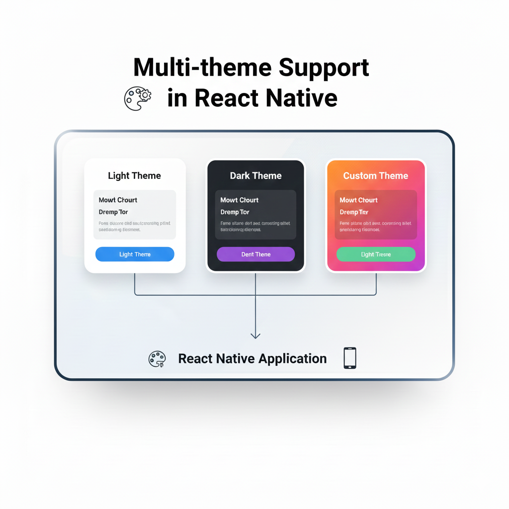
What Exactly is "Multi-Theme"?
Think of a theme as the visual personality of your app. It's not just colors. It's a cohesive design system that includes:
Color Palette: Backgrounds, text, accents, errors, successes.
Typography: Font families, sizes, weights.
Spacing & Layout: Consistent margins, paddings, and grid definitions.
Asset Variations: Different icons or images for light/dark modes.
Shadows & Elevation: How UI elements pop (or don't) in different contexts.
Multi-theme support is the architecture that lets your app switch between these complete design personas seamlessly. The most common duo is, of course, Light & Dark Mode, but the principles apply if you want to offer "Solarized," "High Contrast," or even user-customizable color schemes.
Why Bother? The Real-World Impact
Before we dive into code, let's talk why. It's not just about following trends.
User Comfort & Accessibility: Dark mode reduces eye strain in low-light conditions. High-contrast themes are essential for many users with visual impairments.
Battery Savings: On OLED/AMOLED screens, dark pixels are literally off, saving significant battery life.
Brand Flexibility: Maybe your app needs to look different for different clients or events. A solid theming system makes this trivial.
Professional Polish: It signals that you care about the details of the user experience. It makes your app feel premium.
Building Your Theme Engine: A Practical Approach
Let's roll up our sleeves. The goal is a system where any component can access theme values without prop-drilling hell, and the theme can change reactively.
Step 1: Define Your Theme Structure
You need a single source of truth. We'll use a JavaScript object.
javascript
// themes.js
const lightTheme = {
  mode: 'light',
  colors: {
    primary: '#6C63FF',   // Brand purple
    secondary: '#FF6584', // Brand pink
    background: '#FFFFFF',
    cardBackground: '#F7F9FC',
    text: '#2D3748',
    textSecondary: '#718096',
    border: '#E2E8F0',
    error: '#F56565',
    success: '#38B2AC',
  },
  spacing: {
    xs: 4,
    s: 8,
    m: 16,
    l: 24,
    xl: 32,
  },
  textVariants: {
    heading: { fontSize: 24, fontWeight: '700' },
    body: { fontSize: 16, fontWeight: '400' },
    caption: { fontSize: 12, fontWeight: '300' },
  },
};

const darkTheme = {
  mode: 'dark',
  colors: {
    primary: '#8A85FF',   // Lighter purple for dark BG
    secondary: '#FF85A2',
    background: '#121212', // Deep gray, not pure black
    cardBackground: '#1E1E1E',
    text: '#E2E8F0',
    textSecondary: '#A0AEC0',
    border: '#2D3748',
    error: '#FC8181',
    success: '#4FD1C7',
  },
  // Spacing & typography often remain consistent
  ...lightTheme.spacing,
  ...lightTheme.textVariants,
};
Pro Tip: Notice how dark theme isn't just inverting colors. It uses less saturated, softer contrasts to be easier on the eyes.
Step 2: The Magic of React Context
This is how we make the theme available everywhere. We'll create a ThemeProvider.
javascript
// ThemeContext.js
import React, { createContext, useState, useContext, useEffect } from 'react';
import { useColorScheme } from 'react-native';
import { lightTheme, darkTheme } from './themes';

const ThemeContext = createContext();

export const ThemeProvider = ({ children }) => {
  const systemScheme = useColorScheme(); // 'light' | 'dark'
  const [isDarkMode, setIsDarkMode] = useState(systemScheme === 'dark');

  // Optional: Sync with system theme changes
  useEffect(() => {
    setIsDarkMode(systemScheme === 'dark');
  }, [systemScheme]);

  const toggleTheme = () => setIsDarkMode(!isDarkMode);
  const theme = isDarkMode ? darkTheme : lightTheme;

  return (
    <ThemeContext.Provider value={{ theme, toggleTheme, isDarkMode }}>
      {children}
    </ThemeContext.Provider>
  );
};

// Custom hook for easy access
export const useTheme = () => {
  const context = useContext(ThemeContext);
  if (!context) {
    throw new Error('useTheme must be used within a ThemeProvider');
  }
  return context;
};
Step 3: Using the Theme in Components
Now, using your theme values is clean and simple.
javascript
// MyComponent.js
import React from 'react';
import { View, Text, StyleSheet } from 'react-native';
import { useTheme } from './ThemeContext';

const MyComponent = () => {
  const { theme } = useTheme(); // Destructure the theme

  const styles = StyleSheet.create({
    container: {
      flex: 1,
      backgroundColor: theme.colors.background,
      padding: theme.spacing.m,
    },
    title: {
      ...theme.textVariants.heading,
      color: theme.colors.text,
      marginBottom: theme.spacing.s,
    },
    card: {
      backgroundColor: theme.colors.cardBackground,
      borderRadius: 8,
      padding: theme.spacing.l,
      borderWidth: 1,
      borderColor: theme.colors.border,
    },
  });

  return (
    <View style={styles.container}>
      <Text style={styles.title}>Hello, Themed World!</Text>
      <View style={styles.card}>
        <Text style={{ color: theme.colors.textSecondary }}>
          This card adapts perfectly.
        </Text>
      </View>
    </View>
  );
};
Leveling Up: Advanced Patterns
1. Persisting User Choice
Users hate it when their preference resets. Use AsyncStorage or MMKV to save their selection.
javascript
// Inside ThemeProvider
const [isDarkMode, setIsDarkMode] = useState(false);

useEffect(() => {
  loadThemePreference();
}, []);

const loadThemePreference = async () => {
  try {
    const savedTheme = await AsyncStorage.getItem('userTheme');
    if (savedTheme !== null) {
      setIsDarkMode(savedTheme === 'dark');
    } else {
      // Fallback to system
      setIsDarkMode(systemScheme === 'dark');
    }
  } catch (error) {
    console.error('Failed to load theme:', error);
  }
};

const toggleTheme = async () => {
  const newMode = !isDarkMode;
  setIsDarkMode(newMode);
  await AsyncStorage.setItem('userTheme', newMode ? 'dark' : 'light');
};
2. Supporting More Than Two Themes
Turn your theme object into a collection and let the user choose.
javascript
const allThemes = {
  light: lightTheme,
  dark: darkTheme,
  highContrast: highContrastTheme,
  blueLight: blueLightFilterTheme,
};

// In your context, manage a `themeName` state instead of just a boolean.
3. Themed Images & Icons
Conditional rendering based on theme is your friend.
javascript
<Image
  source={
    theme.mode === 'dark'
      ? require('./logo-dark.png')
      : require('./logo-light.png')
  }
/>
Or use a higher-order component to abstract this logic.
Real-World Gotchas & Best Practices
Avoid Inline Color Values: Never write
style={{ color: '#fff' }}. Always pull fromtheme.colors. This is the golden rule.Test in Both Themes, Religiously: That shadow that looks great on a white background might be invisible on dark gray. Use device/simulator toggles constantly.
Dynamic vs. Static Styles: For performance, especially in lists, define your
StyleSheet.createoutside the component if styles don't depend on props. Use the hook for the dynamic color values inside the style object.Accessibility Check: Use online contrast checkers to ensure your
textonbackgroundcombinations meet WCAG AA standards (at least 4.5:1 for normal text).Third-Party Libraries: Not all libraries respect your theme. You may need to create wrapper components or use their theming APIs if available.
FAQ Section
Q: Does this affect app performance?
A: Negligibly if done right. Context is optimized for frequent updates. The re-render is usually confined to components using the theme values.
Q: Can I animate theme changes?
A: Directly animating across entire theme swaps is complex. A common pattern is to smoothly animate the overlay to create a cross-dissolve effect, rather than animating each property.
Q: How do I handle theming in styled-components for React Native?
A: The pattern is similar! styled-components has its own ThemeProvider that works seamlessly with the same context-based approach.
Q: What about web support (React Native Web)?
A: This approach is platform-agnostic and works perfectly for React Native Web builds, making it a future-proof choice.
Wrapping It Up
Implementing a robust multi-theme system in React Native isn't just a technical task—it's a commitment to building inclusive, user-centric applications. It requires upfront planning but pays massive dividends in user satisfaction and code maintainability.
Start simple with a light/dark context, enforce the discipline of using theme values, and then expand your system as your app grows. The flexibility you gain is worth the initial investment.
Remember, the best code isn't just functional; it's adaptable. And in a world where user preference is king, giving them control over your app's appearance is a powerful way to build loyalty.
Ready to build production-ready applications with these professional patterns? This level of polished implementation is what we teach in our project-based curriculum. To learn professional software development courses such as Python Programming, Full Stack Development, and MERN Stack with a strong focus on modern mobile development with React Native, visit and enroll today at codercrafter.in. Build your portfolio with apps that stand out in both form and function.