Beyond the Hamburger Menu: Advanced Navigation Patterns for 2025
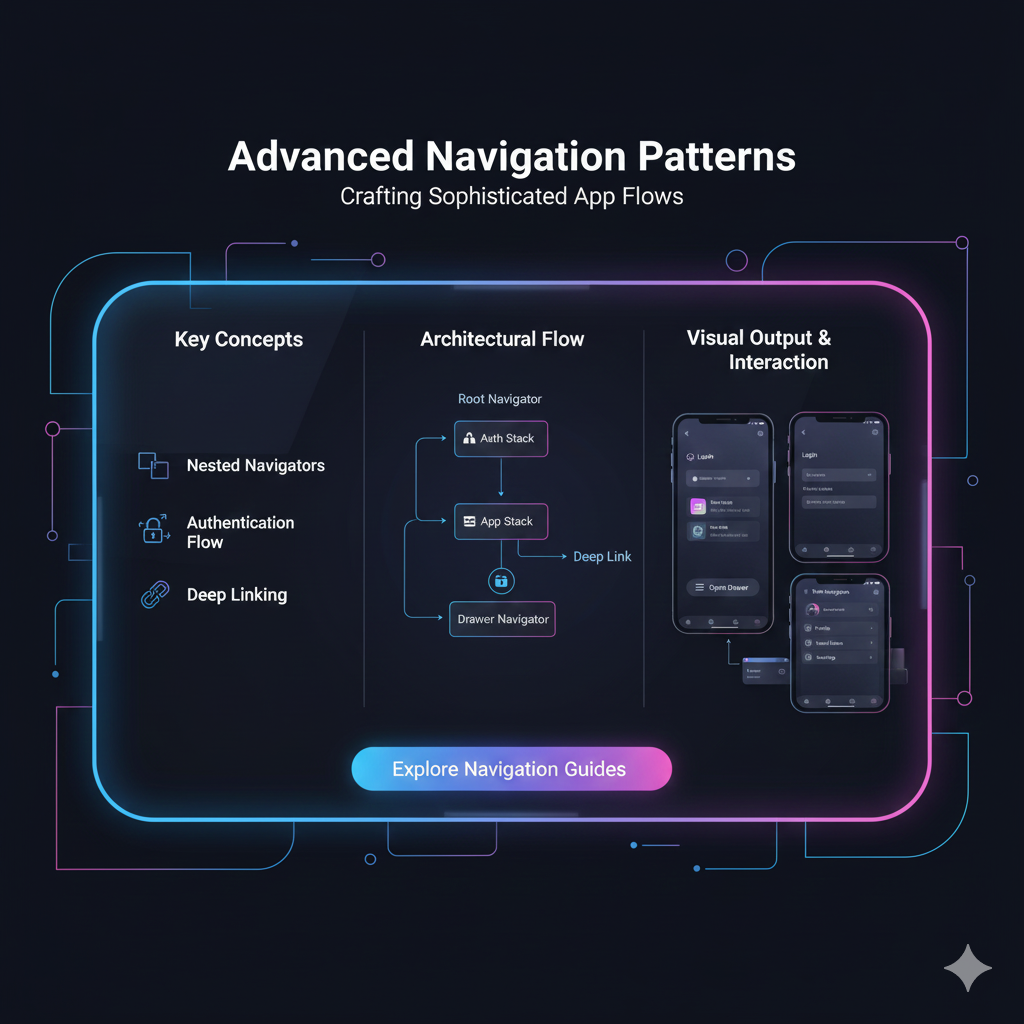
Is your website's navigation stuck in 2015? Explore advanced patterns like Mega Menus, Priority+, and Scroll-Triggered Nav for a seamless user experience. Level up your skills at codercrafter.in!
Let's be real. We've all been there. You land on a website, probably on your phone, and you're hit with that three-line icon – the infamous hamburger menu. You tap it, a menu slides in, you find what you need (hopefully), and you move on. It's functional. It's... fine.
But in 2024, "fine" just doesn't cut it anymore. Users expect more. They crave intuitive, almost magical experiences that feel effortless. The navigation of your website or app is the cornerstone of that experience. It’s the map, the tour guide, and the signpost all rolled into one.
So, if you're a developer or designer looking to level up your UI/UX game, you need to move beyond the basics. Welcome to the world of Advanced Navigation Patterns. This isn't just about where you put the links; it's about how you guide your users through a digital journey without them even realizing they're being guided.
Why Bother with Fancy Navigation? The "So What?" Factor
Before we dive into the nitty-gritty, let's address the elephant in the room. Why go through all this trouble?
Reduce Cognitive Load: Good navigation means users don't have to think hard. They feel their way through your site. This leads to...
Increased Engagement & Lower Bounce Rates: If people can find what they want instantly, they stick around longer.
Better Conversion Rates: Whether it's a sign-up, a purchase, or a contact form, a clear path leads users directly to your goal.
It's a Mark of a Pro: Basic navigation is beginner stuff. Implementing advanced patterns shows a deep understanding of user psychology and modern web principles.
Alright, let's get into the good stuff.
1. The Mega Menu: For Content-Heavy Behemoths
What it is: Imagine a regular dropdown menu on steroids. Instead of a simple list, a mega menu is a large panel that often displays multiple columns of navigation options, images, and even short descriptions.
The Vibe: It’s like walking into a well-organized department store. You can see entire sections (Men, Women, Electronics) at a glance, instead of peeking down one narrow aisle.
Real-World Use Case:
E-commerce Giants: Amazon, Best Buy. They have thousands of product categories. A mega menu allows them to showcase everything from "Laptop Bags" to "Smart Home Devices" without making you click through multiple pages.
News Websites: CNN, BBC. They can categorize news into "World," "Politics," "Tech," and "Sports" all in one expansive view.
Best Practices:
Don't Overcrowd: Just because you have space doesn't mean you should fill it with every link imaginable. Group related items logically.
Use Visuals Sparingly: A relevant icon or a small product image can enhance understanding, but too many can be overwhelming.
Ensure it's Accessible: It must be easy to navigate with a keyboard and screen reader.
2. The Priority+ Pattern: The Smart, Adaptive Nav
What it is: This is one of my personal favorites. The Priority+ pattern displays the most important navigation items visibly, while tucking away less important items into a "More" or "..." dropdown. The cool part? It often adapts based on screen size, moving items in and out of the hidden section dynamically.
The Vibe: It's like a smart closet that automatically brings your most-worn clothes to the front and archives your winter coat during summer.
Real-World Use Case:
Google Drive: On a wide screen, you see "My Drive," "Shared with me," "Recent," "Starred." On a smaller window, some of these get tucked away into a "More" menu.
Many SaaS Dashboards: Tools like Trello or Asana use this to keep the interface clean while still providing access to all sections.
Best Practices:
Prioritize Ruthlessly: Be data-driven. Use analytics to determine which links are most clicked. Your "About Us" page might not make the cut.
Clear "More" Indicator: The icon or button to reveal hidden items should be obvious.
Smooth Resizing: Test the pattern thoroughly as the viewport changes to ensure items don't jump around awkwardly.
3. Scroll-Triggered Navigation: The Chameleon
What it is: A navigation bar that changes its behavior or appearance as the user scrolls. The most common types are:
Sticky Nav: The navbar sticks to the top of the viewport, so it's always accessible.
Hide on Scroll / Appearing Nav: The nav bar disappears as you scroll down (getting out of the way) and reappears when you scroll up (hinting you might want to navigate elsewhere).
The Vibe: It's like a helpful shop assistant who steps back to let you browse the shelves but is immediately at your side the moment you look up for help.
Real-World Use Case:
Sticky Nav: Almost every modern website. It's a best practice now.
Hide on Scroll: Popular on mobile-focused sites and blogs, like Medium. It maximizes the screen real estate for reading.
Best Practices:
Don't Be Too Jumpy: The hide/show animation should be smooth and not triggered by tiny scroll movements.
Consider Adding a Shadow: When a nav becomes sticky, a subtle shadow underneath it creates a clear visual separation from the content.
Performance Matters: Implement this with CSS
position: stickywhere possible for better performance than JavaScript-based solutions.
4. Tabbed Navigation & Vertical Sidebars: For Dashboards & Apps
What it is: This pattern uses tabs (horizontal) or a sidebar (vertical) to switch between different views or sections within the same context without reloading the page.
The Vibe: It’s like the different folders in a filing cabinet. All the related information is contained in one unit, but neatly separated for easy access.
Real-World Use Case:
Web Apps: Your Gmail inbox (Primary, Social, Promotions tabs). GitHub's repository page (Code, Issues, Pull Requests, Actions).
Settings Menus: The macOS System Preferences or Windows Settings use a sidebar to navigate between different preference panes.
Best Practices:
Clearly Indicate the Active State: The currently selected tab or sidebar item must be visually distinct (e.g., a different color, an underline, a background fill).
Keep it Contextual: This pattern is best used for content that is closely related. Don't use it for your main site navigation unless it's an app-like experience.
5. The "Card" Based Navigation & Image-Driven Menus
What it is: Instead of a list of text links, navigation options are presented as cards or large images with text overlay. This is a highly visual and engaging pattern.
The Vibe: It's like the home screen of a streaming service like Netflix or Disney+. You're choosing what to do based on visual cues, not just text.
Real-World Use Case:
Portfolio Websites: For a designer or photographer, using images of their work as navigation to different categories is a powerful way to showcase their skills immediately.
Travel Websites: A site might have large, beautiful images for "Beach Getaways," "Mountain Treks," and "City Breaks" as the main navigation.
Best Practices:
High-Quality Images Only: Blurry or pixelated images will ruin the effect.
Ensure Text is Readable: Use contrasting colors and overlays to make sure the text label is clear on top of any image.
Add Subtle Interaction: A slight scale-up or shadow on hover (for desktop) provides excellent feedback.
Level Up Your Skills with Real-World Projects
Understanding these patterns is one thing; implementing them flawlessly in a real project is another. It requires a solid grasp of modern CSS (Flexbox, Grid, animations), JavaScript for interactivity, and a keen eye for user experience design.
If you're looking to master these skills and build professional, portfolio-worthy projects, you need a structured learning path. To learn professional software development courses such as Python Programming, Full Stack Development, and MERN Stack, visit and enroll today at codercrafter.in. Our project-based curriculum is designed to take you from basics to advanced concepts, ensuring you can build the kind of intuitive, engaging interfaces users love.
FAQs on Advanced Navigation
Q: Aren't these patterns just overcomplicating a simple menu?
A: Not if used correctly. The goal is to simplify the user's journey. A mega menu, for instance, prevents a user from having to click through 5 pages to find a specific product category. The complexity is on the development side to create a simple experience for the user.
Q: Which pattern is the best?
A: There is no single "best" pattern. The best navigation is the one that best serves your content and your users. An e-commerce site needs a mega menu; a reading app needs a priority+ pattern. Always let user needs and content structure dictate your choice.
Q: How do I know if my navigation is working?
A: Test, test, test! Use tools like heatmaps (e.g., Hotjar) to see where people are clicking. Conduct usability testing where you ask real users to find specific information on your site. Analytics will also show you if people are getting stuck.
Q: Is accessibility a big concern with these?
A: Absolutely. Any interactive element must be keyboard-navigable and properly labeled for screen readers. A fancy menu is useless if a significant portion of your audience can't use it. Always follow WCAG guidelines.
Wrapping It Up
Navigation is the silent ambassador of your website's user experience. Moving beyond the standard hamburger menu and exploring these advanced patterns allows you to create digital products that are not just usable, but delightful.
It’s about anticipating user needs, respecting their time, and guiding them with a gentle, invisible hand. So, the next time you're designing or building a site, ask yourself: "Is this navigation just functional, or is it fantastic?"
Start experimenting with these patterns. Your users will thank you for it.