Dark Mode vs. Light Mode: How to Choose the Right Theme for Your App
Struggling with dark or light mode? This in-depth guide breaks down context, UX best practices, real-world examples, and how to implement themes like a pro. Level up your dev skills at CoderCrafter.in.
Let’s be real. A few years ago, dark mode was just a cool, trendy feature for the night owls and battery savers. Remember when everyone lost their minds when Twitter finally rolled it out? Good times.
But now? It’s an expectation. It’s not just a "nice-to-have" anymore; it's a core part of user experience (UX) and accessibility. And if you’re building apps or websites in 2024, slapping a simple toggle that just flips some colors isn't cutting it. Your users are smarter, and their needs are more nuanced.
So, how do you move beyond a basic switch and create a theme system that feels intelligent, respectful, and downright slick? That’s where context comes in.
What Do We Actually Mean by "Theme with Context"?
In simple terms, a theme is the visual skin of your application—colors, shadows, typography. Dark mode, light mode, sepia, high contrast—these are all themes.
Context, in this case, is the "why" and "when" behind applying a theme. It’s about making your app aware of its surroundings and the user's situation to deliver the most appropriate visual experience automatically. Think of it as your app having a bit of common sense.
Instead of just:
"User clicked dark mode. Make everything dark."
It becomes:
"It's 11 PM, the user's OS is in dark mode, and they're in a low-light environment. Let's default to dark theme, but keep an option for them to override if they want."
That subtle shift? That’s the magic.
Why Should You Even Care? (Spoiler: It's Not Just Hype)
Reduced Eye Strain: This is the big one. A bright white screen in a dark room is like a flashlight to the face. Contextual theming (like auto-switching at night) can be a genuine comfort feature.
Battery Life (For OLED/AMOLED Screens): True black pixels on these screens are turned off, literally saving battery. If your user is on a phone with such a screen and battery is low, dark mode isn’t just preference; it’s helpful.
Accessibility: For users with visual impairments like photophobia or certain types of dyslexia, controlling contrast and brightness is crucial. A well-implemented theme system respects OS-level accessibility settings.
Professionalism & Polish: An app that seamlessly adapts to my system or environment feels premium and thoughtfully built. It shows you’ve gone the extra mile.
Real-World Use Cases: Who’s Nailing It?
Twitter/X: They’ve moved past simple light/dark. They offer "Dim" (a softer dark) and "Lights out" (pure black). They also strongly respect your OS theme setting by default.
YouTube: Watch a video in a dark room? The switch to dark theme makes the video player the star, minimizing distraction.
Apple’s Ecosystem (iOS, macOS): This is context royalty. Night Shift (warmer colors at night) combined with automatic theme switching based on sunset/sunrise creates a holistic experience. Apps that follow these settings feel native.
Code Editors (VS Code, Sublime Text): Developers spend hours here. Dark themes are the default because they reduce glare during long coding sessions, and the ability to customize every element is key.
How to Implement This Like a Pro: Best Practices
Okay, let's get into the nuts and bolts. How do you build this?
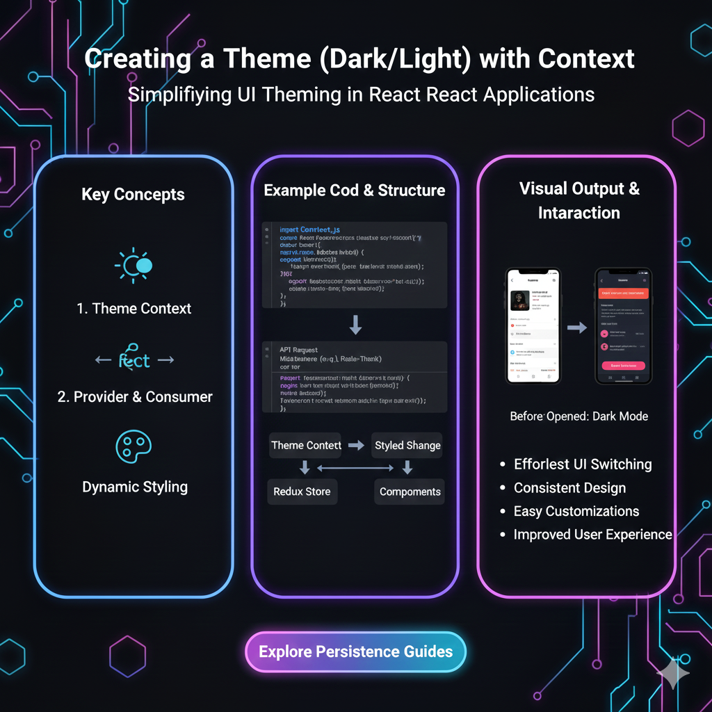
1. Start with CSS Custom Properties (CSS Variables)
This is non-negotiable. Don't use hard-coded hex values everywhere. Define a palette.
css
:root {
  --color-bg-primary: #ffffff;
  --color-text-primary: #222222;
  --color-accent: #3a86ff;
  /* ... other light theme vars ... */
}

[data-theme="dark"] {
  --color-bg-primary: #121212;
  --color-text-primary: #f0f0f0;
  --color-accent: #8338ec;
  /* ... matching dark theme vars ... */
}

body {
  background-color: var(--color-bg-primary);
  color: var(--color-text-primary);
  transition: background-color 0.3s ease, color 0.3s ease; /* Smooth transition! */
}
2. Respect the User's OS Preference
Use the prefers-color-scheme media query. This is your first line of context.
css
@media (prefers-color-scheme: dark) {
  :root {
    /* Auto-apply dark theme if OS is set to dark */
    --color-bg-primary: #121212;
  }
}
3. Give the User Manual Control (And Remember It!)
Always provide a toggle. The hierarchy should be:
User's Manual Choice > OS Setting > Your App's Default.
Store their choice in localStorage so it persists.
javascript
// Simple example to toggle and save
const themeToggle = document.querySelector('.theme-toggle');
const currentTheme = localStorage.getItem('theme') || (window.matchMedia('(prefers-color-scheme: dark)').matches ? 'dark' : 'light');

document.documentElement.setAttribute('data-theme', currentTheme);

themeToggle.addEventListener('click', () => {
  let activeTheme = document.documentElement.getAttribute('data-theme');
  let newTheme = activeTheme === 'light' ? 'dark' : 'light';

  document.documentElement.setAttribute('data-theme', newTheme);
  localStorage.setItem('theme', newTheme);
});
4. Think Beyond Just "Dark" and "Light"
Consider:
High Contrast Mode: For accessibility. Watch for
prefers-contrastmedia query.Time/Location-Based Switching: Use sunset/sunrise APIs or simple time checks to auto-switch.
Contextual Within the App: Maybe the drawing canvas in your app is always dark, but the settings panel follows the global theme.
FAQ: Stuff You Might Be Wondering
Q: Should dark mode just be inverted colors?
A: Absolutely not! This is a common rookie mistake. Pure inversion looks terrible. You need to carefully re-design your color palette for each theme. Grays, accents, and shadows need separate treatment.
Q: Where do I get good color palettes for themes?
A: Start with Material Design 3 or Apple's Human Interface Guidelines. Tools like Tailwind CSS also have excellent built-in dark mode support.
Q: Is dark mode better for everyone?
A: Nope! It’s subjective. Some people with astigmatism actually find light mode easier. That’s why choice and context are king.
Q: How do I test for accessibility?
A: Use tools like WebAIM's Contrast Checker. Ensure your text has a minimum contrast ratio of 4.5:1 for normal text (WCAG AA). Don't rely solely on color to convey information.
Wrapping It Up: Build Smarter, Not Harder
Implementing a contextual theme system isn't just about following a trend; it’s about building inclusive, respectful, and modern software. It shows you care about the user's experience in the real world, not just on a perfect, brightly lit demo screen.
Start with CSS variables, respect the OS, give the user control, and always think about the context in which your app will be used. This approach will set your projects apart from the crowd.
Want to build real-world features like this from the ground up? This is exactly the kind of practical, industry-relevant skill we focus on at CoderCrafter.in. To learn professional software development courses such as Python Programming, Full Stack Development, and MERN Stack—where you build actual projects with modern best practices—visit and enroll today at codercrafter.in. Transform from a beginner to a job-ready developer who knows how to think about the why, not just the how.
So, what’s your take? Are you team dark, team light, or team “just adapt to my life already”? Let us know in the comments (if you had them on your site)! Now go forth and build something adaptive.