Authentication Flow Navigation: Your Complete Guide to Login UX & Security | CoderCrafter
Master Authentication Flow Navigation. Learn how login journeys work, best practices for security & UX, and real-world examples. Build better apps today. Enroll in CoderCrafter's expert-led courses.
Authentication Flow Navigation: The Art of Not Pissing Off Your Users While Keeping Them Safe
Let’s be real. We’ve all been there. You’re buzzing with excitement to use a new app, hit “Sign Up,” and then… ugh. You’re thrown into a labyrinth of forms, confusing error messages, and the dreaded “password must contain an ancient hieroglyph.” You just want to get in. That moment, that critical journey from stranger to logged-in user, is what we call Authentication Flow Navigation. And nailing it is the difference between a loyal user and a bounced visit.
Think of it as the digital bouncer and concierge rolled into one. It needs to be tough enough to keep the bad guys out but smooth enough to make the VIPs (your users) feel welcome. This isn’t just a backend checklist; it’s a core part of your product’s personality and trust factor.
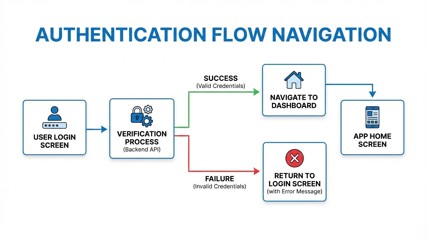
What Exactly is Authentication Flow Navigation?
In simple, non-jargony terms, it’s the entire step-by-step journey a user takes to prove they are who they say they are, and then get to where they need to go. It’s not just the login screen. It’s the whole saga:
The Discovery: “Sign Up” or “Log In” buttons.
The Gate: The actual form (email/password, social logins, phone number).
The Verification: The email OTP, the magic link, the SMS code.
The Handoff: What happens right after? Are they dumped on a homepage or guided to their dashboard?
The Ongoing Relationship: Password resets, 2FA prompts, “Remember me” functionality, and logging out.
A poorly designed flow feels like arguing with a robot. A great one feels invisible.
The Real-World Stuff: How Apps Get This Right (or Spectacularly Wrong)
Let’s look at examples we all know.
The Good: Slack
Slack’s magic link flow is a UX masterclass. You enter your email, they send a link, you click it, and you’re in—no password to remember on a new device. It reduces friction massively. Their navigation during this process is clear, with helpful status messages and a seamless transition into your workspace.
The Bad: That One Banking App We All Have
You log in (username, password, PIN). Then, you try to pay a friend. Cue: 2FA via SMS (wait for it…). Then, a security question you set in 2012 (“What was your first pet’s cousin’s name?”). The navigation between these steps is often clunky, with full-page reloads and little indication of progress. It’s secure, sure, but it feels like an interrogation.
The Modern Hybrid: Notion
Notion offers you every door: email/password, “Continue with Google,” “Continue with Apple.” The navigation is consistent. Choose your path, get a quick verification, and you’re dropped right into your docs. The flow respects your choice and gets out of your way.
Building a Flow That Doesn’t Suck: Best Practices for 2024
So, how do you build the good kind? Here’s the cheat sheet:
Clarity is King: Label buttons clearly. “Sign Up for Free” vs. “Log In.” Use microcopy to guide. “We’ll send you a magic link” sets the right expectation.
Offer Escape Routes: A “Forgot Password?” link shouldn’t be a treasure hunt. It should be right there. Same for “Use a different method.”
Progress Indication: If there are steps (Enter Email -> Verify -> Set Profile), show a progress bar. Don’t leave users wondering if the app froze.
Error Messages That Actually Help: “Invalid password” is lazy. “Invalid password. Hint: You used ‘P@ssw0rd’ in May 2023” is creepy but helpful. Okay, maybe not that, but something like “Incorrect password. Reset it?” with a link is good.
Smart Post-Auth Navigation: This is CRUCIAL. Where does the user land? If they came to read a specific article, can they still get there after logging in? Use session history or intelligent redirects (like a
return_toURL parameter). Never just default to a generic dashboard every single time.Security WITH UX: Implement 2FA, but use TOTP apps (like Google Authenticator) or biometrics (FaceID, TouchID) as options alongside SMS. SMS is better than nothing, but it’s the least secure and most friction-filled modern method.
Test the “Edge” Journeys: The happy path (perfect login) is easy. Test the forgotten password flow, the expired link flow, the “I no longer have access to my 2FA device” flow. This is where trust is built or broken.
Mastering these patterns requires a blend of frontend finesse, backend logic, and security awareness. To learn professional software development courses such as Python Programming, Full Stack Development, and MERN Stack, visit and enroll today at codercrafter.in. Our project-based curriculum forces you to think through these exact user experience challenges.
FAQs: The Stuff You Actually Google
Q: Is “Login with Facebook/Google” actually secure?
A: Generally, yes, and often more secure for the user. You’re outsourcing the password security to a giant (Google, Facebook, Apple). It also gives you verified email data. The trade-off is user privacy reliance on that platform. “Sign in with Apple” is great as it offers email relay to hide the user’s real email.
Q: What’s better: Magic Links or One-Time Passwords (OTPs)?
A: Magic links (email) are fantastic for UX—one click and you’re in. OTPs (SMS/email codes) are more universal and work in all mail clients. Magic links can be caught by spam filters. A combo or choice is often best.
Q: How do I handle navigation after logout?
A: Don’t just show a “you’ve logged out” message on a blank page. Redirect them to the public homepage or, even better, back to the content they were viewing (now in a logged-out state). The session ends, but their browsing intent doesn’t have to.
Q: How long should a user stay logged in?
A: It depends. Banking app? Short session (15-30 mins). A streaming app? Long (weeks or months). Use secure, long-lived refresh token patterns for the latter. Always let the user choose “Remember me” for non-critical apps.
Conclusion: The Flow is a Conversation
Authentication flow navigation isn’t a technical hurdle to clear. It’s the first sustained conversation your app has with a human. Is it a warm, helpful, efficient conversation? Or a bureaucratic, frustrating interrogation?
In today’s crowded digital space, users have zero patience for clunky logins. They equate a smooth auth flow with a competent, trustworthy product. By investing in clear navigation, thoughtful error states, and intelligent redirects, you’re not just checking a security box—you’re building the foundation of a great user relationship.
If you’re looking to build these systems from the ground up and understand the intricate dance between the frontend UI, the backend API endpoints, and database sessions, you need structured, industry-relevant training. To learn professional software development courses such as Python Programming, Full Stack Development, and MERN Stack, visit and enroll today at codercrafter.in. Let’s build apps that people love to use, starting from the very first click.