Android UI/UX Design 101: Your Ultimate Guide to Material Design & Human Interface
A complete, non-boring guide to Android Design Guidelines. Learn Material Design 3 secrets, real-world examples, best practices, and how to build stunning apps. Elevate your skills today.
Let’s be real. When you hear “design guidelines,” your brain might scream “BORING!” and picture a dusty, thousand-page PDF full of jargon. What if I told you that understanding Android’s design rules is less about following strict orders and more about unlocking a superpower?
It’s the difference between an app that feels janky and one that feels buttery smooth. Between an app people delete after one use and one that becomes a daily habit.
So, grab your coffee. We’re ditching the textbook talk and breaking down Android design (especially Material Design 3, the latest iteration) into something actually useful. Whether you're a budding developer, a curious designer, or a product manager, this is your backstage pass.
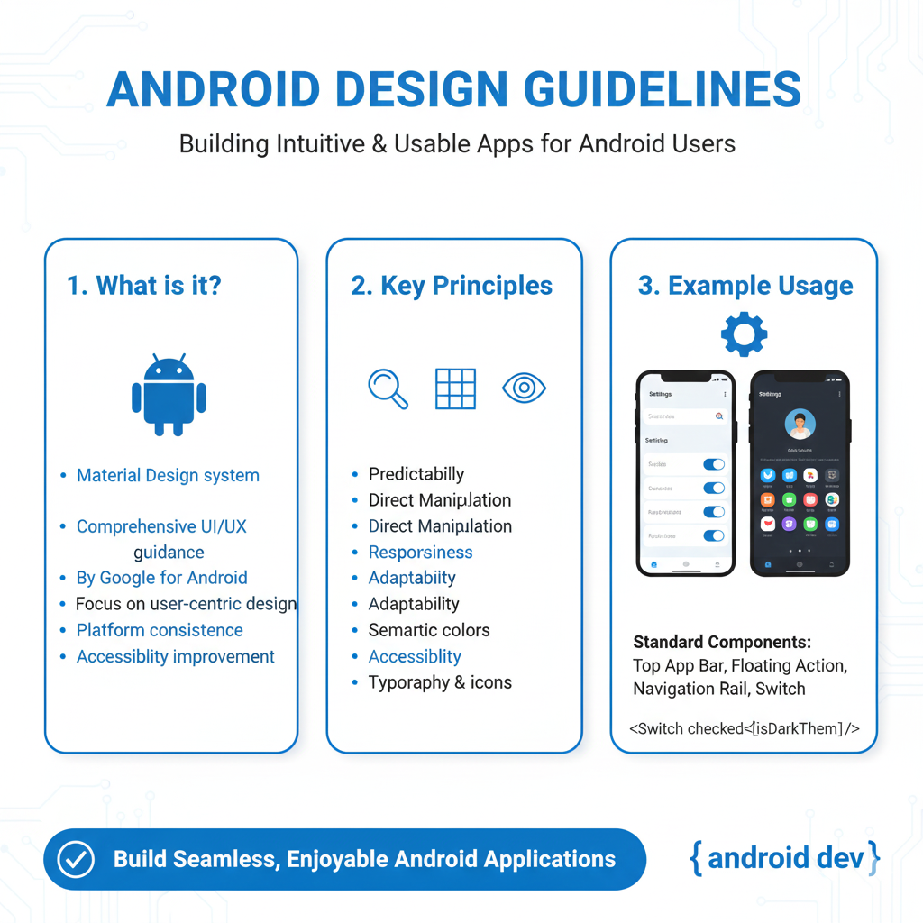
What ARE Android Design Guidelines, Actually?
In simple terms, they’re a playbook created by Google. But not a rigid one. Think of it as the collective wisdom of the best designers and engineers at Google, distilled into principles, components, and patterns that make Android apps intuitive, accessible, and consistently great.
The star of the show is Material Design. It’s not just a “look.” It’s a design language. The core idea? Imagine digital interfaces are made of tangible “material” – like digital paper and ink. This material has physics: it can be stacked, shrunk, expanded, and cast shadows. This metaphor creates a sense of familiarity for users.
With Material You (Material Design 3), things got personal. It’s all about dynamic color extraction from your wallpaper, custom shapes, and adaptive components. Your app doesn’t just sit on the phone; it can adapt to the user’s personal style.
Why Should You Even Care? (The Real-World Perks)
User Trust & Comfort: An app that follows platform conventions feels familiar. Users know where to find things. This reduces cognitive load—they’re not learning a new universe with every app. They feel in control.
Less Decision Fatigue: As a designer/developer, you don't have to reinvent the wheel for every button or menu. The components are tested and ready. You focus on solving your unique problem, not the navigation.
Accessibility Isn’t an Afterthought: The guidelines bake in contrast ratios, touch target sizes (that tiny button is a rage-tap waiting to happen), and screen reader support. You build inclusive apps from the start.
It Just Feels “Premium”: Smooth transitions, meaningful animations, and consistent spacing have a subconscious effect. It feels polished, not slapped together.
Let’s Get Concrete: Material Design 3 in the Wild
Stop thinking theory. Let’s see this stuff in action on your phone right now.
Dynamic Color: Open the Google Messages app. See the color of the send button and highlights? Now, change your wallpaper. Boom. Those colors shift to match. That’s Material You in action. It creates a deeply personalized experience.
Component Spotlight – Cards: Your news app, your food delivery app – they all use Cards. Why? A card is a container for a single, cohesive concept (one news story, one restaurant). It has a slight shadow, implying it’s above the surface, ready to be interacted with (tapped, swiped). It’s a genius pattern for organizing info.
Motion with Meaning: When you tap a song in Spotify and it expands to fill the screen, that’s a container transform. The animation visually connects the starting point and the destination, so you don’t feel lost. It’s not just decoration; it’s a guide.
Best Practices You Can Steal Today
Want your app to level up? Implement these, like, yesterday.
Respect the Density: Android screens come in all sizes. Use
dp(density-independent pixels) for sizing andspfor font scales. Your 16sp text will be legible on a budget phone and a tablet.The 8dp Grid System: Align almost everything (padding, margins, component sizes) to multiples of 8dp. This creates a visual rhythm that’s pleasing and organized. It’s the secret sauce to clean layouts.
Hierarchy is King: Use color, size, and weight to tell users what’s most important. Your primary action button should be the most prominent thing. Don’t make everything shout at the same volume.
Feedback is Non-Negotiable: When a user taps something, something must happen. A ripple effect, a color change, a tiny haptic buzz. This acknowledges the interaction. No feedback makes users think the app is broken.
Test on Real Thumbs: That beautiful nav bar at the top of a huge screen? It’s unreachable with one hand. Place key actions in the thumb zone (the bottom third of the screen). Your users will thank you.
FAQs – Stuff You Were Too Afraid to Ask
Q: Do I HAVE to follow these guidelines 100%?
A: They’re guidelines, not laws. You can have a brand-specific style. But break them intentionally, not out of ignorance. Understand the rule before you bend it, so you don’t break the user experience.
Q: My app needs to be on iOS too. Do I make them identical?
A: Big no. Each platform has its own language. Android uses a navigation drawer and a floating action button (FAB). iOS prefers a tab bar at the bottom. Maintain your brand core but adapt the components. Users expect iOS apps to feel like iOS, and Android apps to feel like Android.
Q: Is Material Design only for “Google-like” apps?
A: Not at all! Look at apps like Airbnb or Trello. They have strong brand identities but use Material principles (clear hierarchy, meaningful cards, consistent spacing) as a solid foundation.
Q: Where do I actually start implementing this?
A: Dive into the official Material Design 3 website (m3.material.io). It’s surprisingly well-documented now. For developers, Google provides Material Components for Android libraries—pre-built, customizable UI widgets that do the heavy lifting for you.
Wrapping It Up: Design is a Conversation
At the end of the day, Android Design Guidelines are about starting a positive conversation with your user. Every consistent icon, every comfortable tap target, every smooth animation is a sentence in that conversation that says, “I respect your time and I’ve thought this through.”
It’s what separates amateur-hour apps from professional, scalable products. And in today’s saturated app market, that difference isn’t just nice-to-have; it’s essential for survival and growth.
Feeling pumped to not just code, but to craft exceptional digital experiences? Understanding design is a massive part of being a modern, in-demand developer. To learn professional software development courses such as Python Programming, Full Stack Development, and MERN Stack, which include deep dives into crucial topics like UI/UX principles and front-end frameworks, visit and enroll today at codercrafter.in. We build developers who think like product craftsmen.
So go ahead. Open your favorite app and try to spot the Material Design principles. Then, go build something better.