Master Custom Charts in React Native: A Deep Dive into Victory Native
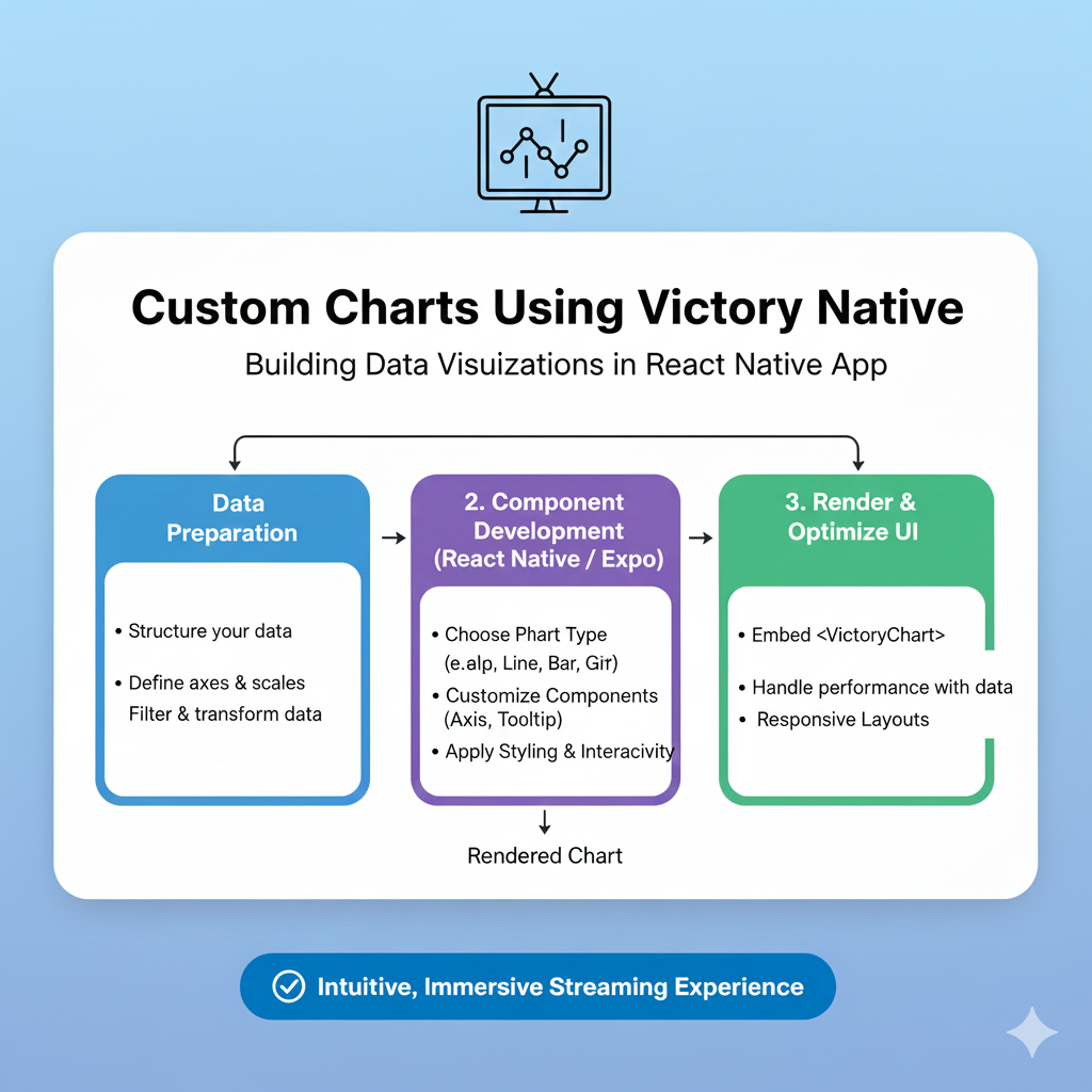
Unlock data visualization in React Native with Victory Native. Learn how to build custom, interactive charts with step-by-step examples, best practices, and real-world use cases.
From Bland to Grand: How to Build Stunning Custom Charts in React Native with Victory Native
Let’s be real. Data in a mobile app can be snooze-fest material. Walls of text and endless numbers? Users will bounce faster than you can say “analytics.” But what if you could turn that dry data into a visual story that’s not just informative, but actually engaging? That’s where data visualization comes in, and for React Native developers, there’s one library that stands out from the crowd: Victory Native.
If you’ve been scrolling through app stores, you’ve seen this in action—the smooth line chart tracking your fitness progress, the vibrant pie chart breaking down your monthly expenses, the interactive bar graph in your crypto app. That’s the magic we’re talking about, and guess what? It’s not as hard to build as you might think.
In this deep dive, we’re going to get our hands dirty with Victory Native. We’ll move beyond the basic tutorials and explore how to craft custom charts that feel native, interactive, and perfectly aligned with your app’s brand. Buckle up!
What Exactly is Victory Native?
In simple terms, Victory Native is a powerhouse React Native charting library built on top of the popular React.js library, Victory. It’s like the cool, mobile-optimized sibling. The beauty of Victory lies in its philosophy: it’s composable. Think of it like LEGO blocks for charts. You don’t just get a rigid “Chart” component; you get axes, grids, lines, bars, legends, and labels that you can mix, match, and style to create literally any visualization you can imagine.
Why did it become a go-to for so many devs?
It Just Works with React Native: Uses SVG under the hood, so you get crisp, scalable graphics.
Seriously Declarative: You describe what the chart should look like, and Victory figures out the how. This makes your code readable and intuitive.
Battle-Tested: It’s been around, is well-maintained, and has a strong community.
The Customization is Wild: From colors and fonts to event-driven interactivity, you have near-total control.
Setting the Stage: Getting Victory Native into Your Project
First things first, let’s get it installed. Fire up your terminal in your React Native project directory and run:
bash
npm install victory-native react-native-svg
# or
yarn add victory-native react-native-svg
Pro Tip: Ensure react-native-svg is correctly linked or configured for your specific React Native version (it’s usually auto-linked in newer RN versions). This is the engine that makes the SVGs run.
From Zero to Hero: Building a Custom Line Chart
Let’s not just talk. Let’s code. Say we’re building a meditation app and want to show a user’s weekly “mindful minutes.” A basic line chart is a great start.
javascript
import React from 'react';
import { View } from 'react-native';
import { VictoryLine, VictoryChart, VictoryTheme, VictoryAxis } from 'victory-native';

const MeditationChart = () => {
  // Sample data - day of the week and minutes
  const data = [
    { day: 'Mon', minutes: 10 },
    { day: 'Tue', minutes: 25 },
    { day: 'Wed', minutes: 15 },
    { day: 'Thu', minutes: 40 },
    { day: 'Fri', minutes: 20 },
    { day: 'Sat', minutes: 50 },
    { day: 'Sun', minutes: 30 },
  ];

  return (
    <View>
      <VictoryChart theme={VictoryTheme.material}>
        <VictoryAxis tickFormat={data.map(d => d.day)} />
        <VictoryAxis dependentAxis />
        <VictoryLine
          data={data}
          x="day"
          y="minutes"
          style={{
            data: { stroke: "#7c3aed", strokeWidth: 3 }, // A nice purple
          }}
          interpolation="natural" // Makes the line smooth and curvy
        />
      </VictoryChart>
    </View>
  );
};

export default MeditationChart;
Boom! You’ve got a functional chart. But it looks a bit... generic. Let’s customize it.
Leveling Up: Making It Uniquely Yours
This is where Victory Native shines. Let’s transform our basic chart into something that looks like it truly belongs in our app.
Theme it Your Way: Don’t rely on the default material theme. Define your own color palette and styles.
Add Interactivity: Let users tap on data points for details.
Custom Labels & Legends: Make everything crystal clear.
Here’s an upgraded version:
javascript
<VictoryChart
  domainPadding={{ x: 20, y: 20 }} // Gives breathing room
  height={300}
>
  {/* Custom X Axis */}
  <VictoryAxis
    style={{
      axis: { stroke: "#94a3b8" },
      tickLabels: { fill: "#64748b", fontSize: 12, fontFamily: 'Your-App-Font' }
    }}
  />
  {/* Custom Y Axis */}
  <VictoryAxis
    dependentAxis
    style={{
      axis: { stroke: "transparent" }, // Hide the y-axis line
      grid: { stroke: "#e2e8f0" }, // Light grey gridlines
      tickLabels: { fill: "#64748b", fontSize: 12 }
    }}
  />
  {/* The Main Event: The Line */}
  <VictoryLine
    data={data}
    x="day"
    y="minutes"
    style={{
      data: {
        stroke: "#8b5cf6",
        strokeWidth: 4,
        strokeLinecap: "round"
      }
    }}
    interpolation="catmullRom" // Even smoother curves
    // Interactive Data Points
    dataComponent={
      <VictoryScatter
        size={5}
        style={{
          data: { fill: "#ffffff", stroke: "#8b5cf6", strokeWidth: 2 }
        }}
        events={[{
          target: "data",
          eventHandlers: {
            onPressIn: () => {
              return [{
                target: "data",
                mutation: (props) => {
                  // Handle press! Show a tooltip, log data, etc.
                  console.log(`Pressed: ${props.datum.day}, ${props.datum.minutes} mins`);
                }
              }];
            }
          }
        }]}
      />
    }
  />
</VictoryChart>
See the difference? We’ve controlled the colors, the grid, the stroke, and added a touch of interactivity. This chart now has a personality.
Where Would You Actually Use This? (Real-World Use Cases)
Fitness & Health Apps: Progress charts (steps, heart rate, weight), sleep cycle graphs.
Fintech & Crypto Apps: Portfolio performance line charts, asset distribution pie charts, transaction history bars.
E-commerce Dashboards: Sales trends, customer demographics, product performance.
IoT Monitoring Apps: Real-time data streams from sensors (temperature, humidity).
Social Media Analytics: Follower growth, engagement metrics over time.
The pattern is clear: anywhere you have data that changes, trends, or needs comparison, a custom chart boosts user understanding and retention.
Best Practices to Keep Your Charts from Crashing and Burning
Performance is Key: For super dense, real-time data (like a live stock ticker), consider data sampling or using
VictoryNative.VictoryAreafor smoother rendering than thousands of line segments.Accessibility Matters: Ensure sufficient color contrast. Use
labelprops or custom tooltips to convey data to screen readers. Don’t rely on color alone.Keep it Simple: Don’t overload a single chart. One clear message per visualization is the golden rule.
Test on Real Devices: SVG rendering can vary. Always test your charts on both iOS and Android, especially on lower-end devices.
Embrace the Community: The Victory docs are good, but the GitHub issues and Stack Overflow are goldmines for solving tricky problems.
FAQs About Victory Native
Q: Victory Native vs. react-native-chart-kit? Which is better?
A: react-native-chart-kit is fantastic for quick, simple, good-looking charts with minimal code. Victory Native is for when you need deep customization, complex interactions, and a composable approach. It’s more powerful but has a steeper learning curve.
Q: Can I use it with Expo?
A: Absolutely! Since it uses react-native-svg, and Expo includes that, it works out of the box. Just expo install victory-native react-native-svg.
Q: My chart isn’t showing anything! What do I do?
A: The classic culprits: 1) Check your data format. It must be an array of objects. 2) Verify the x and y accessor strings match your data keys exactly. 3) Ensure you have defined a width/height for the chart container.
Q: How do I animate chart updates?
A: Victory has a sweet animate prop. Just pass {{ duration: 500, onLoad: { duration: 1000 } }} to your chart component, and it will gracefully animate when the data prop changes.
Conclusion: Your Data, Your Story
Victory Native unlocks a world where your app’s data isn’t just seen—it’s experienced. It moves from static numbers to an interactive, visual narrative that keeps users informed and engaged. The learning curve is worth it for the level of control and polish you achieve.
Start with a simple line or bar chart. Tweak the colors to match your brand. Add a click handler. Before you know it, you’ll be building complex, dashboard-ready visualizations that look and feel professionally crafted.
Remember, the best way to master these skills is through structured learning and building real projects. To learn professional software development courses that dive deep into React Native, advanced JavaScript, and full-stack tools that make libraries like Victory Native click, visit and enroll today at codercrafter.in. We offer hands-on training in Python Programming, Full Stack Development, and the MERN Stack to turn you from a coder into a crafting pro.