Build a High-Converting E-Commerce UI: 2025 Guide with Best Practices & Tools
Learn how to build a modern e-commerce UI that sells. Our step-by-step 2025 guide covers homepage design, product pages, checkout UX, and the best Tailwind CSS tools. Boost conversions now.
So, you want to build an e-commerce website? Not just a placeholder with a “Buy Now” button, but a conversion machine that looks slick, feels intuitive, and actually gets people to click “Checkout.” You’re in the right place.
Forget the dry, technical jargon. Let’s talk about building a digital storefront that your customers will love to shop in. We’ll walk through the why, the how, and the tools that make it happen in 2025, with practical advice you can use today. And yes, we’ll sneak in some real talk about common pitfalls.
Why Your UI/UX is Your Silent Salesperson
Think about the last time you abandoned an online cart. Was it a confusing form? A photo that didn’t show the product clearly? That moment of friction is what kills sales. Your User Interface (UI—the look and feel) and User Experience (UX—the journey) work together as your 24/7 sales team.
A well-designed e-commerce platform does more than just look pretty. It builds trust, guides customers to products they’ll love, and makes purchasing effortless, directly boosting your bottom line. In a world where customers can jump to a competitor in one click, a seamless experience isn't a luxury—it's a necessity.
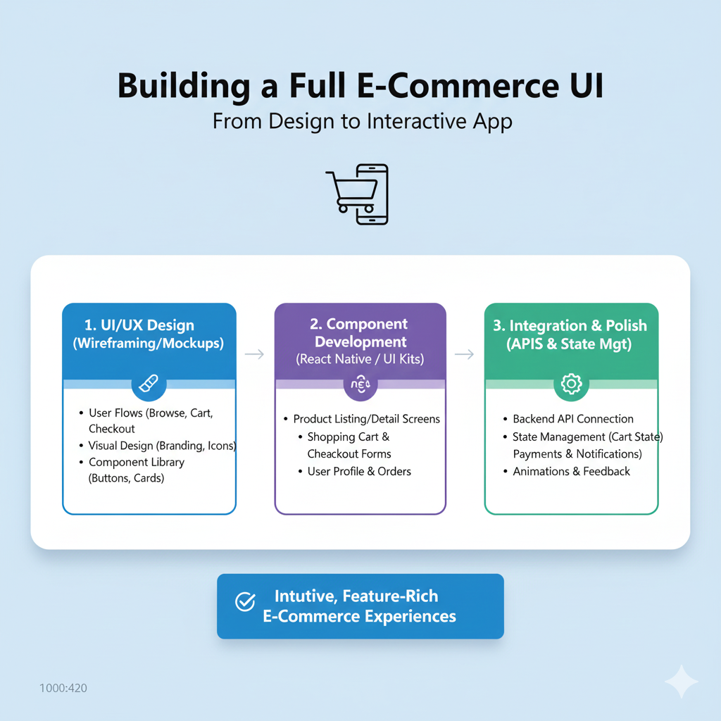
Phase 1: The Blueprint – Research & Planning (Don’t Skip This!)
Jumping straight into color schemes is tempting, but the pros start with a plan.
Know Your Audience: Who are you selling to? A 20-year-old shopping for streetwear has different expectations than a 60-year-old buying gardening tools. Define their demographics, tech-savviness, and shopping habits.
Spy on the Competition (Ethically): Analyze successful stores in your niche. What’s their layout? How do they handle filters or checkout? Tools like Baymard’s database of over 18,000 e-commerce design examples are gold mines for inspiration and spotting trends.
Map the Journey: Create a simple sitemap. What are your main pages (Home, Categories, Product, Cart, Checkout)? Sketch low-fidelity wireframes—basic layouts that focus on structure, not style. This step ensures your site's flow makes sense before you add a single color.
Pro Tip: Looking for a structured path to master these full-stack development skills? To learn professional software development courses such as Python Programming, Full Stack Development, and MERN Stack, visit and enroll today at codercrafter.in.
Phase 2: Building the Key Pages – A Data-Driven Deep Dive
This is where the magic happens. Let’s break down the critical pages using insights from real user research.
1. The Homepage: Your Digital Front Door
Your homepage needs to make a great first impression and guide users deeper.
Show Your Range: Feature a broad selection of your product types (aim for at least 40% of them). If users only see one category, they might assume that’s all you sell.
Ditch Auto-Rotating Carousels (Especially on Mobile): Data shows they often cause “unintended detours.” Users swipe away vital info, or get annoyed by the movement. Consider static, well-organized sections instead.
High-Quality Imagery is Non-Negotiable: Sites with inspiring photography (think IKEA or REI) make users want to stay and browse. They even build patience for minor site hiccups.
Search Bar, Front and Center: Users rely on search as a fallback. Make the search field impossible to miss with a contrasting design.
2. Category & Navigation: The Store Aisles
Poor navigation is where shoppers get lost and leave.
Chunk Your Categories: Don’t overwhelm users. Divide categories into manageable groups of about 10 subcategories. Conversely, ensure the deepest categories have at least 10 products to feel substantial.
Avoid Redundancy: Clear out overlapping categories (e.g., “Gadgets” and “Electronics” with the same products). A messy taxonomy confuses everyone.
Include a “Bestsellers” Path: New visitors often look for popular items to understand your brand. A dedicated “Bestsellers” category is a fantastic, low-friction entry point.
3. The Product Page: The Make-or-Break Moment
This is where the buying decision happens. Users can’t touch the product, so your page must answer every question.
The Must-Haves (Don’t Even Think of Skipping These):
Multiple high-res images with a zoom function.
A clear, descriptive title and price.
Obvious selection tools for variants (size, color).
Stock availability.
A prominent “Add to Cart” button with clear confirmation.
A concise, informative description that gets to the point.
Anticipate Questions: Use text, images, and video to describe the product in context. A bag’s product page should show its interior pockets; a dress should be shown on a model.
Leverage Reviews—All of Them: Shoppers devour reviews, often skipping to the negatives first to see “the worst this product might be.” Display both positive and negative reviews transparently. They build credibility and answer practical questions the description might not.
Enable Comparison: Ensure information is consistent across product variants (all colors list the same specs) and categories. This helps users compare options easily.
4. Checkout: The Final Hurdle
The goal here is minimal friction.
Guest Checkout: Always, always offer the option to checkout as a guest. Forcing account creation is a top cause of cart abandonment.
Clarity & Progress: Use a clear progress indicator (e.g., Cart > Information > Shipping > Payment). Show order summaries and all costs (tax, shipping) upfront.
Trust Signals: Display security badges, multiple payment options (digital wallets, credit cards), and a simple return policy link.
Phase 3: Tools & Implementation – Building at Warp Speed
Gone are the days of building every button from scratch. Use modern tools to build faster and smarter.
UI Libraries & Kits: Why reinvent the wheel? Libraries like Tailwind UI offer production-ready e-commerce components for product lists, shopping carts, and checkout forms. For a more e-commerce-specific toolkit, Storefront UI provides accessible, performant components built for React, Vue, and Qwik.
The Framework of Choice: Tailwind CSS: Both libraries above are built with Tailwind CSS, a utility-first framework that lets you style directly in your HTML. It’s incredibly efficient for building custom, responsive designs quickly.
Design Handoff: Use tools like Figma to create interactive prototypes and collaborate seamlessly with developers. Storefront UI even offers a matching Figma design system for perfect parity between design and code.
Your E-Commerce UI FAQs Answered
Q: How important is mobile design?
It’s not just important; it’s essential. The majority of traffic now comes from mobile devices. Your design must be responsive—adapting flawlessly to any screen size. Test every interaction on a phone.
Q: Can I just copy a big site like Amazon?
You can learn from them, but don’t copy blindly. Their design is the result of decades of testing for their massive scale and inventory. Focus on the principles (clarity, simplicity, trust) and adapt them to your specific brand and product range.
Q: How do I know if my design is working?
Test, test, test. Use tools like hotjar for session recordings, conduct usability testing with real people, and obsess over analytics: conversion rate, average order value, and cart abandonment rate are your key metrics.
Q: Should UI/UX align with my brand?
Absolutely. Your brand’s colors, tone, and style should be woven into the UI. This creates a cohesive experience that builds recognition and trust. A luxury brand and a skate shop should have wildly different visual feels.
Conclusion: It’s a Journey, Not a Destination
Building a killer e-commerce UI is a mix of art, psychology, and data. Start with a user-centric plan, build your key pages with proven best practices in mind, and leverage modern tools to execute efficiently.
Remember, even after launch, your work isn’t done. The best e-commerce sites are in a cycle of constant testing, learning, and iterating. Watch how users behave, listen to feedback, and don’t be afraid to change what isn’t working.
Ready to turn your product idea into a thriving online store? It all starts with the right foundation. To learn professional software development courses such as Python Programming, Full Stack Development, and MERN Stack—skills that will let you build and deploy dynamic e-commerce sites—visit and enroll today at codercrafter.in.