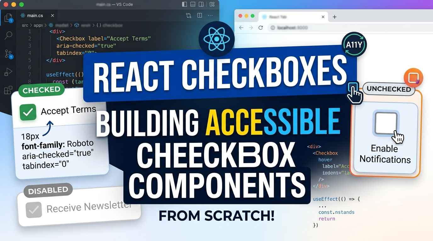
Master React checkboxes from basic controlled inputs to complex checkbox groups with indeterminate state, custom styling, and full WCAG accessibility compliance.
Checkboxes are deceptively simple — until you need indeterminate state, keyboard navigation, accessible labels, custom styling, or a "Select All" pattern. This guide covers every checkbox pattern you'll encounter in React applications, from basic controlled inputs to fully accessible checkbox groups.
Basic Controlled Checkbox
In React, a controlled checkbox ties its checked state to React state:
import { useState } from 'react';

function BasicCheckbox() {
  const [isChecked, setIsChecked] = useState(false);

  return (
    <label className="flex items-center gap-2 cursor-pointer">
      <input
        type="checkbox"
        checked={isChecked}
        onChange={(e) => setIsChecked(e.target.checked)}
        className="w-4 h-4 accent-blue-600"
      />
      <span>Subscribe to newsletter</span>
    </label>
  );
}
Key points:
Always wrap input in a
<label>— clicking the label text toggles the checkboxUse
e.target.checked, note.target.value, for checkboxesCSS
accent-color(theaccent-Tailwind prefix) styles the native checkbox in modern browsers
Reusable Checkbox Component
// components/Checkbox.tsx
import { InputHTMLAttributes, forwardRef } from 'react';

interface CheckboxProps extends Omit<InputHTMLAttributes<HTMLInputElement>, 'type'> {
  label: string;
  description?: string;
}

const Checkbox = forwardRef<HTMLInputElement, CheckboxProps>(
  ({ label, description, id, className, ...props }, ref) => {
    const checkboxId = id || `checkbox-${label.toLowerCase().replace(/\s+/g, '-')}`;

    return (
      <div className="flex gap-3">
        <div className="flex items-center h-5">
          <input
            ref={ref}
            id={checkboxId}
            type="checkbox"
            className="w-4 h-4 rounded border-gray-300 text-blue-600 focus:ring-blue-500"
            aria-describedby={description ? `${checkboxId}-desc` : undefined}
            {...props}
          />
        </div>
        <div>
          <label htmlFor={checkboxId} className="text-sm font-medium text-gray-900 cursor-pointer">
            {label}
          </label>
          {description && (
            <p id={`${checkboxId}-desc`} className="text-sm text-gray-500">{description}</p>
          )}
        </div>
      </div>
    );
  }
);

Checkbox.displayName = 'Checkbox';
export default Checkbox;

// Usage
<Checkbox
  label="Send marketing emails"
  description="We'll send you product updates and promotions."
  checked={receiveEmails}
  onChange={(e) => setReceiveEmails(e.target.checked)}
/>
Indeterminate State
The indeterminate state (the dash shown when some but not all items in a group are selected) can only be set via the DOM — not through JSX attributes. Use a ref:
import { useRef, useEffect } from 'react';

interface SelectAllCheckboxProps {
  checked: boolean;
  indeterminate: boolean;
  onChange: (checked: boolean) => void;
  label: string;
}

function SelectAllCheckbox({ checked, indeterminate, onChange, label }: SelectAllCheckboxProps) {
  const ref = useRef<HTMLInputElement>(null);

  useEffect(() => {
    if (ref.current) {
      ref.current.indeterminate = indeterminate;
    }
  }, [indeterminate]);

  return (
    <label className="flex items-center gap-2 cursor-pointer font-medium">
      <input
        ref={ref}
        type="checkbox"
        checked={checked}
        onChange={(e) => onChange(e.target.checked)}
        className="w-4 h-4"
      />
      {label}
    </label>
  );
}
Checkbox Group with Select All
const FRUITS = ['Apple', 'Banana', 'Cherry', 'Dragonfruit', 'Elderberry'];

function FruitSelector() {
  const [selected, setSelected] = useState<Set<string>>(new Set());

  const allChecked = selected.size === FRUITS.length;
  const someChecked = selected.size > 0 && !allChecked;

  function toggleAll(checked: boolean) {
    setSelected(checked ? new Set(FRUITS) : new Set());
  }

  function toggleOne(fruit: string, checked: boolean) {
    setSelected(prev => {
      const next = new Set(prev);
      checked ? next.add(fruit) : next.delete(fruit);
      return next;
    });
  }

  return (
    <fieldset>
      <legend className="text-base font-semibold mb-3">Select fruits</legend>

      <SelectAllCheckbox
        checked={allChecked}
        indeterminate={someChecked}
        onChange={toggleAll}
        label="Select all"
      />

      <div className="mt-2 ml-6 space-y-2">
        {FRUITS.map(fruit => (
          <label key={fruit} className="flex items-center gap-2 cursor-pointer">
            <input
              type="checkbox"
              checked={selected.has(fruit)}
              onChange={(e) => toggleOne(fruit, e.target.checked)}
              className="w-4 h-4"
            />
            <span className="text-sm">{fruit}</span>
          </label>
        ))}
      </div>

      <p className="mt-3 text-sm text-gray-500">
        {selected.size} of {FRUITS.length} selected: {[...selected].join(', ') || 'none'}
      </p>
    </fieldset>
  );
}
Custom Styled Checkbox (Hiding Native, Using CSS)
When accent-color isn't enough and you need full design control:
/* styles/checkbox.css */
.custom-checkbox-wrapper {
  display: flex;
  align-items: center;
  gap: 0.5rem;
  cursor: pointer;
  user-select: none;
}

/* Hide native checkbox visually but keep it accessible */
.custom-checkbox-wrapper input[type="checkbox"] {
  position: absolute;
  opacity: 0;
  width: 0;
  height: 0;
}

/* Custom visual box */
.custom-checkbox-wrapper .checkmark {
  width: 18px;
  height: 18px;
  border: 2px solid #d1d5db;
  border-radius: 4px;
  display: flex;
  align-items: center;
  justify-content: center;
  background: white;
  transition: all 0.15s ease;
  flex-shrink: 0;
}

/* Checked state */
.custom-checkbox-wrapper input:checked + .checkmark {
  background: #0070DC;
  border-color: #0070DC;
}

/* Checkmark tick */
.custom-checkbox-wrapper input:checked + .checkmark::after {
  content: '';
  width: 5px;
  height: 9px;
  border: 2px solid white;
  border-top: none;
  border-left: none;
  transform: rotate(45deg) translateY(-1px);
}

/* Focus ring for keyboard navigation */
.custom-checkbox-wrapper input:focus-visible + .checkmark {
  outline: 2px solid #0070DC;
  outline-offset: 2px;
}// React component using custom checkbox
function CustomCheckbox({ label, checked, onChange, id }: CheckboxProps) {
const inputId = id || `custom-${label}`;
return (
<label htmlFor={inputId} className="custom-checkbox-wrapper">
<input
id={inputId}
type="checkbox"
checked={checked}
onChange={(e) => onChange(e.target.checked)}
/>
<span className="checkmark" aria-hidden="true" />
<span>{label}</span>
</label>
);
}Checkbox with React Hook Form
import { useForm } from 'react-hook-form';
import { z } from 'zod';
import { zodResolver } from '@hookform/resolvers/zod';

const schema = z.object({
  agreeToTerms: z.boolean().refine(val => val === true, {
    message: 'You must accept the terms of service',
  }),
  receiveMarketing: z.boolean().optional(),
});

function SignupForm() {
  const { register, handleSubmit, formState: { errors } } = useForm({
    resolver: zodResolver(schema),
    defaultValues: { agreeToTerms: false, receiveMarketing: false },
  });

  return (
    <form onSubmit={handleSubmit(console.log)}>
      <div>
        <label className="flex items-center gap-2">
          <input type="checkbox" {...register('agreeToTerms')} />
          I accept the <a href="/terms">terms of service</a>
        </label>
        {errors.agreeToTerms && (
          <p className="text-red-600 text-sm mt-1" role="alert">
            {errors.agreeToTerms.message}
          </p>
        )}
      </div>

      <label className="flex items-center gap-2 mt-3">
        <input type="checkbox" {...register('receiveMarketing')} />
        Send me product updates
      </label>

      <button type="submit" className="mt-4 px-4 py-2 bg-blue-600 text-white rounded">
        Sign up
      </button>
    </form>
  );
}
Accessibility Requirements
Always use a
<label>— either wrap the input, or usehtmlFor+idUse
<fieldset>+<legend>for checkbox groups — screen readers announce the group contextNever disable focus rings — add a visible
:focus-visiblering for keyboard usersError messages — use
aria-describedbyto associate errors with the checkbox, androle="alert"on the error elementRequired checkboxes — use
aria-required="true"and communicate the requirement in the label text, not just colourCustom styled checkboxes — keep the native
<input type="checkbox">in the DOM (visually hidden, notdisplay:none) so screen readers and keyboard navigation still work
Conclusion
React checkboxes range from a three-line controlled input to complex accessible group components with indeterminate state and custom styling. The key principles are: always use semantic <label> elements, handle indeterminate state via a ref, use Set for efficient group state management, and never remove the native input from the accessibility tree when custom styling. With React Hook Form integration, checkbox groups become part of your overall form validation strategy seamlessly.