Master the art of mobile app branding. Learn how to create engaging Splash Screens and professional App Icons that boost user retention and downloads. Enroll in CoderCrafter's development courses today!
Your App's First Handshake: The Ultimate Guide to Killer Splash Screens & App Icons
Let's be real for a second. We’ve all been there.
You hear about a cool new app, you tap the download button, and you’re staring at your home screen, waiting. The icon looks... meh. You open the app, and you're greeted by a blank, white screen that hangs for what feels like an eternity. Your excitement? Gone. You’re already one thumb-twitch away from swiping it away.
That, my friend, is a first impression fail in the digital world.
In today's hyper-competitive app market, you don't get a second chance to make a first impression. Before a user even sees your slick UI or uses your groundbreaking feature, they interact with two critical elements: the App Icon and the Splash Screen.
Think of it this way: Your app icon is your dating profile picture—it needs to be so fire that people have to swipe right (or, you know, tap download). Your splash screen is the first thing you say when you meet—it sets the vibe, builds anticipation, and assures them they made the right choice.
So, let's break down how to absolutely nail both.
Part 1: The App Icon - Your Digital Billboard
What Exactly is an App Icon?
In simple terms, it's the small, visual square you tap to open any app on your phone. But in the grand scheme of things, it’s so much more. It’s your app’s identity, its brand ambassador, and its primary marketing asset on a user's crowded home screen.
Your goal isn't just to be seen; it's to be recognized and remembered. Think about the Twitter bird, the Instagram camera, or the WhatsApp phone-in-a-speech-bubble. You don't even need to see the name.
Why Bother So Much? The Psychology Behind the Pixel
A great app icon does three things:
Attracts Clicks: A unique, visually appealing icon stands out in the app store sea of sameness.
Builds Brand Recognition: Every time a user sees it on their screen, it reinforces your brand.
Communicates Your App's Core Purpose: A well-designed icon gives a subtle hint about what your app does (e.g., a camera icon for a photo app, a dollar sign for a finance app).
Real-World Use Case: The Duolingo Owl
Take Duolingo's iconic green owl, Duo. It's simple, friendly, and memorable. But there's genius in its simplicity. The owl represents wisdom and learning, perfectly aligning with the app's purpose. It’s so recognizable that Duolingo uses it across all its marketing, creating a cohesive and powerful brand identity. You see the owl, you think of learning a language.
Best Practices for Designing a Banger App Icon in 2024
Keep It Simple, Stupid (KISS): You have a tiny canvas. Don't cram it with text, complex shapes, or a rainbow of colors. One strong, central concept is all you need.
Be Unique, But Relevant: Your icon for a meditation app shouldn't look like a racing game. Ensure the design connects to your app's function or brand name.
Test on Different Backgrounds: Your icon won't always be on a clean, white App Store page. Test it on various home screen wallpapers—busy ones, dark ones, light ones—to ensure it always pops.
Follow Platform Guidelines (Seriously!): Apple’s Human Interface Guidelines and Google’s Material Design have specific rules for icon size, shape, and safe zones. Ignoring them means your icon might get cropped weirdly or look unprofessional.
A/B Test Like Your Downloads Depend On It (Because They Do): Use App Store Connect and Google Play Console's built-in testing features to try out different icon variations. You might be surprised which one converts better.
Designing a professional app icon requires a keen eye for design and an understanding of user psychology. To learn professional software development courses such as Python Programming, Full Stack Development, and MERN Stack, which cover everything from backend logic to front-end aesthetics, visit and enroll today at codercrafter.in.
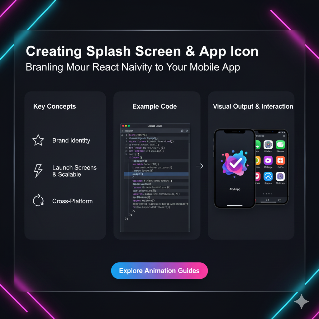
Part 2: The Splash Screen - The Art of the Graceful Entrance
What is a Splash Screen, Anyway?
That's the first screen you see immediately after tapping the app icon, while the app's core code and resources are loading in the background. It's not a "loading screen" per se—it's a branded screen designed to make that loading time feel seamless and professional.
Many people confuse it with a loading screen. A loading screen has progress bars or spinners and is part of the app's main activity. A splash screen is usually a static, branded image or a simple animation that appears before the app is fully ready.
Why Can't I Just Skip It? The Power of Perception
You might think, "If my app is optimized, it should load instantly!" In a perfect world, yes. But in reality, there's always a minuscule delay. The splash screen uses this unavoidable delay to:
Provide Instant Feedback: It tells the user the app is launching and working. A blank screen makes users think the app has frozen.
Brand Reinforcement: It's a free, full-screen ad for your brand. It sets the visual tone and personality of your app.
Manage User Expectations: A well-designed splash screen makes the wait feel intentional and shorter than it actually is (this is a proven UX principle!).
Real-World Use Case: Spotify
Open Spotify. You're immediately greeted by a slick, dark screen with the iconic green logo. It's on brand, it's fast, and it builds anticipation for the music experience you're about to have. It feels premium. Now, imagine if it was just a blank, black screen. The vibe would be totally different, right?
Best Practices for a Splash Screen That Doesn't Suck
Speed is King: Your splash screen shouldn't add to the loading time. Its display should be tied to the native app initialization process. Keep it under 1-2 seconds.
Brand Consistency is Non-Negotiable: Use your brand's logo, color palette, and fonts. This is not the place to get experimental.
Keep it Simple (Yes, Again): Avoid text, version numbers, or complex animations. A simple logo centered on a branded background is often the most effective.
Mind the Dimensions: Design for all screen sizes and resolutions! What looks good on a new iPhone might be cropped or pixelated on an older Android device.
Consider an Animated Splash Screen: For a more polished feel, a subtle animation (like a gentle fade-in or a logo "breathing") can elevate the experience. But remember rule #1: don't let it slow down the app launch.
Implementing a seamless splash screen requires a solid grasp of native mobile development (like Android's SplashScreen API or iOS's LaunchScreen storyboard). If you want to master the technical skills to build fluid, professional mobile apps from the ground up, check out the Full Stack Development program at codercrafter.in.
FAQs: Your Burning Questions, Answered
Q1: Can I use a photo as my app icon?
Generally, it's a bad idea. Photos are complex, don't scale down well, and rarely communicate a clear brand identity. Stick to simplified, vector-based graphics.
Q2: How many different sizes do I need to create for my app icon?
A lot! For a professional release, you'll need a whole range—from 1024x1024 for the App Store down to 16x16 for certain system uses. Both iOS and Android have detailed documentation listing all the required sizes.
Q3: My splash screen shows for too long. What's the problem?
This is usually a performance issue, not a splash screen design issue. The splash screen is waiting for your app's main activity to load. You need to optimize your app's startup code—lazy-load resources, defer non-critical initialization, and check for heavy operations on the main thread.
Q4: Should the splash screen and the first screen of my app look the same?
This is a popular and effective technique! It creates a seamless, "instant" feeling. The splash screen acts as a placeholder, and when the app is ready, the main UI fades in seamlessly behind it, providing a smooth transition.
Q5: What tools can I use to design these assets?
For Pros: Figma, Adobe XD, and Sketch are the industry standards for designing and prototyping.
For Beginners & Pros Alike: Canva is a fantastic web-based tool with templates that can help you get started.
Conclusion: Don't Underestimate the First Click
In the journey of building an app, it's easy to get lost in the complex logic, the databases, and the fancy features. But never forget that for your user, the journey starts with a single tap.
Your app icon and splash screen are the gatekeepers of that experience. They are the silent salespeople working 24/7 on the user's home screen. Investing time, thought, and design resources into getting them right is not a "nice-to-have"—it's a fundamental part of your app's success.
A killer icon gets the download. A professional splash screen builds the trust. Together, they ensure your user sticks around long enough to discover all the amazing things your app can do.
Ready to build an app that not only works flawlessly but also looks and feels incredible from the very first tap? The journey starts with the right skills. To learn professional software development courses such as Python Programming, Full Stack Development, and the MERN Stack, visit and enroll today at codercrafter.in. Your future as a pro developer awaits!