Stack Navigation Guide: Best Practices, Examples & How to Implement
Master stack navigation for seamless app flow. This in-depth guide covers definitions, real-world examples from Stack Overflow, best practices, and common pitfalls. Learn to build intuitive navigation today.

Stack Navigation Guide: Best Practices, Examples & How to Implement
Stack Navigation Demystified: Your Blueprint for Seamless App Flow
From Lost to Found: Why Navigation Makes or Breaks Your App
Ever downloaded an app, tapped around aimlessly for a minute, and then just gave up and deleted it? Yeah, we’ve all been there. That feeling of being lost inside a piece of software is almost always a failure of navigation. It’s the invisible skeleton that holds your app together, the silent guide that determines whether a user feels in control or completely adrift.
Think about the last great app you used. Whether you were ordering food, hailing a ride, or doom-scrolling social media, you probably didn't even think about how you got from one screen to another. That’s the hallmark of excellent stack navigation—it feels intuitive, predictable, and seamless. When it's done poorly, it’s the single biggest reason users abandon ship. For developers, getting this right isn't just a nice-to-have; it's foundational to creating professional, engaging digital experiences.
To learn professional software development courses that cover these essential skills, such as Python Programming, Full Stack Development, and the MERN Stack, visit and enroll today at codercrafter.in.
What Exactly is Stack Navigation?
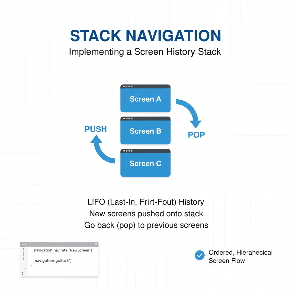
At its core, stack navigation is a fundamental pattern for managing the presentation and transition between different screens (or "routes") in an application. The "stack" is a perfect metaphor: imagine a stack of plates. You start with a home screen. When you navigate to a new screen, it’s like placing a new plate on top of the stack. To go back, you simply remove the top plate, revealing the one beneath it.
This Last-In-First-Out (LIFO) model is incredibly powerful for several reasons:
Predictable Back Behavior: Users instinctively understand that the back button or gesture will take them to the previous screen in their journey.
State Preservation: Each screen in the stack maintains its own state. Go back from a product detail page, and your home screen’s scroll position and data are exactly as you left them.
Clear Hierarchy: It creates a logical, linear flow that users can mentally map, crucial for complex tasks like a multi-step checkout process.
This pattern is so essential that it’s built into the fabric of major frameworks. React Navigation provides a robust createStackNavigator for React Native apps. For web developers, client-side routers in React (like React Router) or Vue.js implement similar stack-like behavior for browser history management. Even native platforms like iOS's UINavigationController and Android's Fragment back stack are built on this principle.
The Real-World Impact: Lessons from Stack Overflow
You might wonder, "How big a deal can a nav bar really be?" Let’s look at a massive, real-world case study: Stack Overflow's 2017 top navigation redesign.
Before the redesign, the Stack Overflow team discovered something startling: despite 9.3 million daily visits, fewer than 1% of users ever clicked the navigation. User interviews revealed a "mental block"—developers were so mission-focused on finding a single answer that they literally didn't see the top bar. They’d come from Google, scroll straight past the navigation to the answer, and leave, completely missing other valuable parts of the site like Jobs or Documentation.
Their redesign, focused on clarity and modern patterns, led to staggering results in A/B tests:
Clicks to Documentation increased by 229% among anonymous users.
Clicks to Jobs increased by 160%.
User signups increased by 7%.
This wasn't just a coat of paint. It was a strategic overhaul that made the site's entire ecosystem discoverable. It proves that intelligent stack navigation isn't about aesthetics—it's about user cognition, discoverability, and fulfilling business goals.
Crafting Your Navigation: Best Practices You Can't Ignore
Building a navigation system that works isn't about blindly following a trend. It's about applying timeless principles to your specific context. Here are the non-negotiables, drawn from industry patterns and lessons like Stack Overflow's.
1. Prioritize User Goals Over Your Org Chart
Your navigation should reflect the user's tasks, not your company's department structure. Stack Overflow's research showed users filtered out anything that didn't look immediately relevant to their goal. Group similar information and remove clutter. Every item should answer the user's silent question: "What can I do here?"
2. Strive for Consistency and Familiarity
Use established patterns. The Stack Overflow team moved to a "more standardized position that you’re used to on other sites" because familiarity reduces cognitive load. Whether it's a bottom tab bar for primary destinations or a stack for drill-down flows, don’t reinvent the wheel unless you have a phenomenal reason.
3. Design for Flexibility and Scalability
Your app will grow. The navigation you build today must accommodate the features you'll add tomorrow. The Stack Overflow design system, Stacks, explicitly provides for different navigation types (vertical, muted, scrollable) to handle diverse content needs. Their later work on a unified left-hand navigation for all their sites (Stack Overflow, Enterprise, Teams) was guided by a principle of flexibility to support everything from a single-site user to someone in a private team channel.
4. Make it Accessible and Responsive from Day One
Navigation is your app's control panel. It must work for everyone, everywhere. This means:
Semantic HTML: Use
<nav>and proper ARIA labels (aria-label). The Stacks component library enforces this in its code samples.Keyboard & Screen Reader Navigation: Ensure all items are focusable and have descriptive text. Icons alone, as Stack Overflow found, are often not enough—users didn't understand what the inbox or achievements icons meant.
Responsive Behavior: Will your horizontal nav wrap on small screens, or scroll horizontally? Stacks offers both classes (
.s-navigation__scrollor default wrap), noting that scrolling is a known mobile pattern. Plan for all screen sizes.
5. Provide Clear Visual Feedback
Users should always know where they are. The Stacks system uses an .is-selected class to mark the active navigation item clearly. A pro-tip from their documentation: use a data-text attribute on items to prevent annoying layout shifts when the selected state changes and text weight might alter the element's size.
Common Pitfalls & Your Navigation FAQ
Let’s tackle the headaches before they happen.
Q: My app has deep nesting. How do I prevent users from feeling lost?
A: Implement "breadcrumb" navigation for deep hierarchies. For mobile, consider a hybrid model where major sections are tabs, and each tab has its own internal stack. Avoid nesting stacks more than 2-3 levels deep without a clear way out.
Q: How do I handle the "up" vs. "back" behavior on Android?
A: "Up" (the arrow in the app bar) should navigate within your app's hierarchy (e.g., from a post to the main blog list). "Back" (the system button) should move backward through the user's chronological history. These can, and often should, be different. Define your app's hierarchical parent for each screen clearly.
Q: How many items should be in my primary navigation?
A: The magic number is between 3 and 7. Cognitive psychology suggests this is what users can hold in working memory. If you have more, you need to categorize and create secondary navigation levels. Stack Overflow's own design guidelines caution against using multiple navigations with the same style on one page, as it causes confusion.
Q: Should I use tabs or a drawer menu?
A:
Use Tabs (Bottom or Top): For 3-5 core destinations that need to be constantly accessible. Tabs are always visible and encourage switching. Perfect for apps like Spotify (Home, Search, Library) or a social media feed.
Use a Drawer (Hamburger Menu): For apps with many top-level sections (more than 5) or where the primary focus is deep content consumption (like a news reader or settings-heavy app). Be aware that drawers can reduce discoverability, as items are hidden.
The Future is Seamless: Conclusion
Great stack navigation is a form of empathy. It’s about understanding the user’s intent, anticipating their next move, and quietly clearing the path. It’s the difference between an app that feels like a tool and one that feels like a maze.
As the digital landscape evolves, with technologies like Python and FastAPI driving the backend (noted for significant growth in the 2025 Stack Overflow survey) and AI integrating into development tools, the principles of clear navigation will only become more critical. The most advanced AI feature is useless if a user can't find it.
Start thinking about navigation not as an afterthought, but as the first draft of your user experience. Map it out on paper, test it with real people, and iterate. Your users—and your app’s success metrics—will thank you for it.
Ready to build apps with professional-grade architecture and user experience? Master the full spectrum of development, from backend logic with Python Programming to dynamic interfaces with Full Stack Development and the MERN Stack. Take the next step in your developer journey—visit and enroll today at codercrafter.in.
