Master Responsive UI in React Native: A 2025 Guide to Dimensions & PixelRatio
Stop guessing screen sizes! Learn how to use React Native's Dimensions and PixelRatio APIs to build pixel-perfect, responsive mobile apps that look great on any device. Level up your skills with professional courses from CoderCrafter.
Let's be real. We've all been there. You've just finished coding this gorgeous screen on your iPhone 15 Pro Max. It's a masterpiece. Every pixel is in place, the layout is fire, and you're feeling like a coding wizard. Then, you run it on your friend's older Android phone, and... yikes. Buttons are overlapping, text is spilling out of containers, and your perfect layout looks like it went through a trash compactor.
What gives?
The mobile world is a wild, fragmented jungle of screen sizes, resolutions, and pixel densities. Designing for one screen is like preparing for a party and only expecting one guest. You have to build your React Native apps to be responsive from day one.
So, how do we tame this chaos? Forget hard-coding widths and heights. It's time to get acquainted with two of your new best friends in the React Native toolkit: Dimensions and PixelRatio.
In this deep dive, we're not just skimming the surface. We're going to get our hands dirty with what these APIs are, when to use them, and how to combine them to create UIs that are not just "good enough," but pixel-perfect on every device.
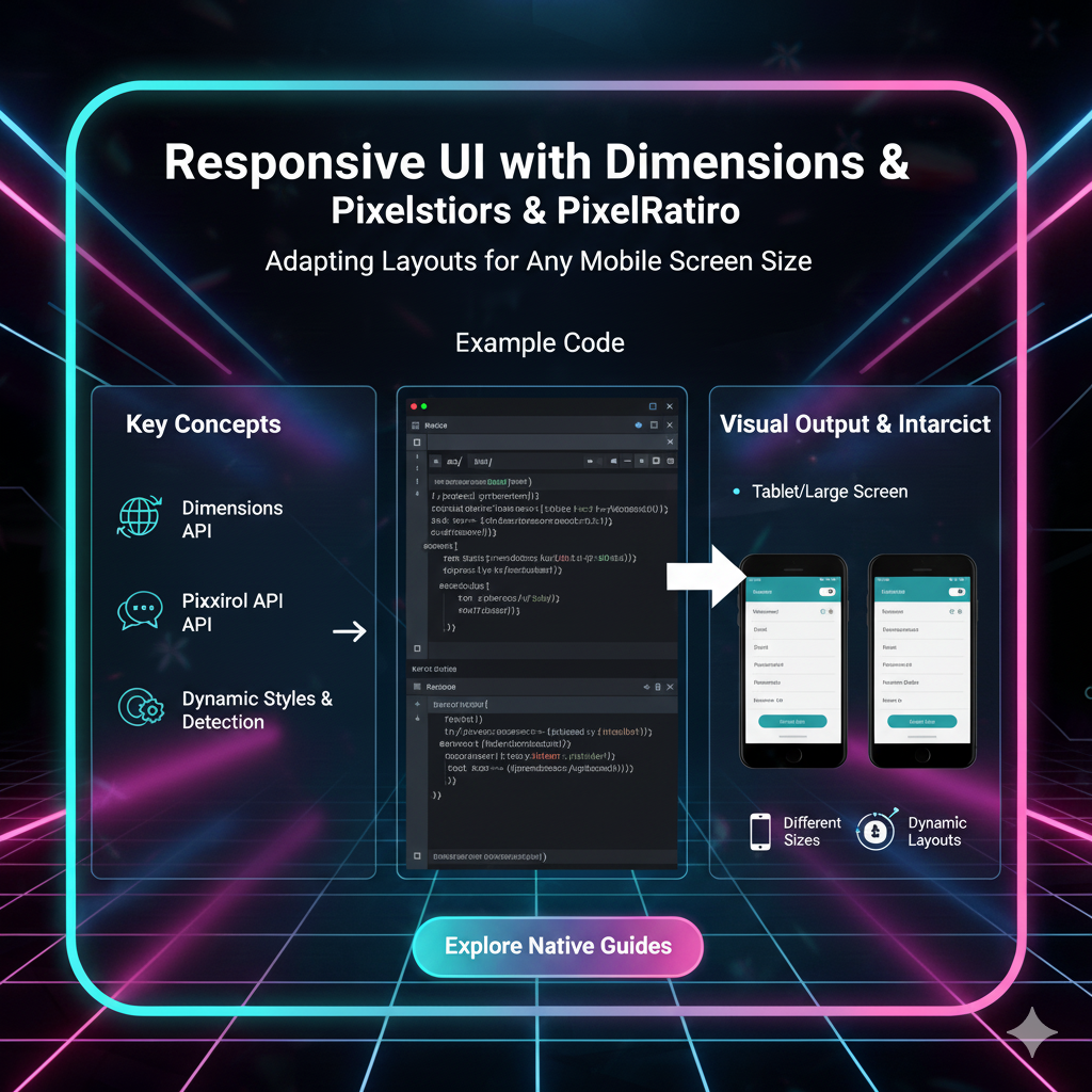
What is the Dimensions API? Getting to Know the Screen's Real Estate
Think of the Dimensions API as your app's personal real estate agent. It gives you the exact measurements of the available screen space. You can get the width and height of both the window (the area your app can use) and the screen (the entire physical screen of the device).
How to Use It: The Basics
Using Dimensions is straightforward.
javascript
import { Dimensions } from 'react-native';

// Get the window object which contains the width and height
const window = Dimensions.get('window');
const screen = Dimensions.get('screen');

console.log('Window Width:', window.width);
console.log('Window Height:', window.height);
console.log('Screen Width:', screen.width);
console.log('Screen Height:', screen.height);
This will spit out numbers like 390 (width) and 844 (height) for a device like an iPhone 14.
The Real Magic: Listening to Changes
Here's where it gets powerful. What if the user rotates their phone? Or resizes a window on a tablet? The screen dimensions change! You need to listen for these events to avoid a broken layout.
javascript
import { Dimensions } from 'react-native';

// Subscribe to dimension changes
const subscription = Dimensions.addEventListener('change', ({ window, screen }) => {
  console.log('New Window Width:', window.width);
  // Re-render your component with new dimensions here
});

// Don't forget to cleanup the listener when your component unmounts!
// Later... in a useEffect cleanup function or similar
subscription?.remove();
What is the PixelRatio API? The Secret to Crisp Graphics
If Dimensions tells you how much space you have, PixelRatio tells you how dense that space is.
You've heard terms like "Retina Display," right? A standard-density screen (like an old computer monitor) might have 1 pixel per physical point. A high-density screen (like a modern smartphone) might pack 3, 4, or even more pixels into that same point to make images and text incredibly sharp.
PixelRatio gives you a number that represents this.
PixelRatio.get() === 1: Standard density (e.g., old devices)PixelRatio.get() === 2: High density (e.g., iPhone 4s-7)PixelRatio.get() === 3: Very high density (e.g., iPhone 6+ and newer)PixelRatio.get() === 3.5+: Ultra-high density (e.g., some Android flagships)
Why Should You Care?
Let's say you need a thin, 1-pixel border. If you just do borderWidth: 1, on a high-density screen, it might render as 2 or 3 physical pixels thick, looking more like a chunky divider than a sleek border.
PixelRatio lets you be precise.
javascript
import { PixelRatio } from 'react-native';

const borderWidth = 1 / PixelRatio.get(); // This will be a hairline thin border
It's also crucial for serving the right resolution images. A 100x100px icon will look blurry on a 3x device. You should serve a 300x300px image for it to look crisp.
javascript
const iconSize = 100;
const pixelRatio = PixelRatio.get();
const requiredImageSize = iconSize * pixelRatio;

// You might have logic to load a different image based on requiredImageSize
// e.g., icon.png (100x100), icon@2x.png (200x200), icon@3x.png (300x300)
Putting It All Together: Real-World Use Cases & Code
Theory is cool, but let's build. Here are some common patterns.
1. The Responsive Card Component
You want a card that takes up 90% of the screen width on phones but is limited to a max width on tablets.
javascript
import React from 'react';
import { View, Text, StyleSheet, Dimensions } from 'react-native';

const { width: windowWidth } = Dimensions.get('window');

const ResponsiveCard = ({ title, content }) => {
  // On small phones, use 90% of width. On larger screens (tablets), don't let it get wider than 400.
  const cardWidth = Math.min(windowWidth * 0.9, 400);

  return (
    <View style={[styles.card, { width: cardWidth }]}>
      <Text style={styles.title}>{title}</Text>
      <Text>{content}</Text>
    </View>
  );
};

const styles = StyleSheet.create({
  card: {
    backgroundColor: 'white',
    padding: 20,
    borderRadius: 8,
    shadowColor: '#000',
    shadowOffset: { width: 0, height: 2 },
    shadowOpacity: 0.1,
    shadowRadius: 4,
    elevation: 3, // for Android
    alignSelf: 'center', // center the card
  },
  title: {
    fontSize: 18,
    fontWeight: 'bold',
    marginBottom: 10,
  },
});

export default ResponsiveCard;
2. Dynamic Font Sizing
You don't want text to be microscopic on a small phone and huge on a tablet. Use a scaled font size.
javascript
import { Dimensions } from 'react-native';

const { width: SCREEN_WIDTH } = Dimensions.get('window');

// Base scale for a screen of 375 width (standard iPhone)
const scale = SCREEN_WIDTH / 375;

export const scaleFont = (size) => Math.round(scale * size);

// Usage in your component
<Text style={{ fontSize: scaleFont(16) }}>This text scales dynamically!</Text>
3. The Perfectly Rounded Avatar
Making a circular avatar that works on any screen is a classic problem. You can't just set borderRadius: 50 on a View with a dynamic size—you need to calculate it.
javascript
import React from 'react';
import { View, Image, StyleSheet } from 'react-native';

const DynamicAvatar = ({ imageUrl, size = 50 }) => {
  return (
    <View style={[styles.avatarContainer, { width: size, height: size, borderRadius: size / 2 }]}>
      <Image source={{ uri: imageUrl }} style={[styles.avatarImage, { width: size, height: size, borderRadius: size / 2 }]} />
    </View>
  );
};

const styles = StyleSheet.create({
  avatarContainer: {
    overflow: 'hidden', // This is crucial to clip the image to the circle
    backgroundColor: '#f0f0f0',
  },
  avatarImage: {
    resizeMode: 'cover',
  },
});

export default DynamicAvatar;
Level Up Your Skills: From Basics to Pro
Mastering these foundational APIs is what separates hobbyists from professional developers. Understanding how to make interfaces fluid and adaptive is a non-negotiable skill in today's multi-device world.
If you're finding this guide helpful and want to go from "getting it to work" to "architecting it perfectly," we've got you covered. To learn professional software development courses such as Python Programming, Full Stack Development, and MERN Stack, visit and enroll today at codercrafter.in. Our project-based curriculum is designed to make you job-ready by tackling real-world problems, just like building responsive UIs.
Best Practices & Pro-Tips
Don't Overuse It: Not every element needs to be dynamically sized. Sometimes, fixed margins or padding are fine. Use dynamic sizing for major layout blocks.
Use Platform-Specific Code: Sometimes, you need slight tweaks for iOS and Android. Use
Platform.select()in conjunction with dimensions.Clean Up Your Listeners: Always remove
Dimensionsevent listeners in youruseEffectcleanup function to prevent memory leaks.Test, Test, Test: Use emulators/simulators for a range of devices. Test on a real small Android phone and a large tablet if you can.
Consider a Library: For extremely complex layouts, libraries like
react-native-responsive-screenorreact-native-size-matterscan abstract some of this math, but understanding the core concepts (Dimensions & PixelRatio) is still vital.
FAQs (Frequently Asked Questions)
Q: Can I use Dimensions with Hooks?
A: Absolutely! A common pattern is to create a custom hook.
javascript
import { useState, useEffect } from 'react';
import { Dimensions } from 'react-native';

const useWindowDimensions = () => {
  const [dimensions, setDimensions] = useState(Dimensions.get('window'));

  useEffect(() => {
    const subscription = Dimensions.addEventListener('change', ({ window }) => {
      setDimensions(window);
    });
    return () => subscription?.remove();
  }, []);

  return dimensions;
};

// Usage in a functional component
const MyComponent = () => {
  const { height, width } = useWindowDimensions();
  // ... your JSX
};
Q: What's the difference between window and screen in Dimensions?
A: window is the size of your app's visible content area (excluding the status bar, navigation bar, etc.). screen is the size of the device's entire physical screen. You'll use window 99% of the time for layout.
Q: Is PixelRatio still as important as it used to be?
A: For borders and hairline separators, yes. For images, modern tools like react-native's Image component and services that serve optimized assets have made it slightly less manual, but understanding the principle is critical for debugging blurry images.
Conclusion: Responsive UI Isn't Optional, It's Essential
Building a responsive UI in React Native isn't just a "nice-to-have" anymore—it's a core part of the development process. By leveraging the Dimensions API to understand your space and the PixelRatio API to ensure visual fidelity, you can create apps that provide a consistent and high-quality experience for every user, regardless of their device.
Stop fighting the squish. Embrace the dynamic nature of mobile screens. Start using Dimensions and PixelRatio in your next project, and watch your apps become truly robust and professional.
Ready to build the next generation of stunning, cross-platform applications? Dive deeper into advanced React Native concepts, state management, and backend integration with our comprehensive Full Stack Development and MERN Stack programs at codercrafter.in. Let's build your future, together.