Tired of boring icons? Learn how to use React Native Vector Icons to level up your app's UI. Step-by-step setup, pro tips, best practices, and FAQs. Build stunning apps today!
Let's be real. No one gets excited about a plain text button or a boring, pixelated icon. In today's app world, the UI/UX is everything. It’s the difference between an app that feels premium and one that gets uninstalled after 5 seconds. And a huge part of that slick, professional feel? Icons.
Icons are the visual shorthand of your app. They guide users, represent actions, and add that layer of polish that just makes everything feel right. But where do you get them? How do you add them to your React Native app without bloating its size or dealing with fuzzy images?
The answer, my friend, is React Native Vector Icons.
In this deep dive, we're not just going to skim the surface. We're going to get our hands dirty with setup, customization, pro tips, and even some gotchas to avoid. By the end of this, you'll be an icon wizard. Let's get it.
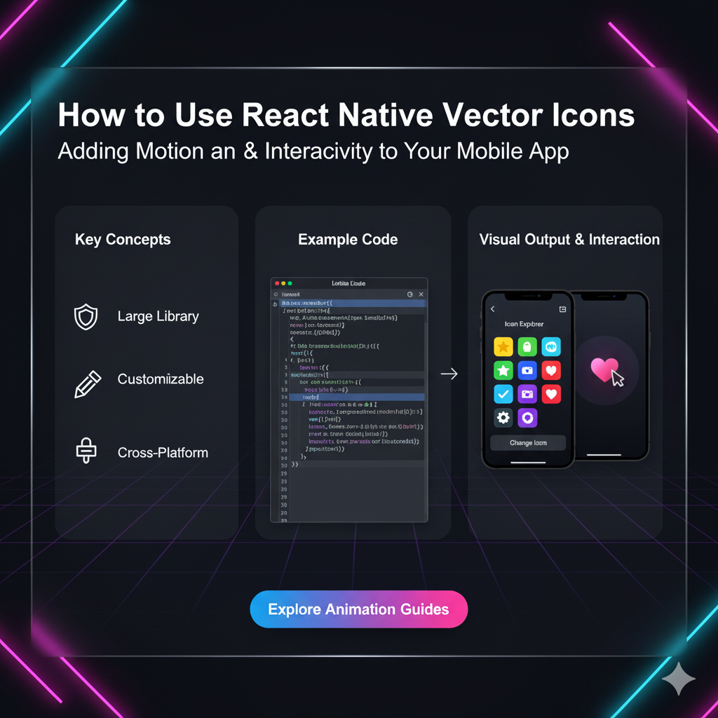
What Exactly Are React Native Vector Icons?
In simple terms, React Native Vector Icons is a library that gives you access to thousands of free, high-quality icons right inside your React Native project. Think of it as a massive toolbox filled with every icon you could possibly need – from simple arrows and hearts to brand logos like Facebook, Twitter, and Instagram.
But the magic word here is "Vector."
Unlike PNG or JPG images (which are made of pixels and get blurry when you zoom in), vector icons are made from mathematical paths and shapes. This means they are infinitely scalable. You can make them as big as a billboard or as small as a pinhead, and they'll remain razor-sharp and crystal clear on any screen resolution. This is a non-negotiable for modern mobile development.
Getting Started: Installation and Setup
Alright, enough talk. Let's code. Getting this library into your project is straightforward.
Step 1: Install the Library
Navigate to your project directory in your terminal and run:
bash
npm install react-native-vector-icons
# or if you're using Yarn
yarn add react-native-vector-icons
Step 2: Link the Native Dependencies (For React Native < 0.60)
If you're on an older version of React Native, you might need to link the library manually:
bash
react-native link react-native-vector-iconsFor React Native 0.60 and above, autolinking handles this for you, so you can probably skip this step. Sweet, right?
Step 3: Platform-Specific Setup (Important!)
This is where most people get tripped up, so pay attention.
For iOS:
After installing, run npx pod-install ios inside your project root. This command installs the native dependencies for iOS.
For Android:
The library should work out of the box. However, if you want to use the Icon.getImageSource function (which lets you use an icon as a image source, like for a tab bar), you might need to add the following to your android/app/build.gradle file:
gradle
apply from: "../../node_modules/react-native-vector-icons/fonts.gradle"This line ensures all the icon font files are copied to your Android project. Just add it at the bottom of the file.
Pro Tip: Always, and I mean always, do a clean build after adding a new library. For iOS, delete the build folder in your ios directory and run again. For Android, run ./gradlew clean in your android folder.
Let's Actually Use Some Icons! 🎉
Now for the fun part. The library is organized into different icon sets (like FontAwesome, MaterialIcons, Ionicons, etc.). You import the specific set you want and use it like a component.
Basic Usage Example
javascript
import React from 'react';
import { View, Text } from 'react-native';
// Import the icon sets you want to use
import Icon from 'react-native-vector-icons/FontAwesome';
import MaterialIcon from 'react-native-vector-icons/MaterialIcons';

const MyAwesomeComponent = () => {
  return (
    <View>
      <Text>Look at these icons!</Text>
      {/* A simple heart icon */}
      <Icon name="heart" />

      {/* A star icon, in a specific color and size */}
      <MaterialIcon name="star" size={30} color="#FFD700" />

      {/* A button with an icon and text */}
      <Icon name="rocket" size={20} color="#900" />
      <Text>Launch!</Text>
    </View>
  );
};

export default MyAwesomeComponent;
See? It's just a component. The name prop is the most important one – it defines which icon from the set you want to display. You can find all the available names for each set on their official directory: React Native Vector Icons Directory. Bookmark this page; you'll live here.
Next-Level Customization: Styling and More
Just plopping an icon on the screen is cool, but making it fit your app's vibe is cooler. Here’s how you can style them.
1. Changing Size and Color:
This is the bread and butter. Use the size and color props. It's that simple.
javascript
<Ionicons name="md-checkmark-circle" size={64} color="green" />2. Styling with CSS-in-JS:
You can apply all the usual styles, like margins, padding, and even a background color, using the style prop.
javascript
<FontAwesome5
  name="user-astronaut"
  size={24}
  color="#4F8EF7"
  style={{
    marginRight: 10,
    padding: 10,
    backgroundColor: '#e0e0e0',
    borderRadius: 20,
  }}
/>
3. Creating Icon Buttons:
Combine an icon with a TouchableOpacity or Pressable to create a interactive button.
javascript
import { TouchableOpacity, Alert } from 'react-native';

<TouchableOpacity onPress={() => Alert.alert('Bookmarked!')}>
  <Ionicons name="bookmark" size={28} color="black" />
</TouchableOpacity>
Real-World Use Cases: Where Would You Actually Use These?
Icons aren't just for decoration. They serve critical functions. Here are some real-world examples:
Bottom Tab Navigator: This is the most common use case. Instead of text, you use icons for Home, Profile, Search, etc.
App Bars / Headers: The classic hamburger menu, back arrow, search icon, and notification bell.
Feature Lists: Displaying a list of features with a relevant icon next to each (e.g., a Wi-Fi icon for "Free WiFi", a car icon for "Parking Available").
Rating Systems: Using star icons to display a 5-star rating.
Social Logins/Shares: Using the official brand icons for "Login with Facebook" or "Share on Twitter".
Status Indicators: A checkmark for "completed", a clock for "pending", or an X for "failed".
Best Practices and Pro Tips from the Trenches
After using this library in countless projects, here’s my cheat sheet for you:
Be Consistent: Pick one or two icon sets and stick with them throughout your app. Don't use a Material Design icon on one screen and a FontAwesome one on another for the same action. Consistency is key to good UX.
Optimize Your Bundle: Don't import the entire library. If you only use MaterialIcons and FeatherIcons, only import those. This keeps your app bundle size lean.
Use the Icon Explorer: Seriously, that directory I linked earlier is your best friend. Use the search to find the perfect icon quickly.
Mind the Accessibility: Always add an
accessibilityLabelprop to your icon buttons so screen readers can describe what the button does.javascript
<MaterialCommunityIcon name="email" size={26} accessibilityLabel="Send an email" />Create a Wrapper Component: If you find yourself using the same icon with the same styles repeatedly (e.g., a primary action button icon), create a reusable
AppIconcomponent. It will make your life easier and your code cleaner.
Frequently Asked Questions (FAQs)
Q: Can I use my own custom icon fonts with this library?
A: Yes, you can! The library provides a way to generate your own .ttf file and a mapping to use your custom icons. It's a bit more advanced, but totally doable.
Q: I've linked everything, but the icons show up as a question mark (?) or a blank space. Why?
A: This is the #1 issue. The most common causes are:
Forgetting to run
pod installfor iOS.Forgetting to clean and rebuild your project.
Using the wrong
nameprop for the icon set. Double-check the directory!
Q: Is this library compatible with Expo?
A: Absolutely! Expo actually includes react-native-vector-icons by default, so you can use it without any extra configuration. It's one of the reasons it's so popular.
Q: How do I use icons in my Tab Navigator?
A: Here's a quick example with React Navigation:
javascript
import { createBottomTabNavigator } from '@react-navigation/bottom-tabs';
import Ionicons from 'react-native-vector-icons/Ionicons';

const Tab = createBottomTabNavigator();

function MyTabs() {
  return (
    <Tab.Navigator
      screenOptions={({ route }) => ({
        tabBarIcon: ({ focused, color, size }) => {
          let iconName;
          if (route.name === 'Home') {
            iconName = focused ? 'home' : 'home-outline';
          } else if (route.name === 'Settings') {
            iconName = focused ? 'settings' : 'settings-outline';
          }
          return <Ionicons name={iconName} size={size} color={color} />;
        },
      })}
    >
      {/* Your Tab.Screens here */}
    </Tab.Navigator>
  );
}
Conclusion: Icon Your Way to a Better App
And there you have it! React Native Vector Icons is a powerhouse library that, when used correctly, can dramatically improve the look, feel, and usability of your mobile application. It's easy to install, simple to use, and incredibly powerful. From basic arrows to complex brand logos, it has everything you need to make your app's interface intuitive and beautiful.
Remember, the best developers aren't just coders; they're craftsmen who pay attention to the details that users see and feel. Mastering tools like this is what separates a good app from a great one.
Ready to build more than just icon buttons? To learn professional software development courses such as Python Programming, Full Stack Development, and the MERN Stack, visit and enroll today at codercrafter.in. We'll help you turn your ideas into fully-fledged, professionally crafted applications.