Master Dark Mode in React Native: A 2025 Developer's Guide
Tired of blindingly white apps? Learn how to implement a slick, system-responsive Dark Mode in React Native using Context and Hooks. Step-by-step guide, best practices, and code examples included!
Embrace the Dark Side: A No-BS Guide to Dark Mode in React Native
Let's be real for a second. How many times have you been scrolling through an app late at night, only to be flashbanged by a pure white screen? It’s 2024, and a well-implemented dark mode isn't just a "nice-to-have" feature anymore—it's a user expectation. It’s easier on the eyes, can save battery life on OLED screens, and let's be honest, it just looks cool.
If you're a React Native developer looking to add this essential feature to your app, you've landed in the right place. We're not just going to slap together a quick theme toggle. We're going to build a robust, scalable, and system-responsive dark mode that feels native. Buckle up!
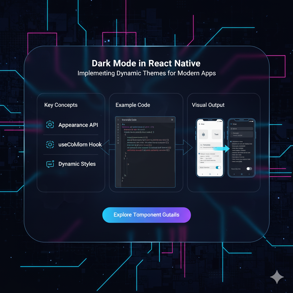
What We're Actually Building: Beyond a Simple Toggle
When we say "Dark Mode," we mean a system that:
Respects the User's System Preference: If their phone is in dark mode, your app should be too, right out of the gate.
Allows Manual Override: Give users the power to choose "Light," "Dark," or "System Default."
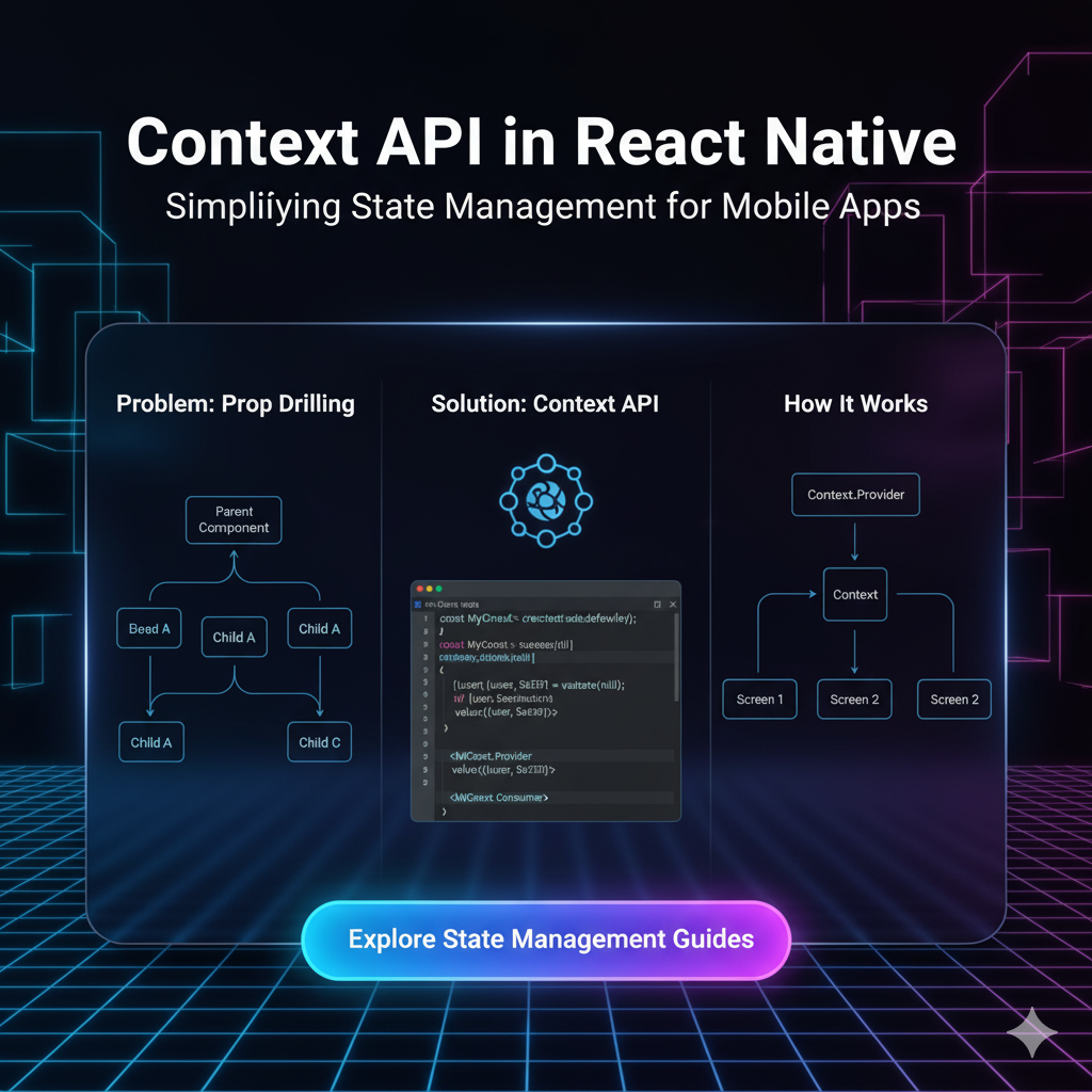
Is Effortlessly Maintainable: You shouldn't have to manually change colors on every screen. We'll use a central source of truth.
The Toolkit: What You'll Need
We're going to use the modern React Native stack for this:
React Native (obviously)
React Hooks:
useState,useEffect,useContext(This is the MVP)React Context API: For global state management without prop drilling.
useColorSchemefromreact-native: This hook is our gateway to detecting the system's theme.AsyncStorage: To save the user's preference locally on their device.
Let's Get Our Hands Dirty: Coding the Solution
Enough talk, let's code. We'll break this down into manageable steps.
Step 1: Setting Up Our Theme Context (The Brain)
The Context will be the central hub for our theme state. It will hold the current theme mode and the actual color palette.
Create a file called ThemeContext.js.
javascript
// ThemeContext.js
import React, { createContext, useState, useEffect, useContext } from 'react';
import { useColorScheme } from 'react-native';
import AsyncStorage from '@react-native-async-storage/async-storage';

// 1. Define our color schemes
const lightColors = {
  background: '#FFFFFF',
  text: '#333333',
  subtitle: '#666666',
  primary: '#007AFF', // A nice iOS-blue
  card: '#F2F2F7',
  border: '#E5E5E7',
};

const darkColors = {
  background: '#000000',
  text: '#FFFFFF',
  subtitle: '#EBEBF5',
  primary: '#0A84FF',
  card: '#1C1C1E',
  border: '#38383A',
};

// 2. Create the Context
const ThemeContext = createContext();

// 3. Create the Provider Component
export const ThemeProvider = ({ children }) => {
  const systemColorScheme = useColorScheme(); // 'light' | 'dark'
  const [theme, setTheme] = useState('system'); // 'light', 'dark', 'system'
  const [colors, setColors] = useState(lightColors); // The actual colors to use

  // 4. The magic function that determines the actual colors based on theme and system
  const updateColors = (selectedTheme) => {
    let colorPalette;
    if (selectedTheme === 'system') {
      colorPalette = systemColorScheme === 'dark' ? darkColors : lightColors;
    } else {
      colorPalette = selectedTheme === 'dark' ? darkColors : lightColors;
    }
    setColors(colorPalette);
  };

  // 5. Load saved theme from device storage when app starts
  useEffect(() => {
    const loadSavedTheme = async () => {
      try {
        const savedTheme = await AsyncStorage.getItem('user_theme');
        if (savedTheme) {
          setTheme(savedTheme);
          updateColors(savedTheme);
        } else {
          updateColors('system'); // Default to system
        }
      } catch (error) {
        console.log('Error loading theme:', error);
        updateColors('system');
      }
    };
    loadSavedTheme();
  }, []);

  // 6. Update colors whenever the theme state OR the system theme changes
  useEffect(() => {
    updateColors(theme);
  }, [theme, systemColorScheme]);

  // 7. Function to toggle the theme and save it
  const toggleTheme = async (newTheme) => {
    setTheme(newTheme);
    try {
      await AsyncStorage.setItem('user_theme', newTheme);
    } catch (error) {
      console.log('Error saving theme:', error);
    }
  };

  const value = {
    theme,
    toggleTheme,
    colors,
  };

  return (
    <ThemeContext.Provider value={value}>
      {children}
    </ThemeContext.Provider>
  );
};

// 8. Custom hook for easy access to the context
export const useTheme = () => {
  const context = useContext(ThemeContext);
  if (context === undefined) {
    throw new Error('useTheme must be used within a ThemeProvider');
  }
  return context;
};
Step 2: Wrapping Our App with the Provider
Now, we need to make this context available to our entire app. Go to your top-level component, usually App.js.
javascript
// App.js
import React from 'react';
import { ThemeProvider } from './ThemeContext';
import HomeScreen from './HomeScreen'; // Your main screen

export default function App() {
  return (
    <ThemeProvider>
      <HomeScreen />
    </ThemeProvider>
  );
}
Boom! Now every component inside App has access to our theme magic.
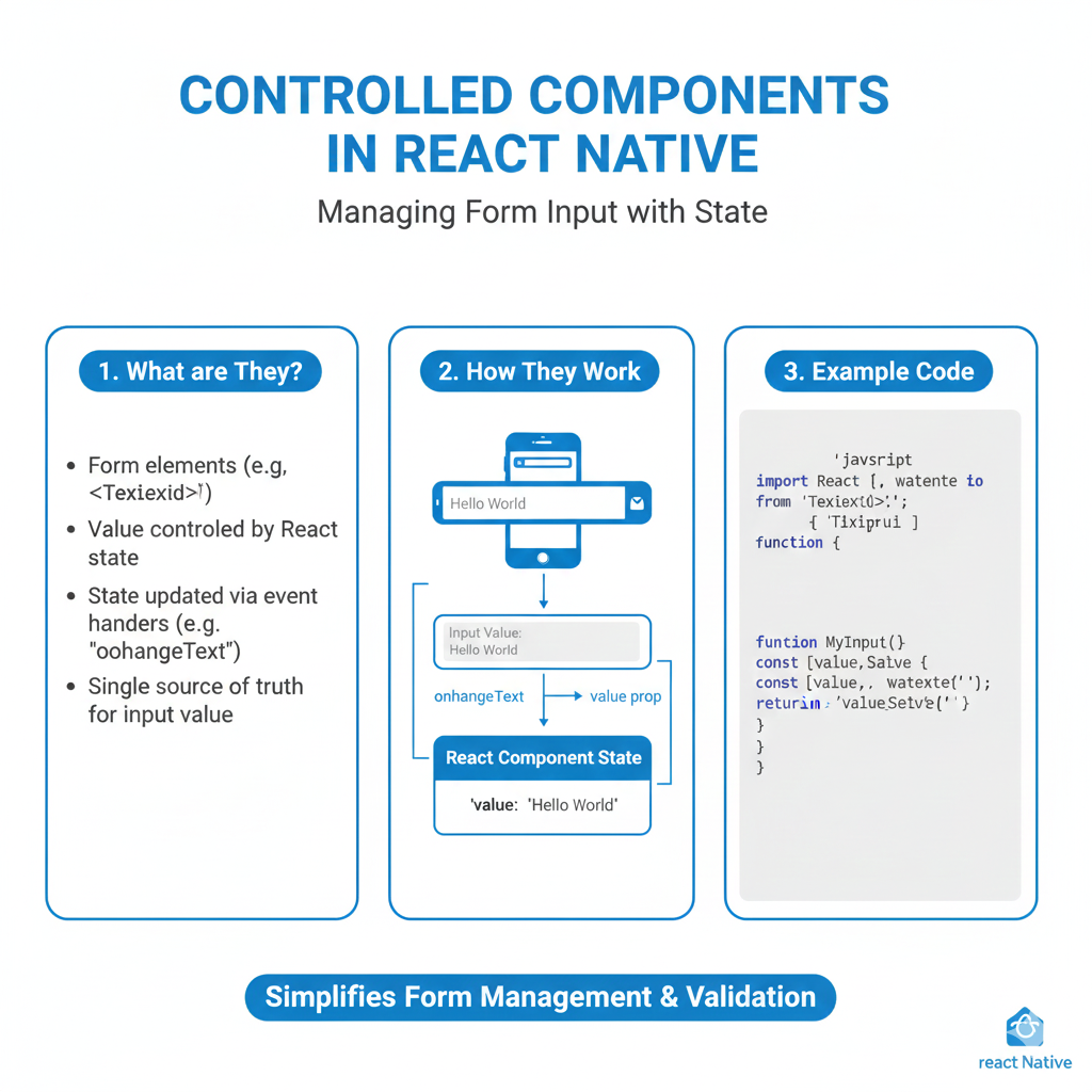
Step 3: Using the Theme in a Component
Let's see how easy it is to use our dynamic colors. Here's a sample HomeScreen.js.
javascript
// HomeScreen.js
import React from 'react';
import { View, Text, StyleSheet, StatusBar, SafeAreaView } from 'react-native';
import { useTheme } from './ThemeContext';
import ThemeToggle from './ThemeToggle'; // We'll create this next

const HomeScreen = () => {
  const { colors } = useTheme();

  // Dynamic styles that use our theme colors
  const styles = StyleSheet.create({
    container: {
      flex: 1,
      backgroundColor: colors.background,
      padding: 20,
    },
    title: {
      fontSize: 32,
      fontWeight: 'bold',
      color: colors.text,
      marginBottom: 10,
    },
    subtitle: {
      fontSize: 16,
      color: colors.subtitle,
      marginBottom: 30,
    },
    card: {
      backgroundColor: colors.card,
      padding: 15,
      borderRadius: 12,
      borderWidth: 1,
      borderColor: colors.border,
    },
  });

  return (
    <SafeAreaView style={styles.container}>
      {/* Dynamically set the status bar */}
      <StatusBar barStyle={colors.background === '#000000' ? 'light-content' : 'dark-content'} />

      <Text style={styles.title}>Hello, Dark Side!</Text>
      <Text style={styles.subtitle>This text automatically adapts to the theme. Pretty slick, huh?</Text>

      <View style={styles.card}>
        <Text style={{ color: colors.text }}>This is a themed card.</Text>
      </View>

      {/* Our Toggle Component */}
      <ThemeToggle />
    </SafeAreaView>
  );
};

export default HomeScreen;
See how we're using colors.background, colors.text, etc.? This is the power of context. Change the theme, and every component using these colors will re-render instantly.
Step 4: Building the Theme Toggle Component
Finally, let's give the user control. Create a ThemeToggle.js.
javascript
// ThemeToggle.js
import React from 'react';
import { View, Text, TouchableOpacity, StyleSheet } from 'react-native';
import { useTheme } from './ThemeContext';

const ThemeToggle = () => {
  const { theme, toggleTheme, colors } = useTheme();

  const styles = StyleSheet.create({
    container: {
      flexDirection: 'row',
      marginTop: 40,
      backgroundColor: colors.card,
      borderRadius: 25,
      padding: 4,
    },
    option: {
      flex: 1,
      paddingVertical: 10,
      borderRadius: 20,
      alignItems: 'center',
    },
    activeOption: {
      backgroundColor: colors.primary,
    },
    optionText: {
      color: colors.text,
      fontWeight: '600',
    },
    activeText: {
      color: '#FFF', // White text for the active button
    },
  });

  const options = [
    { label: 'Light', value: 'light' },
    { label: 'Dark', value: 'dark' },
    { label: 'Auto', value: 'system' },
  ];

  return (
    <View style={styles.container}>
      {options.map((option) => (
        <TouchableOpacity
          key={option.value}
          style={[
            styles.option,
            theme === option.value && styles.activeOption,
          ]}
          onPress={() => toggleTheme(option.value)}
        >
          <Text
            style={[
              styles.optionText,
              theme === option.value && styles.activeText,
            ]}
          >
            {option.label}
          </Text>
        </TouchableOpacity>
      ))}
    </View>
  );
};

export default ThemeToggle;
And there you have it! A beautiful, segmented toggle that lets the user switch between Light, Dark, and Auto (system) modes.
Leveling Up: Best Practices & Pro Tips
Go Beyond Colors: Think about subtle shadows in light mode (which disappear in dark mode) and different image assets. You can add an
isDarkboolean to your context to handle such cases.Test, Test, Test: Manually switch your phone's theme in Settings while your app is running. Ensure the transition is smooth and there are no flashes of the wrong theme.
Accessibility Matters: Ensure your color combinations have sufficient contrast ratio. Use tools like WCAG contrast checkers.
Keep it Consistent: Your color palette should be defined in one place (like our
ThemeContext). Don't hardcode colors anywhere else in your app.
FAQs: Your Questions, Answered
Q: This seems complex. Can't I just use a simple boolean?
A: You could, but it's not future-proof. What if you want to add an "Auto" mode later? Or a "Midnight Green" theme? This structure scales beautifully.
Q: Do I need a state management library like Redux for this?
A: Nope! The React Context API is perfectly suited for low-frequency updates like theme changes. It's lightweight and built-in.
Q: My app flashes a light screen before loading dark mode. Help!
A: This is a common issue. The app loads with default light colors before AsyncStorage retrieves the saved theme. You can implement a "splash screen" until the theme is loaded, or use a community package like react-native-appearance for more immediate setup.
Q: How do I theme third-party components?
A: Many popular libraries support a theme prop or have instructions for theming. If not, you can often wrap them and override their styles using your dynamic colors.
Conclusion: You've Now Mastered Dark Mode
Implementing dark mode is more than just an aesthetic choice; it's a sign of a mature, user-centric application. By leveraging React's Context API and Hooks, you've built a solution that is clean, maintainable, and provides a fantastic user experience.
The pattern we've built today is a fundamental one. You can apply this same global state management technique to other app-wide settings like language (i18n), user authentication state, and more.
Feeling empowered? This is just the tip of the iceberg in modern mobile development. To learn professional software development courses such as Python Programming, Full Stack Development, and the MERN Stack, and build complex, production-ready applications from the ground up, visit and enroll today at codercrafter.in. We'll turn you from a coder into a craftsman.