Level Up Your UI: A Dev's Guide to Building Custom Buttons & Inputs
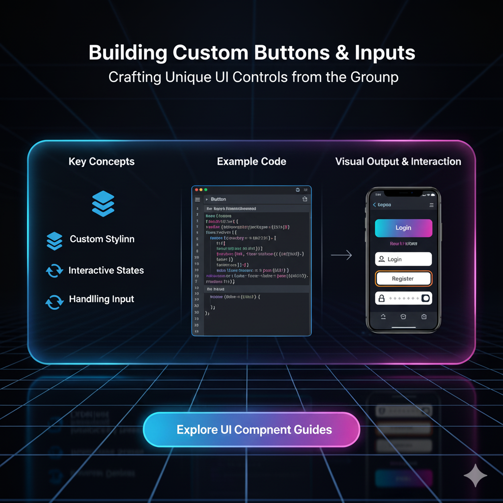
Tired of boring HTML forms? Learn how to build fully accessible, stunning custom buttons and text inputs from scratch. Boost UX and make your forms pop. Plus, pro tips and code examples!
Let's be real for a second. The default <button> and <input> elements that HTML gives us are... kind of a snooze-fest. They’re functional, sure. They get the job done. But in a world where user experience (UX) can make or break your website or app, "functional" just doesn't cut it anymore.
You want that wow factor. You want buttons that feel satisfying to click and input fields that guide the user seamlessly. You want a UI that looks and feels uniquely yours.
That’s where custom buttons and inputs come in. This isn't just about making things pretty (though that's a big part of it). It's about usability, branding, and creating a truly professional product.
In this deep dive, we're going to break down everything you need to know—from the basic "why" to the advanced "how," including the all-important accessibility pitfalls you MUST avoid.
Why Bother Customizing? Can't We Just Use Bootstrap?
Okay, fair question. Libraries like Bootstrap or Tailwind UI are awesome for getting started. But here’s the tea:
Brand Identity: Your brand has a specific vibe. Pre-styled components can make your site look like a template. Custom controls are a key part of your design system.
Unique Interactions: Want a button that morphs into a progress bar on click? Or an input that expands with a gentle animation? Defaults can't do that.
Performance: Sometimes, loading an entire library for a few components is overkill. A few lines of custom CSS can be much lighter.
Total Control: You're not fighting against someone else's styles. You define every state, every transition, every pixel.
So, if you're serious about front-end development, knowing how to build these from the ground up is a non-negotiable skill. Speaking of skills, if you're looking to master professional front-end and back-end techniques, our Full Stack Development course at codercrafter.in goes deep into building complex, production-ready UIs. Just saying! 😉
Deconstructing the Humble Button
Let's start with the workhorse of the web: the button.
The HTML Foundation
Always, and I mean always, use the correct semantic element.
html
<!-- Good -->
<button type="button">Click Me</button>

<!-- Bad -->
<div class="button">Click Me</div>
Why? Semantics. The <button> element is inherently focusable, clickable, and understandable by screen readers. The <div> is none of those things without a ton of extra work (adding tabindex, JavaScript click listeners, ARIA roles).
Styling it Up with CSS
This is where the magic happens. Let's create a modern, "pill-shaped" button.
css
.my-custom-btn {
  /* Layout */
  display: inline-block;
  padding: 12px 28px;

  /* Typography */
  font-family: 'Inter', sans-serif; /* Modern font stack */
  font-size: 1rem;
  font-weight: 600;
  text-decoration: none;
  color: #fff;

  /* Visual Design */
  background: linear-gradient(135deg, #667eea 0%, #764ba2 100%);
  border: none;
  border-radius: 50px; /* This creates the pill shape */
  cursor: pointer; /* Crucial for usability! */

  /* Interaction Prep */
  transition: all 0.3s ease;
  box-shadow: 0 4px 15px 0 rgba(0, 0, 0, 0.1);
}
Boom. We've already left the default button in the dust. But a button isn't just a static object. It has states.
Handling States: Hover, Focus, Active
This is what makes a button feel alive.
css
.my-custom-btn:hover {
  transform: translateY(-2px); /* Lifts the button slightly */
  box-shadow: 0 7px 20px 0 rgba(0, 0, 0, 0.15);
}

.my-custom-btn:focus {
  outline: none; /* We remove the default blue outline... */
  box-shadow: 0 0 0 3px rgba(102, 126, 234, 0.5); /* ...and add a custom one that matches our brand */
}

.my-custom-btn:active {
  transform: translateY(0); /* Pushes the button back down on click */
  box-shadow: 0 4px 10px 0 rgba(0, 0, 0, 0.1);
}
Pro Tip: The order of these pseudo-classes in your CSS matters! A good rule is LoVe HAte: :link, :visited, :hover, :active. For buttons, it's typically :hover, :focus, :active.
Leveling Up Your Input Fields
Inputs are where users talk to your application. Making this conversation smooth is critical.
The Basic Custom Input
Let's create a clean, modern text input.
html
<div class="input-group">
  <label for="username" class="input-label">Username</label>
  <input type="text" id="username" name="username" class="custom-input" placeholder="Enter your username">
</div>
Notice we wrapped it in a div.input-group. This gives us more control for layout and for positioning things like icons or error messages.
css
.input-group {
  margin-bottom: 1.5rem;
  text-align: left;
}

.input-label {
  display: block;
  margin-bottom: 0.5rem;
  font-weight: 500;
  color: #2d3748;
}

.custom-input {
  width: 100%;
  padding: 12px 16px;
  font-size: 1rem;
  border: 2px solid #e2e8f0; /* A light, neutral border */
  border-radius: 8px;
  background-color: #fff;
  transition: border-color 0.2s ease, box-shadow 0.2s ease;
}

.custom-input:focus {
  outline: none;
  border-color: #667eea; /* Same color as our button for consistency */
  box-shadow: 0 0 0 3px rgba(102, 126, 234, 0.1);
}
The "Floating Label" Pattern
This is a super slick pattern that saves space and looks modern. The label sits inside the input until you focus on it, then it moves to the top.
Implementing this requires a bit more HTML and CSS, often using the :focus and :placeholder-shown pseudo-classes, and sometimes a sprinkle of JavaScript for the best browser support. It's a perfect example of how customizing inputs can elevate your entire form's UX. Understanding these advanced CSS concepts is a core part of what we teach in our MERN Stack program at codercrafter.in, where you learn to build dynamic, user-centric applications from the ground up.
The Elephant in the Room: Accessibility (A11y)
This is the part where many developers slip up. Customization should never come at the cost of accessibility.
For Buttons:
Color Contrast: Ensure the text color has a sufficient contrast ratio against the background color (WCAG guidelines recommend 4.5:1 for normal text). Use tools like WebAIM's Contrast Checker.
Focus Indicators: Never remove
outlinewithout providing a custom:focusstyle. This is essential for keyboard users.ARIA: If you must use a non-semantic element (like a
<div>), you must addrole="button"andtabindex="0". But really, just use a<button>.
For Inputs:
Always Use
<label>: Placeholders are not replacements for labels. Labels are permanently visible, placeholders are hints that disappear.Associate Labels Correctly: Use the
forattribute on the<label>that matches theidof the<input>. This makes the input clickable and is crucial for screen readers.
Real-World Use Case: A Subscription Form
Let's tie it all together. Imagine a newsletter signup form in a website footer.
The Goal: A compact, attractive form that provides clear feedback.
The Implementation:
You'd use a div styled to look like an input, with a nested <input type="email"> (with no border) and a custom <button>. On successful submission, you might use JavaScript to change the button's text to "Subscribed!" and disable it, providing immediate, satisfying feedback to the user. This kind of seamless integration is what separates amateur projects from professional ones.
FAQs (Frequently Asked Questions)
Q1: Is it okay to style a <div> to look like a button?
A: Only if you add all the necessary accessibility attributes (role="button", tabindex="0", JavaScript for keypress events) and ensure it's semantically correct. For 99% of cases, it's less work and more robust to just use a <button>.
Q2: How do I add icons to my custom buttons or inputs?
A: The cleanest way is to use an SVG icon, either inline or as a background image. For inputs, it's common to have an icon as a background-image with padding-left to make room for it. For buttons, you can place an <svg> element inside the <button> tag alongside the text.
Q3: My custom styles aren't applying to the input! What's wrong?
A: Browser default styles are stubborn. Use a CSS reset or normalize.css to level the playing field. Also, ensure your CSS selector has enough specificity (e.g., .my-form .custom-input is stronger than just input).
Q4: Can I customize the native date picker?
A: You can style the input itself, but the actual calendar dropdown that appears is controlled by the browser and is very difficult to style consistently. For heavy customization, developers often use JavaScript libraries to build a custom date picker from scratch.
Conclusion: Your UI, Your Rules
Building custom buttons and inputs is a fundamental skill for any front-end developer who cares about quality. It starts with solid semantic HTML, is brought to life with thoughtful CSS, and is perfected with an unwavering commitment to accessibility.
It’s not about reinventing the wheel for every project, but about having the skill to do so when the design calls for it. This ability to translate a design mockup into a functional, accessible, and beautiful interface is exactly what the industry demands.
Ready to take your skills to the next level and build complete, professional-grade applications? This is just the beginning. To learn professional software development courses such as Python Programming, Full Stack Development, and MERN Stack, visit and enroll today at codercrafter.in. Let's build something amazing together