Level Up Your App: The Ultimate Guide to Reusable Components in React Native
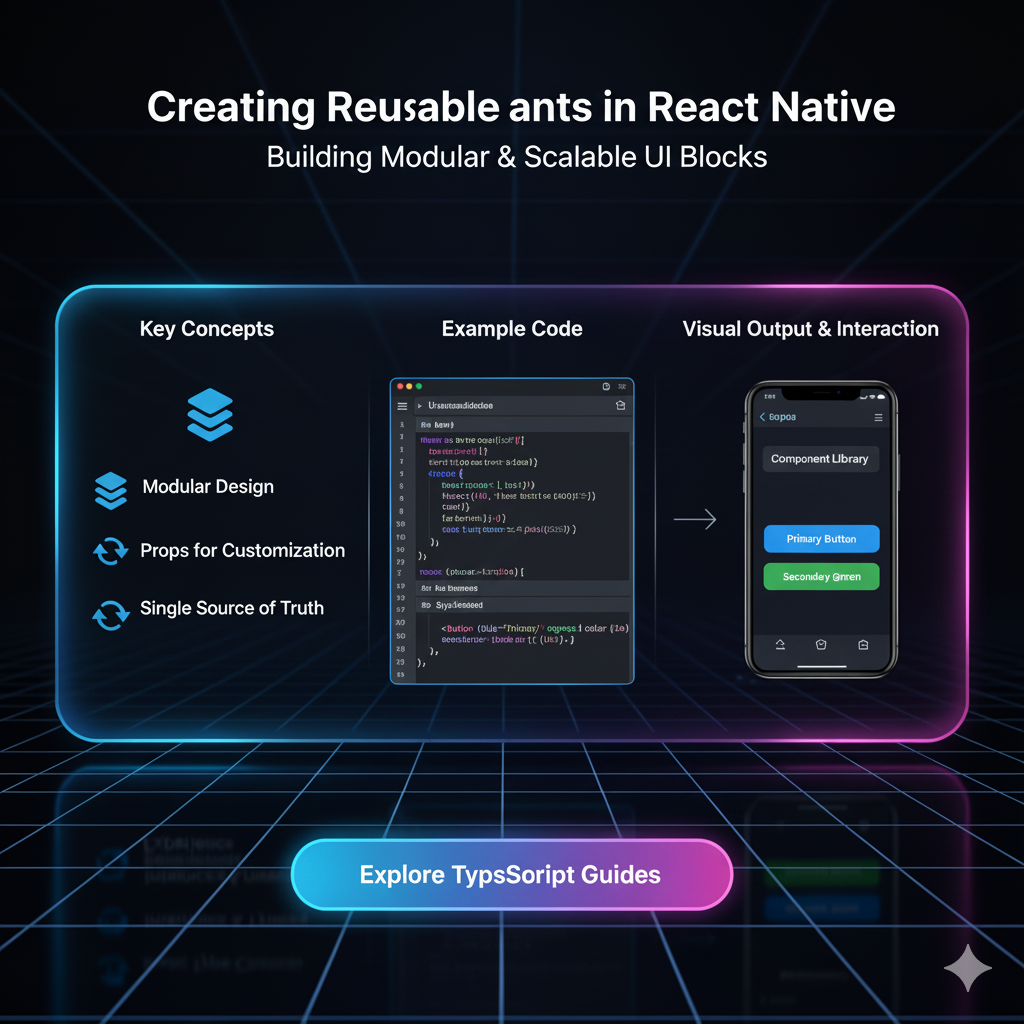
Stop repeating code! Master React Native reusable components with this in-depth guide. Learn best practices, real-world examples, and boost your development speed. Enroll in CoderCrafter's courses today!
Let's be real. Writing the same code over and over again is a drag. It’s tedious, it’s error-prone, and frankly, it’s not what you signed up for as a developer. You wanted to build cool, scalable apps, not get stuck in copy-paste hell.
If you're building a React Native app and find yourself duplicating similar chunks of JSX, there's a superhero move you need to learn: Mastering Reusable Components.
This isn't just a "nice-to-have" skill; it's the absolute bedrock of professional, maintainable, and efficient mobile development. In this deep dive, we're going to break down everything—from the "what" and "why" to the "how" with real-world code you can actually use. Let's get your app-building game on another level.
What Exactly is a Reusable Component?
Think of it like a Lego brick. You don't buy a Lego set that has a pre-molded car; you get a bunch of individual, standardized bricks. You can use those same bricks to build a car, a spaceship, or a castle. A reusable component is your digital Lego brick.
In technical terms, a reusable component is a self-contained, independent block of code (JSX, styles, and logic) that encapsulates a specific piece of UI or functionality. You define it once and can use it in multiple places across your application, often by passing different "props" (properties) to customize its behavior and appearance.
The "Why" - More Than Just Laziness
Sure, not repeating yourself (the DRY principle) is a big part of it. But the benefits are way more profound:
Consistency: Every
Button,Card, orHeaderlooks and behaves the same way throughout your entire app. This is crucial for a polished user experience.Maintainability: Need to change the border radius on all your buttons? Instead of hunting through 50 different files, you change it in one place—the
Buttoncomponent. Boom. Done.Development Speed: Once you have a library of these components, building new screens becomes like assembling pre-built parts. You move faster, much faster.
Fewer Bugs: Less code duplication means fewer places for typos and logical errors to hide.
Better Collaboration: Your team can work on different parts of the app using the same standardized components, ensuring everyone is on the same page.
Let's Build: From a Messy Start to a Reusable Masterpiece
Let's take a journey from a common beginner pattern to a clean, professional one.
The "Before" Scenario: The Repetition Trap
Imagine you're building a profile screen and a product screen. You might end up with code like this:
jsx
// ProfileScreen.js - A card for a user
import { View, Text, Image, StyleSheet } from 'react-native';

const ProfileScreen = () => {
  return (
    <View style={styles.container}>
      <View style={styles.card}>
        <Image source={{ uri: 'https://example.com/user1.jpg' }} style={styles.image} />
        <Text style={styles.name}>John Doe</Text>
        <Text style={styles.title}>Software Developer</Text>
      </View>
    </View>
  );
};

const styles = StyleSheet.create({
  container: { padding: 20 },
  card: { backgroundColor: 'white', padding: 15, borderRadius: 10, shadowColor: '#000', shadowOffset: { width: 0, height: 2 }, shadowOpacity: 0.1, shadowRadius: 4 },
  image: { width: 60, height: 60, borderRadius: 30 },
  name: { fontSize: 18, fontWeight: 'bold', marginTop: 10 },
  title: { fontSize: 14, color: 'gray' },
});

export default ProfileScreen;
jsx
// ProductScreen.js - A card for a product (look familiar?)
import { View, Text, Image, StyleSheet } from 'react-native';

const ProductScreen = () => {
  return (
    <View style={styles.container}>
      <View style={styles.card}>
        <Image source={{ uri: 'https://example.com/product1.jpg' }} style={styles.image} />
        <Text style={styles.name}>Cool Product</Text>
        <Text style={styles.price}>$19.99</Text>
      </View>
    </View>
  );
};

const styles = StyleSheet.create({
  container: { padding: 20 },
  card: { backgroundColor: 'white', padding: 15, borderRadius: 10, shadowColor: '#000', shadowOffset: { width: 0, height: 2 }, shadowOpacity: 0.1, shadowRadius: 4 },
  image: { width: 60, height: 60, borderRadius: 10 }, // Slightly different border radius!
  name: { fontSize: 18, fontWeight: 'bold', marginTop: 10 },
  price: { fontSize: 16, color: 'green', fontWeight: '600' }, // Different color and style
});

export default ProductScreen;
See the problem? The card style is almost identical, but the image and text styles have slight, inconsistent variations. This is how UI bugs and tech debt are born.
The "After" Scenario: The Reusable Card Component
Let's extract that common structure into a dedicated, reusable component.
Step 1: Create the Component (components/Card.js)
jsx
// components/Card.js
import { View, Text, Image, StyleSheet } from 'react-native';

const Card = ({ imageUrl, title, subtitle, imageStyle, titleStyle, subtitleStyle }) => {
  return (
    <View style={styles.card}>
      <Image source={{ uri: imageUrl }} style={[styles.image, imageStyle]} />
      <Text style={[styles.title, titleStyle]}>{title}</Text>
      <Text style={[styles.subtitle, subtitleStyle]}>{subtitle}</Text>
    </View>
  );
};

const styles = StyleSheet.create({
  card: {
    backgroundColor: 'white',
    padding: 15,
    borderRadius: 10,
    shadowColor: '#000',
    shadowOffset: { width: 0, height: 2 },
    shadowOpacity: 0.1,
    shadowRadius: 4,
    elevation: 3, // For Android shadow
    marginVertical: 10,
  },
  image: {
    width: 60,
    height: 60,
    borderRadius: 30, // Default to a circle
  },
  title: {
    fontSize: 18,
    fontWeight: 'bold',
    marginTop: 10,
  },
  subtitle: {
    fontSize: 14,
    color: 'gray',
    marginTop: 5,
  },
});

export default Card;
Step 2: Use the Component (The Magic Part)
Now, look how clean our screens become:
jsx
// ProfileScreen.js
import { View } from 'react-native';
import Card from '../components/Card'; // Import the component

const ProfileScreen = () => {
  return (
    <View style={{ padding: 20 }}>
      <Card
        imageUrl="https://example.com/user1.jpg"
        title="John Doe"
        subtitle="Software Developer"
        // We don't need to override anything, the defaults are perfect!
      />
    </View>
  );
};

export default ProfileScreen;
jsx
// ProductScreen.js
import { View } from 'react-native';
import Card from '../components/Card';

const ProductScreen = () => {
  return (
    <View style={{ padding: 20 }}>
      <Card
        imageUrl="https://example.com/product1.jpg"
        title="Cool Product"
        subtitle="$19.99"
        imageStyle={{ borderRadius: 10 }} // Override just the image style for a square
        subtitleStyle={{ color: 'green', fontWeight: '600', fontSize: 16 }} // Override the subtitle style
      />
    </View>
  );
};

export default ProductScreen;
See that? We've eliminated duplication, enforced consistency for the card layout, but still allowed for flexibility where needed. This is the power of props and composable styling (using the array syntax [styles.image, imageStyle] to merge default and custom styles).
Leveling Up: Advanced Patterns for Real-World Apps
As your app grows, your component architecture needs to evolve.
1. The children Prop: The Ultimate Flexibility
What if your card needs to contain more than just an image, title, and subtitle? Maybe sometimes it has a button, or a rating bar. This is where the magical children prop comes in.
jsx
// components/ContainerCard.js
import { View, StyleSheet } from 'react-native';

const ContainerCard = ({ children, style }) => {
  return <View style={[styles.card, style]}>{children}</View>;
};

const styles = StyleSheet.create({
  card: {
    backgroundColor: 'white',
    padding: 15,
    borderRadius: 10,
    // ... shadow styles
  },
});

export default ContainerCard;
Now, you can put anything inside it:
jsx
// Using the ContainerCard
<ContainerCard>
  <Image source={{ uri: '...' }} style={...} />
  <Text>My Title</Text>
  <View style={{ flexDirection: 'row' }}>
    <Button title="Like" />
    <Button title="Share" />
  </View>
  {/* Anything you want! */}
</ContainerCard>
2. Compound Components for Complex UI
Think of a Header component with a Header.Title, Header.Icon, and Header.Avatar. This pattern, used by libraries like React Navigation, allows for highly declarative and readable code.
jsx
// components/Header.js
import { View, Text, TouchableOpacity, StyleSheet } from 'react-native';

const Header = ({ children }) => {
  return <View style={styles.header}>{children}</View>;
};

// Sub-components attached to Header
Header.Title = ({ title }) => <Text style={styles.title}>{title}</Text>;
Header.Icon = ({ iconName, onPress }) => (
  <TouchableOpacity onPress={onPress}>
    <Text style={styles.icon}>{iconName}</Text>
  </TouchableOpacity>
);

const styles = StyleSheet.create({
  header: { flexDirection: 'row', justifyContent: 'space-between', alignItems: 'center', padding: 15 },
  title: { fontSize: 20, fontWeight: 'bold' },
  icon: { fontSize: 18 },
});

export default Header;
Usage:
jsx
// In your screen
<Header>
  <Header.Icon iconName="←" onPress={() => navigation.goBack()} />
  <Header.Title title="My Profile" />
  <Header.Icon iconName="⋮" onPress={() => openMenu()} />
</Header>
Best Practices You Should Actually Follow
Single Responsibility: A component should do one thing and do it well. Is your component handling a layout, displaying data, and fetching from an API? Break it down.
Meaningful Prop Names: Use
imageUrlinstead ofimg,onItemPressinstead ofclick. Clarity is king.Default Props & Prop-Types/TypeScript: Define default values for optional props and use TypeScript or
PropTypesto catch errors early. This is a hallmark of professional code.Composition over Configuration: Don't try to make a "mega-component" with 50 props for every possible scenario. Prefer building smaller, composable components (like our
ContainerCardwithchildren).
Mastering these patterns is what separates hobbyists from professionals. To learn professional software development courses such as Python Programming, Full Stack Development, and MERN Stack, visit and enroll today at codercrafter.in. Our project-based curriculum is designed to make you industry-ready.
FAQs
Q1: How do I decide when to make a component reusable?
The "Rule of Three" is a good start. If you've copied and pasted a piece of UI logic 2-3 times, it's a strong candidate for being extracted into a reusable component.
Q2: Can I make reusable components for logic, not just UI?
Absolutely! This is where custom Hooks come in (e.g., useFetch, useAuth). They are the logical counterpart to reusable UI components.
Q3: Where should I put all these component files?
A common and scalable practice is to have a components folder at the root of your project. Inside, you can have sub-folders for common components (components/common/Button.js) and scene-specific components (components/profile/Avatar.js).
Q4: My reusable component is getting too big with too many props. What now?
This is a sign you should split it. Use the composition pattern with children or break it down into several smaller, more focused components.
Conclusion: Build Smarter, Not Harder
Adopting a reusable component mindset is a game-changer. It transforms your React Native development process from a repetitive chore into a strategic, efficient, and highly satisfying practice. You'll build apps faster, with fewer bugs, and that are a pleasure to work on for years to come.
Start small. Look at your current project. Find one piece of UI you've repeated, and refactor it into a reusable component. You'll feel the difference immediately.
And remember, building a strong foundation in modern development practices is crucial. If you're looking to solidify your skills and build complex, real-world applications, check out the comprehensive courses at codercrafter.in.
