iOS vs Android UI: Why Your App Can't Look the Same
Struggling with iOS vs Android UI? This in-depth guide breaks down platform-specific design, from Navigation to Buttons. Build apps that feel native. Learn professional development at CoderCrafter.in!
Let's be real. We've all been there. You download a new, hyped-up app on your iPhone, and something just feels... off. The back button is in a weird place, the menus slide from the wrong direction, or the tabs are at the top feeling all clunky. It’s like wearing a suit to the beach – it just doesn’t fit the vibe.
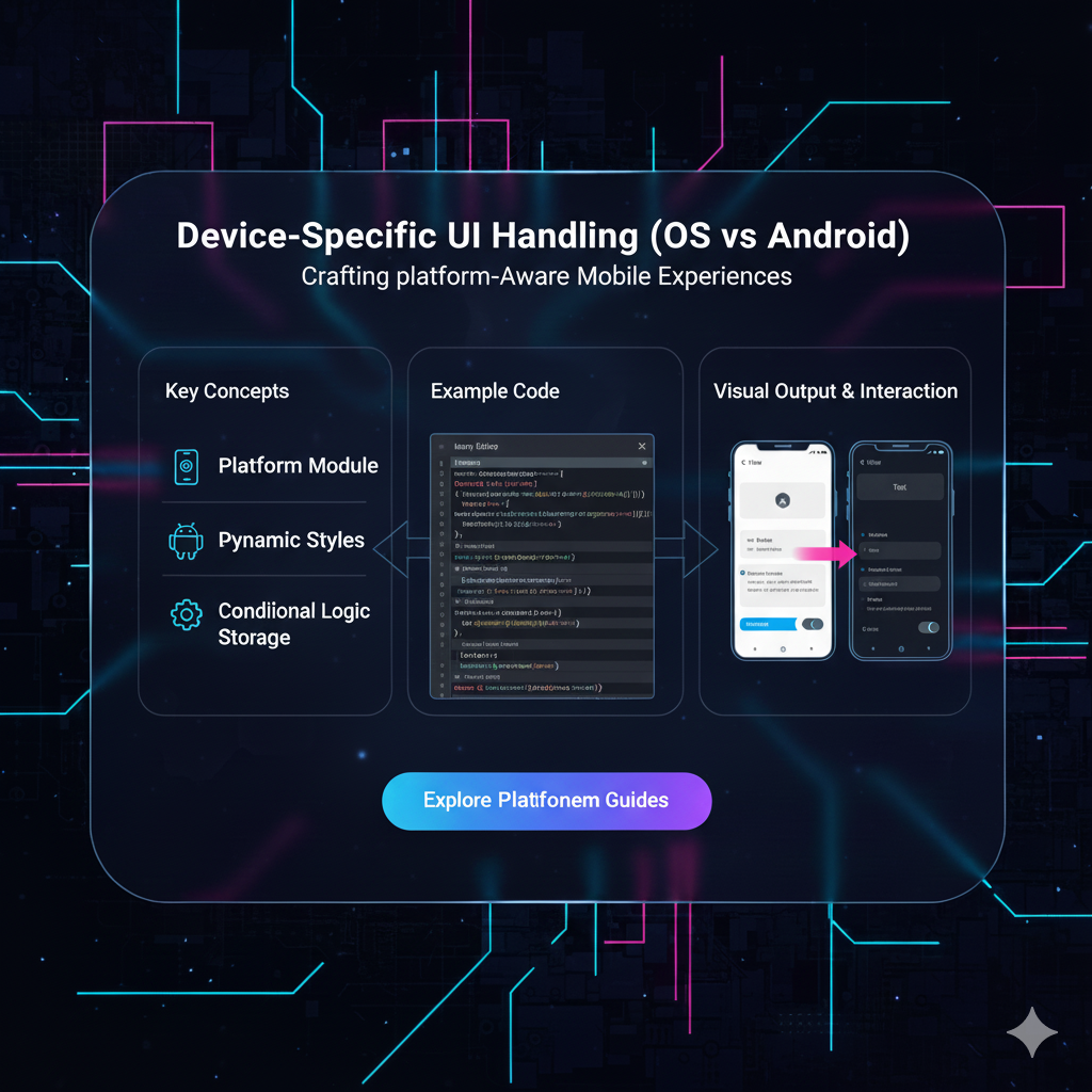
What you’re experiencing is an app that ignored one of the golden rules of mobile development: Device-Specific UI Handling.
In a world where we want to code fast and release faster, the temptation to build one UI and slap it on both iOS and Android is huge. But here’s the tea: your users can tell. And they will judge your app for it.
So, let's deep-dive into why treating iOS and Android as unique individuals is non-negotiable, and how you can master this art. Buckle up!
The "Why": It's All About User Expectations
Think of it this way: iOS users have been trained by Apple for over a decade, and Android users by Google. They've built something called Muscle Memory. They know, instinctively, how to navigate their phone.
An iPhone user expects a swipe from the left edge to go back.
An Android user instinctively looks for a back button (or gesture) at the bottom.
When you break these deeply ingrained habits, you create friction. Friction leads to frustration. And frustration leads to your app getting deleted. It’s that simple.
This is where the two holy books of mobile design come in:
Apple's Human Interface Guidelines (HIG): The rulebook for everything iOS. It’s all about clarity, deference, and depth. Think clean, minimal, and content-focused.
Google's Material Design (MD): The philosophy for Android. It’s more about bold colors, tactile surfaces, and meaningful motion. It uses digital "paper" and "ink" to create a sense of physicality.
Your job as a developer or designer isn't to choose a favorite. It's to speak both languages fluently.
Key Battlefronts: Where iOS and Android UI Diverge
Let's get into the nitty-gritty. Here are the most common areas where you need to pay attention.
1. Navigation Patterns: The Great Divide
This is arguably the biggest difference.
iOS (The Tab Bar): On iOS, the primary navigation is almost always a Tab Bar at the bottom of the screen. It’s persistent, tangible, and gives you one-tap access to the app's core areas. Think Instagram, Spotify, or Apple's own Phone app.
Android (The Navigation Drawer): On Android, the king is often the Navigation Drawer (or "hamburger menu"). You swipe from the left edge or tap a hamburger icon to reveal a menu that slides over the content. Gmail and Google Drive are perfect examples.
The Wrong Move: Putting a hamburger menu as the main nav on an iOS app. It just feels alien. Conversely, forcing a bottom tab bar on an Android app when you have many sections can waste valuable screen space.
2. The "Back" Saga: A Never-Ending Story
How users go back is a fundamental difference.
iOS: The back action is usually contextual. It's typically placed in the top-left corner and is often labeled with the title of the previous screen (e.g., "< Back" or "< Messages"). The universal swipe-from-the-left-edge gesture is now the primary way users navigate back.
Android: The system-level Back Button (or gesture) is sacred. It’s always there, at the bottom. It navigates chronologically through your screen history, which can sometimes mean going back to the home screen or even another app.
The Wrong Move: Trying to create a custom back button on Android that overrides the system behavior. You’ll break the user's mental model.
3. Common Components: Buttons, Alerts, and More
Even small elements have their own personalities.
Buttons:
iOS: Tends to use plain text buttons, often in a blue color. They are minimalist. The main action is often on the right side of a navigation bar.
Android: Uses Floating Action Buttons (FAB) for a primary action. Regular buttons are more pronounced, with shadows and uppercase text. The main action in a dialog is on the bottom-right.
Alerts (Dialogs):
iOS: Alerts pop up in the center of the screen. The destructive option (like "Delete") is usually in red and placed on the left.
Android: These are called "Dialogs." The destructive option is often on the left, but the styling is more card-like, aligning with Material Design's paper metaphor.
Real-World Use Case: A Todo List App
Let's imagine you're building a simple Todo app, "TaskBuster."
On iOS (following HIG):
You have a bottom tab bar with "Today," "Scheduled," and "All Tasks."
To add a new task, there's a "+" button in the top-right of the navigation bar.
Swiping a task from right to left reveals options like "Delete" and "Flag."
The overall feel is clean, spacious, and text-heavy.
On Android (following Material Design):
You use a Navigation Drawer to house "Today," "Scheduled," "All Tasks," and also "Settings" and "Archive."
The primary action, "Add New Task," is a bright, colorful Floating Action Button (FAB) hovering at the bottom-right.
To delete a task, the user long-presses it, and a contextual toolbar appears at the top.
The design uses subtle shadows, bolder colors, and more pronounced animations.
Both apps do the same thing, but they feel right at home on their respective platforms. This is the magic you're aiming for.
Best Practices for Nailing Platform-Specific UI
So, how do you actually implement this without losing your mind? Here’s the playbook:
Design Systems, Not Screens: Don't design one screen and then "port" it. Create two separate design systems from the start—one in HIG style and one in Material Design. Tools like Figma are fantastic for this, allowing you to create component libraries for both platforms.
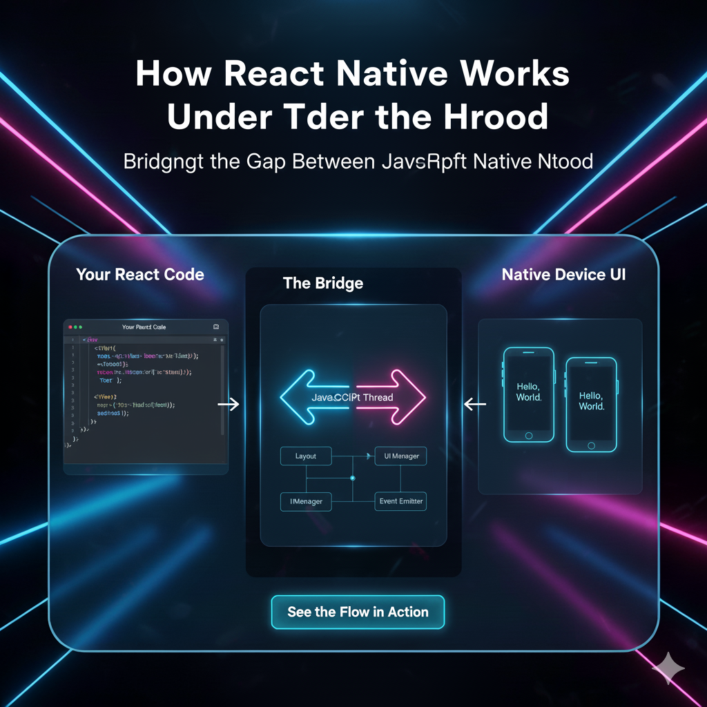
Leverage Cross-Platform Frameworks Wisely: Using React Native or Flutter? Awesome! But don't take the easy way out. These frameworks provide components that automatically adapt to the platform.
In React Native, using
<Button>will render a native iOS button on iOS and a native Android button on Android.In Flutter, the
cupertino_iconsandmaterial/iconspackages give you platform-specific icons. UseCupertinoPageScaffoldfor iOS andScaffoldfor Android.
Test, Test, and Test on Real Devices: There is no substitute for this. Use an actual iPhone and an actual Android phone. Feel the gestures. Experience the animations. What looks good in a simulator might feel awkward in your hand.
Embrace Platform-Specific Gestures: Implement the iOS swipe-from-left-to-go-back gesture flawlessly. On Android, ensure the system back button works as expected, even through complex navigation flows.
Hire/Be a T-Shaped Developer: The best mobile developers have a deep understanding of one platform (the vertical bar of the T) but also a broad understanding of the other (the horizontal bar). This empathy is key to building great cross-platform experiences.
Mastering these nuances is what separates a good app from a great one. It’s the kind of professional, industry-standard thinking we embed in our students at CoderCrafter. To learn professional software development courses such as Python Programming, Full Stack Development, and MERN Stack, visit and enroll today at codercrafter.in. Our curriculum is designed to make you not just a coder, but a craftsman who understands the entire ecosystem.
FAQs: Quick Fire Round
Q1: Can't I just use a hybrid framework like Ionic/Capacitor and make it look the same everywhere?
You can, but you probably shouldn't for a public-facing app. You'll end up with a "lowest common denominator" UI that doesn't feel truly native on either platform. It can work for internal tools or very simple apps, but for a premium user experience, platform-specific is the way to go.
Q2: Does this mean I have to write my app twice?
Not necessarily! Modern cross-platform frameworks like Flutter and React Native are brilliant because they let you write most of your business logic (the brain) once, while allowing you to easily customize the UI (the face) for each platform from a single codebase.
Q3: What about branding? Shouldn't my app have a consistent look?
Absolutely! Brand consistency is about your color scheme, typography, logo, and voice. Platform consistency is about navigation, gestures, and interaction patterns. You can (and should) maintain your brand identity while respecting platform conventions. Think of it as your brand wearing different outfits for different occasions.
Q4: Are there any areas where it's okay to be consistent?
Yes! Your core content, data, and features should be identical. If a user can book a flight on iOS, they should be able to do the exact same thing on Android. The how is what changes.
Conclusion: Respect the Platform, Delight the User
At the end of the day, building a successful app isn't just about the features you pack in; it's about the experience you deliver. By respecting the design languages of iOS and Android, you show your users that you care about the details. You reduce their cognitive load and make your app intuitive, familiar, and a joy to use.
It’s a commitment to quality over convenience. It’s the difference between an app that people use because they have to, and an app they love because it just works.
So, the next time you start a new project, remember: don't just build an app. Build an iOS app and an Android app. Your users—and your app store ratings—will thank you for it.
Ready to build apps that feel native? The journey starts with a solid foundation. At CoderCrafter, we don't just teach code; we teach the principles of crafting exceptional digital products. Explore our professional software development courses such as Python Programming, Full Stack Development, and MERN Stack. Visit and enroll today at codercrafter.in and start building the future, the right way.