Drawer Navigation Explained: Best Practices, Examples & When to Use It
Confused about drawer navigation? This in-depth guide covers everything from definitions and real-world examples to best practices and FAQs. Learn how to use it like a pro.
Drawer Navigation Explained: Best Practices, Examples & When to Use It
The Ultimate Guide to Drawer Navigation: Your App’s Secret Sidekick
Let’s be real. We’ve all been there. You download a slick new app, you’re excited to use it, and then… you’re lost. Menus are hidden, buttons are cryptic, and finding what you need feels like solving a puzzle. This is where Drawer Navigation swoops in like a superhero. You know it—that smooth, sliding panel that glides out from the side of your screen, revealing all the important links and sections. It’s the digital equivalent of a tidy, organized drawer in a messy desk.
But what’s the big deal? And how do you use it right? In this deep dive, we’ll unpack everything about drawer navigation—from the “what” and “why” to the “how-to” and “oh-don’t-do-that.” Buckle up.
What Exactly Is Drawer Navigation? (It’s Not Just a Fancy Menu)
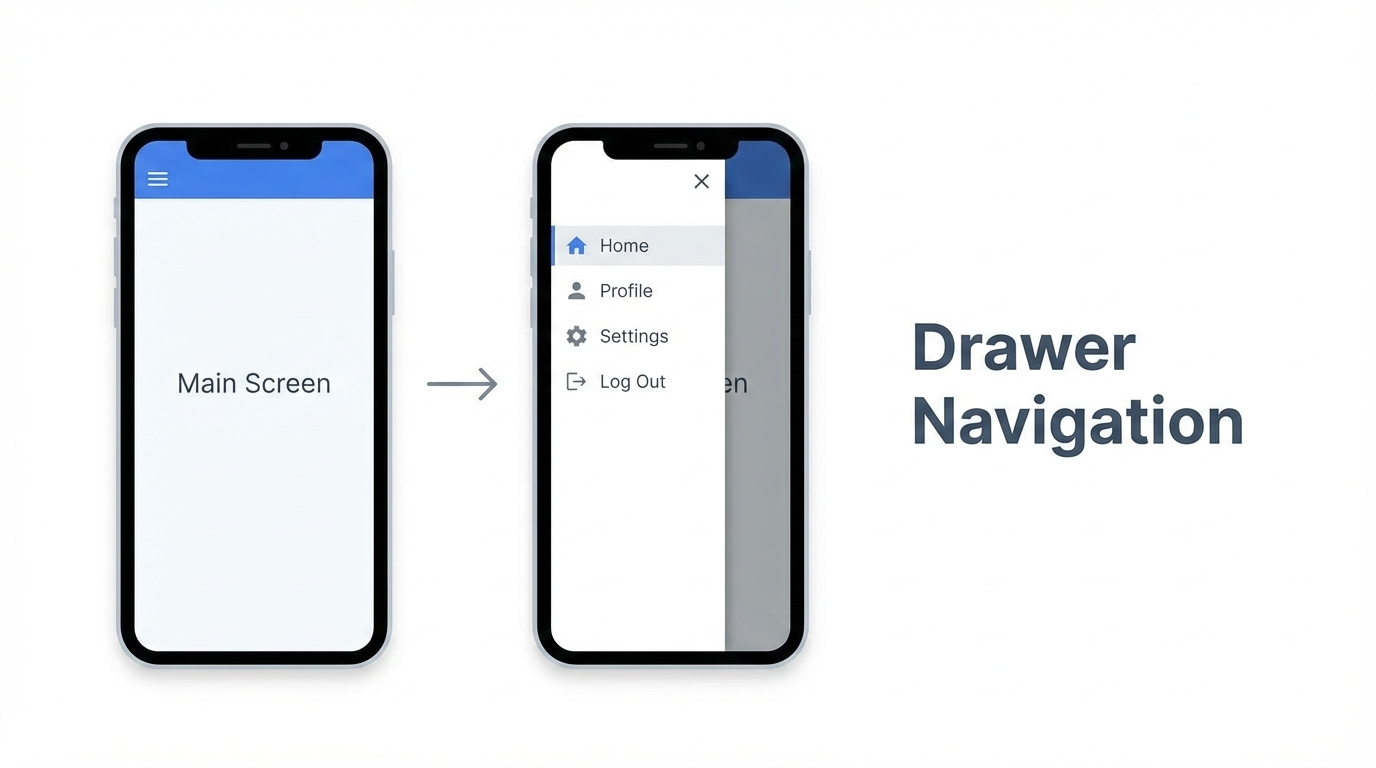
In the simplest terms, a navigation drawer (often called a “hamburger menu” because of the three-line icon that usually opens it) is a hidden panel that houses an app’s primary destinations. It lives off-screen, typically on the left, and slides in over or pushes aside the main content when you tap that iconic icon or swipe from the edge.
Think of it as your app’s control center. It’s not for every little action, but for the big, important sections: Home, Profile, Messages, Settings, Saved Items, etc. It keeps the main screen clean and focused, reducing visual clutter while keeping critical navigation just one tap away.
Real-World Examples: Apps That Nail the Drawer Game
You use drawer navigation more often than you think. Let’s look at some pros:
Gmail: The classic. Your inbox, starred, sent, and all your labels are neatly tucked away in the drawer. It’s the perfect use case for an app with many top-level sections.
Spotify: Your Library, Home, Search, and all your playlists live here. It handles a massive amount of user content without overwhelming the main “now playing” interface.
Facebook: While its navigation has evolved, the drawer is still key for accessing shortcuts to Groups, Marketplace, Dating, and all your saved shortcuts. It manages complexity brilliantly.
Slack: Channels, DMs, threads, and saved items—all accessible from the drawer, keeping your workspace conversation front and center.
These apps show the drawer’s strength: managing a wide information architecture without sacrificing the user’s current context.
When Should You Use a Drawer? (Spoiler: Not Always)
The drawer isn’t a one-size-fits-all solution. Using it wrong can actually hide your most important features. Here’s the golden rule:
✅ USE A DRAWER WHEN:
Your app has 5 or more top-level destinations. (Think: Home, Feed, Profile, Explore, Activity, Settings, etc.).
These destinations don’t need to be visible simultaneously for the user’s primary task.
You want to maximize screen real estate for content (like reading articles, browsing photos).
Your navigation hierarchy is complex with multiple levels.
❌ AVOID A DRAWER WHEN:
You have only 2-4 top-level views. Use a Bottom Navigation Bar instead (it’s more visible and easier to reach with thumbs).
The core user journey requires rapid switching between sections (like in a music player between Library, Search, and Now Playing).
Your primary features need immediate discoverability. Out of sight can mean out of mind.
Best Practices for a Smoother-Than-Butter Drawer
Want your drawer to feel amazing, not annoying? Follow these modern best practices:
Prioritize Ruthlessly: Put the most important items at the top. “Home,” “Profile,” and core features should be the first things users see.
Use Recognizable Icons + Text: Never rely solely on icons. Pair them with clear, concise labels. That mysterious icon might make sense to you, but not to a new user.
Indicate the Current Location: Highlight the active section in the drawer (with a different color or bold text). Users should never wonder where they are.
The Swipe Gesture is King: Yes, the hamburger icon should work, but always implement a swipe-from-the-left-edge gesture. It feels intuitive and fast.
Don’t Bury Critical Actions: If “Create New Post” or “Search” is a primary action, consider keeping it in the main toolbar, not inside the drawer.
Keep it Lean: Avoid dumping every single link in there. Use sections, dividers, and maybe even an expandable/collapsible design for sub-menus if needed.
Smooth Animations Matter: The slide-in should feel responsive and natural, matching your app’s overall motion design.
Drawer Navigation in Action: A Developer’s Perspective
For the tech-curious, implementing a drawer has become incredibly streamlined. In the web world, you might use a combination of HTML/CSS for the structure and JavaScript to handle the toggle state. In modern frameworks:
React: Libraries like
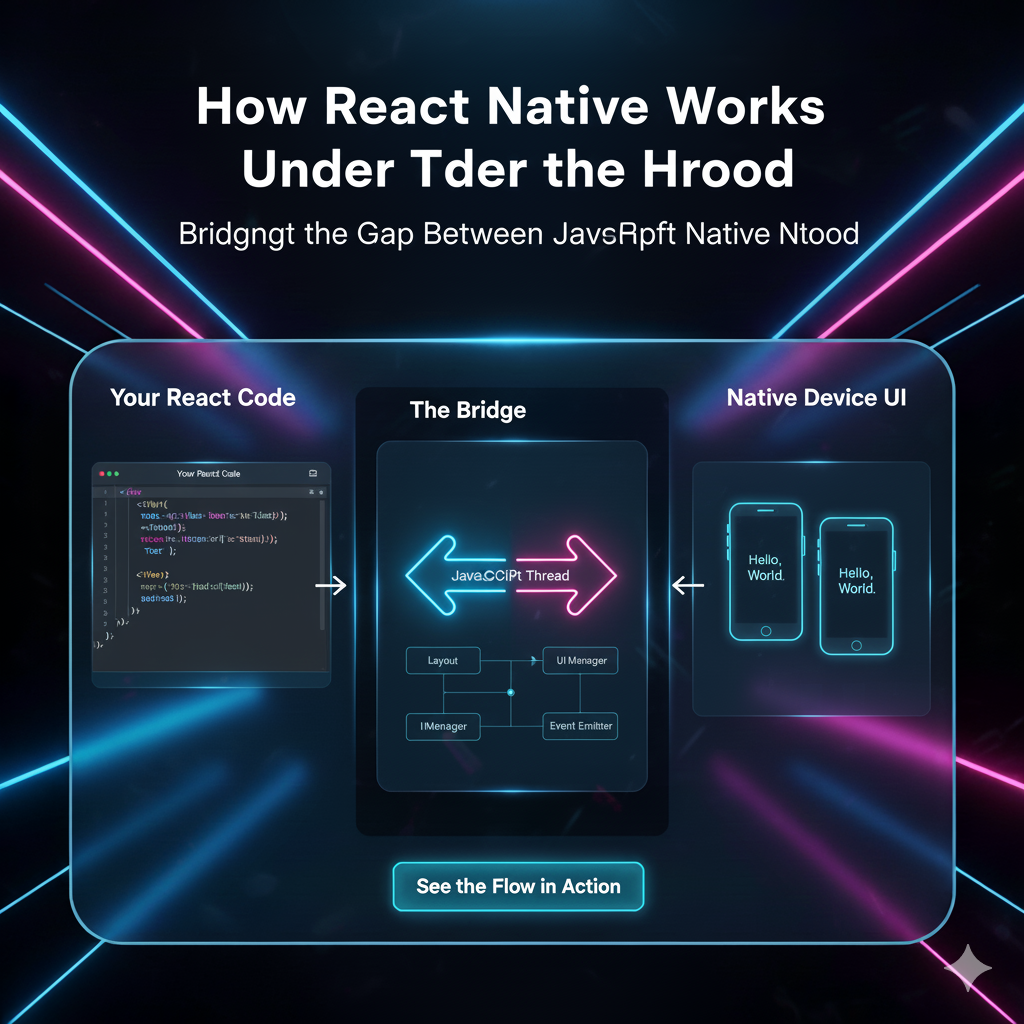
Material-UIorChakra UIhave pre-built, accessible drawer components.React Native: The built-in
DrawerLayoutAndroidor popular community libraries likereact-navigationmake it standard.Flutter: The
Drawerwidget in the Material library integrates seamlessly.
The key is to ensure it’s accessible—proper ARIA labels for screen readers and keyboard navigation are non-negotiable for a professional app.
Mastering these UI patterns is a core part of becoming a proficient developer. To learn professional software development courses such as Python Programming, Full Stack Development, and MERN Stack, which cover these essential front-end and mobile concepts in depth, visit and enroll today at codercrafter.in.
FAQ: Your Drawer Navigation Questions, Answered
Q: Hamburger menu or bottom bar? Which is better?
A: It depends! Bottom bars are fantastic for 3-5 critical, frequently switched tabs. Drawers are better for housing a larger list of primary destinations. When in doubt, if your user needs to jump between sections often, choose the bottom bar.
Q: Are hamburger menus bad for discoverability?
A: They can be, if used poorly. If you hide your app’s most important feature behind it, yes, that’s bad. But for consolidating secondary-yet-important navigation, they’re excellent. The key is intelligent information architecture.
Q: Should the drawer slide over content or push it?
A: The “slide-over” style is more modern and standard. It creates a clear layering effect and feels less disruptive than pushing the entire screen content.
Q: Can I have a drawer on the right side?
A: Technically, yes. But convention places it on the left. Deviating from this can confuse users unless you have a very strong, specific reason (like a context-specific tools panel).
Conclusion: The Drawer’s Place in Your UI Toolkit
Drawer navigation isn’t a trend; it’s a fundamental UI pattern for managing complex app navigation. When used thoughtfully, it creates a clean, focused, and powerful user experience. It declutters your interface and organizes your app’s structure in a way that feels intuitive.
The next time you’re designing or building an app, ask yourself: “Do my users need immediate access to these items, or can they afford a single tap to reveal them?” Your answer will guide you to the right choice.
Remember, great UX is invisible. It’s the feeling of ease a user gets when they can navigate your app without a second thought. A well-implemented drawer is a quiet but powerful tool to achieve just that.
Building intuitive interfaces like this is a key skill in the industry. If you’re looking to build a career in creating such seamless digital experiences, consider strengthening your foundation. To learn professional software development courses such as Python Programming, Full Stack Development, and MERN Stack, which equip you with the skills to design and develop these modern applications, visit and enroll today at codercrafter.in.
