Dark Mode vs. Light Mode: A Dev's Guide to Building a Smooth Theme System
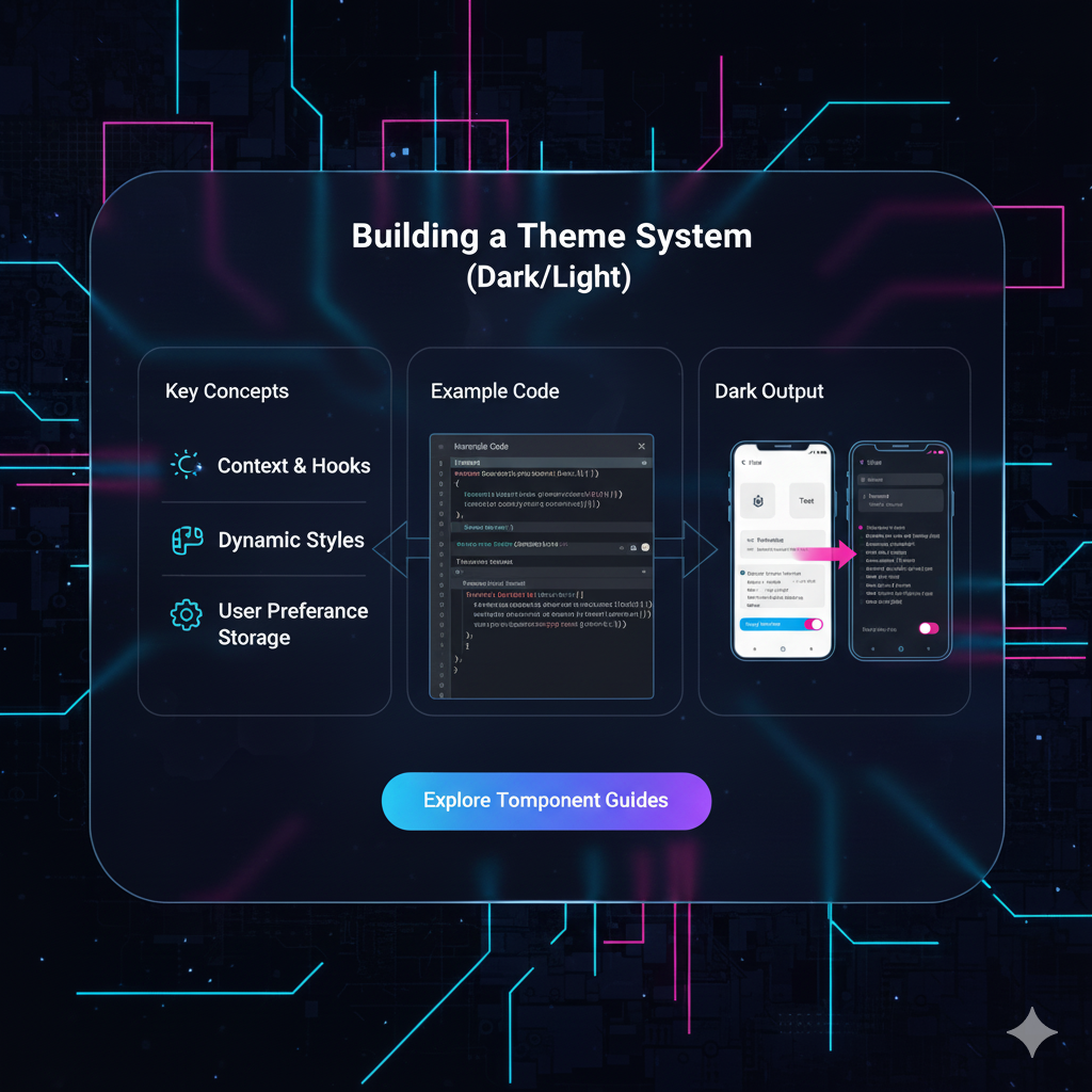
Tired of blinding white screens? Learn how to build a dynamic Dark/Light theme system with CSS variables & JavaScript. Level up your UI/UX skills. Enroll at
Let's be real. We've all been there. It's 2 AM, you're deep in a code rabbit hole, and you open a website that's pure, unadulterated white. It feels like a flashbang just went off in your retinas. Ouch.
Enter the hero of the late-night coder: Dark Mode.
But dark mode isn't just a trendy feature anymore; it's a user expectation. It’s about accessibility, reducing eye strain, and frankly, just giving people a choice in how they experience your creation. So, how do you stop just using themes and start building them like a pro?
Buckle up, because we're diving deep into building a slick, persistent, and accessible dark/light theme system from scratch. This isn't just a quick CSS trick; it's a proper frontend architecture lesson.
The Core Concept: It's All About CSS Variables
Before we write a single line of code, let's get our heads around the main character of our story: CSS Custom Properties, aka CSS Variables.
Think of them as your style sheet's personal notepad. You can write down a value once and reuse it everywhere.
The Old, Clunky Way (The pain is real):
css
.body-light {
  background-color: #ffffff;
  color: #333333;
}

.body-dark {
  background-color: #1a1a1a;
  color: #f0f0f0;
}

/* Then you have to duplicate EVERYTHING */
.button-light {
  background: #007bff;
  color: white;
}
.button-dark {
  background: #66b3ff;
  color: black;
}
Nightmare, right? Managing this is a one-way ticket to CSS hell.
The New, Cool Way (With CSS Variables):
css
:root {
  --bg-color: #ffffff;
  --text-color: #333333;
  --primary-color: #007bff;
}

body {
  background-color: var(--bg-color);
  color: var(--text-color);
}

.button {
  background: var(--primary-color);
}
See the magic? We define the variables at the :root (the top level of the document), and then we just use var(--variable-name) wherever we need that value. To change the entire theme, we just need to update the variables in one place.
Building the System: A Step-by-Step Walkthrough
Let's get our hands dirty and build this thing.
Step 1: Define Your Themes in CSS
We'll start by defining our two themes—light and dark—using CSS variables. We do this by scoping them to a class or data-attribute. Using a data-theme attribute is super clean.
css
/* Default Light Theme */
:root {
  --bg-primary: #ffffff;
  --bg-secondary: #f8f9fa;
  --text-primary: #212529;
  --text-secondary: #6c757d;
  --accent-color: #007bff;
  --border-color: #dee2e6;
}

/* Dark Theme */
[data-theme="dark"] {
  --bg-primary: #121212;
  --bg-secondary: #1e1e1e;
  --text-primary: #f8f9fa;
  --text-secondary: #adb5bd;
  --accent-color: #4dabf7;
  --border-color: #495057;
}
Step 2: Apply the Variables to Your Styles
Now, we wire everything up to use these variables. The beauty here is that your component styles don't need to know which theme is active.
css
body {
  background-color: var(--bg-primary);
  color: var(--text-primary);
  font-family: 'Inter', sans-serif; /* Because we're modern like that */
  transition: background-color 0.3s ease, color 0.3s ease; /* Smooth transition, very important! */
}

.card {
  background-color: var(--bg-secondary);
  border: 1px solid var(--border-color);
  padding: 2rem;
  border-radius: 12px;
}

button {
  background-color: var(--accent-color);
  color: white;
  border: none;
  padding: 0.75rem 1.5rem;
  border-radius: 6px;
  cursor: pointer;
}
Step 3: The JavaScript Toggle Magic
This is where we make it interactive. We need a button that toggles the data-theme attribute on the <html> tag and, crucially, remembers the user's choice.
javascript
// Grab the toggle button from the DOM
const themeToggle = document.getElementById('theme-toggle');

// Function to toggle the theme
function toggleTheme() {
  const currentTheme = document.documentElement.getAttribute('data-theme');
  const newTheme = currentTheme === 'dark' ? 'light' : 'dark';

  // Set the new theme
  document.documentElement.setAttribute('data-theme', newTheme);

  // Save the user's choice to localStorage
  localStorage.setItem('theme', newTheme);
}

// Event listener for the button
themeToggle.addEventListener('click', toggleTheme);
Step 4: Persistence & User Respect (The Pro Moves)
A theme that resets on every page refresh is a bad theme. We use localStorage to remember the user's choice. And even better, we can respect the user's system-level preference on their first visit.
javascript
// Function to apply the saved theme on page load
function applySavedTheme() {
  const savedTheme = localStorage.getItem('theme');

  // If the user has a saved theme, use it.
  if (savedTheme) {
    document.documentElement.setAttribute('data-theme', savedTheme);
  } else {
    // Otherwise, check their system preference.
    const prefersDark = window.matchMedia('(prefers-color-scheme: dark)').matches;
    if (prefersDark) {
      document.documentElement.setAttribute('data-theme', 'dark');
    }
  }
}

// Run this function when the page loads
applySavedTheme();
Boom. Now your theme system is not just dynamic, but also smart and respectful.
Leveling Up: Best Practices You Shouldn't Ignore
Smooth Transitions: Always add a
transitionto your color and background properties. That smooth fade between themes is pure user experience candy.Beyond Black & White: A true dark theme isn't just pure black (#000000). Use dark grays (#121212, #1e1e1e) which are easier on the eyes and reduce contrast fatigue.
Accessible Contrast: Just because it's in dark mode doesn't mean you can use light grey on dark grey. Always check your color contrast ratios with tools like WebAIM's Contrast Checker to ensure readability for everyone.
Icons & Images: Consider having different versions of your icons for light and dark modes. You can use the same CSS variable logic to switch out
srcor use CSS filters.
Building something like this really solidifies your understanding of the core trio of web development: HTML, CSS, and JavaScript. If you found this breakdown helpful, imagine building entire applications with this level of detail. To learn professional software development courses such as Python Programming, Full Stack Development, and MERN Stack, visit and enroll today at codercrafter.in. We break down complex concepts into digestible, real-world projects.
FAQs: Quick-Fire Round
Q: Can I have more than two themes?
A: Absolutely! You can have a "dim" theme, a "blue" theme, whatever! Just define more sets of variables like [data-theme="ocean"] and update your toggle logic to cycle through them.
Q: Does this work with CSS frameworks like Tailwind?
A: Yes, but it's a bit different. Tailwind has a built-in dark mode variant. You can enable it in your config file and it uses a similar class or media strategy. The core concept of switching a class/attribute remains the same.
Q: What about flash of unstyled content (FOUC) in dark mode?
A: Great question! If you're applying the theme with JavaScript, the HTML might render in the default light theme for a split second before the JS runs. To fix this, you can put a small inline script in your <head> that checks localStorage and applies the theme before the page paints.
Q: Is this bad for performance?
A: Not at all. CSS Variables are very well optimized in modern browsers. This method is incredibly efficient.
Conclusion: You're Now a Theme Master
And there you have it. You've just built a robust, user-friendly theme system that's a million miles ahead of a simple color swap. You've used modern CSS, added smart JavaScript, and baked in persistence and user preference.
This is the kind of polished feature that separates a hobbyist project from a professional web application. It shows you care about the user's experience from every angle. So go ahead, implement it on your portfolio, your side projects, and impress everyone with your attention to detail.