UI/UX Mistakes to Avoid in 2025: A Practical Guide to Better Design
Stop losing users! Discover the 5 most common UI/UX design mistakes that hurt conversion in 2025, with real examples and actionable fixes based on design psychology. Learn how to build better digital products.
UI/UX Mistakes to Avoid in 2025: A Practical Guide to Better Design
The 2025 Guide to UI/UX Mistakes That Cost You Users (And How to Fix Them)
Ever feel a flash of pure frustration trying to use an app or website? Maybe a button did nothing, a form was a maze, or you just couldn’t find what you were looking for. As a designer, that sinking feeling is your worst nightmare coming to life for your users.
Let's be real—good UI/UX is no longer a nice-to-have; it's the bedrock of any successful digital product in 2025. A well-designed interface can boost conversion rates by up to 200%, while a stellar user experience can drive that figure as high as 400%. On the flip side, preventable usability issues cause 63% of mobile users to abandon a site altogether.
This isn't about pixel-perfect aesthetics; it's about building trust, clarity, and seamless interaction. Drawing on real examples and established design laws, this guide will walk you through the common UI/UX mistakes that scream "amateur," and more importantly, how to fix them like a pro.
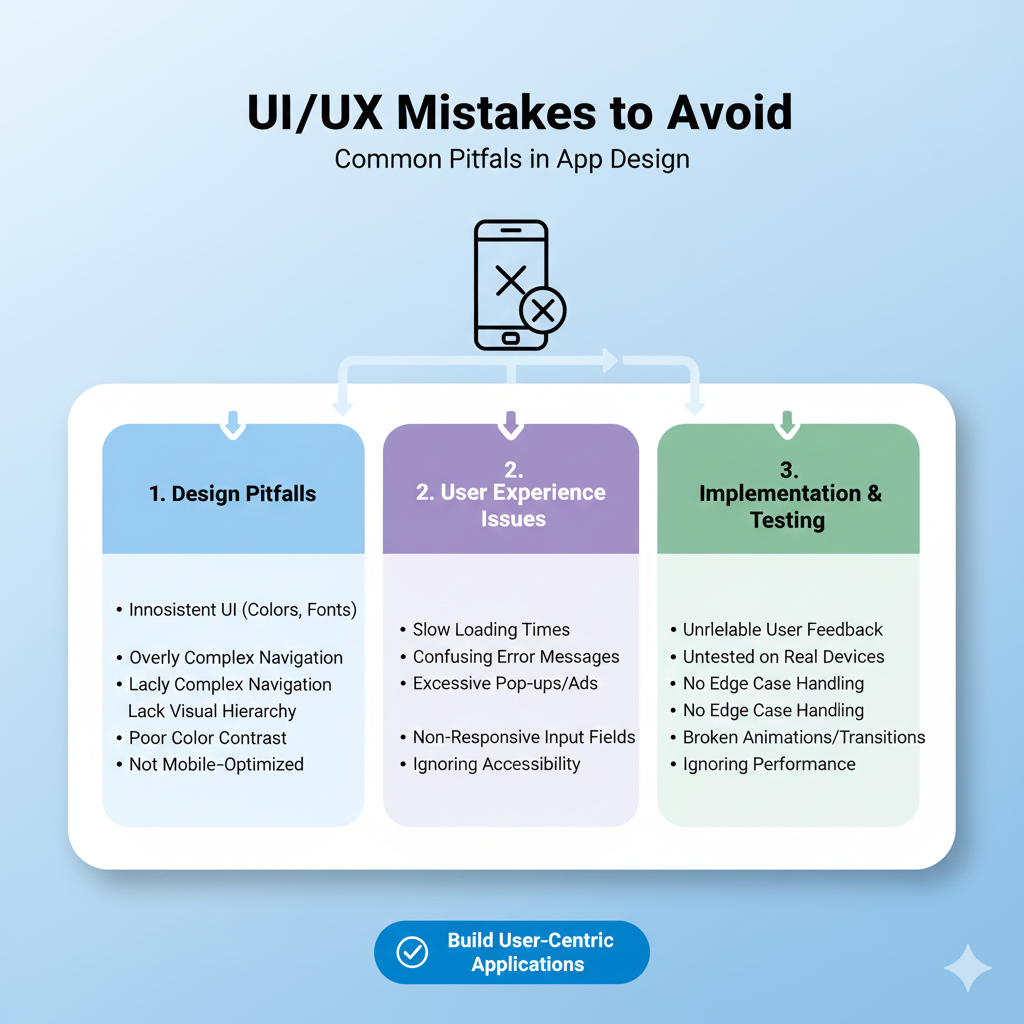
Mistake 1: Prioritizing Aesthetics Over Usability
The allure of a stunning, trend-forward design is powerful. Who doesn't want their product to look cutting-edge? However, this often leads to the first major pitfall: sacrificing clarity on the altar of visual flair.
This mistake violates Jakob’s Law, which states users spend most of their time on other sites and apps. They come with set expectations. When you reinvent common patterns—hiding navigation, using cryptic icons, or employing unreadable fonts—you force users to learn a new language. The result? Confusion and a quick exit.
The Fix: Let usability lead the dance. Adhere to established conventions (like the shopping cart icon for e-commerce) and ensure your beautiful design serves a clear purpose. Remember the Aesthetic-Usability Effect: while a visually pleasing design can make users more forgiving of minor issues, it should never be a mask for poor functionality. Clarity must come first.
Mistake 2: Ignoring the Need for Speed & Feedback
In 2025, patience is a scarce commodity. Users expect interfaces to feel instantaneous and responsive. Two critical laws highlight this:
Doherty Threshold: Productivity soars when system response time is 400 milliseconds or less.
Fitts’s Law: The time to acquire a target depends on its size and distance; tiny, cramped buttons are a recipe for misclicks and frustration.
A slow, unresponsive interface that provides no feedback is a silent killer. Users are left wondering: "Did my click register? Is it loading? Should I press again?"
The Fix: Performance is a core part of UX. Optimize images, code, and server response times. For actions that will take time, always provide clear feedback. Use:
Skeleton screens to show content is coming.
Progress indicators for multi-step processes.
Clear button state changes (enabled, hovered, pressed) to confirm interaction.
Ensure touch targets are at least 44x44 pixels and have adequate spacing.
Mistake 3: Inconsistent & Unpredictable Patterns
Consistency isn't just about using the same blue color everywhere. It's about creating a predictable, trustworthy environment. When similar actions yield different results across your app—like an "edit" button opening a modal in one place and enabling inline editing in another—you break the user's mental model.
This inconsistency forces users to re-learn how to use your product on every screen, increasing cognitive load and eroding confidence. As one industry expert bluntly puts it, treating consistency as optional is a foundational mistake: "Consistency is not optional. It is the foundation for scalable UX".
The Fix: Build and religiously follow a design system. This is your single source of truth for components, patterns, and styles. It ensures that every "save" button looks and behaves the same way, every form uses the same validation pattern, and navigation is predictable. This reduces development bottlenecks and creates a cohesive experience that users can master quickly.
Mistake 4: Overwhelming Users with Choice (Ignoring Hick’s Law)
Hick’s Law is simple but profound: the time it takes to make a decision increases with the number and complexity of choices. Presenting users with a dashboard cluttered with 30 equal-weight options, or a signup form with 20 fields, leads to decision paralysis. The most likely outcome? They make no decision at all and leave.
The Fix: Guide users by simplifying and sequencing.
Prioritize ruthlessly. Use the Pareto Principle: identify the 20% of features used 80% of the time and make those primary.
Break complex tasks into smaller steps. A multi-page checkout with clear progress indicators (using the Goal-Gradient Effect, where motivation increases as one nears a goal) is far more effective than one long, daunting page.
Use the Von Restorff Effect: make the primary call-to-action visually distinct from secondary options.
Mistake 5: Designing for Yourself, Not Your User
This is perhaps the most fundamental error. Designing based on personal preference or internal assumptions, rather than actual user data and behavior, is a direct path to a product that no one wants or can use effectively.
Henry Ford’s famous quote—“If I had asked people what they wanted, they would have said faster horses”—is often misinterpreted. It doesn't mean ignore users; it means deeply understand their needs (faster transportation) rather than just their stated wants (faster horses).
The Fix: Embed user research and testing into your core process.
Conduct qualitative research: Watch real users interact with your product. Their struggles are your most valuable data.
Use quantitative tools: Heatmaps and session recordings can reveal where users click, scroll, and get stuck.
Prototype and test early: Don't wait for a finished product. Use tools to create interactive mockups and validate ideas with real feedback before a single line of code is written. As one product manager noted, this shifts teams "from having almost entirely opinion-backed ideas to having ones that are data-backed".
Learning to Build What Users Truly Need
Mastering the balance between user needs, business goals, and technical feasibility is the essence of modern digital craftsmanship. It's a skill that blends psychology, strategy, and technical execution. If you're looking to build this comprehensive skill set—to move from making assumptions to building validated, user-loved products—structured learning can fast-track your journey.
To learn professional software development courses such as Python Programming, Full Stack Development, and MERN Stack, visit and enroll today at codercrafter.in.
Frequently Asked Questions (FAQs)
What's the biggest difference between UI and UX?
Think of it this way: UI (User Interface) is the look and feel—the buttons, icons, colors, and layout. It's what you see and interact with directly. UX (User Experience) is the overall journey and feeling you get from using a product. It encompasses every interaction, from discovering the app to solving a problem with customer support. Good UI is a part of good UX.
How can I quickly test if my UX is failing?
Run a simple 5-second test. Show your homepage or key screen to someone for just five seconds, then ask: "What is this product? What can you do here?" If they can't answer accurately, your value proposition and visual hierarchy need work. Also, check your analytics for high bounce rates and low conversion on key pages.
Is following every design "law" strictly necessary?
The "laws" (like Hick's or Fitts's) are principles based on human psychology, not unbreakable rules. They are excellent guides for making informed design decisions. However, context matters. The key is to understand why a principle exists so you know when and how to apply it—or when a unique situation warrants a thoughtful exception.
What's one small change I can make today to improve UX?
Audit your forms. Look at every form on your site (contact, signup, checkout). For each field, ask: "Is this absolutely necessary for the user to proceed?" Research shows many sites can reduce form fields by 20-60% without losing essential information. Removing even one unnecessary field can significantly boost completions.
Conclusion: Build for Humans, Not Just Screens
The goal of exceptional UI/UX in 2025 isn't to create the most visually stunning or feature-packed product. It's to create the most human one. It's about removing friction, building trust, and guiding users to their goals with clarity and respect for their time and cognition.
Great design is often invisible—it's the feeling of effortless accomplishment a user gets when everything works as expected. By avoiding these common mistakes and grounding your decisions in user-centric principles and data, you stop building barriers and start creating pathways. In a digital world full of noise, the product that feels simple, reliable, and intuitive is the one people return to, recommend, and love.