Mastering Flexbox in React Native: Complete Guide with Real Examples
Learn Flexbox in React Native like a pro! Our detailed guide covers fundamentals, real-world examples, best practices, and pro tips for creating responsive mobile app layouts. Perfect for beginners and experienced developers.
Mastering Flexbox in React Native: Complete Guide with Real Examples
Mastering Flexbox in React Native: The Ultimate Guide for Mobile Developers
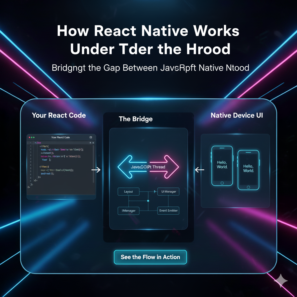
So you're diving into React Native development and everyone's talking about Flexbox. It's everywhere, right? You hear it in tutorials, see it in code examples, but what's the real deal with this layout system that's become the backbone of mobile app design? Let me break it down for you in a way that actually makes sense.
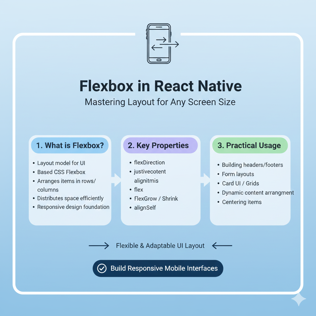
What Exactly is Flexbox?
Alright, let's start simple. Flexbox is basically a layout model that helps you arrange your app's components in a predictable way across different screen sizes. Think of it like a smart container that knows how to position its children without you having to do crazy math calculations.
The beauty of Flexbox in React Native is that it's the default layout system. Unlike web development where you might choose between float, grid, or flexbox, React Native simplifies things by making Flexbox the primary way you'll position almost everything in your app.
Here's what makes it so awesome:
Direction-agnostic: Unlike block layouts (vertical) or inline layouts (horizontal), flexbox gives you freedom
Space distribution: It smartly distributes space among items in a container
Alignment control: You get incredible control over how items align both in the main and cross axes
Responsive by nature: It automatically adapts to different screen sizes
Flexbox Fundamentals: The Core Concepts
1. Flex Direction: The Starting Point
This is where it all begins. flexDirection determines the primary axis along which your items will be placed. You've got four options:
row: Left to right (default in web, but NOT default in React Native!)row-reverse: Right to leftcolumn: Top to bottom (THIS is the React Native default)column-reverse: Bottom to top
javascript
// Example: Creating a simple row layout
<View style={{flexDirection: 'row'}}>
  <View style={{width: 50, height: 50, backgroundColor: 'red'}} />
  <View style={{width: 50, height: 50, backgroundColor: 'blue'}} />
  <View style={{width: 50, height: 50, backgroundColor: 'green'}} />
</View>
2. Justify Content: The Space Distributor
This controls how items are spaced along the main axis (your flexDirection axis). This is where you handle that tricky spacing between elements.
Options include:
flex-start: Pack items at the start (default)flex-end: Pack items at the endcenter: Pack items around the centerspace-between: Evenly distribute items, first at start, last at endspace-around: Evenly distribute with equal space around themspace-evenly: Even distribution with equal space between AND around
3. Align Items: The Cross-Axis Aligner
While justifyContent works on the main axis, alignItems works on the cross axis (perpendicular to your flexDirection). This is super useful for vertical alignment in rows or horizontal alignment in columns.
4. Flex: The Size Controller
The flex property is like the magic sauce. It determines how much space a child should take up relative to its siblings. A component with flex: 2 will take twice the space as a component with flex: 1.
javascript
// Example: Flexible components that share space proportionally
<View style={{flex: 1, flexDirection: 'row'}}>
  <View style={{flex: 1, backgroundColor: 'red'}} />   {/* Takes 1/4 */}
  <View style={{flex: 2, backgroundColor: 'blue'}} />  {/* Takes 2/4 */}
  <View style={{flex: 1, backgroundColor: 'green'}} /> {/* Takes 1/4 */}
</View>
Real-World Examples You'll Actually Use
Building a Simple Card Component
javascript
const Card = ({title, description}) => (
  <View style={styles.cardContainer}>
    <View style={styles.header}>
      <Text style={styles.title}>{title}</Text>
      <TouchableOpacity style={styles.menuButton}>
        <Text>⋮</Text>
      </TouchableOpacity>
    </View>
    <Text style={styles.description}>{description}</Text>
    <View style={styles.footer}>
      <Text style={styles.timestamp}>2 hours ago</Text>
      <View style={styles.actions}>
        <TouchableOpacity style={styles.actionButton}>
          <Text>Like</Text>
        </TouchableOpacity>
        <TouchableOpacity style={styles.actionButton}>
          <Text>Share</Text>
        </TouchableOpacity>
      </View>
    </View>
  </View>
);

const styles = StyleSheet.create({
  cardContainer: {
    backgroundColor: 'white',
    borderRadius: 8,
    padding: 16,
    margin: 8,
    shadowColor: '#000',
    shadowOffset: { width: 0, height: 2 },
    shadowOpacity: 0.1,
    shadowRadius: 4,
    elevation: 3,
  },
  header: {
    flexDirection: 'row',
    justifyContent: 'space-between',
    alignItems: 'center',
    marginBottom: 12,
  },
  footer: {
    flexDirection: 'row',
    justifyContent: 'space-between',
    alignItems: 'center',
    marginTop: 16,
  },
  actions: {
    flexDirection: 'row',
  },
  actionButton: {
    marginLeft: 12,
  },
});
Creating a Responsive Grid
javascript
const ProductGrid = ({products}) => (
  <View style={styles.gridContainer}>
    {products.map((product, index) => (
      <View
        key={product.id}
        style={[
          styles.gridItem,
          // Every third item gets special margin
          index % 3 !== 2 && {marginRight: 8}
        ]}
      >
        <Image source={{uri: product.image}} style={styles.productImage} />
        <Text style={styles.productName}>{product.name}</Text>
        <Text style={styles.productPrice}>${product.price}</Text>
      </View>
    ))}
  </View>
);

const styles = StyleSheet.create({
  gridContainer: {
    flex: 1,
    flexDirection: 'row',
    flexWrap: 'wrap',
    padding: 16,
  },
  gridItem: {
    width: '31%', // 3 items per row with some spacing
    marginBottom: 16,
    alignItems: 'center',
  },
});
Common Flexbox Patterns in Real Apps
1. The Centering Pattern
This is probably the most common pattern you'll use:
javascript
// Center both horizontally and vertically
<View style={{
  flex: 1,
  justifyContent: 'center',
  alignItems: 'center'
}}>
  <Text>Perfectly centered!</Text>
</View>
2. The Navigation Header Pattern
javascript
<View style={styles.header}>
  <TouchableOpacity style={styles.backButton}>
    <Ionicons name="arrow-back" size={24} />
  </TouchableOpacity>

  <Text style={styles.headerTitle} numberOfLines={1}>
    This is a really long header title that needs to truncate
  </Text>

  <TouchableOpacity style={styles.menuButton}>
    <Ionicons name="menu" size={24} />
  </TouchableOpacity>
</View>

const styles = StyleSheet.create({
  header: {
    flexDirection: 'row',
    alignItems: 'center',
    paddingHorizontal: 16,
    paddingVertical: 12,
    backgroundColor: 'white',
    borderBottomWidth: 1,
    borderBottomColor: '#eee',
  },
  backButton: {
    marginRight: 16,
  },
  headerTitle: {
    flex: 1, // This makes the title take all available space
    fontSize: 18,
    fontWeight: 'bold',
    textAlign: 'center',
  },
  menuButton: {
    marginLeft: 16,
  },
});
Pro Tips and Gotchas
1. The flex: 1 Magic
Almost every top-level container in your screens should have flex: 1. This ensures it takes up all available space. Forgetting this is the #1 reason components seem "invisible" or don't appear where you expect.
2. Nesting Flex Containers
Flex containers can (and should) be nested. A typical screen might have:
Outer container with
flex: 1, flexDirection: 'column'Header with fixed height
Content area with
flex: 1(takes remaining space)Footer with fixed height
3. Debugging with Borders
When layouts aren't behaving, add temporary borders:
javascript
<View style={{borderWidth: 1, borderColor: 'red'}}>
  {/* Your problematic component */}
</View>
4. Platform Differences
Remember: React Native's Flexbox is based on Yoga, which implements a subset of CSS Flexbox with some differences:
flexDirectiondefaults tocolumninstead ofrowflexonly supports a single number (noflex-grow,flex-shrink,flex-basisseparately)
When Flexbox Isn't Enough
Flexbox is amazing for 90% of layout problems, but sometimes you need more:
Absolute Positioning: For overlays, modals, or elements that need to break out of the flex flow
Fixed Dimensions: When you need exact pixel dimensions (but be careful with responsiveness!)
Platform-Specific Code: Occasionally you'll need different layouts for iOS vs Android
FAQs: Questions Real Developers Ask
Q: Why are my components overlapping or not showing up?
A: 99% of the time, it's because you forgot flex: 1 on a parent container. Add it and watch the magic happen.
Q: How do I make a component take the full width?
A: Use alignSelf: 'stretch' on the child, or make sure the parent has alignItems: 'stretch' (which is actually the default).
Q: What's the difference between alignItems and alignContent?
A: alignItems aligns items along the cross axis for each line. alignContent aligns the entire set of lines (only works with flexWrap: 'wrap').
Q: How do I create equal spacing between items?
A: justifyContent: 'space-between' if you want no space at the ends, space-around if you want equal space including ends.
Q: Can I use percentages in Flexbox?
A: React Native doesn't support percentage values directly in most properties. Use flex properties or calculate pixel values based on screen dimensions.
Leveling Up Your Skills
Mastering Flexbox is just the beginning of your React Native journey. Once you've got layouts down, you'll want to dive into navigation, state management, API integration, and native module development.
If you're serious about becoming a professional mobile developer, structured learning makes all the difference. At CoderCrafter, we've helped thousands of developers level up their skills with our industry-focused curriculum. Our React Native course covers everything from Flexbox fundamentals to advanced patterns used in production apps.
Wrapping Up
Flexbox in React Native isn't just another layout system—it's the foundation of almost every screen you'll build. Start with the basics (flexDirection, justifyContent, alignItems, flex), practice building common UI patterns, and soon you'll be creating complex, responsive layouts without even thinking about it.
Remember: The best way to learn is by building. Start with simple layouts, add complexity gradually, and don't be afraid to experiment. Every expert React Native developer was once staring at a screen wondering why their components weren't aligning properly!
Want to master React Native and other in-demand technologies? To learn professional software development courses such as Python Programming, Full Stack Development, and MERN Stack, visit and enroll today at codercrafter.in. Our structured programs with hands-on projects and industry mentorship can accelerate your journey from beginner to professional developer.