Master toast messages in React Native! This in-depth guide covers implementation with code examples, customization, best practices, and library comparisons for perfect user feedback.
Ever used an app where a little message pops up at the bottom saying “Message Sent” or “Profile Updated Successfully” and then gracefully disappears? That’s a toast message! They’re the silent helpers of the app world, giving you feedback without being annoying. If you’re into React Native development, mastering toast messages is a must-have skill in your toolkit.
In this guide, I’ll walk you through everything you need to know about toast messages in React Native, from the basic “why” and “how” to some cool customizations that’ll make your app feel pro.
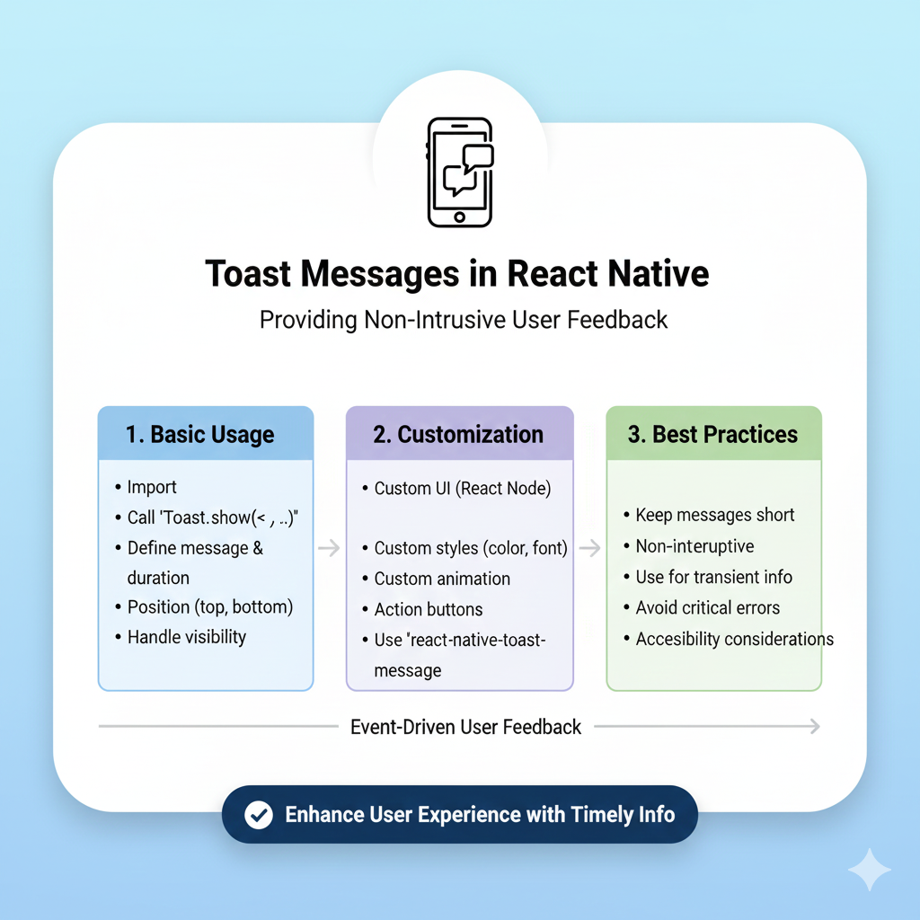
What Exactly is a Toast Message?
Let’s start with the basics. A toast message is a small, non-intrusive notification that pops up in your app to give users quick feedback. Think of it as a digital nudge—it appears, delivers its message, and vanishes on its own without requiring you to click “OK.”
Where did the quirky name come from? There are a couple of fun theories. Some say it’s like raising a glass for a “toast”—a short, celebratory statement. Others think it mimics the quick “pop-up” of bread from a toaster. Either way, the name stuck because it perfectly captures something brief and timely.
Key Characteristics of a Good Toast
Unobtrusive: It’s small and positioned so it doesn’t block important stuff on your screen.
Non-Interactable: You usually can’t tap it. You just wait for it to auto-close.
Short-Lived: It shows up for just a few seconds (usually 2-6) and then fades away.
Toast vs. Everything Else: Picking the Right Tool
It’s easy to get confused with all the notification types out there. Here’s a quick cheat sheet:
Message Type | Best For | Key Difference from Toast |
|---|---|---|
Push Notification | Re-engaging users who aren’t in the app. | Appears outside your app (on your phone’s lock screen). |
In-App Notification (e.g., Snackbar) | Messages that might need a user action, like “Undo.” | Often includes a button and stays until dismissed. |
Persistent Message (Email, SMS) | Important info users need to save or act on later. | Stays in your inbox until you delete it. |
The golden rule? Use toasts for simple, non-critical feedback. If the message is critical or requires an action, you probably need a different UI element.
Real-World Use Cases: Where Toasts Shine
You see toast messages in action in almost every good app. Here’s when you should use them:
Action Confirmation: “Photo uploaded successfully!” or “Item added to cart.”
Error Feedback (Non-Blocking): “Could not connect to network.” (For major errors, use a more prominent alert).
Status Updates: “Sending message…” like in Gmail.
Gentle Reminders: “Don’t forget to complete your profile!”
Getting Your Hands Dirty: Implementation in React Native
Alright, enough theory. Let’s code. You have two main paths: using the built-in Android module or a popular third-party library for more power and cross-platform consistency.
Method 1: The Built-in Way (Android Only)
React Native provides ToastAndroid for, well, Android. It’s simple but limited.
javascript
import { ToastAndroid, Button, View } from 'react-native';

const SimpleToastExample = () => {
  const showToast = () => {
    // Basic toast
    ToastAndroid.show('Profile saved!', ToastAndroid.SHORT);

    // Toast with position
    ToastAndroid.showWithGravity(
      'Item deleted!',
      ToastAndroid.LONG,
      ToastAndroid.CENTER
    );
  };

  return (
    <View style={{flex: 1, justifyContent: 'center'}}>
      <Button title="Show Toast" onPress={showToast} />
    </View>
  );
};
Big Caveat: This only works on Android. For iOS support or more features, you need a library.
Method 2: The Powerful Library Way (react-native-toast-message)
For most real-world projects, you’ll want a cross-platform solution. The react-native-toast-message library is a top choice—it’s lightweight (~40 kB), feature-packed, and works on both iOS and Android.
Step 1: Installation
Bash
bash
npm install react-native-toast-message
# or
yarn add react-native-toast-message
Step 2: Basic Setup in Your App
The key is to place the Toast component at the root level of your app, usually in App.js.
javascript
// App.js
import React from 'react';
import { View, Button } from 'react-native';
import Toast from 'react-native-toast-message';

export default function App() {
  const showSuccessToast = () => {
    Toast.show({
      type: 'success',
      text1: 'Hello there!',
      text2: 'This is a success toast message.'
    });
  };

  return (
    <View style={{ flex: 1, justifyContent: 'center' }}>
      <Button title="Show Toast" onPress={showSuccessToast} />
      {/* This is the magic container that renders toasts */}
      <Toast />
    </View>
  );
}
With this, you can call Toast.show() from anywhere in your app—super convenient!
Step 3: Level Up with Customization
The real magic of react-native-toast-message is customization. You can define exactly how each toast type (success, error, info) looks.
javascript
// toastConfig.js
import React from 'react';
import { View, Text } from 'react-native';

export const toastConfig = {
  // Custom success toast
  success: ({ text1, text2 }) => (
    <View style={{
        backgroundColor: '#ECFDF3',
        borderLeftColor: '#067647',
        borderLeftWidth: 6,
        padding: 16,
        borderRadius: 8,
        width: '90%'
    }}>
      <Text style={{ fontWeight: 'bold', color: '#067647' }}>{text1}</Text>
      <Text style={{ color: '#065F46', marginTop: 4 }}>{text2}</Text>
    </View>
  ),

  // Custom error toast
  error: ({ text1 }) => (
    <View style={{
        backgroundColor: '#FEF3F2',
        padding: 16,
        borderRadius: 8,
        flexDirection: 'row',
        alignItems: 'center'
    }}>
      <Text style={{ color: '#D92D20', marginLeft: 8 }}>⚠️ {text1}</Text>
    </View>
  ),
};

// In App.js, pass the config
<Toast config={toastConfig} />
This approach lets you perfectly match the toast to your app’s brand and style.
Best Practices & Pro Tips
Building a toast is easy; building a good toast requires some thought. Here’s how to nail it:
Keep It Short & Sweet: One line is ideal, two is the max. Users are glancing, not reading a novel.
Use Clear Colors: Green for success, red/amber for errors, blue for info. This creates instant visual recognition.
Mind the Duration: 2-4 seconds is usually perfect. For a slightly more complex message, you might go up to 5-6 seconds.
Position Consistently: Top or bottom of the screen is standard. Don’t make users hunt for your notification.
Don’t Abuse Them: Toasts are for non-critical info. Never use them for error messages that require user action or for critical system alerts. That’s what modal dialogs are for.
Think About the Stack: What if multiple actions trigger toasts at once? A good library like
react-native-toast-messageortoastify-react-nativecan queue them up or stack them neatly so they don’t overwhelm the screen.
FAQ: Quickfire Questions Answered
Q: Can a user tap a toast message?
Typically, no. Their non-interactive nature is a core feature. However, some advanced libraries allow you to add an onPress callback for specific use cases.
Q: What’s a “delivery status toast message”?
It’s just a specific use case—a brief toast that confirms something was delivered, like “Message delivered”.
Q: My toast doesn’t show up over a modal!
This is a common headache. Some toast libraries render within your app’s view hierarchy. To make a toast appear over everything (including modals), look for a useModal prop or similar in your library’s settings.
Q: Are there other good libraries besides react-native-toast-message?
Absolutely! toastify-react-native is another excellent option with a slightly different API and great built-in icons. Explore and see which one fits your style.
Wrapping Up
Toast messages are a small detail with a huge impact on user experience. They provide that seamless, polished feel that separates amateur apps from professional ones. By choosing the right library, customizing the look, and following best practices, you can implement feedback mechanisms that are helpful, not annoying.
Remember, the best UI is often the one you don’t notice—it just works.
Ready to build more than just toast messages? This attention to detail is what separates good developers from great ones. If you’re looking to level up your skills and build complete, professional-grade applications, consider diving deeper. To learn professional software development courses such as Python Programming, Full Stack Development, and MERN Stack, visit and enroll today at codercrafter.in.