Tired of notches eating your UI? Learn how to use SafeAreaView & SafeArea in Flutter & React Native to make your apps look pro on every phone. Examples, gotchas, and best practices inside.
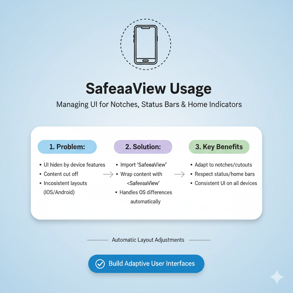
If you’ve ever built a mobile app and then watched in horror as your perfect layout gets eaten by that weird notch at the top of the phone, or awkwardly slips behind the bottom navigation bar, then you already know why we’re talking about SafeAreaView today. It’s that one simple concept that separates a professional, polished app from one that feels slightly off. Let’s break it down in a way that actually makes sense.
What is a Safe Area, Anyway?
Think of your phone’s screen like a piece of paper. In the old days, that paper was a perfect, usable rectangle. Now? It’s more like a piece of paper with a chunk bitten out of the top for a camera, rounded corners, and a software navigation bar glued to the bottom. The safe area is the actual usable rectangle that’s left after you account for all these intrusions—the notches, the status bars, the home indicators, and the rounded corners.
If your content lives inside this safe zone, users can see and interact with all of it. If it strays outside? It gets hidden, covered, or looks just plain broken. The goal of a SafeAreaView (or its equivalent in your framework) is to automatically pad your content so it sits snugly within this safe rectangle, without you having to manually calculate the size of every phone’s notch.
A Quick Tour Across Platforms
Here’s where it gets interesting—different frameworks handle this crucial task in their own way. Knowing the lingo is half the battle.
In React Native: The built-in
SafeAreaViewcomponent has a big, red flag attached to it: it’s deprecated and only works on iOS. For any serious, cross-platform app, the community standard is thereact-native-safe-area-contextlibrary. It’s the go-to solution because, as the name implies, it actually works on Android (and even the web!).In Flutter: Things are beautifully straightforward. Flutter gives you a
SafeAreawidget right out of the box. You just wrap any part of your widget tree with it, and it handles padding for all platforms intelligently. It’s a great example of Flutter’s "batteries included" philosophy.In SwiftUI: Apple’s modern framework is the most opinionated. By default, SwiftUI automatically respects the safe area for you. Your content will stay within bounds unless you explicitly tell it not to using the
.ignoresSafeArea()modifier, which is perfect for creating immersive, edge-to-edge backgrounds.
Getting Your Hands Dirty: Code Examples
Let’s look at how you actually use these tools. We'll focus on the two most common cross-platform scenarios.
For React Native Developers (using react-native-safe-area-context)
First, you need to set up the provider at the root of your app. This gives all child components access to the safe area insets.
javascript
// App.tsx
import { SafeAreaProvider } from 'react-native-safe-area-context';

function App() {
  return (
    <SafeAreaProvider>
      {/* Your navigation logic or main screen goes here */}
    </SafeAreaProvider>
  );
}
Then, on any screen, you have two powerful options:
1. The Simple Wrapper (SafeAreaView):
This is perfect for most screens. It's just a View that automatically applies the correct padding.
javascript
import { SafeAreaView } from 'react-native-safe-area-context';

function HomeScreen() {
  return (
    <SafeAreaView style={{ flex: 1, backgroundColor: '#f5f5f5' }}>
      <Text>Your safe content here!</Text>
    </SafeAreaView>
  );
}
2. The Precision Tool (useSafeAreaInsets Hook):
Need more control? This hook gives you exact numbers (in pixels) for each edge, letting you apply custom padding or margins.
javascript
import { View, Text } from 'react-native';
import { useSafeAreaInsets } from 'react-native-safe-area-context';

function ProfileScreen() {
  const insets = useSafeAreaInsets(); // { top: 44, right: 0, bottom: 34, left: 0 }

  return (
    <View style={{
      flex: 1,
      paddingTop: insets.top, // Apply only top padding
      paddingLeft: 20, // Mix with your own custom padding
    }}>
      <Text>Customized safe area handling!</Text>
    </View>
  );
}
For Flutter Developers
Flutter's approach is wonderfully declarative. The SafeArea widget is highly configurable.
dart
import 'package:flutter/material.dart';

class MyHomePage extends StatelessWidget {
  @override
  Widget build(BuildContext context) {
    return Scaffold(
      body: SafeArea(
        // You can control which sides to protect
        top: true,
        bottom: true,
        left: false, // Let content flow to the very left edge
        right: false,
        // Add a minimum padding on all sides
        minimum: const EdgeInsets.all(16.0),
        child: const Center(
          child: Text('Perfectly placed content!'),
        ),
      ),
    );
  }
}
A common best practice in Flutter is to wrap the body of your Scaffold in a SafeArea, rather than the entire Scaffold itself. This allows elements like the AppBar to correctly extend underneath the status bar for a modern look.
Real-World Use Cases & Gotchas
This isn't just theoretical. Here’s where safe area management makes or breaks your app:
The Full-Screen Image Gallery: You want your images to go edge-to-edge for maximum impact. Use
.ignoresSafeArea()in SwiftUI or selectively disabletop/bottomin Flutter'sSafeAreato let the background bleed out, while keeping your interactive close button and captions inside the safe zone.The Bottom Tab Navigator Trap (React Native): This is a classic. You set up a
SafeAreaViewon your screen, then add a tab bar. Suddenly, there's a huge, awkward gap above the tabs! Why? Because theSafeAreaViewis adding bottom padding for the device's home indicator, but doesn't know about your custom tab bar.The Fix: Use the
edgesprop on yourSafeAreaViewfromreact-native-safe-area-context.
javascript
<SafeAreaView style={{ flex: 1 }} edges={['top', 'left', 'right']}>
  {/* Screen content */}
</SafeAreaView>
This applies safe area insets only to the top and sides, leaving the bottom for your tab navigator to handle.
The "Sticky" Footer Button: In iOS 15+, SwiftUI introduced the
.safeAreaInset()modifier. This is a game-changer. It lets you anchor a button or a banner outside the main safe area (like floating over the very bottom edge), but then automatically adjusts the scrollable content above it so nothing is ever hidden. It’s seamless and built for this exact purpose.
Best Practices to Keep in Mind
Don't Over-Nest: Wrap content at the appropriate level. Putting a
SafeAreawidget at the root of every tiny component is overkill and can cause layout issues.Test on Real Hardware: Emulators are great, but they don't always mimic notches, dynamic islands, or foldable screen hinges perfectly. Always check on a physical device.
It's About More Than Notches: Remember, safe areas also account for software UI. On Android, the status bar and gesture bar are key considerations. In React Native, this is precisely why the deprecated built-in component is insufficient.
Combine with Responsive Design:
SafeAreaViewworks hand-in-hand with other responsive techniques. In Flutter, it usesMediaQueryunder the hood. Think of it as the first layer of defense in your adaptive layout strategy.
FAQ: Your Burning Questions, Answered
Q: Do I still need SafeAreaView on older phones without notches?
A: Yes! It’s not just for notches. It also accounts for the system status bar (the clock and battery icon area) and software navigation bars. Your content will look better and more consistent across all devices.
Q: Can I override or add to the automatic padding?
A: Absolutely. All implementations allow it. You can add your own extra padding or margin styles on top of the safe area insets. For example, you might want a 20-pixel gutter inside the safe area.
Q: My app is mostly used on Android. Can I skip this?
A: No! This is a critical mistake. Android devices have status bars, gesture navigation bars, and increasingly, hole-punch cameras. Ignoring the safe area on Android leads to content being obscured at the top or bottom. Using react-native-safe-area-context is essential.
Q: How does this work with on-screen keyboards?
A: It depends. The safe area typically relates to the physical/static parts of the screen. Keyboards are usually handled separately by the framework (like KeyboardAvoidingView in React Native). However, Flutter's SafeArea has a maintainBottomViewPadding parameter to help manage this interaction.
Wrapping It Up
Mastering the safe area isn't a flashy, advanced skill—it's a fundamental. It’s the difference between an app that feels "native" and one that feels like a janky web page. It shows you care about the details of the user experience on the platform you’re building for.
By using SafeAreaView (or SafeArea, or safe area modifiers) thoughtfully, you future-proof your app against the next weird and wonderful screen shape that phone manufacturers dream up. You ensure that every user, on every device, gets the clean, functional, and beautiful interface you designed.
Ready to build professional, pixel-perfect mobile apps from the ground up? This kind of detailed, platform-aware knowledge is what we focus on in our professional software development courses. To learn how to master Flutter, React Native, and other in-demand skills, visit and enroll today at codercrafter.in. Start building apps that don’t just work, but impress.