Modal Components Explained: A Complete Developer Guide (2025)
Learn how to build and use modal components correctly. This in-depth guide covers definitions, real-world examples, best practices, React code, and common pitfalls for developers.
Ever clicked a button on a website, only to have a small window pop up in the center of your screen, demanding your attention before you can do anything else? You’ve just encountered a modal component.
Done right, it’s a helpful guide. Done wrong, it’s the digital equivalent of someone tapping your shoulder mid-conversation. For developers and designers, understanding modals is crucial for creating apps that feel intuitive, not intrusive.
In this guide, we’ll cut through the jargon and break down everything you need to know about modal components: what they are, when to use them, how to build them well, and common mistakes to avoid.
What Exactly Is a Modal Component?
Let’s start with a simple definition. A modal is a special window that appears on top of the main content of a page or app. Its key characteristic is that it creates a new "mode" of interaction. When a modal is open, the background content is dimmed or blurred, and you must interact with the modal before returning to the main screen .
Think of it like this: you're watching TV (the main app), and your phone rings (the modal opens). You have to deal with the call—answer or decline—before you can go back to your show. The show is still there, but it’s temporarily paused.
This is different from a simple popup or a modeless dialog. A non-modal dialog, like a sticky chat window, stays open but lets you continue interacting with the page behind it .
The Core Anatomy of a Modal
Every well-designed modal has a few essential parts :
Overlay/Backdrop: The translucent layer behind the modal that dims the main content.
Container: The box that holds the modal's content.
Header: Contains a clear title and a close button (typically an
X).Body: Holds the main message, form, or media.
Footer (Optional): Often home to action buttons like "Confirm," "Save," or "Cancel."
When to Use a Modal (And When to Run the Other Way)
Because modals are disruptive by nature, they should be used sparingly and strategically. They are perfect for focused, short-term tasks that are critical to the user's immediate workflow.
Good Use Cases for Modals:
Critical Confirmations: "Are you sure you want to delete your account?" This action is destructive and deserves a full-stop moment .
Focused Tasks: Short forms, like adding a quick note or updating a payment method, where leaving the page would be overkill.
Important System Alerts: Warnings about expired sessions or mandatory policy updates that require acknowledgment .
Immediate User Input: When an app needs information to proceed, like asking for login details to save an item .
When to Avoid Modals:
Complex Tasks: If a task requires multiple steps, lots of information, or references to the background page, use a dedicated page instead .
Non-Essential Information: Never use a modal for a newsletter signup that blocks content a user is trying to read. It feels like a bait-and-switch .
Displaying Errors in Forms: Error messages should appear inline with the form field, not in a modal that covers the very fields needing correction .
Showing Simple Information: Use a tooltip or an expandable section for clarifying a term or showing a small detail .
Inside Another Modal (Modal Stacking): Avoid nesting modals. This is a usability nightmare that confuses context and navigation .
Best Practices for Building Great Modals
Building a modal isn't just about slapping a div in the center of the screen. Here’s what separates a good modal from a frustrating one, based on industry best practices.
1. Keep it Simple and Scannable
Your modal should communicate its purpose instantly.
Title is Key: Use a clear, action-oriented header (e.g., "Delete Project," not "Attention") .
Concise Body: Get to the point. Use bullet points for benefits and plain language. Users should grasp the value in 2-3 seconds .
Action-Driven Buttons: Button text should describe the action. Use "Delete Forever" instead of a vague "OK" .
2. Provide Clear Dismissal and Ensure Accessibility
A user should never feel trapped. Always include a clear way to close the modal:
A visible close (X) button in the header.
The ability to close by pressing the Escape key.
Often, clicking the semi-transparent backdrop .
Accessibility is non-negotiable.
Focus Trap: Keyboard focus must be trapped inside the modal when it's open. Tabbing should cycle through modal elements, not jump to the background .
Initial Focus: Set the initial keyboard focus to the first interactive element (like the primary button or a form field) when the modal opens .
Screen Reader Support: Use proper ARIA attributes (
role="dialog",aria-modal="true",aria-labelledby) so screen reader users know a new dialog has opened .
3. Make it Responsive and Performance-Friendly
Mobile First: On small screens, modals often need to be nearly full-screen with larger tap targets. Test thoroughly .
Mind the Size: Don't let modals dominate the screen. A common guideline is to keep them to 20-25% of the viewport on desktop .
Smooth Animation: Use a subtle fade-in/scale animation for a polished feel, but ensure it's not slow or disruptive.
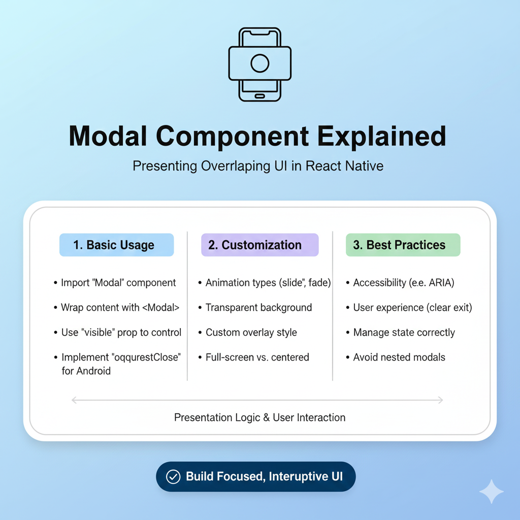
A Developer's Blueprint: Building a Modal in React
Let’s look at a practical, step-by-step approach to building a basic, reusable modal component in React, inspired by real-world development thinking .
Step 1: Start with the Simplest Viable Component
Begin with a state to control visibility and the basic HTML/CSS structure.
jsx
import { useState } from 'react';

function MyPage() {
  const [isModalOpen, setIsModalOpen] = useState(false);

  return (
    <div>
      <button onClick={() => setIsModalOpen(true)}>
        Open Modal
      </button>

      {isModalOpen && (
        <div className="modal-overlay" onClick={() => setIsModalOpen(false)}>
          <div className="modal-content" onClick={(e) => e.stopPropagation()}>
            <h2>Modal Title</h2>
            <p>This is the modal body content.</p>
            <button onClick={() => setIsModalOpen(false)}>Close</button>
          </div>
        </div>
      )}
    </div>
  );
}
Step 2: Extract a Reusable Component
Refactor the modal into its own component for maintainability and reusability .
jsx
// ModalDialog.jsx
const ModalDialog = ({ isOpen, onClose, title, children }) => {
  if (!isOpen) return null;

  return (
    <div className="modal-overlay" onClick={onClose}>
      <div className="modal-content" onClick={(e) => e.stopPropagation()}>
        <div className="modal-header">
          <h2>{title}</h2>
          <button className="close-btn" onClick={onClose}>X</button>
        </div>
        <div className="modal-body">{children}</div>
      </div>
    </div>
  );
};

// Using the component
<ModalDialog
  isOpen={isModalOpen}
  onClose={() => setIsModalOpen(false)}
  title="My Custom Modal"
>
  <p>This content is passed as children.</p>
  <button onClick={handleSubmit}>Submit</button>
</ModalDialog>
Step 3: Enhance with Advanced Features
For a production-ready modal, you'd progressively add:
Focus Management: Using
useRefanduseEffectto trap focus.Escape Key Listener: Add an event listener to close the modal on
Esc.Portal: Render the modal outside the main React component hierarchy using
ReactDOM.createPortalto avoid CSS stacking context issues .Animation: Integrate a CSS transition library for smooth entry/exit.
Common Modal Pitfalls (And How to Dodge Them)
The Blocking Background Scroll: When a modal opens, you must prevent the background page from scrolling. A common side effect is that fixed-positioned elements (like a fixed header) may shift slightly. This can be fixed by conditionally adding a class that accounts for the missing scrollbar width .
Ignoring the Mobile Experience: A desktop-centric modal can become unusable on a phone. Ensure your modal is responsive, with touch-friendly buttons and appropriate sizing.
Forgetting the "X": It seems obvious, but many modals lack a clear close option, leading to user frustration .
Mastering the modal component is a hallmark of a thoughtful developer. It’s a UI pattern that sits at the intersection of technical skill, design thinking, and user empathy. Use it wisely to create focused, helpful interruptions that enhance your application's flow, rather than breaking it.
Ready to build professional, user-friendly interfaces? The principles of good component design are foundational to modern web development. To learn professional software development courses such as Python Programming, Full Stack Development, and MERN Stack, visit and enroll today at codercrafter.in. Build your skills from the ground up and create digital experiences that users love.