Level Up Your Web Typography: Killer CSS Text Effects You Need to Try
Stop with boring text! Master CSS text effects like text-shadow, background-clip, blend-modes, and animations to make your website's typography pop.
Beyond Bold & Italic: CSS Text Effects That'll Make Your Site Look Pro
Let's be real. The web is a visual playground. If your site's text is just... text, you're missing out on a massive opportunity to grab attention, set a mood, and create a memorable experience. We're not talking about the old-school <blink> tag (thankfully). We're talking about modern, sleek, and seriously cool CSS text effects.
Gone are the days when typography was just about choosing a font. Today, it's about making your words feel something. It's the difference between a whisper and a shout.
In this deep dive, we're going to unpack the CSS magic that can transform your boring headings and paragraphs into visual masterpieces. No fluff, just actionable code and the "why" behind it.
The Foundation: Meet Your New Best Friends
Before we get to the flashy stuff, you need to be besties with the core properties that make it all happen.
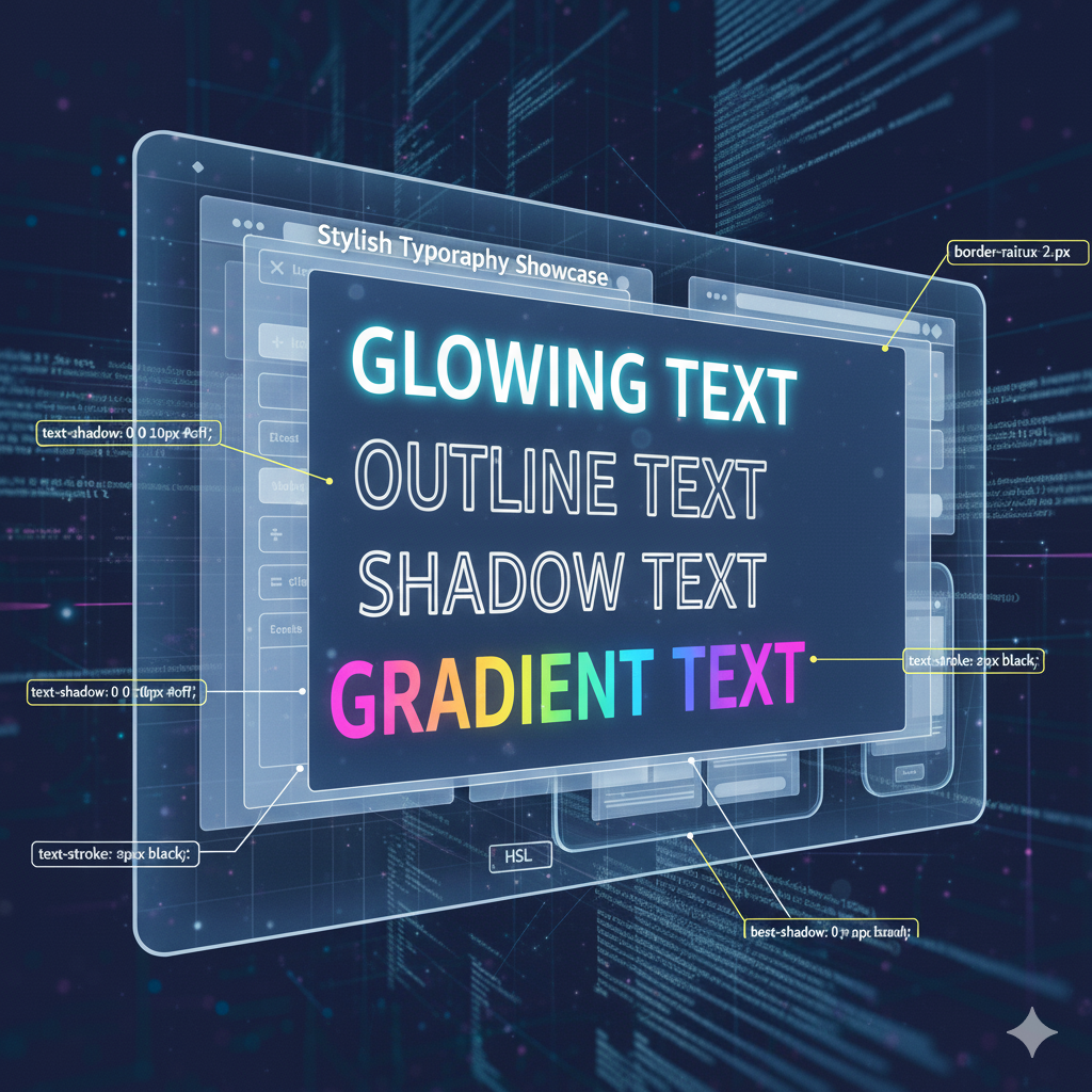
1. text-shadow: The OG Game-Changer
This is your go-to for adding depth, glow, and dimension. The syntax is straightforward but powerful:text-shadow: [horizontal-offset] [vertical-offset] [blur-radius] [color];
Horizontal Offset: Moves the shadow left (negative value) or right (positive value).
Vertical Offset: Moves the shadow up (negative) or down (positive).
Blur Radius: How blurry the shadow gets. Higher number = more blur.
Color: Self-explanatory, but you can use RGBA for transparency!
Simple Example: The Classic Drop Shadow
css
.hero-title {
  text-shadow: 2px 2px 4px rgba(0, 0, 0, 0.5);
}
This gives a subtle, professional shadow that makes text stand out from the background.
2. background-clip: text - The "Gradient & Image Text" Hack
This one is a bit of a magician's trick. It lets you define the background of an element, but then clips that background to the shape of the text. The key is you also need to set -webkit-text-fill-color: transparent to see the background through the letters.
Simple Example: Gradient Text
css
.gradient-text {
  background: linear-gradient(to right, #ff8a00, #da1b60);
  -webkit-background-clip: text;
  background-clip: text;
  -webkit-text-fill-color: transparent;
}
Boom! Instantly cool, on-trend text.
3. mix-blend-mode - Playing with Layers
This property is pure sorcery. It controls how an element's content should blend with the content of the element's parent and its background. It's how you get text that seamlessly interacts with what's behind it.
Simple Example: Lighten/Darken Blend
Imagine white text on a busy image. Sometimes it's hard to read. With mix-blend-mode, you can make the text only appear on the darker parts of the image, or vice-versa.
css
.blend-text {
  mix-blend-mode: difference; /* or screen, multiply, overlay */
  color: white;
}
Next-Level Effects: Let's Get Creative
Okay, foundations are set. Let's combine these tools to build some truly stunning effects.
Effect 1: The Neon Glow
Perfect for retro-themed sites, gaming portals, or just adding a bit of cyberpunk flair.
css
.neon {
  color: #fff;
  text-shadow:
    0 0 5px #fff,
    0 0 10px #fff,
    0 0 20px #ff00de,
    0 0 40px #ff00de,
    0 0 80px #ff00de;
  animation: flicker 1.5s infinite alternate;
}

/* Add a subtle flicker for authenticity */
@keyframes flicker {
  0%, 18%, 22%, 25%, 53%, 57%, 100% {
    text-shadow:
      0 0 5px #fff,
      0 0 10px #fff,
      0 0 20px #ff00de,
      0 0 40px #ff00de,
      0 0 80px #ff00de;
  }
  20%, 24%, 55% {
    text-shadow: none;
  }
}
Real-World Use Case: Headlines for a synthwave music blog, a "New Game" button, or a featured section on a tech product page.
Effect 2: The 3D Extruded Text
This effect creates a massive sense of depth and weight, making your text look like it's popping right out of the screen.
css
.extruded {
  color: #f4f4f4;
  text-shadow:
    1px 1px 0 #ccc,
    2px 2px 0 #ccc,
    3px 3px 0 #ccc,
    4px 4px 0 #ccc,
    5px 5px 0 #ccc,
    6px 6px 6px rgba(0,0,0,0.5);
}
Real-World Use Case: Main logos, key value propositions on a landing page, or any element you want to give a "premium" and solid feel.
Effect 3: The Animated Gradient Stroke
Instead of a solid fill, let's create a moving border around the text. It's complex but unbelievably eye-catching.
css
.stroke-text {
  color: transparent;
  -webkit-text-stroke: 2px transparent;
  background: linear-gradient(90deg, red, blue, green, red);
  background-size: 200% 100%;
  -webkit-background-clip: text;
  background-clip: text;
  animation: shimmer 3s linear infinite;
}

@keyframes shimmer {
  0% { background-position: 200% 0; }
  100% { background-position: -200% 0; }
}
Real-World Use Case: Call-to-action buttons, highlighting limited-time offers, or featured badges.
Best Practices: Don't Be "That" Developer
With great power comes great responsibility. It's easy to go overboard.
Readability is King: No effect is worth it if people can't read your text. Always test on different backgrounds and screen sizes.
Performance Matters: Heavy animations and multiple complex shadows can slow down your site, especially on mobile. Use them sparingly.
Know Your Audience: A neon glow might be perfect for a gaming site but totally inappropriate for a law firm's blog. Match the effect to your brand's voice.
Accessibility (A11y) is Non-Negotiable: Ensure there is sufficient color contrast between your text and its background, even with effects applied. Some blend modes can make text hard to see for users with visual impairments.
Progressive Enhancement: Not all effects are supported in every browser. Make sure your core message is still delivered even if the fancy effect doesn't load.
FAQs: Your Burning Questions, Answered
Q: Why is my background-clip: text not working?
A: This is the most common headache. You must include the -webkit- prefix for it to work in most browsers. So, always write:-webkit-background-clip: text; background-clip: text; and don't forget -webkit-text-fill-color: transparent;.
Q: Can I combine multiple effects?
A: Absolutely! That's where the real magic happens. You can have a neon text with a slight 3D extrusion, for example. Just be cautious about performance and readability.
Q: Are these effects bad for SEO?
A: Nope! Since you're applying these effects to real HTML text (not images), search engines can still read and index your content perfectly. It's a win-win.
Q: How do I make these effects responsive?
A: Use relative units like em or rem for your shadow offsets and blur radius. A shadow that looks good on a desktop might be way too big on a mobile screen. Media queries are your friend to tone down effects on smaller viewports.
Conclusion: Your Words Have Power. Unleash It.
CSS text effects are more than just decoration; they are a tool for communication. They can guide a user's eye, evoke an emotion, and significantly elevate the perceived quality of your website. Start with text-shadow, experiment with background-clip, and when you're feeling brave, dive into the wild world of mix-blend-mode.
The key is to practice, experiment, and see what resonates with your project's aesthetic.
Feeling inspired but want to master not just CSS, but the entire world of modern web development? This is just the tip of the iceberg. To learn professional software development courses such as Python Programming, Full Stack Development, and MERN Stack, visit and enroll today at codercrafter.in. We'll help you build the skills to turn these creative ideas into fully-functional, stunning applications.


