CSS Font Fallbacks: The Ultimate Guide to Bulletproof Web Typography
Tired of websites breaking? Master CSS font fallbacks to ensure your text always looks sharp. Learn best practices, real-world examples, and how to use @font-face like a pro.
Let's be real for a second. We've all been there. You've spent hours, maybe days, crafting the perfect website. The layout is fire, the colors are on point, and you've chosen this absolutely slick custom font that just screams professionalism. You hit deploy, you open it on your own machine... and it's perfect.
Then your friend texts you: "Hey, your site looks... weird on my phone."
Your heart sinks. You check it on an old laptop, and boom. Instead of your beautiful "Inter" or "Poppins" font, you're seeing Times New Roman. Times New Roman. It's like showing up to a rooftop party in a tuxedo and finding out everyone else is in flip-flops.
What went wrong? The font didn't load. Maybe the user has a slow connection, maybe your CDN hiccuped, or maybe their browser just doesn't support that fancy variable font you're using.
This, my friends, is where the unsung hero of CSS comes in: Font Fallbacks.
And no, it's not just a boring "best practice." It's your website's emergency backup plan. It's the difference between a slight, almost unnoticeable style shift and a full-blown, layout-breaking typographic disaster.
So, What Exactly Are CSS Font Fallbacks?
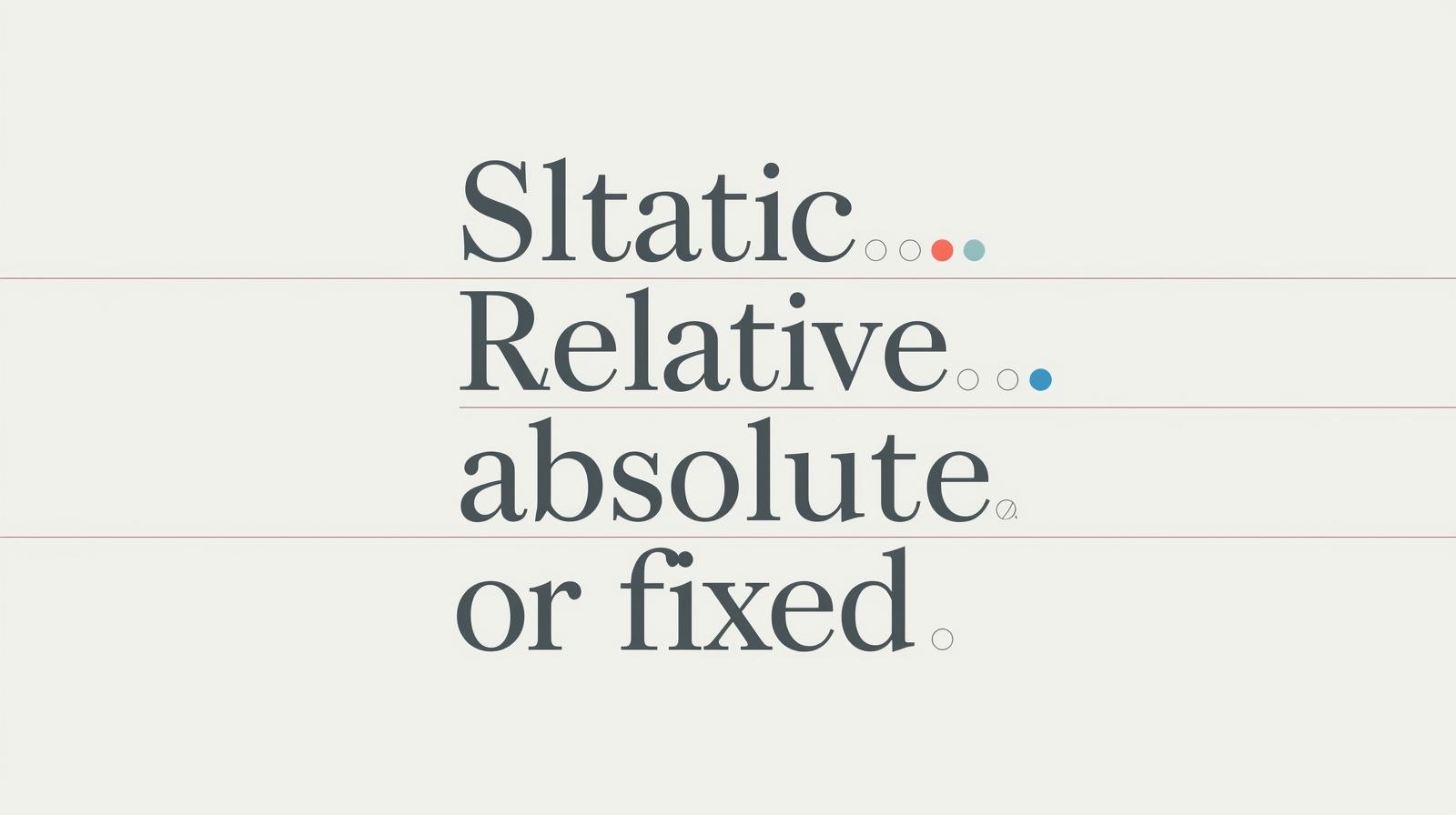
In simple terms, a font fallback is a prioritized list of fonts you tell the browser to use. You're basically giving the browser a set of instructions:
"Hey browser, try to load this first font I really want. If you can't, for whatever reason, don't panic. Just move on to the next one on the list. And if you can't find that, use this super generic one that you definitely have."
You do this using the font-family property in CSS. This list of fonts is called a font stack.
Here's a basic example:
css
body {
    font-family: 'Helvetica Neue', Helvetica, Arial, sans-serif;
}
Let's break down what the browser does here:
Tries to load
Helvetica Neue.If that's not found, it tries
Helvetica.If even that fails, it tries
Arial.If all else fails, it just uses the default
sans-seriffont on the user's system (like Roboto on Android or San Francisco on macOS).
See how that works? You're guiding the browser gracefully down a ladder of options instead of letting it fall off a cliff.
Why Bother? This Seems Like a Small Thing.
Glad you asked! This "small thing" has massive implications:
Performance & Perceived Performance: If your custom font is large or takes time to load from a server (like Google Fonts), the text will be invisible until it loads (if you have
font-display: swapset) or will show a system font and then suddenly "flash" into the new one. A smart fallback ensures the text is readable immediately with a font that has similar dimensions, preventing a jarring layout shift.Reliability & Resilience: The web is a wild place. Networks fail. CDNs have outages. A proper fallback stack makes your site resilient to these issues. The show will always go on.
Cross-Platform Consistency: You want your site to feel at home on a Windows PC, a Mac, an Android phone, and an iPhone. Each of these systems has different fonts installed. A well-crafted font stack helps you get as close as possible to a consistent look everywhere, even when your first-choice font isn't available.
Crafting the Perfect Font Stack: It's an Art and a Science
You can't just throw random fonts into a list. The goal is to find fallback fonts that are metrically similar to your primary font. This means they have a similar width, height, and x-height, so the layout of your page doesn't dramatically change when the fallback kicks in.
Let's look at some real-world examples.
Example 1: The Modern Sans-Serif (e.g., Inter, Poppins)
You're using a clean, modern sans-serif like Inter. Throwing Arial as a fallback is okay, but we can do better.
Good:
css
font-family: 'Inter', Arial, sans-serif;Better (More Cross-Platform):
css
font-family: 'Inter', 'Segoe UI', Tahoma, Geneva, Verdana, sans-serif;Segoe UIis the system font for Windows.TahomaandVerdanaare common on older Windows systems.Genevais common on macOS.
Example 2: The Elegant Serif (e.g., Playfair Display, Lora)
For a beautiful serif font like Lora, you don't want to fall back to the default serif (which is often Times New Roman). Let's get more specific.
Good:
css
font-family: 'Lora', 'Times New Roman', serif;Better:
css
font-family: 'Lora', Georgia, 'Times New Roman', Times, serif;Georgiais a much more elegant and web-friendly serif font that's widely available.
Example 3: The Monospace (for code)
When displaying code, consistency is key. You want every character to be the same width.
The Gold Standard:
css
font-family: 'Fira Code', 'Courier New', Courier, monospace;Fira Codeis a fantastic programming font with ligatures.Courier Newis the most common monospace font on Windows and macOS.The generic
monospaceat the end is your final safety net.
Level Up: Using @font-face for Ultimate Control
When you use @font-face to host your own fonts, you can define your fallbacks right at the source. This is next-level stuff.
The magic lies in the local() function. You can tell the browser to first check if the user already has a specific font installed on their device before downloading it.
css
/* Define your custom font */
@font-face {
    font-family: 'MyCustomFont';
    src: local('MyCustomFont'), /* Check if it's installed locally */
         url('mycustomfont.woff2') format('woff2'), /* If not, download it */
         url('mycustomfont.woff') format('woff');
    font-weight: 400;
    font-display: swap; /* This tells the browser to use the fallback first, then swap in the font when it loads. */
}

body {
    font-family: 'MyCustomFont', 'Segoe UI', Tahoma, sans-serif;
}
This is a huge performance win! If the user has the font locally, the browser uses it instantly with zero network request.
Best Practices You Should Actually Follow
Always End with a Generic Family: This is non-negotiable. Your stack should always end with
sans-serif,serif,monospace,cursive, orfantasy. It's the ultimate safety net.Use
font-display: swap: This CSS property is a game-changer. It tells the browser to use the fallback font immediately and then "swap" in your custom font once it loads. This eliminates the FOIT (Flash of Invisible Text) and is much better for user experience.Quote Font Names with Spaces: If a font family name has spaces, it must be wrapped in quotes.
'Helvetica Neue'is correct.Helvetica Neueis not.Test, Test, Test! Use your browser's developer tools! You can manually disable your custom fonts to simulate a failure and see how your fallbacks hold up.
FAQs: Your Font Fallback Questions, Answered
Q: What's the single most common mistake you see with font fallbacks?
A: Easy. Not using them at all, or just using one custom font and then the generic family. Always build a robust stack of 2-3 specific fallbacks before the generic one.
Q: How do I find a good fallback for a really unique font?
A: Use tools like Font Style Matcher (just search for it, it's a web tool). You can input your primary font and a potential fallback, and it will show you a side-by-side comparison of their metrics, helping you minimize layout shift.
Q: Are Google Fonts automatically fallback-proof?
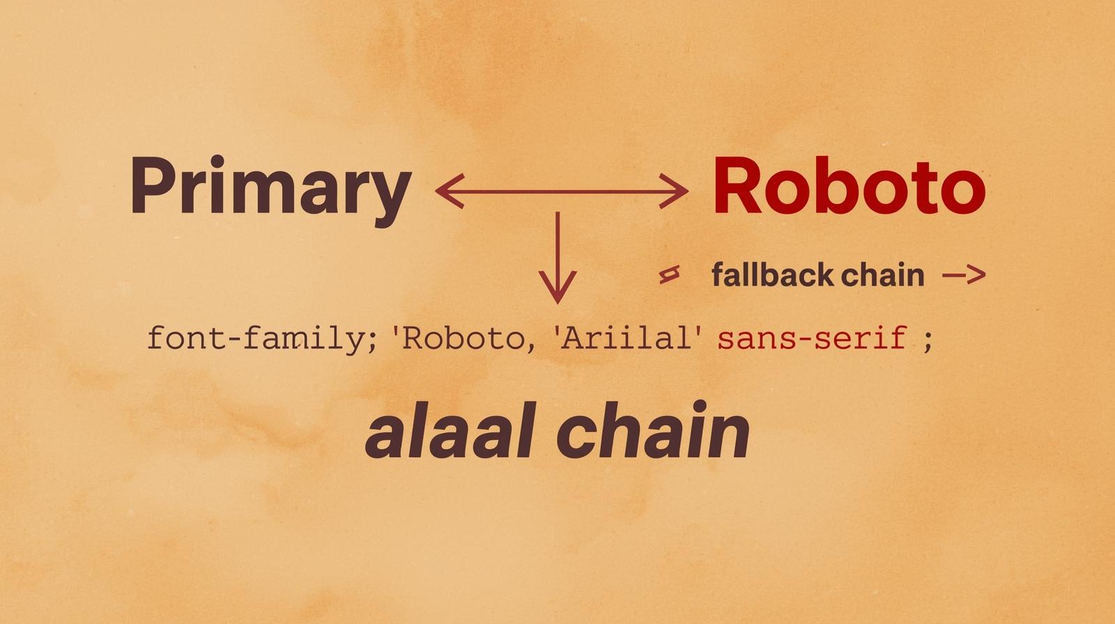
A: No! When you embed a Google Font, it only gives you the font-family declaration for that one font. It's up to you to add the fallback stack afterward. For example:
```css
/* From Google */
font-family: 'Roboto', sans-serif;
text
/* Your improved version */
font-family: 'Roboto', 'Segoe UI', Tahoma, sans-serif;
```
Q: Does this matter for icon fonts (like FontAwesome)?
A: Absolutely. For icon fonts, your fallback strategy is crucial to prevent random characters from showing up if the icon font fails. A common practice is to set a generic family that doesn't contain those characters, like sans-serif, to ensure a blank box is shown instead of a random letter.
Conclusion: Stop Gambling With Your Typography
Think of font fallbacks not as an optional extra, but as a core part of your CSS foundation. It’s a small amount of effort that pays massive dividends in reliability, user experience, and professional polish. In a world where users will bounce from a site in seconds if it feels "off," ensuring your text always renders cleanly is non-negotiable.
Mastering these subtle yet powerful details is what separates hobbyists from professional developers. It’s the kind of nuanced skill that makes a website truly robust.
Speaking of going from hobbyist to pro, if you're serious about leveling up your web development skills, this is just the beginning. To learn professional software development courses such as Python Programming, Full Stack Development, and the MERN Stack, visit and enroll today at codercrafter.in. We break down complex topics like this, giving you the in-depth knowledge to build fast, beautiful, and unbreakable web applications.