Build a Reusable Angular Component Library: A Complete Guide

Learn how to create a scalable, maintainable, and reusable component library in Angular. Step-by-step guide with best practices, examples, and FAQs to boost your development workflow.
Building Your Own Reusable Angular Component Library: A Guide to Scalability and Consistency
Imagine you’re building a house. You wouldn't craft every single nail, screw, and door hinge from scratch each time, would you? You'd use standardized, reliable parts that you know will fit and work every time. The same principle is at the heart of modern software development, especially in front-end frameworks like Angular.
This is where the concept of a Reusable Component Library comes in. It’s the single source of truth for your UI (User Interface) – a collection of pre-built, battle-tested Lego blocks that your team can use to assemble applications with speed, consistency, and minimal bugs.
In this deep dive, we're going to roll up our sleeves and walk through the entire process of creating your very own reusable component library in Angular. We'll go beyond the basics, covering the "why," the "how," and the crucial best practices that separate a good library from a great one.
Why Bother? The Compelling Case for a Component Library
Before we write a single line of code, let's solidify the "why." Investing time in a component library isn't just a technical exercise; it's a strategic decision that pays massive dividends.
Unbeatable Consistency: Every
app-button,data-table, ormodal-dialoglooks and behaves identically across your entire ecosystem of applications. This is a godsend for brand identity and user experience.Blazing-Fast Development: Need a new form? Instead of building and styling a dozen input fields, you grab them from your library. Development becomes an assembly line, not an artisanal craft for every feature.
Simplified Maintenance: Found a bug in your button component? Fix it in one place, and it's automatically fixed everywhere it's used. This is a maintenance dream.
Improved Team Collaboration: Designers and developers can speak the same language. A component library acts as a contract between them, reducing ambiguity and rework.
Easy Onboarding: New developers can become productive much faster. They don't need to learn the nuances of your UI; they just need to learn which components to use and how.
To learn professional software development courses such as Python Programming, Full Stack Development, and MERN Stack, which cover these fundamental architectural concepts, visit and enroll today at codercrafter.in.
Laying the Foundation: Setting Up Your Library Project
You don't want your component library to live inside a specific application. It needs to be a standalone, publishable project. The Angular CLI provides the perfect tool for this: Workspaces.
Let's create our workspace and library project.
Generate a New Workspace:
We'll start by creating a new workspace, which will house both our application (for testing the library) and the library itself.bash
ng new my-component-workspace --create-application=false
cd my-component-workspace
The
--create-application=falseflag tells the CLI to create an empty workspace.Generate the Library:
Now, let's generate our library, which we'll callui-lib.bash
ng generate library ui-libThis command creates a
/projects/ui-libfolder in your workspace. This is your library! It has its ownng-package.json(for building),public-api.ts(which controls what parts of your library are exposed), and atsconfig.lib.json.Generate a Test Application (Optional but Recommended):
To test our components as we build them, let's create a test application within the same workspace.bash
ng generate application playgroundThis creates a
/projects/playgroundfolder. You can serve this app withng serve playgroundand use it to visually test your library components.
Crafting Your First Reusable Component: A Button
Let's build a classic example: a reusable button. A simple button is deceptively complex. It needs to handle types (primary, secondary), sizes (small, medium, large), disabled states, and click events.
Generate the Button Component:
Inside your workspace, navigate to the library project and generate the component.bash
ng generate component button --project=ui-libDefine the Inputs and Outputs (
button.component.ts):
The reusability magic happens with the@Input()and@Output()decorators. They define the API for your component.typescript
// projects/ui-lib/src/lib/button/button.component.ts
import { Component, Input, Output, EventEmitter } from '@angular/core';

export type ButtonVariant = 'primary' | 'secondary' | 'danger';
export type ButtonSize = 'sm' | 'md' | 'lg';

@Component({
  selector: 'lib-button',
  templateUrl: './button.component.html',
  // We use styleUrls for scoped styles
  styleUrls: ['./button.component.css']
})
export class ButtonComponent {
  @Input() variant: ButtonVariant = 'primary';
  @Input() size: ButtonSize = 'md';
  @Input() disabled: boolean = false;

  @Output() buttonClick = new EventEmitter<Event>();

  onClick(event: Event) {
    if (!this.disabled) {
      this.buttonClick.emit(event);
    }
  }
}
Create the Flexible Template (
button.component.html):
The template uses Angular's class binding to apply different CSS classes based on the input properties.html
<!-- projects/ui-lib/src/lib/button/button.component.html -->
<button
  class="btn btn--{{variant}} btn--{{size}}"
  [disabled]="disabled"
  (click)="onClick($event)"
  type="button">
  <ng-content></ng-content>
</button>
The
<ng-content></ng-content>tag is a game-changer. It's a projection point, allowing the user of the component to inject their own content (like text or an icon) inside the button.Style with Scalability in Mind (
button.component.css):
We use CSS classes to manage the different visual states. A common practice is to use a base.btnclass and then modifiers.css
/* projects/ui-lib/src/lib/button/button.component.css */
.btn {
  border: none;
  border-radius: 4px;
  font-family: inherit;
  cursor: pointer;
  transition: all 0.2s ease-in-out;
  display: inline-flex;
  align-items: center;
  justify-content: center;
}

.btn:disabled {
  opacity: 0.6;
  cursor: not-allowed;
}

/* Variants */
.btn--primary {
  background-color: #3f51b5;
  color: white;
}
.btn--primary:hover:not(:disabled) {
  background-color: #303f9f;
}

.btn--secondary {
  background-color: #f5f5f5;
  color: #333;
  border: 1px solid #ddd;
}

/* Sizes */
.btn--sm { padding: 0.4rem 0.8rem; font-size: 0.875rem; }
.btn--md { padding: 0.6rem 1.2rem; font-size: 1rem; }
.btn--lg { padding: 0.8rem 1.6rem; font-size: 1.125rem; }
Export Your Component (
public-api.ts):
This is a critical step. You must export your component from the library's public API so that it can be used by other applications.typescript
// projects/ui-lib/src/public-api.ts
export * from './lib/button/button.component';
// We'll export other components here as we build them
Leveling Up: Advanced Patterns for a Robust Library
A button is a great start, but a real-world library needs more sophisticated patterns.
1. Theming with CSS Custom Properties:
Hard-coding colors like #3f51b5 is inflexible. Instead, use CSS variables (custom properties). Define them at a higher level (e.g., :root in your main app) and reference them in your library.
Update your button CSS:
css
.btn--primary {
  background-color: var(--primary-color, #3f51b5); /* Fallback to #3f51b5 */
  color: var(--on-primary-color, white);
}
Now, any consuming application can define its own --primary-color and --on-primary-color to theme the entire library.
2. Content Projection with Multiple Slots:
What if you want an icon on the left or right of the button text? Use multiple <ng-content> tags with the select attribute.
In your button.component.html:
html
<button class="btn ...">
  <ng-content select="[prefix]"></ng-content>
  <ng-content></ng-content> <!-- This is the default slot -->
  <ng-content select="[suffix]"></ng-content>
</button>
In the consuming app:
html
<lib-button>
  <i prefix class="fas fa-download"></i>
  Download Now
  <i suffix class="fas fa-chevron-right"></i>
</lib-button>
3. Building a Complex Data Table Component:
A data table component would accept an @Input() data: any[] and @Input() columns: ColumnConfig[]. The template would then use *ngFor to dynamically create the headers and rows based on this configuration. This pattern is powerful and demonstrates how a complex UI can be abstracted into a simple, reusable interface.
Mastering these patterns is key to becoming a proficient Angular developer. To learn professional software development courses such as Python Programming, Full Stack Development, and MERN Stack, which dive deep into these advanced architectural concepts, visit and enroll today at codercrafter.in.
Building, Packaging, and Publishing
Once your components are ready, you need to build and package them.
Build the Library:
bash
ng build ui-lib --configuration productionThis creates a
dist/ui-libfolder with the compiled, npm-ready package.Versioning and Publishing:
Navigate to thedistfolder and runnpm publish. You'll need an npm account. Use semantic versioning (major.minor.patch) for your releases.
Best Practices for a Long-Lived Library
Documentation is Non-Negotiable: Use tools like Storybook or Compodoc to create a living style guide and documentation. Show examples for every component state.
Write Tests: Your library is a dependency. It must be reliable. Write comprehensive unit tests (with Jasmine/Karma) for your components' logic and visual states.
Semantic Versioning (SemVer): Follow SemVer strictly. A breaking change (like renaming an
@Input()) requires a major version bump.Accessibility (a11y): Build for everyone. Use proper ARIA attributes, ensure keyboard navigation, and support screen readers. This isn't a feature; it's a requirement.
Frequently Asked Questions (FAQs)
Q1: Should I just use a pre-built library like Angular Material?
A: Angular Material is excellent. The decision is "buy vs. build." If your needs are standard and you want speed, use Material. If you have a very unique brand identity or complex business-specific components, building your own is the way to go.
Q2: How do I handle updates without breaking existing apps?
A: This is where SemVer and careful planning come in. Avoid breaking changes in minor and patch releases. For deprecations, mark the old API as deprecated in the documentation and remove it only in a major release.
Q3: Can I use this library in non-Angular projects?
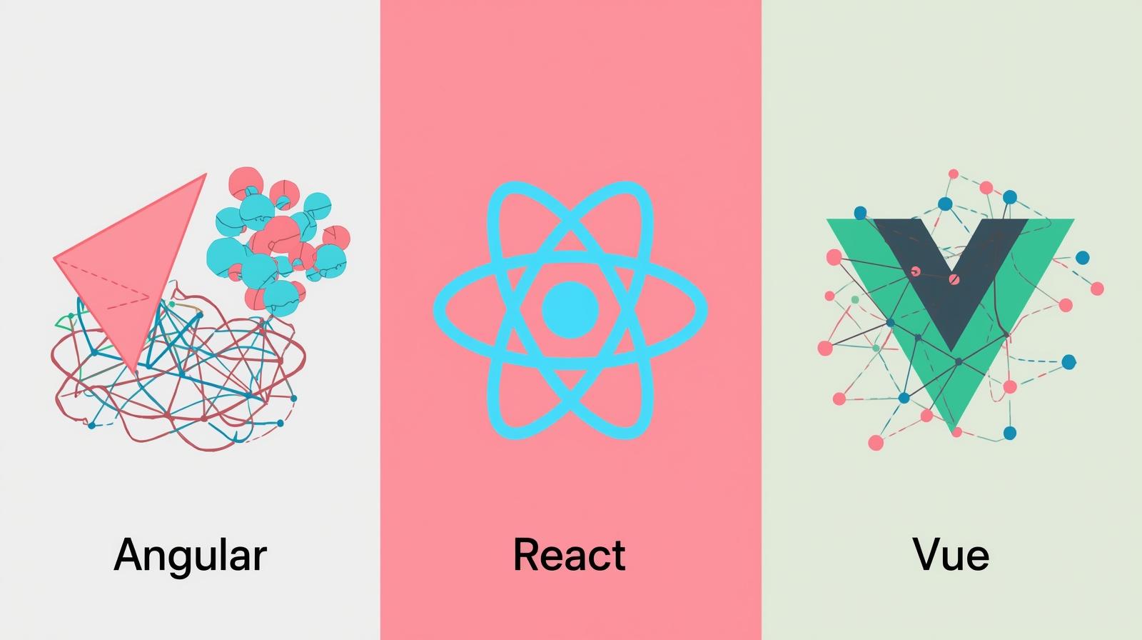
A: A standard Angular library cannot be used in React or Vue. However, you can explore "Web Components" by using Angular Elements to package your components as framework-agnostic custom elements.
Conclusion: Your Foundation for Scalable Applications
Building your own reusable Angular component library is a journey. It starts with a simple button and evolves into a comprehensive design system that becomes the bedrock of your front-end development. It enforces consistency, accelerates development, and dramatically reduces long-term maintenance costs.
It’s a practice that separates hobby projects from professional, enterprise-grade software. The initial investment of time and effort is returned a hundredfold as your applications grow and your team scales.
Ready to take your Angular skills to the next level and master the art of building scalable, maintainable software architectures? To learn professional software development courses such as Python Programming, Full Stack Development, and MERN Stack, visit and enroll today at codercrafter.in. Start building your future, one component at a time.