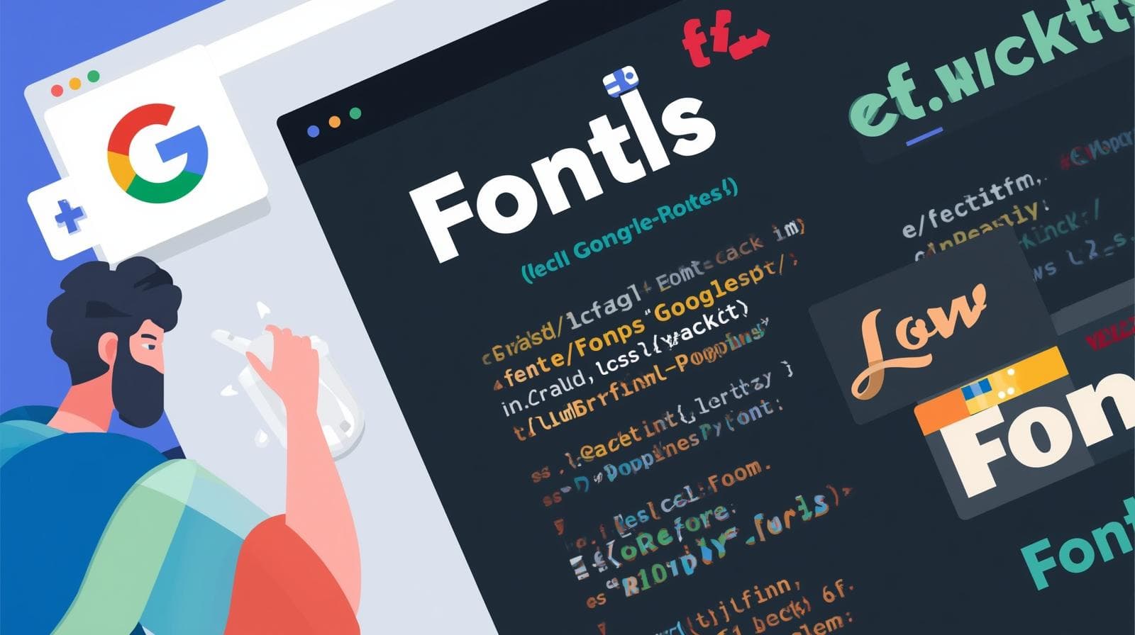
Stop Using Boring Fonts! A 2025 Guide to CSS Google Fonts
Level up your web design with CSS Google Fonts. Our in-depth guide covers how to use them, best practices, performance tips, and real-world examples
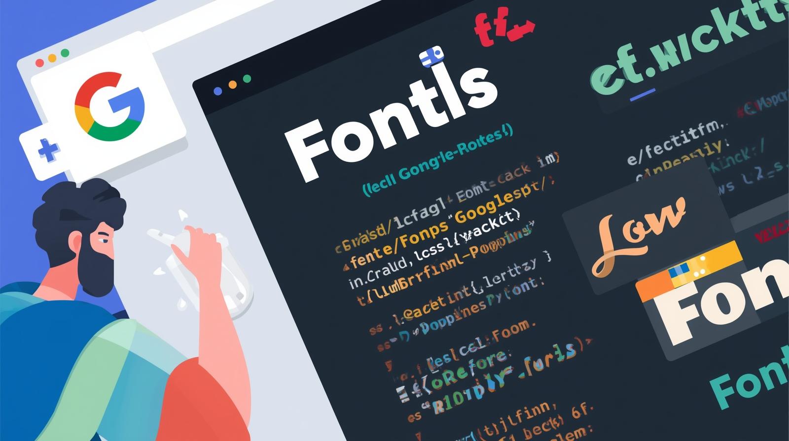
Stop Using Boring Fonts! A 2025 Guide to CSS Google Fonts
top Using Boring Fonts! Your 2025 Guide to CSS Google Fonts
Let's be real for a second. How many times have you landed on a website and thought, "Wow, this looks... exactly the same as every other website"? Arial, Helvetica, Times New Roman—they're the plain white t-shirts of the web. They get the job done, but they don't exactly make a statement.
What if you could dress your website in a custom-designed outfit that screams your brand's personality? That’s the power of typography. And the easiest, most powerful way to get started is with CSS Google Fonts.
In this deep dive, we're not just going to skim the surface. We're going to get into the nitty-gritty of how to use Google Fonts, why they're awesome, the pitfalls to avoid, and how to make your text look so good that people will want to read it just for the aesthetics. Buckle up!
What Exactly Are Google Fonts?
In the simplest terms, Google Fonts is a massive, free, and open-source library of web fonts. Think of it as a gigantic, free-to-use wardrobe for your website's text. Before services like this, using a custom font was a huge pain—involving complex licensing, file hosting, and compatibility issues.
Google Fonts changed the game. It offers over 1,500 font families that you can use on your website with just a few lines of code. No downloads, no licensing fees, no headaches. It’s a developer's and designer's best friend.
Why Should You Even Bother? The Real-World Perks
"Why not just stick with the system fonts?" I hear you ask. Here’s why:
Brand Identity: Your font is a huge part of your brand. A tech startup might use a clean, geometric sans-serif like Poppins or Montserrat, while a luxury bakery might opt for an elegant serif like Cormorant Garamond. The font sets the mood before a single word is read.
Improved User Experience (UX): Good typography is readable typography. A well-chosen font with proper sizing, spacing, and line height can make your content a joy to read, keeping visitors on your page longer.
Visual Hierarchy: Using different font weights (like Light, Regular, Semi-Bold, Bold) and styles, you can guide your user's eye. The headline grabs attention, the subheadings break up content, and the body text is comfortable for long reads.
It's Just... Modern: Let's face it, using custom fonts makes your site look more professional and current. It shows you care about the details.
How to Use Google Fonts: A Step-by-Step Guide (No Fluff)
Alright, let's get our hands dirty. Adding a Google Font to your website is a two-step process: grabbing the code from Google, and then using it in your CSS.
Step 1: The <link> Method (The Easiest Way)
This is the most common method and is perfect for most use cases.
Head to the Google Fonts Website.
Browse or search for a font. Let's pick two popular ones:
Robotofor the body andOswaldfor headings.Select the font(s). Click on the "+" icon next to each font family you want.
Review your selection. A drawer will appear at the bottom of the screen. Click on it.
Get the code.
In the "Embed Font" section, you'll see a
<link>tag. Copy this and paste it into the<head>of your HTML file.
html
<!DOCTYPE html>
<html>
<head>
    <title>My Awesome Site</title>
    <!-- This is the Google Fonts link -->
    <link rel="preconnect" href="https://fonts.googleapis.com">
    <link rel="preconnect" href="https://fonts.gstatic.com" crossorigin>
    <link href="https://fonts.googleapis.com/css2?family=Oswald:wght@400;700&family=Roboto:ital,wght@0,400;0,700;1,400&display=swap" rel="stylesheet">

    <!-- Your CSS file -->
    <link rel="stylesheet" href="style.css">
</head>
<body>
    ...
</body>
</html>
Pro Tip: Notice the
preconnectlinks? They help with performance by establishing early connections to the font servers. Google provides them, so use them!
Step 2: The CSS font-family Rule
Now that the font is "loaded" onto your page, you can use it in your CSS. Copy the rules from the "Specify in CSS" section in the Google Fonts drawer and paste them into your stylesheet.
css
/* Define the fonts for your elements */
body {
  font-family: 'Roboto', sans-serif;
  font-weight: 400; /* This is the regular weight */
  line-height: 1.6;
}

h1, h2, h3 {
  font-family: 'Oswald', sans-serif;
  font-weight: 700; /* This is the bold weight we selected */
}

.italic-text {
  font-family: 'Roboto', sans-serif;
  font-style: italic;
  font-weight: 400;
}
And that's it! Your website is now rocking custom fonts.
The @import Method (The CSS Way)
If you prefer to keep everything in your CSS file, you can use the @import method. Simply copy the @import rule from Google Fonts and paste it at the very top of your CSS file.
css
/* At the top of your style.css file */
@import url('https://fonts.googleapis.com/css2?family=Oswald:wght@400;700&family=Roboto:ital,wght@0,400;0,700;1,400&display=swap');

/* Then proceed with the rest of your CSS */
body {
  font-family: 'Roboto', sans-serif;
}
...
Which method is better? The <link> method is generally preferred for performance reasons, as it allows the browser to download the font without blocking the CSS parsing. But both work perfectly fine.
Real-World Use Cases & Font Pairing Ideas
Choosing fonts can be overwhelming. Here are some classic combinations to get you inspired:
The Modern SaaS/Startup: Inter (Body) + Poppins (Headings). Clean, professional, and highly readable.
The Elegant Editorial/Blog: Merriweather (Body) + Source Sans Pro (Headings). A classic serif/sans-serif combo that oozes credibility.
The Bold & Playful Brand: Montserrat (Headings) + Open Sans (Body). Montserrat has a ton of character, while Open Sans is a incredibly versatile body font.
Want to master the art of creating beautiful, functional UIs like this? To learn professional software development courses such as Python Programming, Full Stack Development, and MERN Stack, visit and enroll today at codercrafter.in. Our project-based curriculum ensures you learn these skills by building real things.
Best Practices & Pro Tips (Don't Skip This!)
Don't Go Font-Crazy: Limit yourself to 2, maybe 3, font families per project. Too many fonts make your site look messy and unprofessional.
Performance Matters: Every font you add is an extra HTTP request. Only select the font weights and styles you actually need. Do you really need Thin, Extra Light, Light, Regular, Medium, Semi-Bold, Bold, and Extra-Bold? Probably not. Just pick Regular (400) and Bold (700) to start.
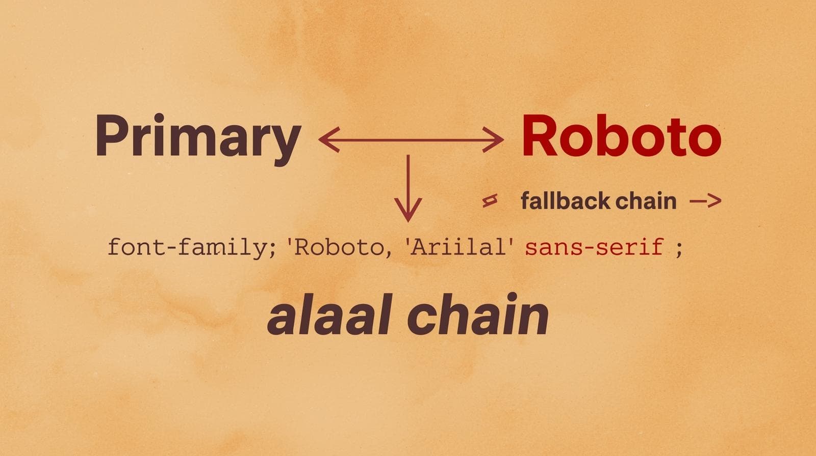
Always Provide Fallbacks: Notice we used
font-family: 'Roboto', sans-serif;. Thesans-serifat the end is a fallback. If the Google Font fails to load for any reason, the browser will use the default sans-serif font on the user's system. This is a crucial practice.Mind the Loading Flash: You might see a "Flash of Unstyled Text" (FOUT) where the system font shows for a split second before the custom font loads. This is normal. Using
font-display: swap;in your font request (which Google Fonts now does by default) helps mitigate this by showing the fallback font immediately and then swapping in the custom font once it's loaded.
Frequently Asked Questions (FAQs)
Q1: Are Google Fonts really free for commercial use?
A: Yes! 100%. All fonts on the Google Fonts directory are open source and licensed for both personal and commercial use. You can use them on your client's websites, your own products, anything.
Q2: How many Google Fonts can I use on one site?
A: Technically, as many as you want. But from a performance and design standpoint, you shouldn't use more than 2-3. Every new font adds to your page load time.
Q3: Can I download Google Fonts for my desktop design software (like Photoshop)?
A: Absolutely! On the Google Fonts website, when you select a font, there's a "Download family" button in the drawer. You can install them on your computer just like any other font.
Q4: My font isn't showing up! What's wrong?
A: Let's troubleshoot:
Did you paste the
<link>in the HTML<head>?Did you spell the
font-familyname correctly in your CSS? (Check for typos and quotation marks).Did you select the correct weight? If you only selected
font-weight: 700, usingfont-weight: 800won't work.
Conclusion: Typography is a Superpower
Moving from system fonts to Google Fonts is one of the easiest and most impactful upgrades you can make to a website. It transforms your site from generic to unique, from boring to engaging. It’s a core skill for any web developer or designer.
So, go ahead. Experiment. Play with pairings. See what speaks to you and your brand. And remember, great typography isn't about being flashy; it's about communicating your message with clarity and style.
Feeling inspired to build the next generation of beautiful, fast, and user-friendly websites? The journey starts with a solid foundation. To learn professional software development courses such as Python Programming, Full Stack Development, and MERN Stack, visit and enroll today at codercrafter.in. Let's build the future, one line of code at a time.