Master CSS Text Spacing: A Guide to Line Height, Letter Spacing & More
Stop guessing font spacing! Learn how to use CSS text spacing properties like line-height, letter-spacing, and word-spacing to create professional, readable, and beautiful web typography. Enroll in CoderCrafter's courses to master web development.
Master CSS Text Spacing: A Guide to Line Height, Letter Spacing & More
Stop Guessing Font Spacing: The Ultimate Guide to CSS Text Spacing
Let's be real. We spend hours picking the perfect font, and then what? We just plop it onto the page and hope for the best. The text looks cramped, the lines are too close together, and honestly, it just doesn't have that professional vibe.
Sound familiar? You're not alone.
The secret sauce that separates an amateur-looking website from a slick, polished one often isn't the font itself—it's the spacing. Proper text spacing is like the kerning of web design; when it's right, you don't notice it, but when it's wrong, it screams "unprofessional."
So, let's fix that. In this deep dive, we're breaking down every CSS property you need to transform your text from "meh" to magnificent. Let's get into it.
The Core Squad: Meet Your CSS Text Spacing Properties
Think of these as your essential toolkit. Master these, and you've solved 95% of your typography spacing problems.
1. line-height: Your Best Friend for Readability
What it is: Simply put, line-height controls the vertical space between lines of text. It's the distance from one baseline to the next.
Why it's a big deal: Poor line height is the number one culprit for text that's exhausting to read. Too little, and it feels claustrophobic. Too much, and the reader gets lost trying to find the next line.
How to use it:
You can set it with a unitless number (recommended!), a length (like px, em), or a percentage.
css
/* Unitless (BEST PRACTICE) - it's a multiplier of the font-size */
p {
  line-height: 1.6;
}

/* Using Pixels (okay, but less flexible) */
p {
  line-height: 24px;
}

/* Using Ems (also good) */
p {
  line-height: 1.5em;
}
Pro Tip: Using a unitless number (like 1.5 or 1.6) is the way to go. Why? Because it's a multiplier based on the element's own font-size. If the font size changes, the line height scales proportionally. No math required!
Real-World Use Case: For body text, a line-height between 1.5 and 1.7 is generally the sweet spot for optimal readability. For headings, which are larger, you can often go tighter, around 1.2 to 1.4.
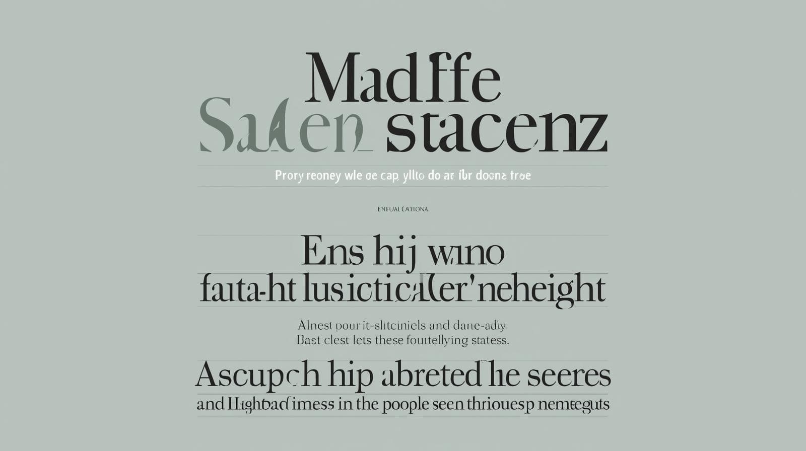
2. letter-spacing: The Mood Setter
What it is: This property controls the space between each individual character. Also known as tracking.
Why it's a big deal: letter-spacing is less about readability and more about aesthetics and tone. Tight letter-spacing can feel modern and bold, while increased letter-spacing can feel elegant, open, or even eerie.
How to use it:
You typically use px or em for this. em is often preferred because it scales with the font size.
css
/* Tight spacing for a bold, compact look */
.hero-title {
  letter-spacing: -0.5px;
}

/* Increased spacing for an elegant, airy feel */
.subtitle {
  letter-spacing: 0.1em;
}

/* A LOT of spacing for a stylistic effect (use sparingly!) */
.styled-heading {
  letter-spacing: 0.25em;
  text-transform: uppercase;
}
Real-World Use Case: Uppercase text (like in navigation menus or small headings) always benefits from a little extra letter-spacing. It dramatically improves legibility and looks super pro.
3. word-spacing: The Paragraph Pacer
What it is: This adjusts the space between—you guessed it—words.
Why it's a big deal: It's less commonly used than line-height and letter-spacing, but it's crucial for fine-tuning. Too much word spacing can make text look broken, while too little can make it feel cramped.
How to use it:
Similar to letter-spacing, it accepts px, em, etc.
css
/* Slightly increase word spacing for a more open, "justified" feel */
article p {
  word-spacing: 0.05em;
}
Real-World Use Case: It can be useful when trying to mimic the look of justified text without the weird river-like gaps that text-align: justify can sometimes create.
Beyond the Basics: The Supporting Cast
These properties give you even more granular control.
text-indent: Indents the first line of a text block. Classic magazine style.css
.magazine-style { text-indent: 2em; }white-space: This boss controls how whitespace inside an element is handled. Want to prevent text from wrapping?white-space: nowrap;. Want to preserve spaces and line breaks like in code?white-space: pre;.
Putting It All Together: A Real-World Example
Let's style a modern blog card.
HTML:
html
<article class="blog-card">
  <h2>The Future of Web Design is Here</h2>
  <p>Lorem ipsum dolor sit amet, consectetur adipiscing elit. Sed do eiusmod tempor incididunt ut labore et dolore magna aliqua. Ut enim ad minim veniam...</p>
  <a href="#">Read More</a>
</article>
CSS:
css
.blog-card {
  width: 350px;
  padding: 2rem;
  background: #fff;
  border-radius: 12px;
  box-shadow: 0 4px 12px rgba(0, 0, 0, 0.1);
}

.blog-card h2 {
  font-size: 1.5rem;
  line-height: 1.3; /* Tighter for headings */
  letter-spacing: -0.02em; /* Slightly tight for a modern look */
  margin-bottom: 1rem;
  color: #333;
}

.blog-card p {
  font-size: 1rem;
  line-height: 1.6; /* Perfect for reading */
  color: #666;
  margin-bottom: 1.5rem;
}

.blog-card a {
  text-transform: uppercase;
  font-weight: bold;
  letter-spacing: 0.08em; /* Crucial for uppercase text! */
  text-decoration: none;
  color: #007bff;
}
See how we used a combination of properties to create hierarchy, readability, and style? That's the power of precise text spacing.
Best Practices You Should Actually Follow
Prioritize Readability: Always. Your
line-heightis your most important tool here. Don't sacrifice it for a "cool" layout.Context is King: A
line-heightof1.2might be great for a heading but terrible for a paragraph. Always adjust based on the element's role and font size.Test on Real Devices: What looks good on your giant monitor might be unreadable on a phone. Always, always test.
Use a Typographic Scale: Establish a system for your font sizes and corresponding line heights. It creates rhythm and consistency across your entire site.
Don't Overdo It: Subtle adjustments in
letter-spacingandword-spacingare key. A little goes a long way.
Mastering these details is what separates hobbyists from professionals. If you're serious about building beautiful, functional, and user-friendly websites, a structured learning path is essential. To learn professional software development courses such as Python Programming, Full Stack Development, and MERN Stack, visit and enroll today at codercrafter.in. Our courses are designed to take you from fundamentals to job-ready, covering crucial front-end details like this and so much more.
FAQs: Your Text Spacing Questions, Answered
Q: What's the difference between px and em for spacing?
A: px is an absolute unit—it's fixed. em is a relative unit based on the current element's font-size. If you set letter-spacing: 0.1em; on a 32px heading, the spacing is 3.2px. On a 16px paragraph, it's 1.6px. It scales automatically, which is usually what you want.
Q: Can I use negative values?
A: Absolutely! Negative values for letter-spacing and word-spacing are totally valid. They tighten the space. Just be careful not to make characters overlap and become unreadable.
Q: How does text spacing affect SEO and Accessibility?
A: Indirectly, but significantly. Google prioritizes user experience. Good readability (thanks to proper line-height) leads to longer time on site, which is a positive signal. For accessibility, sufficient line height is critical for users with dyslexia or other visual impairments. The Web Content Accessibility Guidelines (WCAG) recommend a line height of at least 1.5.
Q: Is there a shorthand for all these properties?
A: Not really. While the font shorthand is powerful, it doesn't cover letter-spacing or word-spacing. line-height can be included in the font shorthand (e.g., font: 1rem/1.6 "Helvetica", sans-serif;), but you'll still need to define the others separately.
Conclusion: Stop Hoping, Start Spacing
Text spacing isn't just a minor detail; it's a foundational pillar of good web design. By taking control of line-height, letter-spacing, and word-spacing, you gain the power to directly influence how users feel and interact with your content.
It’s the difference between a wall of text that people skip and a beautifully crafted piece they enjoy reading. So, open up your dev tools, start experimenting with these properties, and watch your designs level up instantly.
And remember, if you want to master these skills systematically and build a career in tech, the best way is to learn from industry experts. To learn professional software development courses such as Python Programming, Full Stack Development, and MERN Stack, visit and enroll today at codercrafter.in.