Master CSS Image Centering: A No-BS Guide for 2025

Struggling to center an image with CSS? This ultimate guide covers everything from basic tricks to Flexbox & Grid. Stop guessing and start coding like a pro
Master CSS Image Centering: A No-BS Guide for 2025
Master CSS Image Centering: The 2025 No-BS Guide
Alright, let's talk about a rite of passage for every web developer: the seemingly simple, yet soul-crushingly tricky task of centering an image with CSS.
You’ve been there. You type align="center" (because you saw it in a 2005 tutorial), and... nothing. You try a few random CSS properties, refresh the page a dozen times, and the image is still stubbornly stuck in the corner, mocking you. It’s a universal experience.
But what if I told you that centering an image isn't about memorizing magic spells? It's about understanding a few core concepts. Once you get them, you'll be centering anything—images, divs, your life choices—with ease.
This isn't just another tutorial. This is your definitive guide. We'll go from the stone-age methods to the modern, powerful techniques that actually make sense. So, grab your coffee, and let's demystify this once and for all.
First Things First: The Basics Are Not Always the Best
Before we dive into the code, let's set up a simple scenario. You have an image, and you want to put it in the middle of its container.
html
<div class="container">
  <img src="your-awesome-image.jpg" alt="A descriptive alt text">
</div>
And some basic CSS for the container so we can see what's happening:
css
.container {
  width: 100%;
  height: 400px;
  background-color: #f0f0f0; /* A nice light grey */
  border: 2px dashed #ccc; /* A dashed border to see the edges */
}
Now, let's get that image centered.
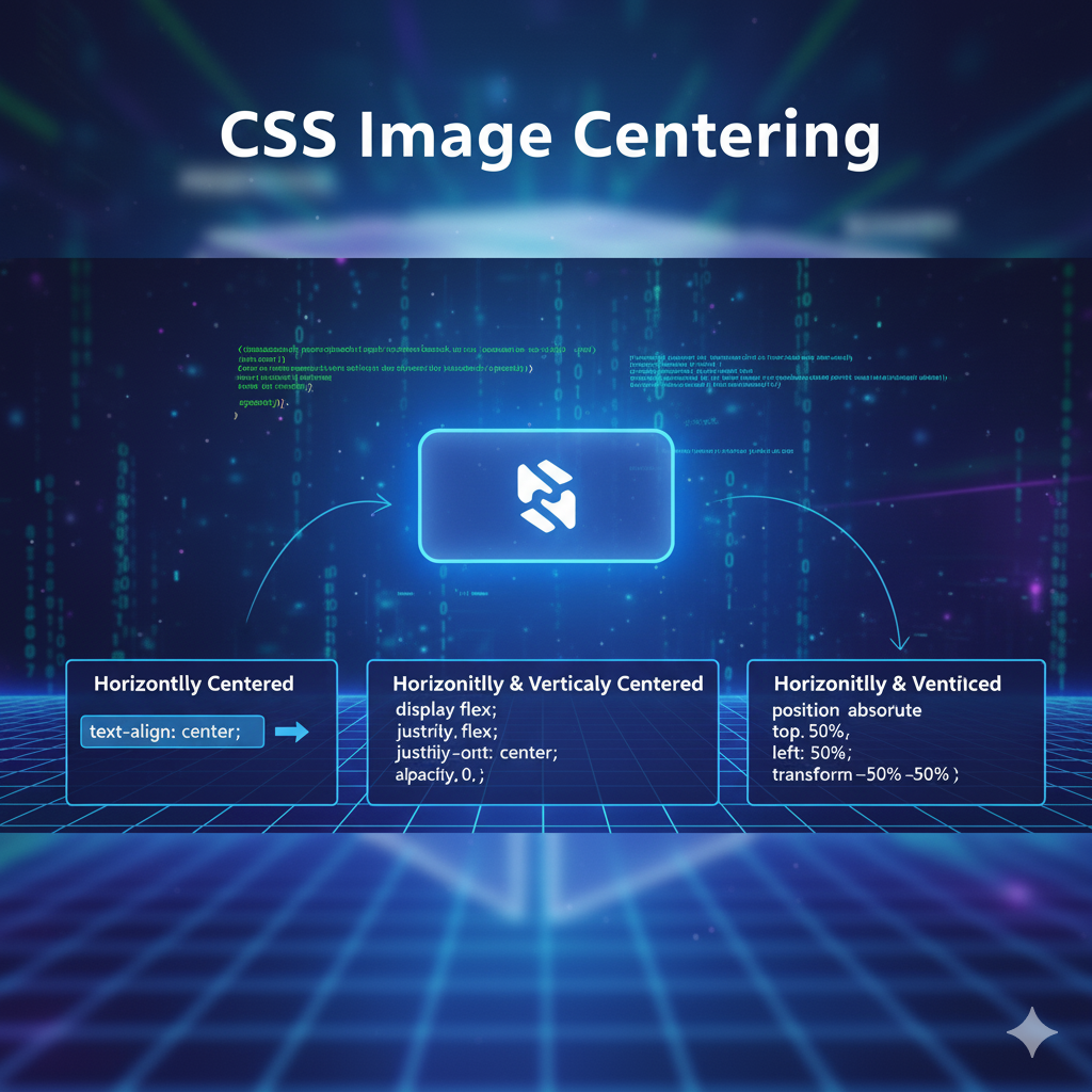
1. The Text-Align Method (The Old-School Horizontal)
This one is a classic. It works because an <img> is an inline-level element, just like text.
css
.container {
  text-align: center; /* That's it! */
}
Verdict: Super simple, but it only works for horizontal centering. If you need vertical centering, this method taps out.
2. The Margin: Auto Trick (For Block-Level Images)
This is another classic for horizontal centering. But there's a catch: the margin: auto trick only works on block-level elements with a defined width. By default, an image is inline, so we need to change its display type.
css
img {
  display: block;
  margin-left: auto;
  margin-right: auto;
}
/* Or the shorthand: */
img {
  display: block;
  margin: 0 auto;
}
Verdict: Still horizontal-only, but very predictable and widely supported. Great for centering a stand-alone image, like a logo in a header.
The Game Changers: Flexbox and Grid
If the methods above are like using a flip phone, then Flexbox and CSS Grid are the latest smartphones. They are modern, powerful, and designed for the complex layouts we build today.
3. Centering with Flexbox (The MVP)
Flexbox is, without a doubt, the hero we needed. It makes centering—both horizontally and vertically—absolutely trivial.
Make your container a flexbox, and then use two magical properties:
css
.container {
  display: flex;
  justify-content: center; /* Centers horizontally */
  align-items: center; /* Centers vertically */
}
Yes, that's literally it. Two lines. The image is now perfectly dead-center.
What's happening?
display: flexturns the container into a flex container.justify-contentcontrols alignment along the main axis (horizontal, by default).align-itemscontrols alignment along the cross axis (vertical, by default).
Real-World Use Case: This is perfect for hero sections, login modals, or any situation where you need to center content both ways. It's my go-to method 90% of the time.
4. Centering with CSS Grid (The Powerhouse)
CSS Grid is another modern layout system that makes centering a breeze. It's a bit like Flexbox but for two-dimensional layouts (rows and columns at the same time).
The simplest way to center with Grid is:
css
.container {
  display: grid;
  place-items: center; /* The magic property */
}
place-items is a shorthand for align-items (vertical) and justify-items (horizontal). Setting it to center does exactly what you think.
Real-World Use Case: While Grid is overkill for a single centered item, it's fantastic if you know your container will eventually hold a more complex grid layout, and you just want to center everything for now.
Real-World Scenarios: Because Life Isn't Perfect
Okay, so you can center a single image. But what about when things get... complicated?
Use Case 1: Centering a Background Image
Sometimes, you don't use an <img> tag but a background-image. This is common for large, decorative banner images.
css
.hero-section {
  background-image: url('hero-bg.jpg');
  background-repeat: no-repeat;
  background-position: center center; /* First value: horizontal, Second: vertical */
  background-size: cover; /* Makes sure the image covers the entire area */
}
The key player here is background-position: center center;. It effortlessly centers the background image within its element.
Use Case 2: Multiple Images in a Centered Group
What if you have a row of logos or avatars that you want to treat as a single centered group? Flexbox to the rescue again!
html
<div class="logo-container">
  <img src="logo1.png" alt="Company 1">
  <img src="logo2.png" alt="Company 2">
  <img src="logo3.png" alt="Company 3">
</div>
css
.logo-container {
  display: flex;
  justify-content: center;
  gap: 30px; /* Adds nice spacing between the logos */
}
Best Practices & Pro Tips
Use Flexbox by Default: For most centering needs, especially dynamic content,
display: flexwithjustify-contentandalign-itemsis the most reliable and intuitive method.Set Image Dimensions: Always define
widthand/orheighton your images, either in HTML or CSS. This prevents layout shifts as the page loads, which is crucial for good user experience and SEO.Don't Forget Accessibility: That
alttext on your image isn't optional. It's essential for screen readers and SEO. Describe what the image is, not just that it's an image.Responsive Considerations: When using modern methods like Flexbox and Grid, your centering will often be naturally responsive. But always test on different screen sizes!
FAQ: Your Burning Questions, Answered
Q: Why does margin: auto not work on my image?
A: 99% of the time, it's because you forgot to set display: block; on the image. margin: auto needs a block-level element.
Q: Flexbox vs. Grid for centering a single item? Which is better?
A: For a single item, it's mostly a matter of personal preference. Both are one-liners (with place-items for Grid). Flexbox is more traditionally associated with one-dimensional layouts, so some developers find it more mentally fitting for a simple centering task.
Q: My image is centered but looks pixelated/stretched. Why?
A: This is a image aspect ratio issue, not a centering issue. You're forcing the image into a width/height that doesn't match its natural ratio. Use object-fit: contain; or object-fit: cover; on the img to control this.
Q: How do I center an image absolutely in the middle of the page?
A: You can combine absolute positioning with the transform trick.
css
img {
  position: absolute;
  top: 50%;
  left: 50%;
  transform: translate(-50%, -50%);
}
This is a classic method, though for full-page overlays, Flexbox or Grid on the body is often cleaner.
Conclusion: You Are Now a Centering Guru
Look at you. You've navigated the journey from the basic text-align to the powerful place-items: center. The mystery of CSS image centering is no more.
The key takeaway is this: for modern, dead-easy, both-ways centering, use Flexbox. It's clean, it's readable, and it's supported everywhere that matters.
Mastering these fundamentals is what separates hobbyists from professionals. Understanding the "why" behind the "how" is the core of robust web development.
This deep dive into CSS is just the beginning. If you're ready to transform from someone who fights with code to someone who commands it, you need a structured path. To learn professional software development courses such as Python Programming, Full Stack Development, and MERN Stack, visit and enroll today at codercrafter.in. We'll guide you from core concepts to building complex, real-world applications.