CSS Display Property: The Ultimate Guide to Layout (2025)
Stop fighting your layouts! Our in-depth guide to the CSS Display property explains block, inline, flex, grid, and more with simple examples and real-world use cases. Master CSS today!

CSS Display Property: The Ultimate Guide to Layout (2025)
CSS Display Property: Your Ultimate Guide to Controlling Layout (No More Frustration!)
Alright, let's talk about one of the first things you learn in CSS that also somehow remains one of the most confusing: the display property.
You’ve probably been here: you’re trying to line up some <div>s, but they just won't sit next to each other. Or you want a link to behave like a button, but it’s just… not working. It’s frustrating, right?
Nine times out of ten, the solution lies in understanding display. This single property is the cornerstone of CSS layout. It tells the browser how an element should behave on the page, how it should play with others, and ultimately, how your entire website is structured.
So, grab your coffee ☕, and let's break down the CSS display property in a way that actually makes sense. We're going beyond block and inline—we're diving into the modern magic of Flexbox and Grid.
What Exactly Is the CSS Display Property?
In the simplest terms, the display property defines an element’s display type. Think of it as assigning a role to an HTML element.
Is it a solo artist that demands its own space (a block)? Or is it part of a band, sitting comfortably inline with others? Or is it a chameleon that can change its behavior (inline-block)?
The browser looks at this property and says, "Aha! This element is a flex container, so I'll arrange all its children in a row." Understanding this is like getting the cheat codes for web layout.
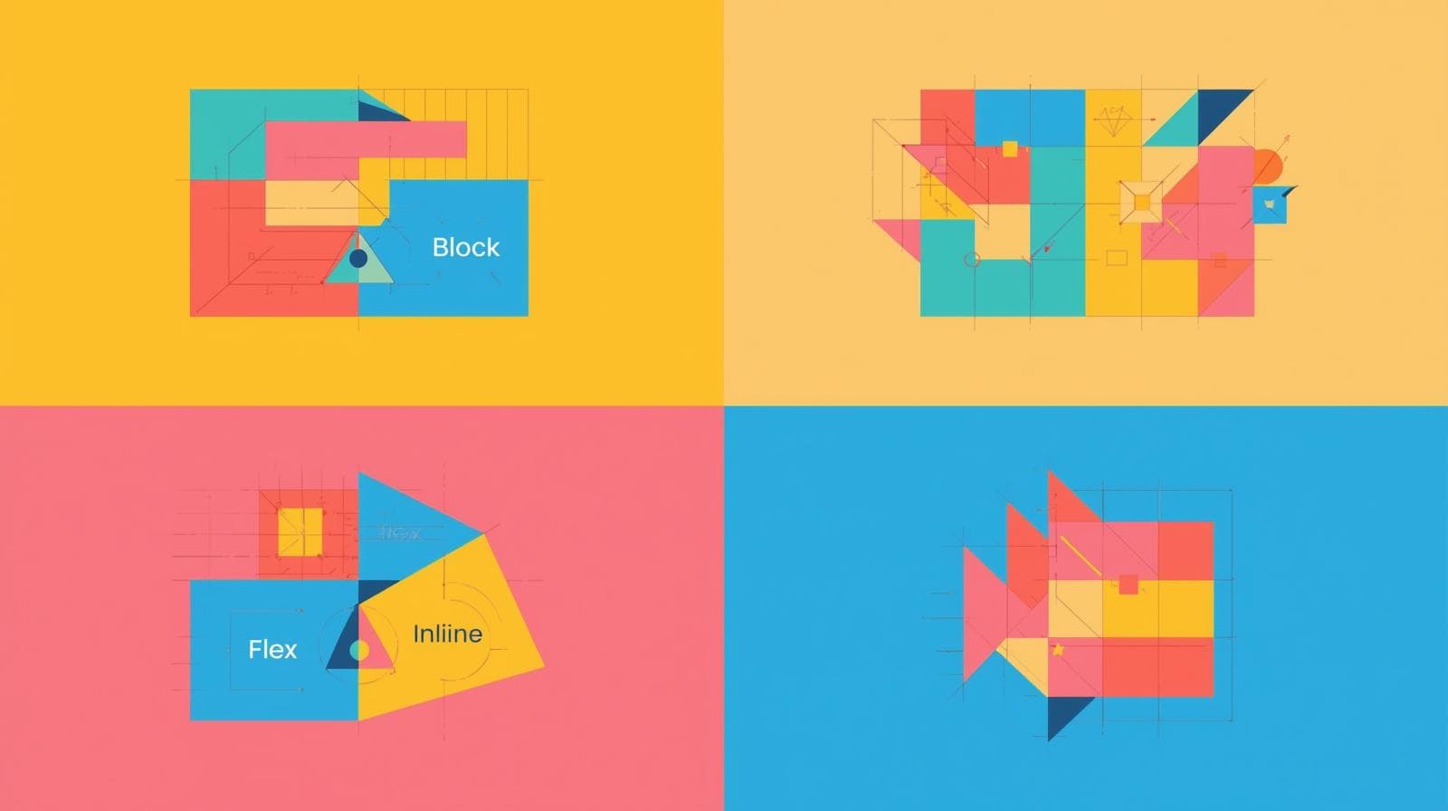
The Classics: Block, Inline, and The Game-Changer, Inline-Block
These are the foundational values. You need to know these.
display: block;
The Behavior: A block-level element starts on a new line and stretches out to take up the full width available. It’s like a diva—it demands its own row.
Common Examples:
<div>,<p>,<h1>to<h6>,<section>,<ul>.In Real Life: Think of a paragraph in a book. It starts on a new line and takes up the entire width of the page.
css
.my-block-element {
  display: block;
  background-color: lightblue;
  padding: 10px;
  margin-bottom: 10px; /* This will actually push other elements away */
}
display: inline;
The Behavior: An inline element does not start on a new line. It only takes up as much width as necessary. You can't set a explicit
widthorheighton it. Margins and padding only push other elements horizontally, not vertically.Common Examples:
<span>,<a>,<strong>,<em>.In Real Life: Think of words in a sentence. The bolded word (
<strong>) sits right inline with the rest of the text without breaking the flow.css
.my-inline-element {
  display: inline;
  background-color: lightcoral;
  margin: 10px; /* Only left/right margin will work */
  padding: 10px; /* Padding will overlap with elements above/below */
}
display: inline-block; (The Best of Both Worlds)
This is where things get interesting. inline-block was the OG hack before Flexbox and Grid became mainstream.
The Behavior: It’s like an inline element on the outside—it sits nicely in a line with other elements. But on the inside, it behaves like a block element—you can set its
widthandheight!Real-World Use Case: Creating a row of buttons or navigation links that need to have a specific, consistent size.
css
.nav-button {
  display: inline-block;
  width: 120px;
  height: 40px;
  text-align: center;
  line-height: 40px;
  background-color: #4CAF50;
  color: white;
}
Now your buttons will sit side-by-side and you can control their dimensions perfectly.
The Modern Powerhouses: Flexbox and Grid
If block and inline are the basic tools, Flexbox and Grid are the power tools that build entire houses.
display: flex;
Flexbox is a one-dimensional layout model. It’s designed for laying out items in a single row or a single column. It gives you insane control over alignment, distribution, and order of items within that container.
The Magic: Once you set
display: flexon a parent container, its direct children become flex items and fall under the powerful rules of Flexbox.Real-World Use Case: A navigation bar. You want your logo, links, and login button to be perfectly aligned and spaced out.
css
.navbar {
  display: flex;
  justify-content: space-between; /* Puts max space between items */
  align-items: center; /* Vertically centers them */
  padding: 1rem 2rem;
}
With just three lines, you have a perfectly structured nav bar. No more float nightmares!
display: grid;
If Flexbox is one-dimensional, CSS Grid is its two-dimensional big brother. It’s designed for laying out items in rows and columns simultaneously. You define the entire grid structure and then place items wherever you want within it.
The Magic: You create a grid container, define your tracks (rows and columns), and then can place child elements into specific grid cells.
Real-World Use Case: A photo gallery or a complex dashboard layout.
css
.photo-gallery {
  display: grid;
  grid-template-columns: repeat(auto-fit, minmax(250px, 1fr));
  gap: 16px;
}
This one block of code creates a fully responsive gallery that automatically adjusts the number of columns based on the screen size. Mind-blowing, right?
The Supporting Cast: none, contents, and table
display: none;: This completely removes the element from the document flow. It's like it never existed. The space it occupied is gone. (For just making something invisible but keeping its space, usevisibility: hidden;).display: contents;: This nifty value makes the container itself disappear, "demoting" its children so they appear as if they are direct children of the container's parent. It's advanced but super useful for un-styling wrapper divs in Grid/Flex layouts.Table Displays (
table,table-row,table-cell): Before Flexbox and Grid, we used these to create complex layouts. Today, their primary use is for—you guessed it—styling actual HTML tables to look exactly how you want.
Best Practices & Common Pitfalls (So You Don't Go Crazy)
Start with a Reset: Browsers have default
displayvalues for elements (e.g.,<div>isblock,<span>isinline). Use a CSS reset or Normalize.css to create a consistent starting point.Use the Right Tool for the Job:
Use Flexbox for components in a single direction (a nav bar, a card with actions aligned).
Use Grid for overall page layout or two-dimensional components (the entire page structure, a gallery).
Don't use a Grid where a simple
inline-blockwould suffice. Keep it simple.
Don't Over-Nest: One of the biggest flexibilities of Flexbox/Grid is that you often don't need deep HTML nesting. A single container with direct children is often enough.
Mobile-First: Use
display: blockfor mobile (stacking elements vertically is often the default) and then use media queries to switch todisplay: flexorgridon larger screens.
FAQs: Your Burning Questions, Answered
Q1: What's the difference between display: none and visibility: hidden?
A: display: none completely removes the element from the layout. It's gone. visibility: hidden hides the element, but the space it occupies remains (it's like an invisible box).
Q2: Can I use multiple display values?
A: No, an element can only have one display value at a time. But you can override it in media queries! An element can be display: block on mobile and display: flex on desktop.
Q3: Flexbox vs. Grid: Which one should I learn first?
A: It's a hot debate, but I recommend starting with Flexbox. It's slightly simpler conceptually (one-dimension) and is perfect for the smaller components that make up a website. Then, move on to Grid for the larger, overall page layouts. You'll use them both together all the time.
Q4: Why is my display: flex not working?
A: 99% of the time, it's because you didn't apply it to the parent container. Remember, display: flex goes on the container, and it affects its direct children.
Wrapping It Up: You've Got the Power Now
The display property isn't just another CSS rule—it's the fundamental key to unlocking how your web pages look and feel. From the basic building blocks of block and inline to the layout superpowers of Flexbox and Grid, mastering this property is a non-negotiable skill for any web developer.
It turns layout frustration into layout freedom. You stop fighting the browser and start telling it exactly what you want.
Ready to move from following tutorials to building professional, production-ready applications?
Understanding CSS is just the first step. If you're serious about becoming a job-ready software developer, you need a structured learning path. To learn professional software development courses such as Python Programming, Full Stack Development, and MERN Stack, visit and enroll today at codercrafter.in. We'll guide you from the fundamentals to advanced concepts, helping you build a portfolio of real-world projects that will get you hired.