Struggling with CSS conflicts in React? Learn how React CSS Modules provide scoped, maintainable, and collision-free styling with step-by-step examples and best practices.
If you've worked on a React project of any significant size, you've felt the pain. You're happily styling a Button component, you give it a class of .btn, and suddenly, your entire navbar collapses. Why? Because three components down the tree, another developer also used .btn for a completely different purpose. Welcome to the wild west of global CSS—where class names clash, and specificity wars are a daily battle.
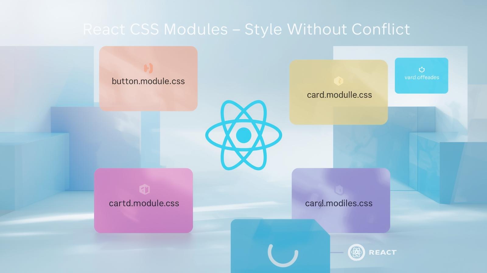
What if there was a way to write CSS that was truly component-scoped? Where a class like .container in one component couldn't possibly interfere with a .container in another? Enter React CSS Modules.
In this comprehensive guide, we're not just going to scratch the surface. We'll dive deep into what CSS Modules are, how to set them up in your React project, and the best practices to make your styling clean, maintainable, and a joy to work with.
What Are React CSS Modules? (And Why You'll Love Them)
At its core, a CSS Module is a CSS file. The magic happens during the build process (handled by tools like Webpack or Vite). When you import a CSS Module into a React component, the build tool automatically transforms your generic class names into unique, scoped identifiers.
Think of it like this: you write styles.button in your component, and the build tool generates something like Button_button__ax7b3 for the HTML and corresponding styles. This unique string ensures that the styles you defined only apply to the component that imported them.
Key Benefits:
Local Scoping by Default: No more worrying about naming conflicts. You can use simple, semantic class names like
.title,.wrapper, or.activewithout a second thought.Explicit Dependency: Your styles are explicitly imported where they are used. If you delete a component, you delete its associated CSS file. This eliminates "dead" or unused CSS.
Composability: You can compose classes from other classes, promoting reusability and DRY (Don't Repeat Yourself) principles.
No New Syntax to Learn: You're writing plain CSS (or SCSS/Sass/Less). CSS Modules are a compilation step, not a new language.
Setting Up CSS Modules in Your React Project
The great news is that if you're using create-react-app (CRA) or Vite, CSS Modules support is built-in and requires zero configuration. You're ready to go!
For custom Webpack setups, you'll need to ensure your css-loader is configured with modules: true. But for 90% of us using CRA or Vite, it's plug-and-play.
Your First Component with CSS Modules: A Hands-On Example
Let's build a simple Card component to see CSS Modules in action.
Step 1: Create the CSS Module File
First, create your CSS file. The naming convention is [ComponentName].module.css. For our Card component, we'll create Card.module.css.
css
/* Card.module.css */
.card {
  background-color: white;
  border-radius: 8px;
  box-shadow: 0 2px 8px rgba(0, 0, 0, 0.1);
  padding: 1.5rem;
  margin: 1rem;
  border: 1px solid #e0e0e0;
}

.title {
  font-size: 1.5rem;
  font-weight: 600;
  color: #333;
  margin-bottom: 0.5rem;
}

.description {
  color: #666;
  line-height: 1.5;
}

/* A state-based style */
.highlighted {
  border-left: 4px solid #4f46e5; /* A nice indigo color */
}
Notice how we're using simple, descriptive class names without any complex BEM-like prefixes? That's the beauty of scoping.
Step 2: Create the React Component
Now, let's import and use these styles in our Card.js component.
jsx
// Card.js
import React from 'react';
import styles from './Card.module.css'; // The key import!

const Card = ({ title, description, isHighlighted }) => {
  // We dynamically add the 'highlighted' class based on a prop
  const cardClasses = `${styles.card} ${isHighlighted ? styles.highlighted : ''}`;

  return (
    <div className={cardClasses}>
      <h2 className={styles.title}>{title}</h2>
      <p className={styles.description}>{description}</p>
    </div>
  );
};

export default Card;
What's happening here?
We import the styles as a JavaScript object (conventionally named
styles).Each class from our CSS file (
card,title, etc.) becomes a property on thisstylesobject.The value of these properties is the unique, scoped class name generated by the build tool (e.g.,
Card_card__ax7b3).
If you inspect the rendered HTML in your browser, you'll see something like:
html
<div class="Card_card__ax7b3 Card_highlighted__d8f2c">
  <h2 class="Card_title__k5j1x">My Card Title</h2>
  <p class="Card_description__l9m2n">This is the card's description.</p>
</div>
The global scope remains clean and conflict-free!
Real-World Use Cases and Best Practices
1. Composing Classes
One powerful feature is the ability to compose one class from another. Let's add a "primary" button variant to our Card.module.css.
css
/* Inside Card.module.css */
.button {
  padding: 0.5rem 1rem;
  border: none;
  border-radius: 4px;
  cursor: pointer;
  font-weight: 500;
}

.primaryButton {
  composes: button; /* Inherits all styles from .button */
  background-color: #4f46e5;
  color: white;
}
In your component, you can now use styles.primaryButton, and it will have all the styles from both .button and .primaryButton.
2. Working with Global Styles
Sometimes, you need to break out of the module. For example, if you're using a third-party CSS library like Bootstrap.
css
/* In your CSS Module */
.modal {
  composes: global-modal from global; /* Targets a global '.global-modal' class */
  padding: 2rem;
}

.title {
  composes: title from './Typography.module.css'; /* Composes from another module! */
  font-size: 2rem;
}
3. Best Practices for a Scalable App
Stick to the Naming Convention: Always use the
.module.csssuffix. This makes it immediately clear to you and your team which files are modules.Use Descriptive Class Names: Leverage the freedom of local scope. Use names like
.listIteminstead of.li.Keep Modules Small: A CSS Module should ideally correspond to a single React component. If a file gets too big, it might be a sign your component is doing too much.
Use CSS Variables for Themes: For global values like colors and fonts, use CSS custom properties (variables) in a global CSS file. Your modules can then consume these variables, ensuring a consistent look and feel.
Mastering these patterns is crucial for building large-scale, enterprise-level applications. It's the kind of professional practice we emphasize in our Full Stack Development and MERN Stack courses at codercrafter.in, where we don't just teach syntax, but how to build robust, real-world software.
FAQs: Answering Your Questions on CSS Modules
Q1: Can I use CSS Modules with Sass/SCSS?
Absolutely! Just name your file [ComponentName].module.scss and install sass as a dependency. The process of importing and using the styles object remains identical.
Q2: How do I handle dynamic class names?
As shown in the example, you can use template literals to conditionally build your className string.
jsx
<div className={`${styles.base} ${isActive ? styles.active : ''}`}>Q3: What about pseudo-classes and media queries?
They work exactly as in regular CSS! CSS Modules only transform class names, not the CSS rules themselves.
css
.button:hover {
  background-color: #ddd;
}

@media (min-width: 768px) {
  .card {
    padding: 2rem;
  }
}
Q4: Are CSS Modules better than Styled Components?
It's not about "better," it's about "different." Styled Components is a CSS-in-JS library that colocates styles with your JavaScript using template literals. CSS Modules are a simpler approach that leverages traditional CSS files. CSS Modules are often praised for their simplicity, performance (no runtime injection), and familiarity to CSS purists.
Q5: Can I use multiple classes from a module on one element?
Yes, using template literals is the most common way.
jsx
<div className={`${styles.classOne} ${styles.classTwo}`}>Conclusion: Cleaner, Safer Styling Awaits
React CSS Modules offer a fantastic middle ground between the chaos of global CSS and the complexity of some CSS-in-JS solutions. They provide the safety of scoped styles while allowing you to leverage the full power and familiarity of CSS (or Sass). By adopting CSS Modules, you'll write more maintainable code, spend less time debugging style conflicts, and build a more scalable component architecture.
The journey to becoming a proficient developer involves choosing the right tools for the job and understanding the principles behind them. Concepts like modular styling are foundational. If you're looking to solidify your understanding of React, modern JavaScript, and other in-demand technologies, we have a structured path for you.
To learn professional software development courses such as Python Programming, Full Stack Development, and MERN Stack, visit and enroll today at codercrafter.in. We break down complex topics like these into manageable, project-based lessons to help you build a standout portfolio and launch your tech career.Tame Your Styles: A Deep Dive into React CSS Modules
If you've worked on a React project of any significant size, you've felt the pain. You're happily styling a Button component, you give it a class of .btn, and suddenly, your entire navbar collapses. Why? Because three components down the tree, another developer also used .btn for a completely different purpose. Welcome to the wild west of global CSS—where class names clash, and specificity wars are a daily battle.
What if there was a way to write CSS that was truly component-scoped? Where a class like .container in one component couldn't possibly interfere with a .container in another? Enter React CSS Modules.
In this comprehensive guide, we're not just going to scratch the surface. We'll dive deep into what CSS Modules are, how to set them up in your React project, and the best practices to make your styling clean, maintainable, and a joy to work with.
to write clean, component-scoped styles.