Navbar 101: Your Ultimate Guide to Building Website Navigation That Doesn't Suck
Stop building confusing navbars! This in-depth guide covers everything from definitions and best practices to real-world code examples for creating a perfect, user-friendly navbar. Level up your web dev skills.
Let's be real for a second. How many times have you landed on a website and just... gotten lost? You're clicking around aimlessly, trying to find the "Pricing" page or the "Contact" info, but it's like navigating a maze with your eyes closed. Frustrating, right?
Nine times out of ten, the culprit is a poorly designed navbar.
The navbar (or navigation bar) is the MVP of your website. It’s the trusty map that sits at the top (usually) of your site and guides your visitors where they want to go. If your navbar is a hot mess, your entire user experience is a hot mess. It’s that simple.
But building a navbar that's both slick and functional? That's where the art comes in. So, whether you're a total newbie just starting out or a dev looking to polish your skills, this guide is your one-stop shop for nailing it. Let's dive in.
What Even Is a Navbar, Though?
In the simplest terms, a navbar is a section of a webpage that contains links to other sections of the website. Think of it as the table of contents for your entire site.
But it's so much more than just a bunch of links. A great navbar:
Sets the tone: Is your brand playful? Professional? Minimalist? Your nav is the first place this personality shines.
Builds trust: A clear, predictable nav makes users feel in control and comfortable on your site.
Drives action: Want people to sign up, buy a product, or contact you? Your nav should make those key actions stupidly easy to find.
You'll see it called a "nav bar," "navigation bar," or "menu." They all mean the same thing.
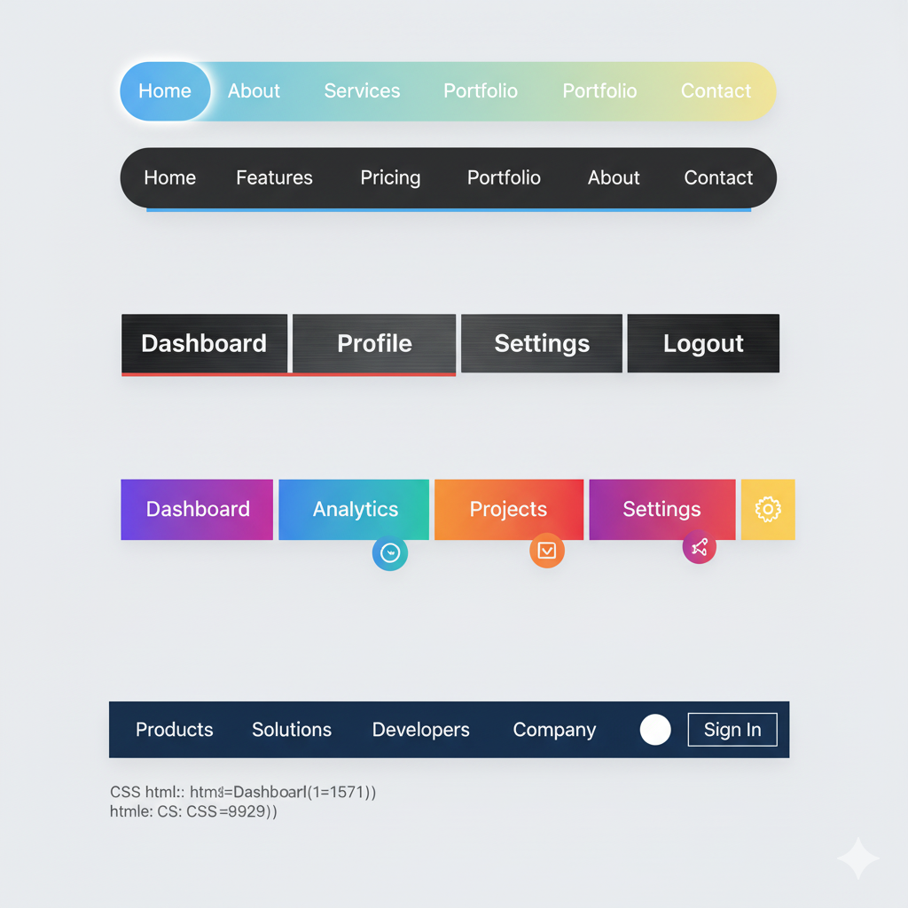
Deconstructing a Modern Navbar: The Key Ingredients
A basic navbar isn't rocket science. It usually contains a mix of these elements:
Logo: Clicking this should always take you back to the homepage. It's rule #1 of the internet.
Navigation Links: The core pages like Home, About, Services, Blog, Contact.
Call-to-Action (CTA) Buttons: These are the stars of the show. "Get Started," "Login," "Buy Now." They should look different from the regular links (often with a contrasting color) to stand out.
Search Icon: Essential for content-heavy sites like blogs or e-commerce stores.
Hamburger Menu: That little three-line icon (☰) on mobile and tablet views that collapses the full menu into a tidy drawer.
Let's Get Our Hands Dirty: Building a Simple, Responsive Navbar
Enough theory. Let's code a clean, modern navbar that works on both desktop and mobile. We'll use HTML and CSS. (No, we're not using a giant framework for this simple example—we're keeping it pure).
The HTML Structure (The Bones)
This is the semantic, accessible foundation.
html
<header class="navbar">
    <div class="nav-container">
        <!-- The Logo -->
        <a href="#" class="nav-logo">YourBrand</a>

        <!-- The Main Navigation Links -->
        <nav class="nav-menu">
            <ul class="nav-list">
                <li class="nav-item"><a href="#" class="nav-link">Home</a></li>
                <li class="nav-item"><a href="#" class="nav-link">About</a></li>
                <li class="nav-item"><a href="#" class="nav-link">Services</a></li>
                <li class="nav-item"><a href="#" class="nav-link">Blog</a></li>
                <li class="nav-item"><a href="#" class="nav-link">Contact</a></li>
            </ul>
        </nav>

        <!-- The CTA Button -->
        <a href="#" class="nav-cta">Sign Up Free</a>

        <!-- The Hamburger Icon (for mobile) -->
        <div class="hamburger">
            <span class="bar"></span>
            <span class="bar"></span>
            <span class="bar"></span>
        </div>
    </div>
</header>
The CSS Styling (The Looks)
Now, let's make it look good. We'll add a dash of Flexbox for layout and some media queries for responsiveness.
css
/* Basic Reset & Font */
* {
    margin: 0;
    padding: 0;
    box-sizing: border-box;
    font-family: 'Segoe UI', Tahoma, Geneva, Verdana, sans-serif;
}

/* The Navbar Container */
.navbar {
    background-color: #fff;
    box-shadow: 0 2px 10px rgba(0, 0, 0, 0.1);
    position: sticky;
    top: 0;
    z-index: 100;
}

.nav-container {
    max-width: 1200px;
    margin: 0 auto;
    display: flex;
    justify-content: space-between;
    align-items: center;
    padding: 1rem 2rem;
}

/* Logo Styling */
.nav-logo {
    font-size: 1.8rem;
    font-weight: bold;
    color: #333;
    text-decoration: none;
}

/* Navigation Menu & List */
.nav-menu {
    display: flex;
}

.nav-list {
    display: flex;
    list-style: none;
    gap: 2rem; /* This is a modern way to add space between items */
}

.nav-link {
    text-decoration: none;
    color: #555;
    font-weight: 500;
    transition: color 0.3s ease;
}

.nav-link:hover {
    color: #007bff; /* A nice blue on hover */
}

/* CTA Button Styling */
.nav-cta {
    background-color: #007bff;
    color: white;
    padding: 0.7rem 1.5rem;
    border-radius: 5px;
    text-decoration: none;
    font-weight: 600;
    transition: background-color 0.3s ease;
}

.nav-cta:hover {
    background-color: #0056b3;
}

/* Hamburger Icon - Hidden on Desktop */
.hamburger {
    display: none;
    flex-direction: column;
    cursor: pointer;
}

.bar {
    width: 25px;
    height: 3px;
    background-color: #333;
    margin: 3px 0;
    transition: 0.3s;
}

/* --- MOBILE STYLES --- */
@media (max-width: 768px) {
    /* Show the hamburger */
    .hamburger {
        display: flex;
    }

    /* Hide the main menu and CTA by default */
    .nav-menu, .nav-cta {
        display: none;
    }

    /* When the hamburger is clicked (we'll use JS for this), we'll add an 'active' class */
    .nav-menu.active {
        display: block;
        position: absolute;
        top: 100%;
        left: 0;
        width: 100%;
        background-color: #fff;
        box-shadow: 0 5px 10px rgba(0, 0, 0, 0.1);
    }

    .nav-list {
        flex-direction: column;
        gap: 0;
        padding: 1rem 0;
    }

    .nav-item {
        text-align: center;
        padding: 0.8rem 0;
    }

    /* Show the CTA inside the mobile menu */
    .nav-menu.active + .nav-cta {
        display: block;
        text-align: center;
        margin: 1rem auto;
        width: 200px;
    }
}
Pro Tip: To make the hamburger menu actually work, you'd need a little bit of JavaScript to toggle the active class on the .nav-menu. This is a fundamental front-end skill!
js
// Simple JavaScript for Hamburger Toggle
const hamburger = document.querySelector(".hamburger");
const navMenu = document.querySelector(".nav-menu");

hamburger.addEventListener("click", () => {
    hamburger.classList.toggle("active");
    navMenu.classList.toggle("active");
});
This is just a starting point. The real magic happens when you start customizing this foundation to match a brand's unique identity.
Navbar Best Practices: Don't Break the Rules
You've got the code. Now, let's talk strategy. Here are the unwritten rules of navbar design that you should never break.
Keep it Simple, Seriously: 5-7 links max. Don't overwhelm people. If you have more, consider a "mega menu" (but that's a topic for another day).
Use Clear, Predictable Labels: People expect "Contact," not "Reach Out." Use "About," not "Our Story." Don't get cute with the wording.
Prioritize with Purpose: Put the most important items (like your main CTA) on the far right. The logo on the far left. It's a standard reading pattern (left-to-right).
Make it Sticky: A
position: stickynavbar that follows the user as they scroll is a UX win. They never lose their way.Mobile-First is Non-Negotiable: Over half of all web traffic is on mobile. If your nav breaks on a phone, you've lost. Our example above is a great start.
Building something like this from scratch teaches you the core concepts of HTML structure, CSS layout with Flexbox, responsive design with media queries, and basic DOM manipulation with JavaScript. These are the building blocks of modern web development.
To learn professional software development courses such as Python Programming, Full Stack Development, and MERN Stack, where we break down complex topics like this into digestible, project-based lessons, visit and enroll today at codercrafter.in. We'll help you go from following tutorials to building professional, production-ready applications.
Real-World Navbar Inspo
Let's look at how the big players do it:
Netflix: Super minimal. Logo on the left, navigation in the middle (when scrolled), and search, notifications, and profile dropdown on the right. It gets out of the way so you can focus on the content.
Amazon: Packed with functionality, but it works because it's organized into clear sections: delivery info, search bar, department dropdown, and user account/cart info. It's a masterclass in information-dense design.
Apple: The epitome of clean, minimalist design. Sparse links, lots of white space, and a subtle background that becomes solid upon scroll. It just feels premium.
FAQs: Your Navbar Questions, Answered
Q1: Should I always put the navbar at the top?
Almost always, yes. It's a deeply ingrained user expectation. Sidebars can work for specific web apps, but for most marketing and content sites, top is the way to go.
Q2: How do I create a dropdown menu?
You use a nested list (<ul> inside an <li>) in your HTML and then use CSS to hide the sub-menu and reveal it on hover or click. It requires a bit more CSS for positioning and transitions.
Q3: Is it okay to have a navbar without a logo?
Only if you're building a personal blog or a very experimental project. For 99.9% of websites, a logo is essential for brand recognition and providing a quick escape back to the homepage.
Q4: What's the best way to handle a navbar on a one-page portfolio site?
You can use anchor links (<a href="#projects">) that smoothly scroll to different sections on the same page. The navbar remains at the top, giving a seamless, single-page experience.
Wrapping It Up
Your navbar is a silent guide, a conversion machine, and a brand ambassador all rolled into one. Don't treat it as an afterthought. By following the principles we've discussed—simplicity, clarity, responsiveness, and strategic placement—you can transform your website's navigation from a source of frustration into a seamless experience that users (and search engines) will love.
Remember, the goal is to help people find what they need without thinking. When you achieve that, you've built a truly great navbar.
Feeling inspired to build not just navbars, but entire, beautiful, full-stack applications? The journey starts with mastering the fundamentals. To learn professional software development courses such as Python Programming, Full Stack Development, and MERN Stack with hands-on projects and expert mentorship, visit and enroll today at codercrafter.in. Let's build the future, one line of code at a time.


