Master CSS Image Centering: A No-BS Guide for 2025
Struggling to center an image with CSS? This ultimate guide breaks down all methods - Flexbox, Grid, old-school tricks & more. Stop the guesswork and code like a pro!
Let's be real for a second. If there's one rite of passage for every web developer, it's the sheer, unadulterated frustration of trying to center a div—or more specifically, an image. You type margin: 0 auto;, you try text-align: center;, you throw your hands up, and then you find yourself on Stack Overflow for the hundredth time.
Why is something so visually simple so darn hard to code?
Well, I'm here to tell you that those days are over. Centering images in modern CSS isn't just easy; it's actually enjoyable once you know the right tools for the job. This isn't just another quick tutorial. This is your deep dive, your go-to resource that will finally make CSS image centering click.
We'll cover everything: from the old-school hacks to the modern, powerful layout systems that make it a breeze. So, grab your coffee, and let's get this sorted once and for all.
First Things First: It's All About the Context
Before we throw code at the problem, you need to understand one key concept: the container. You're not just centering an image in a void; you're centering it within its parent element. Is that parent the entire body? A div with a specific width? A card component? Knowing this is half the battle.
For all our examples, we'll use this simple HTML structure:
html
<div class="container">
  <img src="your-awesome-image.jpg" alt="A descriptive alt text">
</div>
Our goal is to center that .img inside the .container.
Method 1: The Old-School, "It Just Works" (Horizontally) Method
This is the OG, the one your grandpa might have used (if your grandpa was a web developer in the early 2000s).
Using text-align: center;
Yep, the property you use for text works on images too. Why? Because an <img> is, by default, an inline-level element, just like text.
css
.container {
  text-align: center;
  border: 2px dashed #ccc; /* Just to see the container */
}
img {
  width: 250px; /* Giving it a fixed width */
}
When to use this: When you just need simple horizontal centering. It's quick, it's easy, and it has near-universal browser support. Perfect for centering a logo in a header or an image in a blog post.
The Catch: It only works for horizontal centering. Don't even try to use it for vertical alignment; that's a different (and often misused) property.
Method 2: The Classic & Reliable margin: auto
This is the one you probably tried first. And it's a solid choice!
Horizontal Centering with margin: 0 auto;
The magic here is that margin: auto tells the browser to automatically calculate and distribute the available horizontal space equally on the left and right sides. But there's a catch: the image must be a block-level element and have a defined width. It can't be width: 100%, or there's no space left to distribute.
css
.container {
  border: 2px dashed #ccc;
}
img {
  display: block; /* This is crucial! */
  width: 250px;
  margin: 0 auto; /* 0 for top/bottom, auto for left/right */
}
When to use this: It's great for standalone banner images or when you're building simpler layouts without Flexbox or Grid. It's a classic for a reason.
Method 3: The Modern Powerhouse - Flexbox
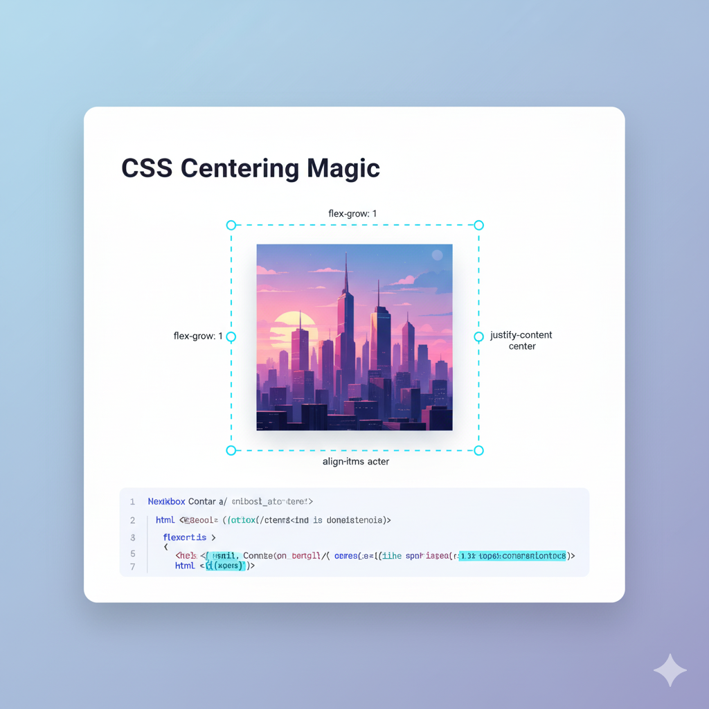
If I had to pick one method to rule them all, it would be Flexbox. It's designed for one-dimensional layouts (either a row or a column) and makes centering an absolute dream. This is where the real fun begins.
The Holy Grail: Horizontal AND Vertical Centering
Behold, the magic incantation:
css
.container {
  display: flex;
  justify-content: center; /* Centers horizontally */
  align-items: center;    /* Centers vertically */
  height: 400px; /* You NEED a height for vertical centering to mean anything */
  border: 2px dashed #ccc;
}
img {
  width: 250px;
}
That's it. justify-content aligns items along the main axis (horizontal, by default), and align-items aligns them along the cross axis (vertical, by default). It's intuitive, powerful, and the go-to for most modern developers.
Real-World Use Case: This is perfect for hero sections, modal dialogs, card content, and any situation where you need an element perfectly centered in both directions within a defined space.
Pro Tip: You can easily change the layout to a column with flex-direction: column;. Just remember that this swaps the axes—justify-content will now control vertical alignment, and align-items will control horizontal alignment.
Method 4: The Layout Grid - CSS Grid
If Flexbox is the one-dimensional powerhouse, CSS Grid is its two-dimensional boss. For centering a single item, it's just as elegant, if not more.
Centering with place-items
Grid gives us a fantastic shorthand property called place-items, which sets both align-items and justify-items at once.
css
.container {
  display: grid;
  place-items: center; /* Does both horizontal and vertical */
  height: 400px;
  border: 2px dashed #ccc;
}
img {
  width: 250px;
}
It's clean, it's readable, and it does exactly what it says on the tin.
When to use this: Grid is excellent when your centering needs are part of a larger, more complex two-dimensional layout (like a whole page). But don't be afraid to use it for simple centering too! The place-items: center trick is arguably the most concise way to achieve perfect centering.
Method 5: The "I Control Everything" Method - Absolute Positioning
This method is a bit more "hands-on." It involves taking the image out of the normal document flow and precisely positioning it.
The 50% / 50% & Translate Trick
css
.container {
  position: relative; /* This is the anchor for the absolute image */
  height: 400px;
  border: 2px dashed #ccc;
}
img {
  width: 250px;
  position: absolute;
  top: 50%;
  left: 50%;
  transform: translate(-50%, -50%);
}
Let's break down the magic:
top: 50%;andleft: 50%;move the top-left corner of the image to the exact center of the container.transform: translate(-50%, -50%);then shifts the image backwards by 50% of its own width and height. This results in the true center of the image being perfectly aligned with the center of the container.
When to use this: This is super useful for overlays, loading spinners inside elements, or when you need to center something within a specific, non-flex/grid context. It's powerful but use it judiciously, as absolutely positioned elements are removed from the document flow.
Best Practices & Pro Tips You Can't Ignore
Be Responsive: Always set your image's
max-width: 100%andheight: auto;. This prevents it from breaking out of its container on smaller screens.css
img {
  max-width: 100%;
  height: auto;
}
Accessibility Matters: Never, ever skip the
altattribute. It's crucial for screen readers and SEO.Choose the Right Tool: Use
text-alignfor quick horizontal centering. Use Flexbox for most component-level centering needs (like cards, heroes). Use Grid for full-page layouts or when your centering is part of a bigger grid structure.The
object-fitSavior: What if your images have different aspect ratios, but you need them to fit perfectly in a fixed-size container? Meetobject-fit.css
.card img {
  width: 100%;
  height: 200px;
  object-fit: cover; /* Acts like background-size: cover for images */
}
This is a game-changer for image galleries and card-based designs.
FAQs (Frequently Asked Frustrations)
Q: Why isn't vertical-align: middle working for my image?
A: vertical-align is meant for aligning inline elements with each other on a line of text (e.g., aligning text next to an image). It's not for centering a block-level element inside its parent. This is the most common misconception!
Q: Flexbox vs. Grid for centering: which is better?
A: For centering a single item, they are virtually identical in ease of use. The choice often comes down to the rest of your layout. If you're building a one-dimensional layout (a row or column of items), use Flexbox. If you're building a two-dimensional layout (both rows and columns), use Grid. If it's just for one centered item, pick the one you're more comfortable with.
Q: My image is still not centering! What do I do?
A: 99% of the time, it's one of these:
Did you forget
display: blockformargin: auto?Did you forget to set a
heighton the container for vertical centering?Is your container actually wider than your image? Use your browser's DevTools to inspect the elements and see their computed sizes.
Conclusion: You're Now a Centering Guru
Look at you. You've journeyed from the simple text-align to the powerful place-items and the clever transform trick. Centering an image in CSS is no longer a mystery; it's a tool in your belt. You now have a method for every possible scenario.
The key takeaway? Embrace Flexbox and Grid. They are the present and future of CSS layout, and they solve these age-old problems elegantly.
Mastering these fundamentals is what separates hobbyists from professionals. If you enjoyed this deep dive and want to build that solid foundation across all of web development, we can help you structure that learning.
To learn professional, industry-ready software development courses such as Python Programming, Full Stack Development, and the MERN Stack, visit and enroll today at codercrafter.in. We break down complex topics just like this, so you can build with confidence.


