Level Up Your UI: The Ultimate Guide to Stunning CSS Buttons
Stop using boring buttons! Learn how to create engaging, interactive, and accessible CSS buttons with hover effects, animations, and best practices. Elevate your web design skills today.
From Bland to Grand: Your Ultimate Guide to Crafting Buttons That Actually Get Clicked
Let's be real for a second. How many times have you landed on a website and been utterly whelmed by a sad, gray, default-looking button? You know the one. It screams "I was made by someone who just discovered the <input type="submit"> tag and called it a day."
In today's attention economy, your buttons aren't just functional elements; they're your digital salespeople. They guide users, drive actions, and can make or break the user experience (UX). A well-designed button can be the difference between a conversion and a bounce.
So, if you're ready to move beyond the basics and start creating buttons that are not just seen but felt, you're in the right place. Buckle up, because we're diving deep into the world of CSS buttons.
What Exactly is a CSS Button?
At its core, a button is an interactive element that users click or tap to perform an action. In HTML, it can be a <button> element, an <input type="submit">, or even an <a> tag styled to look like a button.
A CSS Button is simply any of these elements that has been styled using Cascading Style Sheets (CSS) to make it visually appealing and aligned with the website's brand and feel. We're talking about colors, shapes, shadows, animations—the whole shebang. CSS is what transforms a boring HTML default into a compelling call-to-action (CTA).
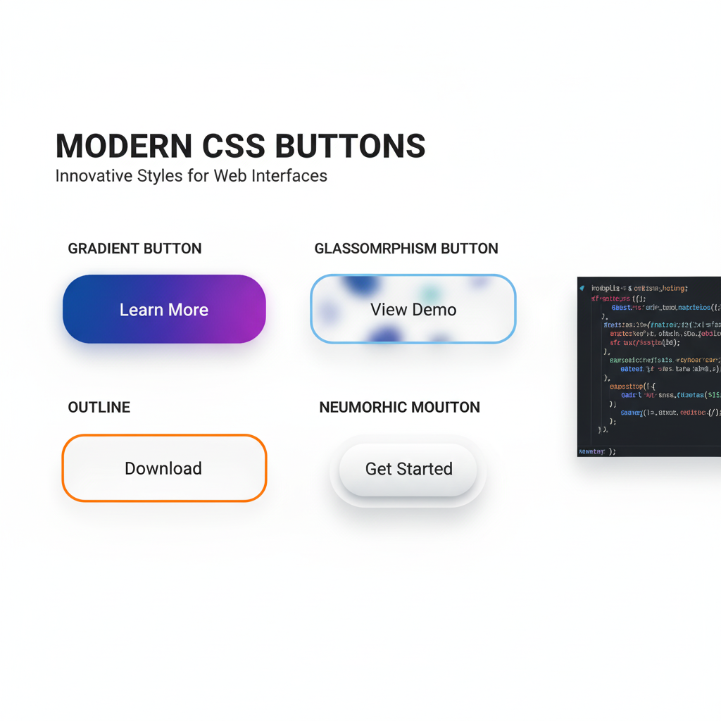
The Anatomy of a Killer Button: Let's Build One from Scratch
Forget just changing the background color. A professional button has layers. Let's break down the key CSS properties that bring a button to life.
1. The Basic Foundation (The Non-Negotiables)
First, you need your HTML. We'll use the semantic <button> tag because it's built for this job and is great for accessibility.
html
<button class="cta-button">Click Me, You Know You Want To</button>Now, let's give it some personality with CSS.
css
.cta-button {
  /* Color & Typography */
  background-color: #4F46E5; /* A modern, vibrant indigo */
  color: white;
  font-family: 'Inter', sans-serif; /* A clean, modern font */
  font-weight: 600;
  font-size: 1rem;

  /* Structure & Spacing */
  padding: 12px 28px;
  border: none;
  border-radius: 8px; /* The magic property for rounded corners */

  /* The all-important cursor change */
  cursor: pointer;

  /* Smooth transitions for any future hover effects */
  transition: all 0.3s ease;
}
Boom! Just like that, we've gone from a system-default eyesore to a clean, modern, and clickable button. The border-radius is a game-changer—it instantly makes things feel more contemporary.
2. The State of Affairs: Hover, Focus, and Active
A button that doesn't change on hover is like a handshake with no grip—it feels dead. States are crucial for feedback.
css
.cta-button:hover {
  background-color: #4338CA; /* A slightly darker shade */
  transform: translateY(-2px); /* Lifts the button up slightly */
  box-shadow: 0 4px 12px rgba(0, 0, 0, 0.15); /* Adds a subtle shadow */
}

.cta-button:focus {
  outline: 2px solid #4F46E5;
  outline-offset: 2px; /* Important for accessibility */
}

.cta-button:active {
  transform: translateY(0); /* Pushes the button back down on click */
}
These micro-interactions tell the user, "Yep, I see you, and I'm ready for your click." It’s a small detail that makes the web feel alive.
3. Taking it to the Next Level: Advanced Effects & Animations
Want to really stand out? Let's get fancy.
The Gradient Glow:
css
.glow-button {
  background: linear-gradient(135deg, #667eea 0%, #764ba2 100%);
  border: none;
  border-radius: 10px;
  color: white;
  padding: 14px 30px;
  font-size: 1rem;
  cursor: pointer;
  transition: all 0.3s ease;
}

.glow-button:hover {
  box-shadow: 0 0 20px rgba(102, 126, 234, 0.6);
  transform: scale(1.05);
}
The "Shy" Outline Button:
Perfect for secondary actions. It's less prominent but still stylish.
css
.outline-button {
  background-color: transparent;
  color: #4F46E5;
  border: 2px solid #4F46E5;
  padding: 10px 26px;
  border-radius: 6px;
  transition: all 0.3s ease;
}

.outline-button:hover {
  background-color: #4F46E5;
  color: white;
}
Real-World Use Cases: Where Do These Buttons Shine?
You don't just use one type of button everywhere. Context is key.
Primary CTA (Call-to-Action): This is your star player. "Buy Now," "Sign Up Free," "Download the Ebook." It should be the most prominent button on the page, using a bold, brand-aligned color. Use the solid, vibrant style we built first.
Secondary Actions: "Learn More," "View Plans," "Add to Wishlist." These are important but shouldn't compete with the primary CTA. The outline button is perfect here.
Danger Zones: Actions like "Delete Account" or "Cancel Subscription" need to be clear but not aggressive. A soft red outline button that fills with red on hover works well.
Navigation Buttons: "Next," "Previous," in a tutorial or form. These can be more subtle, often using icons alongside text.
Best Practices You Can't Ignore
Accessibility is NOT Optional:
Color Contrast: Ensure your text has enough contrast against the background. Use a tool like WebAIM's Contrast Checker. If your button is #4F46E5, white text is perfect.
Focus Indicators: Never, ever remove
outlinewithout providing a custom:focusstyle. It's a lifeline for keyboard users.Semantic HTML: Use
<button>for buttons. If you must use a<div>or<a>, you must addrole="button"and handle keyboard events likeEnterandSpace, which is a lot of extra work.
Size Matters: Make your buttons finger-friendly! On mobile, a minimum tap target of 44x44 pixels is a standard. Use
paddingto achieve this, not justwidthandheight.Copy is Part of the Design: Your button text should be action-oriented and clear. "Get Your Free Trial" is better than "Submit." Be specific.
Don't Go Overboard with Animation: A little animation is delightful; too much is distracting and can make your site feel slow. Keep it subtle and purposeful.
FAQs: Your Button Questions, Answered
Q: Should I use a <button> or an <a> tag for my button?
A: Simple rule: If it navigates to a new page (e.g., "Go to Blog"), use an <a> tag. If it performs an action on the same page (e.g., "Submit Form," "Open Modal," "Add to Cart"), use a <button>.
Q: How can I center text inside a button?
A: Use text-align: center; on the button itself. If you're using a flexbox layout, justify-content: center; and align-items: center; will do the trick.
Q: My button looks different in Safari than in Chrome. Why?
A: Browsers have default stylesheets. The solution is a CSS Reset. Include a reset at the top of your CSS to remove all default margins, paddings, and styles, giving you a consistent blank slate across all browsers.
Q: How do I make a full-width button on mobile?
A: Simply add width: 100%; to your button's CSS. It's a common and effective pattern for mobile views.
Conclusion: Your Buttons, Your Brand
Mastering CSS buttons is more than a technical skill—it's a superpower. It’s the difference between a website that simply functions and one that engages, guides, and converts. By paying attention to color, typography, interaction states, and, most importantly, accessibility, you can create a UI that feels polished, professional, and a joy to use.
Remember, every button is a conversation with your user. Make it a good one.
Feeling inspired to build not just buttons, but entire, beautiful, and functional web applications? This is just the tip of the iceberg. To learn professional software development courses that dive deep into front-end magic, back-end logic, and everything in between—like Python Programming, Full Stack Development, and the MERN Stack—visit and enroll today at codercrafter.in. Transform your curiosity into a career with us!


