Taming the Table: A No-BS Guide to CSS Responsive Tables in 2025
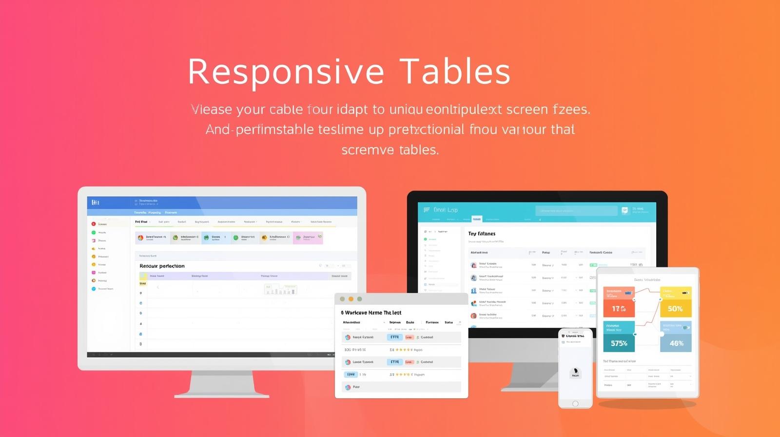
Struggling with tables on mobile? Master CSS Responsive Tables with practical examples, from simple overflow to advanced CSS Grid layouts. Make your data look flawless on any device.
Let's be real. We've all been there. You've poured your soul into crafting a beautiful, data-packed table for your desktop site. It's pristine, it's organized, it's chef's kiss. Then you open it on your phone. Suddenly, it's a hot mess. You're scrolling sideways for what feels like miles, the text is squished, and the user experience is deader than a dial-up modem.
This, my friends, is the classic "Table on Mobile" problem. But guess what? In 2024, there's no excuse for it. With the power of modern CSS, we can make our tables not just survive on small screens, but thrive.
In this deep dive, we're going to move beyond the theory and get our hands dirty with code. We'll explore multiple strategies to make your tables responsive, from quick fixes to elegant, next-level solutions. Buckle up!
What Does "Responsive Table" Even Mean?
Before we jump into the code, let's align on what we're trying to achieve. A responsive table is one that adapts its layout and presentation to provide an optimal viewing experience across different screen sizes—from giant desktop monitors to tiny smartphone screens.
The goal isn't just to "make it fit." The goal is to preserve the readability and usability of the data. No horizontal scrolling hell, no squinting at microscopic text.
Strategy 1: The Simple Overflow Scroll (The Quick Fix)
This is the "get out of jail free" card. It's not always the most user-friendly, but it's fast, easy, and gets the job done when you're in a pinch.
The idea is simple: we contain the table within a wrapper and allow users to scroll horizontally within that wrapper.
The HTML:
html
<div class="table-container">
  <table>
    <thead>
      <tr>
        <th>Player Name</th>
        <th>Team</th>
        <th>Position</th>
        <th>Points Per Game</th>
        <th>Assists</th>
        <th>Rebounds</th>
        <th>Field Goal %</th>
      </tr>
    </thead>
    <tbody>
      <tr>
        <td>LeBron James</td>
        <td>Los Angeles Lakers</td>
        <td>Forward</td>
        <td>25.4</td>
        <td>7.9</td>
        <td>7.9</td>
        <td>52.0%</td>
      </tr>
      <!-- More rows... -->
    </tbody>
  </table>
</div>
The CSS Magic:
css
.table-container {
  width: 100%;
  overflow-x: auto; /* The key property! */
  -webkit-overflow-scrolling: touch; /* For smooth scrolling on iOS */
  border: 1px solid #ddd; /* Optional, for visual clarity */
}

table {
  width: 100%; /* Makes the table try to fill the container */
  min-width: 600px; /* Ensures it doesn't shrink below a readable point */
  border-collapse: collapse;
}

th, td {
  padding: 12px 15px;
  text-align: left;
  border-bottom: 1px solid #ddd;
}
When to use this: For complex data tables where every column is essential and cannot be hidden. It's a pragmatic choice for internal dashboards or financial data.
Strategy 2: The "Stacked" Layout with display: block (The Mobile-First Power Move)
This is where things get sexy. We completely transform the table's structure on small screens. Instead of seeing rows and columns, each row becomes a self-contained "card" or "block" of data. It's incredibly readable and feels native to mobile UX.
We use a media query to trigger this transformation.
The CSS:
css
/* Default styles for desktop */
.responsive-table {
  width: 100%;
  border-collapse: collapse;
}

.responsive-table thead {
  background-color: #f2f2f2;
}

.responsive-table th,
.responsive-table td {
  padding: 12px 15px;
  text-align: left;
  border-bottom: 1px solid #ddd;
}

/* The Magic Happens on Small Screens */
@media screen and (max-width: 768px) {
  .responsive-table thead {
    display: none; /* We hide the header because we'll show the label another way */
  }

  .responsive-table tr {
    display: block; /* Makes each row a block element */
    margin-bottom: 1rem;
    border: 1px solid #ddd;
    border-radius: 5px;
    padding: 10px;
  }

  .responsive-table td {
    display: block; /* Makes each cell a block element */
    text-align: right;
    position: relative;
    padding-left: 50%; /* Creates space for our pseudo-labels */
  }

  .responsive-table td::before {
    /* This acts as our new mobile header */
    content: attr(data-label); /* Crucial: pulls the label from the data-label attribute */
    position: absolute;
    left: 15px;
    width: calc(50% - 15px);
    text-align: left;
    font-weight: bold;
    color: #333;
  }
}
The HTML (Notice the data-label attributes!):
html
<table class="responsive-table">
  <thead>
    <tr>
      <th>Product</th>
      <th>Price</th>
      <th>Stock</th>
      <th>Action</th>
    </tr>
  </thead>
  <tbody>
    <tr>
      <td data-label="Product">Wireless Earbuds Pro</td>
      <td data-label="Price">$199.99</td>
      <td data-label="Stock">In Stock</td>
      <td data-label="Action"><button>Add to Cart</button></td>
    </tr>
    <tr>
      <td data-label="Product">Smartphone Case</td>
      <td data-label="Price">$24.99</td>
      <td data-label="Stock">Low Stock</td>
      <td data-label="Action"><button>Add to Cart</button></td>
    </tr>
  </tbody>
</table>
When to use this: Perfect for product listings, contact lists, or any data set where you can logically pair a label with its value. This is a top-tier choice for user-centric mobile design.
Strategy 3: Hiding Less Important Columns (The Strategic Approach)
Sometimes, not all data is created equal. On a small screen, maybe the user doesn't need to see every single column. We can use CSS to hide non-essential columns as the viewport shrinks.
This requires planning your column priority.
The CSS:
css
.priority-table th,
.priority-table td {
  padding: 10px;
}

/* Hide the 'Date Added' column on tablets */
@media screen and (max-width: 1024px) {
  .col-date {
    display: none;
  }
}

/* Hide the 'SKU' column on mobile phones */
@media screen and (max-width: 768px) {
  .col-sku {
    display: none;
  }
}
The HTML (using classes to target columns):
html
<table class="priority-table">
  <thead>
    <tr>
      <th class="col-product">Product Name</th>
      <th class="col-sku">SKU</th>
      <th class="col-price">Price</th>
      <th class="col-stock">Stock</th>
      <th class="col-date">Date Added</th>
    </tr>
  </thead>
  <tbody>
    <tr>
      <td class="col-product">Ultra HD Monitor</td>
      <td class="col-sku">MON-UHD-27</td>
      <td class="col-price">$349.99</td>
      <td class="col-stock">15</td>
      <td class="col-date">2023-10-15</td>
    </tr>
  </tbody>
</table>
When to use this: For tables where you can clearly identify primary and secondary information. It's a clean way to declutter the view without losing the core table structure.
Level Up: Thinking Outside the <table> Box with CSS Grid
What if we abandoned the <table> element altogether for complex data? With CSS Grid, we can create table-like structures that are incredibly flexible and easy to make responsive.
The HTML (Uses divs):
html
<div class="grid-table">
  <div class="grid-header">
    <div>Name</div>
    <div>Role</div>
    <div>Department</div>
  </div>
  <div class="grid-row">
    <div data-label="Name">Alice Cooper</div>
    <div data-label="Role">Project Manager</div>
    <div data-label="Department">IT</div>
  </div>
  <div class="grid-row">
    <div data-label="Name">Bob Smith</div>
    <div data-label="Role">UX Designer</div>
    <div data-label="Department">Design</div>
  </div>
</div>
The CSS:
css
.grid-table {
  display: grid;
  grid-template-columns: 1fr 1fr 1fr; /* 3 equal columns for desktop */
  gap: 1px;
  background-color: #ddd;
}

.grid-header, .grid-row {
  display: contents; /* A powerful property that makes the children act as direct grid items */
}

.grid-header > div {
  background-color: #333;
  color: white;
  padding: 12px;
  font-weight: bold;
}

.grid-row > div {
  background-color: #fff;
  padding: 12px;
}

/* Responsive Layout for Mobile */
@media (max-width: 768px) {
  .grid-table {
    grid-template-columns: 1fr; /* Stacks everything into one column */
  }

  .grid-header {
    display: none; /* Hide the header row */
  }

  .grid-row > div {
    /* We can use the same data-label technique here */
    padding-left: 50%;
  }
  .grid-row > div::before {
    content: attr(data-label);
    position: absolute;
    left: 15px;
    font-weight: bold;
  }
}
When to use this: When you need maximum control over the layout and are building a component from scratch. It's modern, powerful, but requires more markup and CSS.
Best Practices & Pro-Tips
Be Pragmatic, Not Dogmatic: The "best" method depends entirely on your data and your users. A pricing comparison table might need the scroll method, while a user list is perfect for the stacked layout.
Accessibility is King: Never forget semantic HTML. If it's tabular data, start with a
<table>. Usingdisplay: blockon rows and cells can break screen reader accessibility. Use ARIA labels if necessary and always test with tools like VoiceOver or NVDA.Touch-Friendly: Ensure your interactive elements (buttons, links) inside tables have a large enough touch target (at least 44x44px).
Test Relentlessly: Don't just check on one phone. Use your browser's dev tools, test on real devices, and ask colleagues to check it out.
FAQs
Q: Can I use CSS Frameworks like Bootstrap for this?
A: Absolutely! Bootstrap has built-in responsive table classes like .table-responsive which essentially implements our Strategy 1 (the overflow scroll). It's a great starting point.
Q: Which method is the most accessible?
A: The Overflow Scroll (Strategy 1) and the Column Hiding (Strategy 3) generally preserve the standard table structure, which is best for screen readers. The Stacked Layout (Strategy 2) can be made accessible with careful use of data-label attributes and ARIA roles, but it requires more effort.
Q: My table is populated dynamically from a database. How do I handle the data-label attributes?
A: You need to generate them on the server-side when rendering the table HTML, or use a little bit of JavaScript to inject them after the page loads. It's a small bit of extra work for a huge UX payoff.
Wrapping Up
So, there you have it. The era of broken, unreadable tables on mobile is over. Whether you choose the quick-and-dirty scroll, the elegant card-based stack, or the strategic column hide, you now have a toolkit to tackle any tabular data challenge that comes your way.
The key takeaway? Think about your user's experience first. Choose the method that makes your data the easiest to consume, no matter what device they're on.
Mastering these CSS techniques is just the beginning. To truly become a pro who can build seamless, responsive, and complex web applications from the ground up, you need a solid foundation.
To learn professional software development courses such as Python Programming, Full Stack Development, and MERN Stack, visit and enroll today at codercrafter.in. We'll turn you from a coder into a full-stack craftsman. Now go forth and make your tables responsive

