Taming CSS Align: Your No-Stress Guide to Perfect Layouts
Struggling with CSS alignment? This ultimate guide breaks down Flexbox, Grid, and old-school methods with easy examples. Stop fighting your layout and start coding like a pro!
Let's be real for a second. How many hours have you spent trying to center a div? If your answer is "too many," welcome to the club. CSS alignment is one of those things that seems like it should be a piece of cake, but can quickly turn into a frustrating puzzle.
But what if I told you that in 2024, aligning things in CSS is actually… enjoyable? No, seriously. The dark ages of margin: 0 auto hacks and float nightmares are behind us. We're living in the era of Flexbox and Grid, and life has never been better.
In this deep dive, we're not just going to scratch the surface. We're going to break down every method, from the old-school to the modern, so you can finally stop fighting your layout and start building it with confidence. Let's get this sorted.
What Exactly is CSS Alignment, Anyway?
In simple terms, CSS alignment is all about controlling the position and distribution of space for items inside a container. Think of it like arranging furniture in a room. You can push everything to the left, center it, spread it out evenly, or even control the space between each piece.
This "arrangement" happens in two directions:
Main Axis: The primary direction your items flow in (usually left-to-right).
Cross Axis: The perpendicular direction (usually top-to-bottom).
Understanding these axes is the key to unlocking the power of modern CSS layout tools.
The Old Guard: Tried, True, and Sometimes Troublesome
Before we get to the cool stuff, let's pay respects to the OGs. You might still see these in legacy code, and they're useful for simple, single-axis alignment.
text-align & margin: auto
The classic "center a div" hack.
text-align: center;- This is for inline or inline-block elements only. Think text, spans, or images. Don't try to center a block-leveldivwith this; it won't budge.margin: 0 auto;- The legend. This works by setting the left and right margins of a block-level element to "auto," forcing the browser to calculate equal margins on both sides, thus centering it. But it only works if the element has a definedwidth.
Example: The Classic Centered Card
css
.old-school-card {
  width: 300px; /* Crucial for margin: auto to work */
  margin: 0 auto; /* The magic line */
  padding: 20px;
  background: #f0f0f0;
  text-align: center; /* Centers the text inside */
}
The float Property (RIP)
We don't talk about float for layout anymore. It was never meant for that. It was a hack we used because we had no better tools. It's fragile, requires clearfixes, and was officially dethroned by Flexbox. Let it rest.
The Modern Power Duo: Flexbox and Grid
This is where the magic happens. If you learn only two things from this article, make it these.
Flexbox: The One-Dimensional Alignment King
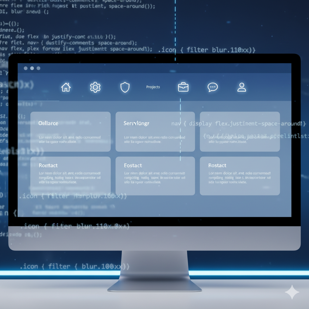
Flexbox is your go-to for laying out items in a single row or column. It's perfect for navbars, button groups, or any component where you're thinking in terms of a straight line.
The beauty is in its properties, which are applied to the parent container (the "flex container").
Key Properties for Alignment:
justify-content: Controls alignment on the main axis (horizontal by default).flex-start: Items pack to the start (left).center: Items center. (Boom, centered.)flex-end: Items pack to the end (right).space-between: Items evenly distributed; first item at start, last at end.space-around: Items evenly distributed with equal space around them.space-evenly: Items are distributed so the spacing between any two items is equal.
align-items: Controls alignment on the cross axis (vertical by default).stretch: Items stretch to fill the container (default).flex-start: Items align to the top.center: Items center vertically. (Boom, vertically centered.)flex-end: Items align to the bottom.
Real-World Use Case: A Modern Navigation Bar
css
.navbar {
  display: flex; /* Activate Flexbox */
  justify-content: space-between; /* Logo on left, menu on right */
  align-items: center; /* Vertically centers the items */
  padding: 1rem 2rem;
  background-color: #333;
}

.logo { color: white; }
.nav-links {
  display: flex;
  gap: 2rem; /* Easy spacing between links */
}
With just a few lines, you have a perfectly aligned, professional-looking nav.
CSS Grid: The Two-Dimensional Layout Boss
While Flexbox is for one direction, CSS Grid is for both rows and columns at the same time. It’s for when you need full control over the entire plane. Think entire page layouts, image galleries, or complex dashboards.
For alignment, Grid introduces a slightly different but incredibly powerful approach.
Key Properties for Alignment:
justify-content&justify-items: Control alignment on the inline (row) axis.align-content&align-items: Control alignment on the block (column) axis.
The difference between content and items is subtle:
-contentaligns the entire grid within its container (useful if your tracks don't take up all the space).-itemsaligns the grid items inside their individual cells.
Real-World Use Case: A Perfectly Centered Login Modal
css
.modal-overlay {
  display: grid;
  place-items: center; /* The ultimate centering hack */
  height: 100vh;
  background: rgba(0, 0, 0, 0.5);
}

.login-modal {
  width: 90%;
  max-width: 400px;
  padding: 2rem;
  background: white;
  border-radius: 8px;
}
See that place-items: center;? It's a shorthand for align-items: center; and justify-items: center;. It tells the browser to center the .login-modal both horizontally and vertically within its grid cell. One line to rule them all.
Best Practices: Don't Just Align, Align Smartly
Use Flexbox for Components: Think navbars, card actions, form fields, and any linear layout.
Use Grid for Layouts: Think overall page structure, card grids, and any complex 2D arrangement.
Embrace
gap: Forgetmarginfor spacing between items in Flexbox or Grid. Thegapproperty is clean, consistent, and doesn't collapse. It's a game-changer.Start with Mobile: Use alignment properties that work well on small screens and use media queries to adjust
justify-contentor switch from a Flexbox column to a row on larger screens.Don't Overthink Simple Centering: Need to center something both vertically and horizontally?
display: grid; place-items: center;is often the simplest solution.
FAQs: Your Burning Questions, Answered
Q1: Why is vertical-align: middle not working for my div?
A: vertical-align is a classic trap. It's only intended for inline and table-cell elements (like <td> or <span>). It has no effect on block-level elements like <div>. Use Flexbox's align-items: center or Grid's align-items: center instead.
Q2: Flexbox vs. Grid for alignment—which one should I use?
A: Ask yourself: "Am I laying out in one direction (a row OR a column)?" If yes, use Flexbox. "Am I laying out in two directions (rows AND columns) simultaneously?" If yes, use Grid. They also work beautifully together—use Grid for the page layout and Flexbox for the components inside.
Q3: What's the difference between align-items and align-content in Flexbox?
A: align-items aligns each line of items individually. align-content aligns the entire set of lines (if you have wrapped flex items) within the container. It only has an effect if there's extra space on the cross axis and you have multiple lines.
Level Up Your Skills with Professional Guidance
Mastering CSS alignment is a fundamental step in becoming a proficient web developer. It transforms your code from hacky and fragile to clean, maintainable, and powerful. But CSS is just the beginning.
If you're ready to move from following tutorials to building professional, full-fledged applications, you need a structured path. To learn professional software development courses such as Python Programming, Full Stack Development, and MERN Stack, visit and enroll today at codercrafter.in. Our project-based curriculum is designed to take you from core concepts to industry-ready skills, with expert mentorship every step of the way.
Conclusion: You've Got This
The journey from margin: auto to place-items: center is the journey of CSS itself. We've moved from clever hacks to powerful, designed tools that give developers immense control.
So, the next time you need to center something, don't panic. Ask yourself about the axes, choose your weapon (Flexbox or Grid), and apply the property. It’s no longer a mystery—it’s a skill you now own.
