Tame Your Images: A No-BS Guide to CSS object-fit
Struggling with image cropping and distortion? Master the CSS object-fit property with our in-depth guide. Learn how to perfectly fit images into any container, with real-world examples and code.
Let's be real for a second. How many times have you been crafting what you think is the perfect website layout, only to have it completely wrecked by an image?
You drop an <img> tag into a nicely styled card or a circular avatar container, and boom—your beautiful, high-resolution photo looks like it was put through a wringer. It’s stretched, squashed, or awkwardly cropped. You spend the next hour fiddling with width, height, and overflow properties, questioning your life choices as a developer.
Sound familiar? We've all been there.
But what if I told you there's a simple, elegant, and downright magical CSS property that can solve about 90% of your image-sizing headaches? Let me introduce you to your new best friend: object-fit.
What the Heck is object-fit Anyway?
In the simplest terms, object-fit tells the content of a replaced element (like an <img> or <video>) how to resize itself to fit its container. It’s the boss that tells your image, "Hey, you need to live inside this box. Here's how you're going to do it without looking weird."
Before object-fit, our only real option for controlling an image's dimensions was to set a fixed width and height. But this often led to distortion because the image's intrinsic aspect ratio (its natural width-to-height proportion) would fight with the container's aspect ratio.
object-fit steps in as the peacekeeper. It answers the question: "Should the image fill the box by stretching? Should it fit entirely inside, leaving some empty space? Or should it fill the box by cropping the edges?"
The Prerequisite: Setting the Stage
For object-fit to work its magic, the image must have both a width and a height defined. This creates the "container box" that the image will fit into. This is crucial. You can use pixels, percentages, or even 100% for both to make it fill a parent div.
css
.img-container {
width: 300px;
height: 200px;
border: 2px solid #f00; /* So we can see the box */
}
.img-container img {
width: 100%;
height: 100%;
/* Now we can add object-fit */
object-fit: cover;
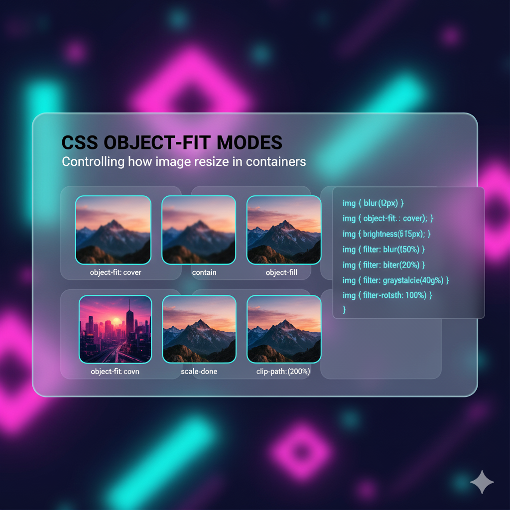
}The object-fit Squad: Meet the 5 Values
Let's break down the gang of five values that object-fit brings to the party. We'll use a classic example: you have a tall, portrait-oriented image, and you're trying to fit it into a wide, landscape-oriented container.
1. object-fit: fill; (The Default Villain)
This is what browsers often do by default and the cause of most of our distortion problems. fill forces the image to stretch itself to exactly fit the container box. It completely ignores the image's original aspect ratio.
The Vibe: "Just make it fit, I don't care how it looks!"
Use Case: Almost never. Unless you're going for a funhouse mirror effect.
2. object-fit: contain; (The Safe Play)
contain is the polite, non-confrontational member of the group. It scales the image down or up to ensure the entire image is visible inside the box. It preserves the aspect ratio perfectly. This will often result in "letterboxing" (empty bands on the sides) or "pillarboxing" (empty bands on the top and bottom).
The Vibe: "Show me the whole thing, no cropping allowed."
Use Case: Product galleries where you need to see the entire product without any part being cut off, or logos in a header.
3. object-fit: cover; (The MVP)
This is the one you'll use 80% of the time. cover tells the image to fill the entire container box, preserving its aspect ratio, but it will crop the parts of the image that don't fit. Think of it like a background image with background-size: cover.
The Vibe: "Fill the box completely. I don't mind losing a bit of the edges if it means no empty space and no stretching."
Use Case: Hero section images, user profile avatars, image grids for portfolios, and blog post thumbnails. This is the go-to for most modern web designs.
4. object-fit: none; (The Purist)
none means what it says. The image ignores the container's size and retains its original intrinsic dimensions. If the container is smaller, the image will be cropped. If the container is larger, the image will sit in the middle with a lot of empty space around it.
The Vibe: "I am what I am. Deal with it."
Use Case: When you need to show an image at its exact original pixel size, or for a very specific "zoomed-in" detail shot.
5. object-fit: scale-down; (The Compromise)
scale-down is a bit of a hybrid. It behaves as if you applied both none and contain, and then chooses the one that results in the smaller concrete object size. So, it will either display the image at its native size (none) or scale it down to fit inside the box (contain), whichever makes the image smaller.
The Vibe: "Show the whole image, and don't you dare make it pixelated by scaling up."
Use Case: Similar to
contain, but useful when you have a mix of small and large images and you want to prevent the small ones from being blown up and looking blurry.
object-fit in the Real World: Let's Get Practical
Enough theory. How do we actually use this in our day-to-day projects?
Use Case 1: Perfect User Avatars (No More Squashed Circles!)
You're building a social media app, and every user avatar needs to be a perfect circle. Without object-fit, this is a nightmare.
The HTML:
html
<div class="avatar">
  <img src="user-photo.jpg" alt="User Profile Picture">
</div>
The CSS (The Old, Painful Way):
You'd have to set the image as a background-image and use background-size: cover, which is less semantic and accessible.
The CSS (The object-fit Way):
css
.avatar {
  width: 150px;
  height: 150px;
  border-radius: 50%; /* This makes it a circle */
  overflow: hidden; /* This is crucial to clip the image */
}

.avatar img {
  width: 100%;
  height: 100%;
  object-fit: cover; /* This makes the image cover the circle perfectly */
}
Boom. Perfect, non-distorted circular avatars, regardless of what image the user uploads.
Use Case 2: A Uniform Product Grid
You're building an e-commerce site. Your product images come in all shapes and sizes—some are square, some are landscape, some are portrait. You want every product card to look uniform.
The Solution:
css
.product-card img {
  width: 100%;
  height: 250px; /* Fixed height for all cards */
  object-fit: cover; /* This will crop all images to the same dimensions */
}
Now, every product image neatly fills its 250px tall container, creating a clean, consistent grid. The alternative—resizing every product image manually in Photoshop—is a workflow from the dark ages.
Use Case 3: A Full-Screen Hero Section
You want a stunning, full-viewport-height hero section with a background image. While you could use background-image, using an <img> tag with object-fit is often better for SEO and allows for native lazy loading.
The HTML:
html
<section class="hero">
  <img src="hero-bg.jpg" alt="Breathtaking landscape">
  <div class="hero-content">
    <h1>Welcome to the Future</h1>
    <button>Learn More</button>
  </div>
</section>
The CSS:
css
.hero {
  position: relative;
  height: 100vh;
}

.hero img {
  width: 100%;
  height: 100%;
  object-fit: cover; /* The key to a full-cover background image */
}

.hero-content {
  position: absolute;
  top: 50%;
  left: 50%;
  transform: translate(-50%, -50%);
  text-align: center;
  color: white;
}
Pro Tip: Don't Forget object-position
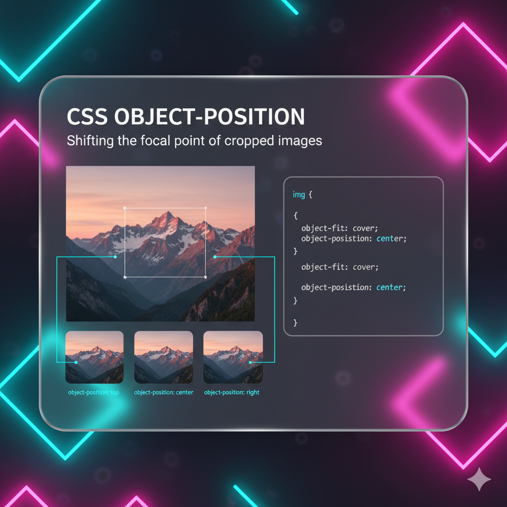
When you use object-fit: cover or object-fit: none, you're cropping the image. But what part of the image gets cropped? By default, it's centered. But you can control this with its partner-in-crime: object-position.
It works exactly like background-position.
css
img {
  object-fit: cover;
  object-position: top center; /* Focus on the top of the image */
  /* object-position: 20% 75%; */ /* Use coordinates for precise control */
}
This is a game-changer for avatars. If a user's photo is a full-body shot, object-position: top center will ensure their face is visible and not cropped out.
FAQ: Stuff You Might Be Wondering
Q: What about browser support?
A: It's fantastic! object-fit is supported in all modern browsers (Chrome, Firefox, Safari, Edge) for years. The only notable exception is Internet Explorer, which has zero support. If you need to support IE, you'll need a fallback, like using a background-image technique for those browsers.
Q: Can I use object-fit on videos?
A: Absolutely! It works on <video> elements exactly the same way. Perfect for making background videos that fill a container.
Q: What's the difference between object-fit: cover and background-size: cover?
A: The main difference is the HTML element you're styling. background-size works on a div's background. object-fit works directly on an <img> or <video> tag. Using an <img> tag is generally better for accessibility, SEO, and semantic correctness.
Level Up Your Skills with Professional Guidance
Mastering CSS properties like object-fit is what separates hobbyists from professional developers. It's these small, powerful tools that allow you to build robust, beautiful, and maintainable user interfaces.
If you're serious about taking your web development skills to the next level, diving deep into modern CSS is just the beginning. To learn professional software development courses such as Python Programming, Full Stack Development, and MERN Stack, visit and enroll today at codercrafter.in. Our project-based curriculum is designed to turn you into a job-ready developer, teaching you not just the "how" but the "why" behind the code.


