Master the Vertical Navbar: A 2025 Guide to Sleek, Functional Sidebars
Tired of boring top navbars? Learn how to build a modern, responsive vertical navbar with HTML, CSS, and JavaScript. Includes examples, best practices, and pro tips.
Let's be real. When we think of a website's navigation, our brains automatically go to that horizontal bar at the top. It's the classic, the OG, the default. But what if I told you there's a sleeker, more space-savvy, and often more aesthetic way to guide your users? Enter the Vertical Navbar.
You've seen it everywhere—on your Spotify desktop app, in the dashboard of your favorite analytics tool, or on those super-clean portfolio sites that make you go, "Whoa, how'd they do that?" A vertical navbar (or a sidebar) isn't just a trend; it's a powerful design pattern for complex apps and content-rich websites.
In this deep dive, we're not just going to throw a code snippet at you. We're going to break down the why, the how, and the oh-wow of vertical navbars. We'll code one together, make it look fire, and even make it responsive. Buckle up!
What Exactly is a Vertical Navbar?
In simple terms, a vertical navbar is a navigation menu that runs vertically along the side of a webpage—typically the left, but sometimes the right. Instead of links laid out horizontally, they're stacked on top of each other.
Think of it like this:
Horizontal Navbar: A busy city street with shops side-by-side.
Vertical Navbar: A high-rise building with different floors stacked on top of each other.
It’s perfect for when you have a lot of navigation items, or when you want to create a clear, hierarchical structure for your content.
Why Go Vertical? The Real-World Use Cases
You wouldn't use a spoon to cut a steak, right? Similarly, a vertical navbar is a tool for specific jobs. Here’s when it absolutely slaps:
Web Applications & Dashboards: This is the #1 use case. Think Gmail, Trello, Asana, or any admin panel. These tools have tons of features and sections (Inbox, Sent, Drafts, Settings, Reports). A vertical sidebar neatly tucks them away, always accessible but not cluttering the main workspace.
Documentation Sites: If you've ever read API docs (like for React or Stripe), you've seen this. A vertical TOC (Table of Contents) on the left allows users to quickly jump between different sections and chapters. It's a lifesaver for long-form content.
Portfolio & Creative Websites: Designers, artists, and photographers often use vertical navs for a unique, layout-breaking aesthetic. It feels more like a digital art gallery than a standard corporate site.
E-commerce Sites with Deep Categories: A massive online store with dozens of categories and sub-categories? A vertical navbar can act as a mega-menu, helping users drill down without feeling lost.
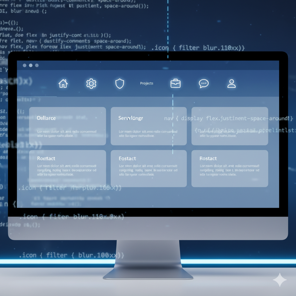
Let's Get Our Hands Dirty: Building a Modern Vertical Navbar
Enough theory. Let's code a clean, modern vertical navbar that you can use in your own projects. We'll use HTML for structure, CSS for the magic, and a tiny bit of JavaScript for some interactive sparkle.
Step 1: The HTML Structure (The Bones)
We'll keep it semantic and accessible.
html
<!DOCTYPE html>
<html lang="en">
<head>
    <meta charset="UTF-8">
    <meta name="viewport" content="width=device-width, initial-scale=1.0">
    <title>My Awesome App</title>
    <link rel="stylesheet" href="style.css">
</head>
<body>
    <!-- The Vertical Navbar -->
    <nav class="vertical-navbar">
        <div class="nav-header">
            <h2>MyApp</h2>
        </div>
        <ul class="nav-links">
            <li><a href="#"><span class="icon">🏠</span> Dashboard</a></li>
            <li><a href="#"><span class="icon">📧</span> Messages</a></li>
            <li><a href="#"><span class="icon">📊</span> Analytics</a></li>
            <li><a href="#"><span class="icon">👥</span> Team</a></li>
            <li><a href="#"><span class="icon">⚙️</span> Settings</a></li>
        </ul>
        <div class="nav-footer">
            <a href="#" class="logout-btn"><span class="icon">🚪</span> Logout</a>
        </div>
    </nav>

    <!-- The Main Content Area -->
    <main class="main-content">
        <h1>Welcome to Your Dashboard</h1>
        <p>This is your main content area. It sits nicely next to the vertical navbar.</p>
        <!-- Your amazing content goes here -->
    </main>

    <script src="script.js"></script>
</body>
</html>
Step 2: The CSS Styling (The Swag)
This is where we make it look good. We'll use Flexbox for easy alignment and some smooth transitions for a premium feel.
css
/* style.css */
body {
    margin: 0;
    font-family: 'Segoe UI', Tahoma, Geneva, Verdana, sans-serif;
    display: flex; /* The key to placing navbar and content side-by-side */
    height: 100vh; /* Full viewport height */
    background-color: #f5f7fa;
}

.vertical-navbar {
    width: 250px;
    background: linear-gradient(180deg, #667eea 0%, #764ba2 100%); /* A cool gradient */
    color: white;
    display: flex;
    flex-direction: column;
    box-shadow: 2px 0 5px rgba(0, 0, 0, 0.1);
}

.nav-header {
    padding: 20px;
    text-align: center;
    border-bottom: 1px solid rgba(255, 255, 255, 0.1);
}

.nav-header h2 {
    margin: 0;
}

.nav-links {
    list-style: none;
    padding: 0;
    margin: 0;
    flex-grow: 1; /* Pushes the footer to the bottom */
}

.nav-links li a {
    display: flex;
    align-items: center;
    padding: 15px 20px;
    color: white;
    text-decoration: none;
    transition: all 0.3s ease;
}

.nav-links li a:hover {
    background-color: rgba(255, 255, 255, 0.1);
    padding-left: 25px; /* A nice hover effect */
}

.nav-links li a .icon {
    margin-right: 10px;
    font-size: 1.2em;
}

.nav-footer {
    padding: 20px;
    border-top: 1px solid rgba(255, 255, 255, 0.1);
}

.logout-btn {
    display: flex;
    align-items: center;
    color: white;
    text-decoration: none;
}

.main-content {
    flex-grow: 1; /* Takes up all remaining space */
    padding: 40px;
    overflow-y: auto; /* Allows scrolling for main content */
}
Boom! You should now have a pretty slick, static vertical navbar. But we can make it better.
Step 3: Leveling Up with Interactivity
Let's add a toggle button to collapse and expand the navbar, which is crucial for mobile views or saving space.
First, update the HTML (add a toggle button inside the nav-header):
html
<div class="nav-header">
    <h2>MyApp</h2>
    <button id="navToggle" class="nav-toggle">☰</button>
</div>
Then, add the CSS for the collapsed state:
css
.vertical-navbar.collapsed {
    width: 70px;
}

.vertical-navbar.collapsed .nav-header h2,
.vertical-navbar.collapsed .nav-links li a span:not(.icon),
.vertical-navbar.collapsed .logout-btn span:not(.icon) {
    display: none; /* Hide text when collapsed */
}

.vertical-navbar.collapsed .nav-links li a {
    justify-content: center;
    padding: 15px 0;
}

.vertical-navbar.collapsed .nav-links li a .icon {
    margin-right: 0;
    font-size: 1.5em; /* Make icons bigger when centered */
}

.nav-toggle {
    background: none;
    border: none;
    color: white;
    font-size: 1.2em;
    cursor: pointer;
    position: absolute;
    right: 15px;
    top: 20px;
}
Finally, the JavaScript to make it work:
javascript
// script.js
document.getElementById('navToggle').addEventListener('click', function() {
    document.querySelector('.vertical-navbar').classList.toggle('collapsed');
});
Now you have a fully functional, collapsible vertical navbar! Pretty cool, right?
Best Practices & Pro-Tips You Shouldn't Ignore
Don't Hide Essential Links: If it's critical for user flow (e.g., "Contact," "Pricing"), a horizontal top bar might be better, or ensure your vertical nav is always visible.
Mind the Scroll: If your vertical nav is longer than the screen, make sure it's scrollable independently of the main content.
Icons are Your Best Friend: As we did, icons make a collapsed navbar still usable. Use them wisely.
Accessibility Matters: Use proper ARIA labels (
aria-label,aria-expanded) for the toggle button, especially for screen readers.Test on Mobile: A 250px sidebar on a 375px mobile screen is a no-go. Our toggle is a start, but for a truly mobile-first approach, you might want the navbar to be off-canvas (sliding in from the side) on small screens.
Building components like this is a fundamental part of modern web development. To learn professional software development courses such as Python Programming, Full Stack Development, and MERN Stack, visit and enroll today at codercrafter.in. Our project-based curriculum ensures you can build real-world features like this with confidence.
FAQs: Your Vertical Navbar Questions, Answered
Q1: Is a vertical navbar bad for SEO?
A: Not at all! As long as your HTML is semantic (using <nav>, <ul>, <li>) and your links are crawlable, Google doesn't care if your navbar is horizontal, vertical, or shaped like a circle.
Q2: How do I make my vertical navbar responsive?
A: Use CSS Media Queries! For smaller screens, you can:
* Set the navbar to position: fixed and height: 100%.
* Start with it off-screen (left: -250px).
* Use the toggle button to slide it in by changing left: 0.
Q3: Can I use this with React or Vue?
A: Absolutely! The core CSS principles remain the same. You would just manage the collapsed state (e.g., with useState in React) instead of using vanilla JavaScript.
Q4: My navbar looks squished. What's wrong?
A: Check your width and padding properties. Also, ensure the parent container (like the body using display: flex) has enough space. Use your browser's developer tools to inspect the elements.
Conclusion: The Vertical Vibe is Strong
The vertical navbar is more than just a design choice; it's a strategic tool for enhancing usability and creating a focused user experience. It’s perfect for complex applications, documentation, and any site that benefits from a clear, hierarchical structure.
By following this guide, you've not only built a functional component but also understood the principles behind it. You can now customize it, animate it further, and integrate it into your projects. Remember, the best UIs are the ones that feel intuitive and effortless.
Ready to build more complex and impressive projects? Dive deeper into the world of web development with structured, industry-relevant courses. To learn professional software development courses such as Python Programming, Full Stack Development, and MERN Stack, visit and enroll today at codercrafter.in.