Master the Navbar: Your Ultimate Guide to Building a Killer Horizontal Navigation Bar
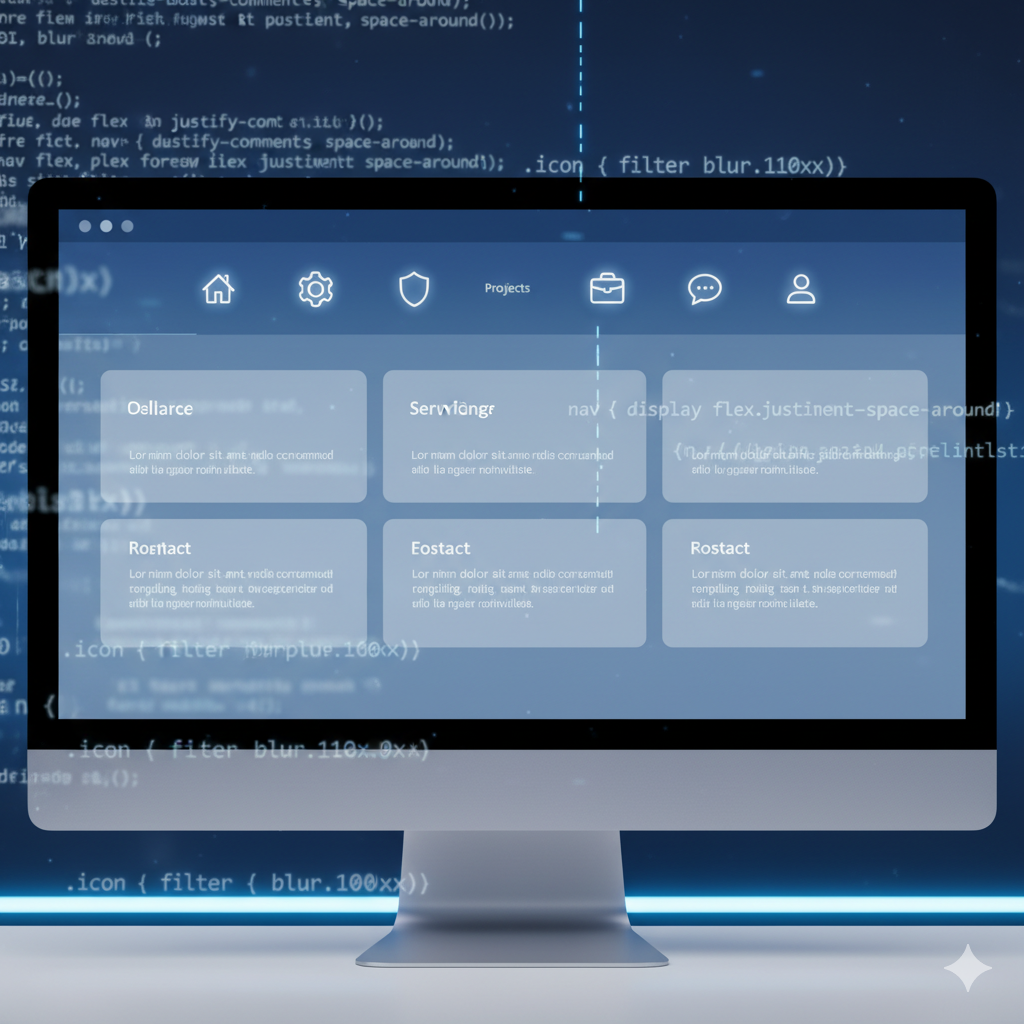
Struggling with your website's navbar? This in-depth guide covers everything from HTML/CSS basics to advanced responsive design. Learn best practices, fix common issues, and build a seamless user experience. Level up your skills with professional courses at CoderCrafter!
Let's be real. We've all been there. You're building a slick new website, the design is fire, the content is ready to go... and then you get to the navbar. Suddenly, your beautiful layout is at the mercy of a few stubborn links that just refuse to line up properly. It's a universal rite of passage for web developers.
But what if I told you it doesn't have to be that way?
The horizontal navigation bar—that trusty strip at the top of a website—is the cornerstone of user experience. It’s your site's GPS. A bad one gets people lost and frustrated. A great one? It feels invisible, guiding users effortlessly to where they want to go.
In this mega-guide, we're not just going to throw a code snippet at you. We're going to demystify the horizontal navbar. We'll break it down from absolute basics to responsive best practices that actually make sense. Let's dive in.
What Exactly is a Horizontal Navbar? (And Why Should You Care?)
In simple terms, a horizontal navbar is a UI component that houses the primary links to the main sections of a website, arranged—you guessed it—horizontally. Think of it as the table of contents for your entire digital book.
You'll spot them everywhere:
Amazon: A massive, complex one with mega-menus for different departments.
Netflix: A clean, focused one for TV Shows, Movies, New & Popular, etc.
GitHub: A developer-friendly one for your repositories, codespaces, and marketplace.
Getting it right is non-negotiable. A well-built navbar:
Boosts Navigation: Users find what they need in seconds.
Improves SEO: Clear site structure helps search engines crawl and index your pages.
Enhances Professionalism: A polished navbar screams "this site was built with care."
Building Your First Navbar: Let's Get Our Hands Dirty
Enough theory. Let's code a solid, modern horizontal navbar from scratch. We'll use plain HTML and CSS because fundamentals are key.
Step 1: The HTML Foundation (The Skeleton)
First, we need to structure our content semantically. Using the right HTML tags is crucial for accessibility and SEO.
html
<header class="site-header">
  <nav class="navbar">
    <div class="nav-brand">
      <a href="/">MyAwesomeSite</a>
    </div>
    <ul class="nav-menu">
      <li class="nav-item">
        <a href="/" class="nav-link">Home</a>
      </li>
      <li class="nav-item">
        <a href="/about" class="nav-link">About</a>
      </li>
      <li class="nav-item">
        <a href="/services" class="nav-link">Services</a>
      </li>
      <li class="nav-item">
        <a href="/contact" class="nav-link">Contact</a>
      </li>
    </ul>
  </nav>
</header>
Key takeaways:
We use the
<nav>tag—it tells browsers and screen readers, "Hey, this is a navigation section!"We use an unordered list (
<ul>) for our menu items. This is the standard, semantic way to represent a list of links.
Step 2: The CSS Magic (The Styling)
Now for the fun part—making it look good. This is where we turn that vertical list into a sleek horizontal bar.
css
/* Basic Reset - Trust me, you need this */
* {
  margin: 0;
  padding: 0;
  box-sizing: border-box;
}

.site-header {
  background-color: #fff;
  box-shadow: 0 2px 10px rgba(0, 0, 0, 0.1); /* A subtle shadow for depth */
  position: sticky; /* This makes it stick to the top on scroll - so modern! */
  top: 0;
  z-index: 1000;
}

.navbar {
  display: flex;
  justify-content: space-between; /* Pushes brand to left, menu to right */
  align-items: center;
  padding: 1rem 2rem;
  max-width: 1200px;
  margin: 0 auto; /* This centers the navbar */
}

.nav-brand a {
  font-size: 1.5rem;
  font-weight: bold;
  color: #333;
  text-decoration: none;
}

.nav-menu {
  display: flex; /* This is the key! It makes the list horizontal */
  list-style: none; /* Gets rid of the bullet points */
  gap: 2rem; /* Modern way to add space between items (better than margin) */
}

.nav-link {
  text-decoration: none;
  color: #555;
  font-weight: 500;
  transition: color 0.3s ease; /* Smooth color change on hover */
}

.nav-link:hover {
  color: #007bff; /* A nice blue color on hover */
}
Boom! You now have a clean, centered, and professional-looking horizontal navbar. The magic ingredient here is display: flex on the .nav-menu. Flexbox is literally a lifesaver for layouts like this.
Leveling Up: Making It Responsive (Because Mobile is King)
Okay, your navbar looks sick on a desktop. But open it on your phone, and the links are probably squished or overflowing. Time to fix that with the iconic "hamburger menu."
We'll need to add a toggle button and a bit of JavaScript.
Updated HTML (Add the Hamburger Button)
html
<header class="site-header">
  <nav class="navbar">
    <div class="nav-brand">
      <a href="/">MyAwesomeSite</a>
    </div>

    <!-- The Hamburger Button (visible only on mobile) -->
    <button class="hamburger" id="hamburger">
      <span></span>
      <span></span>
      <span></span>
    </button>

    <ul class="nav-menu" id="nav-menu">
      <li class="nav-item"><a href="/" class="nav-link">Home</a></li>
      <li class="nav-item"><a href="/about" class="nav-link">About</a></li>
      <li class="nav-item"><a href="/services" class="nav-link">Services</a></li>
      <li class="nav-item"><a href="/contact" class="nav-link">Contact</a></li>
    </ul>
  </nav>
</header>
Enhanced CSS (Handling the Mobile View)
css
/* ... previous CSS remains the same ... */

.hamburger {
  display: none; /* Hidden by default on desktop */
  flex-direction: column;
  background: transparent;
  border: none;
  cursor: pointer;
}

.hamburger span {
  height: 3px;
  width: 25px;
  background: #333;
  margin: 3px 0;
  transition: 0.3s;
}

/* Media Query for Mobile */
@media (max-width: 768px) {
  .hamburger {
    display: flex; /* Show the hamburger button on mobile */
  }

  .nav-menu {
    position: fixed;
    left: -100%; /* Hide the menu off-screen */
    top: 70px; /* Adjust based on your header height */
    flex-direction: column;
    background-color: #fff;
    width: 100%;
    text-align: center;
    transition: 0.3s;
    box-shadow: 0 10px 27px rgba(0, 0, 0, 0.05);
    gap: 0;
  }

  .nav-menu.active {
    left: 0; /* Bring the menu back on-screen when active */
  }

  .nav-item {
    margin: 1.5rem 0;
  }
}
The JavaScript (Adding Interactivity)
javascript
const hamburger = document.getElementById('hamburger');
const navMenu = document.getElementById('nav-menu');

hamburger.addEventListener('click', () => {
  // Toggle the 'active' class on both the menu and the hamburger
  navMenu.classList.toggle('active');
  hamburger.classList.toggle('active');
});
Now you have a fully functional, mobile-responsive navbar that toggles with a smooth animation. This is what modern users expect.
Best Practices to Make Your Navbar Chef's Kiss
Keep it Simple: Don't overload it with 10+ items. 5-7 links is the sweet spot.
Prioritize: Put the most important pages (Home, About, Contact) on the left.
Use Clear Labels: "What We Do" is ambiguous. "Services" is clear.
Highlight the Current Page: Use an
.activeclass to visually indicate where the user is.Don't Forget the Footer: For less crucial links, the footer is a great place.
Accessibility is a Feature, Not an Afterthought: Use
aria-labelon your hamburger button (e.g.,aria-label="Toggle navigation").
FAQs: Your Navbar Questions, Answered
Q: Should I use Flexbox or CSS Grid for a navbar?
A: For a one-dimensional layout like a simple navbar, Flexbox is the go-to choice. It's literally designed for this. Grid is better for complex, two-dimensional layouts.
Q: My navbar links are stacking vertically even with display: flex. What's wrong?
A: 99% of the time, it's a width issue. The parent container might be too narrow. Check your widths and paddings. Use your browser's developer tools to inspect the elements!
Q: How do I center my logo and have links on both sides?
A: This is a classic layout. You can structure your HTML with three divs (left-links, logo, right-links) and use display: flex; justify-content: space-between; on the main navbar container.
Q: Is it okay to use a navbar framework like Bootstrap?
A: Absolutely! Frameworks are great for prototyping. But understanding the underlying CSS, like we've covered here, makes you a better, more flexible developer. You're not just relying on magic.
Building components like this from scratch is a core skill that separates hobbyists from professionals. To learn professional software development courses such as Python Programming, Full Stack Development, and MERN Stack, where you'll master these fundamentals and build complex, real-world applications, visit and enroll today at codercrafter.in.
Wrapping Up
The humble horizontal navbar is a deceptively complex piece of web design. But by breaking it down into structured HTML, powerful CSS with Flexbox, and a dash of JavaScript for interactivity, you can build navigation that is not only beautiful and functional but also robust and accessible.
It's a fundamental building block. Master it, and you've taken a huge step toward becoming a proficient front-end developer. Now go forth and build some awesome navbars!
