Master CSS Navigation Bars: A 2025 Guide to Stunning, User-Friendly Menus
Stop struggling with clunky menus! Learn how to build responsive, accessible, and beautifully styled CSS navigation bars from scratch. Level up your web dev skills with our step-by-step guide.
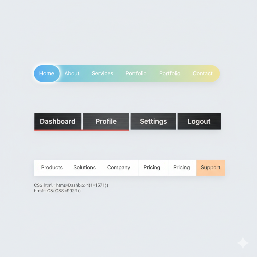
Let's be real. The navigation bar is the MVP of any website. It’s the GPS for your users, the anchor in a sea of content. If it’s clunky, confusing, or just plain ugly, people are gonna bounce faster than you can say "CSS."
You've probably seen a million tutorials, but how do you build a nav bar that's not just functional, but actually good? One that looks slick on desktop, transforms gracefully on mobile, and is a breeze for everyone to use?
That’s exactly what we’re diving into today. Forget the dry, technical jargon. We're breaking down CSS navigation bars into bite-sized, actionable steps. We'll cover the basics, build a modern navbar from scratch, make it responsive, and talk about the pro tips that separate the amateurs from the experts.
Ready to level up your front-end game? Let's get into it.
What Even Is a CSS Navigation Bar?
In simple terms, a navigation bar (or navbar) is that strip, usually at the top of a page, with links to the most important sections of your site—like Home, About, Services, Blog, and Contact.
We use HTML for the structure (the links and the container) and CSS for, well, everything else. CSS is what transforms a boring list of text links into a polished, professional-looking menu. It’s the difference between this:
Home | About | Services | Contact
And a sleek, modern horizontal bar with hover effects and a cool logo.
Building a Modern Navbar, Step-by-Step
Enough talk, let's code. We're going to build a standard horizontal navbar that you see on most professional sites today.
Step 1: The HTML Foundation (The Skeleton)
First, we need a solid HTML structure. We'll use semantic HTML5 tags because they're better for accessibility and SEO.
html
<header class="header">
  <nav class="navbar">
    <div class="nav-brand">
      <a href="#"><img src="logo.png" alt="CoderCrafter Logo"></a>
    </div>
    <ul class="nav-menu">
      <li class="nav-item">
        <a href="/" class="nav-link">Home</a>
      </li>
      <li class="nav-item">
        <a href="/about" class="nav-link">About</a>
      </li>
      <li class="nav-item">
        <a href="/courses" class="nav-link">Courses</a>
      </li>
      <li class="nav-item">
        <a href="/blog" class="nav-link">Blog</a>
      </li>
      <li class="nav-item">
        <a href="/contact" class="nav-link">Contact</a>
      </li>
    </ul>
    <div class="hamburger">
      <span class="bar"></span>
      <span class="bar"></span>
      <span class="bar"></span>
    </div>
  </nav>
</header>
See what we did there? We have a header, a nav, a logo div, an unordered list (ul) for our menu items, and a "hamburger" div. That last one is for our mobile menu, which we'll get to later.
Step 2: The Basic CSS Styling (The Makeover)
Now, let's make this skeleton look presentable. We'll start by resetting some default styles and setting up the main navbar.
css
/* Reset padding and margin for the list */
* {
  margin: 0;
  padding: 0;
  box-sizing: border-box;
}

body {
  font-family: 'Segoe UI', Tahoma, Geneva, Verdana, sans-serif;
}

.header {
  background-color: #fff;
  box-shadow: 0 2px 10px rgba(0, 0, 0, 0.1); /* A subtle shadow for depth */
  position: sticky;
  top: 0;
  z-index: 100;
}

.navbar {
  display: flex;
  justify-content: space-between;
  align-items: center;
  padding: 1rem 2rem;
  max-width: 1200px;
  margin: 0 auto;
}

.nav-brand a {
  font-size: 1.5rem;
  font-weight: bold;
  color: #333;
  text-decoration: none;
}

.nav-menu {
  display: flex;
  list-style: none;
  gap: 2rem; /* This is a modern way to add space between items */
}

.nav-link {
  text-decoration: none;
  color: #333;
  font-weight: 500;
  transition: color 0.3s ease; /* Smooth color transition on hover */
}

.nav-link:hover {
  color: #007bff; /* A nice blue color on hover */
}

.hamburger {
  display: none; /* We hide it by default for desktop */
  cursor: pointer;
}

.bar {
  display: block;
  width: 25px;
  height: 3px;
  margin: 5px auto;
  background-color: #333;
  transition: all 0.3s ease;
}
Boom! Just like that, we have a clean, modern-looking horizontal navbar for desktop. The display: flex on the .navbar is the magic trick that aligns the logo and menu in a row.
Making It Mobile-Friendly (The "Hamburger" Menu)
This is non-negotiable in 2024. Most of your traffic is on mobile. Let's make our navbar responsive.
We'll use a CSS Media Query to change the layout when the screen gets smaller.
css
@media (max-width: 768px) {
  .hamburger {
    display: block; /* Show the hamburger icon on mobile */
  }

  .nav-menu {
    position: fixed;
    left: -100%; /* Hide the menu off-screen */
    top: 70px; /* Height of your navbar */
    gap: 0;
    flex-direction: column;
    background-color: #fff;
    width: 100%;
    text-align: center;
    transition: left 0.3s ease; /* Animate the slide-in */
    box-shadow: 0 10px 15px rgba(0, 0, 0, 0.1);
  }

  .nav-item {
    margin: 1rem 0;
  }

  .nav-menu.active {
    left: 0; /* Bring the menu onto the screen */
  }

  /* Optional: Hamburger animation to 'X' */
  .hamburger.active .bar:nth-child(2) {
    opacity: 0;
  }
  .hamburger.active .bar:nth-child(1) {
    transform: translateY(8px) rotate(45deg);
  }
  .hamburger.active .bar:nth-child(3) {
    transform: translateY(-8px) rotate(-45deg);
  }
}
Now, we need a tiny bit of JavaScript to toggle the active class when the hamburger is clicked.
js
const hamburger = document.querySelector(".hamburger");
const navMenu = document.querySelector(".nav-menu");

hamburger.addEventListener("click", () => {
  hamburger.classList.toggle("active");
  navMenu.classList.toggle("active");
});

// Close menu when a link is clicked
document.querySelectorAll(".nav-link").forEach(n => n.addEventListener("click", () => {
  hamburger.classList.remove("active");
  navMenu.classList.remove("active");
}));
And there you have it! A fully responsive navigation bar that switches to a slick hamburger menu on mobile.
Leveling Up: Real-World Use Cases & Pro Tips
Once you've got the basics down, you can start getting creative. Here are some common variations and best practices.
Sticky Navbar: We already used
position: stickyin our example. This is a game-changer for long-scrolling sites. It keeps the menu always accessible.Dropdown Menus: For sites with lots of content (e.g., e-commerce), dropdowns are essential. You can create them with a nested
ulinside aliand use:hoveror a click event in JavaScript to reveal them.Transparent Navbar on Hero Section: A classic design trend. You make the navbar transparent with
background-color: transparentand a lowerz-index, and it becomes solid as the user scrolls down. This requires a bit of JavaScript to add/remove a class on scroll.Centered Logo with Split Menus: Another trendy layout where the logo is centered and menu items are split on either side. This is easily achievable with CSS Grid.
Best Practices You Shouldn't Ignore
Accessibility (A11y): Always use semantic HTML (
<nav>,<header>). Usearia-labelfor your hamburger button (e.g.,aria-label="Main Menu"). Ensure your color contrast is high enough for visually impaired users.Performance: Keep your CSS lean. Overly complex animations can lag on lower-end devices.
Simplicity: Don't get too fancy. The primary job of a navbar is navigation. If your cool animation makes it harder to use, it's a bad animation.
FAQs (Frequently Asked Questions)
Q: Should I use Flexbox or CSS Grid for my navbar?
A: For a simple row-based layout like a standard navbar, Flexbox is the go-to choice. It's designed for one-dimensional layouts. CSS Grid is more powerful for complex, two-dimensional layouts.
Q: How do I center my navbar links vertically?
A: The align-items: center property on your flex container (the .navbar) is what vertically centers all the items inside it. It's a core feature of Flexbox.
Q: My navbar looks weird on mobile. What's the issue?
A: 99% of the time, it's one of two things:
You forgot the
<meta name="viewport" content="width=device-width, initial-scale=1.0">tag in your HTML<head>.Your media query breakpoint (
768pxin our example) isn't correct for your content. Test and adjust it!
Q: Can I build this without JavaScript?
A: For a basic hover-based dropdown, yes. But for a mobile hamburger menu that toggles on click, you need JavaScript. However, new CSS features like :has() are starting to make some of this possible, but browser support isn't universal yet.
Wrapping Up
Building a solid CSS navigation bar is a fundamental skill for any web developer. It's the first thing users interact with, and nailing it sets the tone for the entire site. We've covered the journey from basic HTML structure to a fully responsive, accessible navbar with interactive elements.
Remember, the key is to start simple, understand the core concepts of Flexbox and media queries, and then build up from there. Experiment with colors, shadows, and transitions to create a nav bar that fits your site's personality.
Feeling inspired but want to build more than just navbars? To learn professional software development courses that dive deep into front-end magic, backend logic, and everything in between—such as Python Programming, Full Stack Development, and the MERN Stack—visit and enroll today at codercrafter.in. We'll help you turn these foundational skills into a full-fledged career.


