Master CSS Fonts: The Ultimate Guide to Typography on the Web
Stop guessing font sizes! Our in-depth guide demystifies the CSS font property. Learn shorthand, best practices, and how to make your website's typography pop. Enroll in CoderCrafter's Full Stack Development course to master CSS!
Let's be real. When you're first starting out with CSS, styling text can feel like throwing darts in the dark. You try a font-size, then a font-family, then you realize the line height is all messed up... it's a whole thing. You end up with a CSS block that looks like a small novel just for one paragraph.
What if I told you there's a better way? A cleaner, more powerful, pro-level method to handle all your typography needs?
Enter the CSS font property.
It’s not just another property; it’s the ultimate shorthand that bundles a bunch of individual properties into one clean, efficient line of code. In this deep dive, we're going to break down everything about the font property. No fluff, just the good stuff that will level up your front-end game.
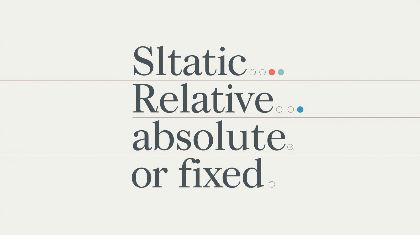
So, What Exactly Is the CSS font Property?
In simple terms, the font property is a CSS shorthand. Think of it like a meal deal instead of buying a burger, fries, and a drink separately. It lets you set multiple font-related styles in a single declaration.
The properties it can combine are:
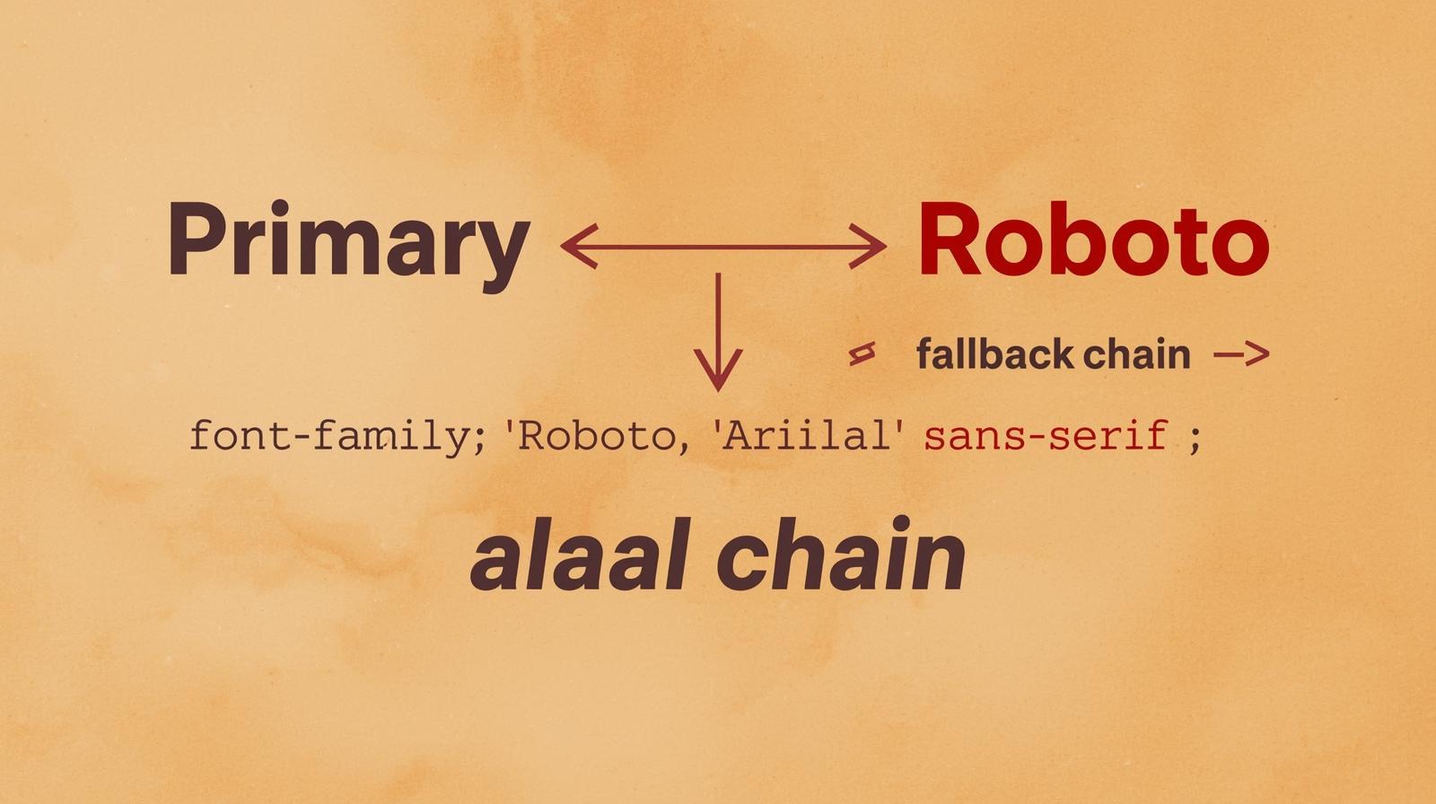
font-style(like italic)font-variant(likesmall-caps)font-weight(like bold)font-stretch(like condensed or expanded)font-size(like1.5remor16px)line-height(the space between lines of text)font-family(the actual typeface, like Arial or "Helvetica Neue")
Phew, that's a lot. Writing all of these individually is tedious and makes your code harder to read. The font shorthand is here to clean up the mess.
Breaking Down the Syntax: It's Not as Scary as It Looks
The official syntax looks a bit intimidating at first:
css
element {
  font: [font-style] [font-variant] [font-weight] [font-stretch] [font-size]/[line-height] [font-family];
}
But don't sweat it. The only two values that are mandatory are font-size and font-family. The others are optional. Let's break it down with a simple example.
From Clunky to Clean: A Basic Example
The Long Way (The Noob Method):
css
p {
  font-style: italic;
  font-variant: small-caps;
  font-weight: 600;
  font-size: 18px;
  line-height: 1.6;
  font-family: 'Segoe UI', Tahoma, Geneva, Verdana, sans-serif;
}
The Clean Way (The Pro Method):
css
p {
  font: italic small-caps 600 18px/1.6 'Segoe UI', Tahoma, Geneva, Verdana, sans-serif;
}
See the difference? One line versus six. It's more efficient, easier to read once you're used to it, and reduces the file size of your stylesheets. It’s a win-win-win.
Let's Get Our Hands Dirty: Real-World Code Examples
Theory is cool, but let's see this property in action. We'll create different styles for different parts of a hypothetical blog.
Example 1: Styling a Punchy Heading
You want a bold, impactful heading that's easy to read.
css
.article-heading {
  font: 700 2.5rem/1.2 'Montserrat', Arial, sans-serif;
}700: This is thefont-weight(equivalent tobold).2.5rem: This is thefont-size.1.2: This is theline-height(tight for headings).'Montserrat', Arial, sans-serif: This is thefont-familystack.
We skipped font-style, font-variant, and font-stretch, so they are set to their default values (normal).
Example 2: Creating a Readable Body Text
The key to good body text is readability. We'll use a slightly larger font size and a comfortable line height.
css
.blog-content {
  font: 400 1.1rem/1.7 'Merriweather', Georgia, serif;
}400: Normalfont-weight.1.1rem: Slightly larger than the default for better readability.1.7: A higherline-heightgives text more "air," making it less cramped and easier to read for long paragraphs.
Example 3: A Subtle, Italicized Caption
For an image caption, you might want something smaller and styled.
css
.image-caption {
  font: italic 300 0.9rem/1.4 'Montserrat', Arial, sans-serif;
}italic: This sets thefont-style.300: A lightfont-weightfor a delicate feel.0.9rem: A smallfont-size.
The Power Move: Using font for System Fonts
This is a next-level trick for making your web app feel blazingly fast and native. You can use the fonts that are already on the user's operating system!
css
.system-ui-demo {
  font: 1rem/1.5 system-ui;
}
The system-ui value tells the browser to use the standard system font (San Francisco on macOS, Segoe UI on Windows, Roboto on Android, etc.). This improves performance because there's no font file to download, and it integrates seamlessly with the user's OS. It's a great choice for web applications.
Best Practices & Gotchas You Need to Know
With great power comes great responsibility. Here are some key things to keep in mind.
Order (Kinda) Matters: While the order of the optional values (
style,variant,weight, etc.) is flexible, it's a best practice to follow the official syntax order to avoid confusion. Thefont-sizeandfont-familymust be in the correct place, and theline-heightmust come directly afterfont-size, separated by a forward slash (/).Resetting Everything: The
fontshorthand is powerful because it sets all font properties at once. If you omit a value, it will be reset to its initial value. For example:css
p { font-weight: bold; }
p.special { font: 16px 'Georgia'; }
In this case, the
.specialparagraph will NOT be bold. Using thefontshorthand reset thefont-weighttonormal.Mandatory Fields are... Mandatory: You must include both
font-sizeandfont-familyfor the declaration to work. Forget one, and the entire line is ignored by the browser.Know When to Break the Rules: The shorthand is amazing for setting multiple values at once. But if you're only changing one thing, like just the weight, it's cleaner and safer to use the individual property (
font-weight: bold;).
Mastering these nuances is what separates hobbyists from professionals. To learn professional software development courses such as Python Programming, Full Stack Development, and MERN Stack, where we cover these front-end fundamentals in depth, visit and enroll today at codercrafter.in.
FAQs: Your Questions, Answered
Q1: Can I use any order for the optional properties?
Technically, yes for font-style, font-variant, and font-weight. But browsers can be finicky. Sticking to the standard order (style variant weight size/line-height family) is the safest bet and makes your code more maintainable.
Q2: What happens if I use a custom font from Google Fonts?
It works exactly the same! Just make sure you've linked the Google Fonts stylesheet in your HTML <head>. Then you can use the font family name in your font shorthand like we did with 'Montserrat' and 'Merriweather' in the examples.
Q3: Is using the font shorthand better for performance?
Indirectly, yes. A smaller CSS file (achieved by using shorthands) downloads and parses slightly faster. The main benefit is code cleanliness and developer efficiency, which is a huge win.
Q4: Why is my font declaration not working?
Double-check these two things:
Did you include both the
font-sizeandfont-family?Did you place the
line-heightimmediately after thefont-sizewith a/in between?
These are the most common mistakes.
Conclusion: Stop Writing More Code Than You Have To
The CSS font property is a powerhouse. It’s not just a "nice-to-have"; it's a fundamental tool for writing efficient, clean, and professional-grade CSS. It reduces clutter, enforces consistency, and once you get the hang of the syntax, it's actually faster to write.
So, the next time you're styling text, challenge yourself. Instead of reaching for five different properties, try to condense it into one powerful font declaration. Your future self (and anyone else who reads your code) will thank you for it.
Ready to take your CSS and web development skills from "getting by" to "absolute mastery"? This is just the tip of the iceberg. To learn professional software development courses such as Python Programming, Full Stack Development, and MERN Stack, visit and enroll today at codercrafter.in. We'll help you build the skills to craft beautiful, functional, and fast websites that stand out.