Level Up Your Web Design: A 2025 Guide to CSS Image Filters
Tired of boring images? Learn how to use CSS Image Filters like blur, grayscale, and hue-rotate to create stunning visual effects. Code examples & pro tips inside!
Let's be real. We've all been there. You've built a sleek website, the layout is fire, the typography is on point, but the images just feel... meh. They look like they were just plopped onto the page without any thought. Stock photo vibes, you know?
What if I told you that with just a few lines of code, you can completely transform the vibe of your images, create cool interactions, and make your site look like it was designed by a pro? Enter CSS Image Filters.
This isn't some complex, arcane magic. It's a powerful tool built right into CSS that every front-end developer should have in their toolkit. So, grab your coffee, and let's dive deep into the world of making your images look absolutely lit.
What Are CSS Image Filters, Actually?
In the simplest terms, CSS Image Filters are like the Instagram filters for your website. Remember scrolling through Instagram and applying Valencia or Clarendon to make your photos pop? CSS gives you that same power, but programmatically.
You can apply visual effects like blurring, changing colors to grayscale, adjusting brightness, and much more, directly in the browser. The best part? No need for Photoshop or any external image editing software. It's all done with code, which means it's dynamic. You can change these effects on hover, on click, or based on user interaction. How cool is that?
The property we use is straightforward: filter.
css
.my-image {
  filter: grayscale(100%);
}
Boom. Just like that, your colorful image is now a classic black and white.
The Filter Toolkit: Breaking Down Every Filter
Let's get our hands dirty and look at the individual filters you can use. I'll give you the code and a quick mental model for each.
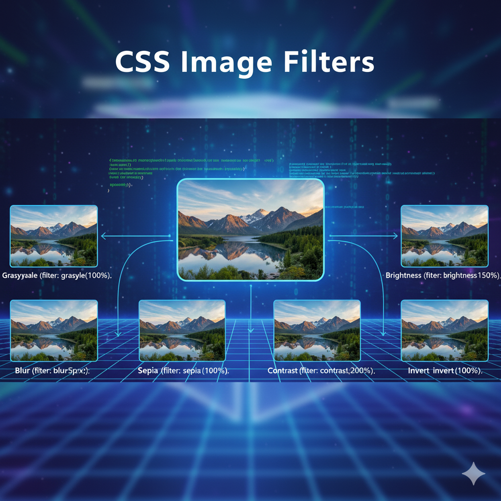
1. grayscale()
This one's a classic. It removes all color from your image.
Value:
0%(full color) to100%(completely grayscale).Vibe: Elegant, nostalgic, serious.
Code:
css
.filtered {
  filter: grayscale(75%); /* A mostly black and white effect */
}
2. blur()
This makes your image out of focus. It's not just for making things dreamy; it's super useful for background images or creating depth.
Value: A measurement like
pxorrem.0means no blur.Vibe: Dreamy, soft, or used to de-emphasize content.
Code:
css
.filtered {
  filter: blur(5px);
}
3. brightness()
Adjusts how light or dark your image is.
Value:
0%(pitch black) to100%(normal). You can go above100%to overexpose it!Vibe: Correcting dark images, creating high-key lighting effects.
Code:
css
.filtered {
  filter: brightness(150%); /* 50% brighter than original */
}
4. contrast()
Adjusts the difference between the darkest and lightest parts of the image.
Value:
0%(completely gray) to100%(normal). Again, go beyond100%for a super-punchy look.Vibe: Dramatic, intense, or for fixing washed-out photos.
Code:
css
.filtered {
  filter: contrast(200%);
}
5. saturate()
Controls the intensity of the colors.
Value:
0%(completely desaturated, like grayscale) to100%(normal). Values over100%create super vibrant, almost cartoonish colors.Vibe: Vibrant, energetic, or retro.
Code:
css
.filtered {
  filter: saturate(250%);
}
6. hue-rotate()
This one is wild. It shifts all the colors in your image along the color wheel.
Value: An angle, like
0deg(normal) to360deg(a full color wheel rotation).Vibe: Psychedelic, creative, brand color matching.
Code:
css
.filtered {
  filter: hue-rotate(90deg); /* Gives everything a greenish tint */
}
7. opacity()
Makes the image transparent. (Yes, it's similar to the opacity property, but this is part of the filter family).
Value:
0%(fully transparent) to100%(fully opaque).Vibe: Layering, subtle overlays.
Code:
css
.filtered {
  filter: opacity(50%);
}
8. sepia()
Gives your image that old-timey, brownish tone.
Value:
0%(normal) to100%(fully sepia).Vibe: Vintage, antique, warm.
Code:
css
.filtered {
  filter: sepia(100%);
}
9. invert()
Inverts the colors of the image, like a photo negative.
Value:
0%(normal) to100%(fully inverted).Vibe: Dark mode toggle, edgy, futuristic.
Code:
css
.filtered {
  filter: invert(100%);
}
10. drop-shadow()
This is the cooler, more flexible sibling of the box-shadow property. It applies a shadow to the non-transparent parts of an image. This is a game-changer for PNG logos or icons.
Value:
drop-shadow(offset-x offset-y blur-radius color)Vibe: Depth, realism, making elements "pop" off the page.
Code:
css
.logo {
  filter: drop-shadow(5px 5px 10px rgba(0, 0, 0, 0.5));
}
The Real Power: Combining Filters
Here's where the magic truly happens. You can chain multiple filters together in a single line to create unique, complex effects.
Example 1: The "Vintage Poster"
css
.vintage-poster {
  filter: contrast(110%) saturate(120%) sepia(30%) hue-rotate(-10deg);
}
This combo boosts contrast and saturation slightly, adds a sepia tone, and then shifts the hue just a bit for a unique vintage look.
Example 2: The "Dark Mode" Preview
css
.dark-preview {
  filter: brightness(70%) invert(100%) hue-rotate(180deg);
}
This is a clever trick for a dark mode image preview. It reduces brightness, inverts the colors, and then rotates the hue back so the colors don't look too crazy.
Real-World Use Cases: More Than Just Pretty Pictures
This isn't just about making things look cool (though that's a big part of it). Filters have practical applications:
User Interaction: The most common use. Change an image on hover to give user feedback.
css
.product-image {
  transition: filter 0.3s ease; /* Smooth transition */
}
.product-image:hover {
  filter: brightness(110%) drop-shadow(0 10px 15px rgba(0,0,0,0.2));
}
De-emphasizing Backgrounds: Use a
blur()on a background image to make foreground text more readable.css
.hero-section {
  background-image: url('cool-bg.jpg');
  filter: blur(3px);
}
/* You'd typically put the text in a separate element on top */
Active States & Selections: When a user selects an item, you can
grayscale()all the other items to draw attention to the selected one.Branding: Use
hue-rotate()to dynamically adjust the color of a generic icon to match your brand's color scheme.
Best Practices & Pro Tips
Performance is Key: While CSS filters are generally fast, overusing heavy blurs or complex filter chains on a lot of elements can cause jank. Always test on lower-powered devices.
Accessibility Matters: Don't rely solely on filters (like
invert()) to convey important information. Ensure there is sufficient color contrast and other visual cues.Use Transitions: Filters pair beautifully with the
transitionproperty. A smooth transition from color to grayscale or from sharp to blur feels polished and professional.Combine with
background-blend-mode: For next-level effects, use filters in combination withbackground-blend-modeon background images. The possibilities are endless.
Mastering these subtle touches is what separates a good developer from a great one. If you're passionate about learning these industry-standard skills, to learn professional software development courses such as Python Programming, Full Stack Development, and MERN Stack, visit and enroll today at codercrafter.in. Our project-based curriculum ensures you not only understand the theory but can build stunning, real-world applications.
FAQs
Q: Can I animate CSS filters?
A: Absolutely! You can use transition for smooth changes and even use @keyframes for complex animations.
Q: Do CSS filters work on any HTML element?
A: Yes! While we call them "image" filters, they work on any non-replaced element. You can apply filter to a div, a section, text, etc.
Q: What's the browser support like?
A: It's excellent! All modern browsers fully support CSS filters. For older browsers (like IE), it's a progressive enhancement—the site will still work, just without the filter effect.
Q: What's the difference between drop-shadow() and box-shadow?
A: box-shadow applies a shadow to the entire rectangular box of an element. drop-shadow() applies a shadow that follows the exact shape (the alpha channel) of the content inside. It's much better for irregular shapes.
Conclusion
CSS Image Filters are a deceptively simple yet incredibly powerful tool. They let you manipulate visuals on the fly, create engaging user experiences, and add that final layer of polish that makes a website stand out. From a subtle drop-shadow on a logo to a complex, animated filter chain, the creative control is now in your hands.
So, stop just displaying images. Start designing with them. Open up your code editor, experiment with these filters, and see what amazing effects you can create.
And remember, if you want to master front-end development and all the other skills needed to become a top-tier software developer, check out the comprehensive courses at codercrafter.in. We'll help you build the future, one line of code at a time.


