Level Up Your Web Design: A 2025 Guide to CSS Custom Fonts

Tired of web-safe fonts? Learn how to use CSS Custom Fonts (@font-face) to make your website stand out. Step-by-step guide, best practices, FAQs, and real-world examples. Enroll in CoderCrafter's Full Stack Development course to master these skills!
Let's be real for a second. How many times have you landed on a website and thought, "Wow, this looks exactly like every other site out there"? A huge part of that "sameness" comes from fonts. For years, we were stuck in the desert of "web-safe fonts"—Arial, Helvetica, Times New Roman, Georgia. They're reliable, sure, but they’re about as exciting as plain toast.
But what if I told you that the web is your typographic playground? That you can use almost any font you can dream of? Welcome to the world of CSS Custom Fonts.
This isn't just a neat trick; it's a fundamental skill for modern web developers. It’s the difference between a site that looks generic and a site that has a real brand identity. In this deep dive, we're going to break down everything from the basic @font-face rule to pro-level optimization tips. Let's get your websites looking fire. 🔥
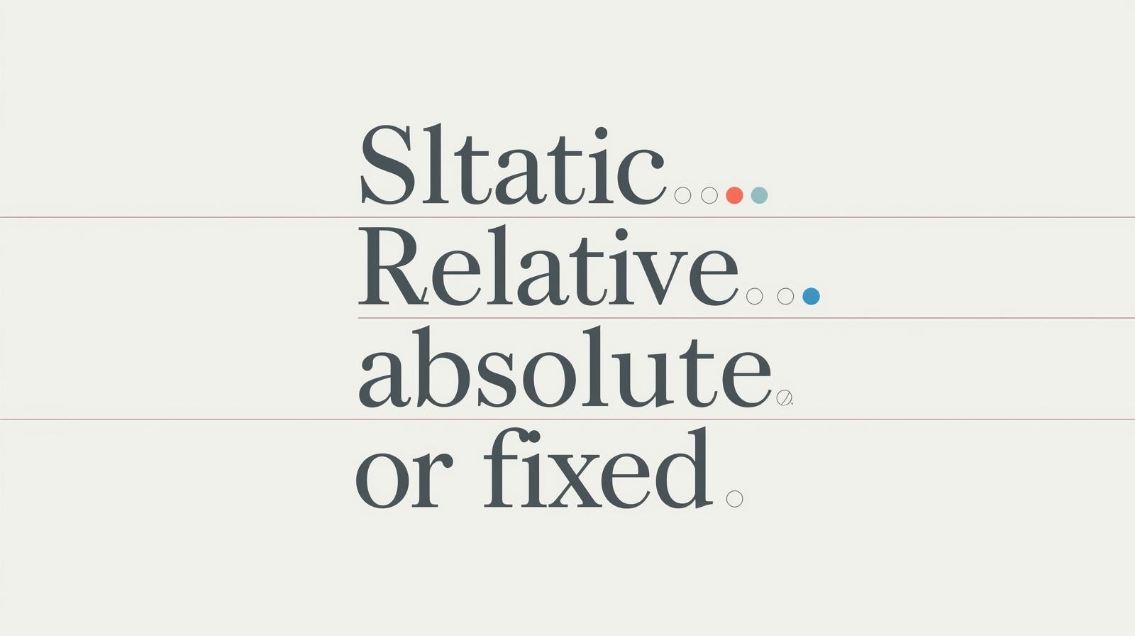
What Are CSS Custom Fonts, Actually?
In simple terms, CSS Custom Fonts allow you to use fonts on your website that aren't pre-installed on your user's computer. You host the font file on your server (or a third-party's) and tell the browser to download it and use it via a special CSS rule called @font-face.
Think of it like this: instead of hoping your visitor has the cool font "Grotesque Mega" installed (they don't), you package it up with your website and serve it to them on demand. It’s a game-changer.
The Magic Wand: The @font-face Rule
This is the core of it all. The @font-face rule is like a gateway you create in your CSS. It essentially defines a new font family that the browser can then use.
Here’s the basic syntax:
css
@font-face {
  font-family: 'My Awesome Font';
  src: url('path/to/my-awesome-font.woff2') format('woff2');
}
Once you've declared this, you can use 'My Awesome Font' just like any other font in your CSS:
css
h1 {
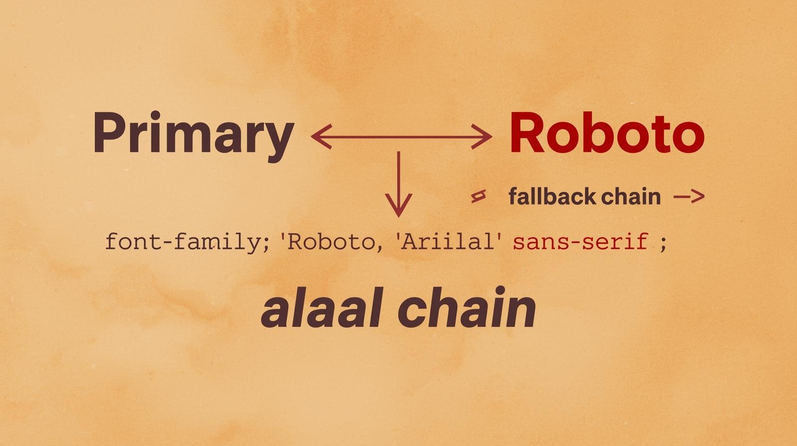
font-family: 'My Awesome Font', Arial, sans-serif;
}See that Arial, sans-serif at the end? That’s your fallback. It’s a best practice we’ll talk about later, but it’s basically a safety net in case your custom font fails to load.
How to Implement Custom Fonts: A Step-by-Step Guide
Alright, let's stop talking and start doing. Here’s how you actually get this working.
Step 1: Source Your Font Files
First, you need the font files. You can’t just use any font from your design software like Figma or Canva; you need a license for web use.
Google Fonts: The easiest and most popular starting point. All fonts are free and web-ready. You can either use their hosted link or download the files.
Adobe Fonts: A massive library of high-quality fonts, included with an Adobe Creative Cloud subscription. They have a robust web hosting service.
Font Squirrel: A great resource for free, commercial-use fonts. Their Webfont Generator is a legendary tool that can convert your font files into all the necessary web formats.
Paid Foundries: Sites like MyFonts, Fontspring, etc., where you can purchase premium fonts with web licenses.
Step 2: The Font Files You Need (WOFF2 is King)
Fonts come in different file formats: .ttf, .otf, .eot, .woff, and .woff2.
Here’s the cheat sheet for 2024:
WOFF2 (Web Open Font Format 2): This is the modern champion. It offers superior compression and is widely supported by all modern browsers. This should be your primary format.
WOFF: The older version of WOFF2. Still good, but use it as a fallback for older browsers.
TTF/OTF: The basic, uncompressed formats. They are larger files and should only be used as a last resort if you need to support very old browsers.
Pro Tip: You really only need WOFF2 and maybe WOFF for a fallback. Ignore the rest to keep your code clean and your site fast.
Step 3: The @font-face Declaration (The Right Way)
Let's write a robust @font-face declaration. Let's say we have a font called "Neon Future" in two weights: Normal (400) and Bold (700).
css
/* Define the Normal weight */
@font-face {
  font-family: 'Neon Future';
  src: url('fonts/neon-future-regular.woff2') format('woff2'),
       url('fonts/neon-future-regular.woff') format('woff');
  font-weight: 400; /* Normal */
  font-style: normal;
  font-display: swap; /* Crucial for performance! */
}

/* Define the Bold weight */
@font-face {
  font-family: 'Neon Future';
  src: url('fonts/neon-future-bold.woff2') format('woff2'),
       url('fonts/neon-future-bold.woff') format('woff');
  font-weight: 700; /* Bold */
  font-style: normal;
  font-display: swap;
}
Breaking this down:
font-family: This is the name you'll use later. Keep it consistent for all weights/styles of the same family.src: List the font files in order of preference. The browser will use the first one it supports. We put WOFF2 first.font-weightandfont-style: This is super important! You are telling the browser which specific font file corresponds to which weight and style. This allows you to usefont-weight: bold;in your CSS, and the browser will know to use the700weight file.font-display: swap;: This is a performance hero. It tells the browser to use the fallback font immediately and then "swap" in the custom font once it's loaded. This prevents the dreaded FOIT (Flash of Invisible Text).
Step 4: Use Your New Font!
Now, the fun part. You can use it anywhere.
css
body {
  font-family: 'Neon Future', Arial, sans-serif;
  font-weight: 400; /* This will use the regular weight file */
}

h1, h2, h3 {
  font-family: 'Neon Future', Arial, sans-serif;
  font-weight: 700; /* This will use the bold weight file */
}
Real-World Use Cases: Where Custom Fonts Shine
This isn't just about making things pretty. It's about strategy.
Brand Identity: This is the big one. Think about Coca-Cola's distinctive script or IBM's use of Plex. A unique font is a core part of a brand's DNA.
Creating a Mood: A tech startup might use a clean, geometric sans-serif to feel modern. A wedding blog might use an elegant serif to feel classic and romantic.
Improved Readability & UX: Some fonts are scientifically designed for better screen readability (like Atkinson Hyperlegible). Using a custom font can genuinely improve your user's experience.
Icon Systems: Libraries like Font Awesome are actually custom fonts! Each "character" in the font file is an icon instead of a letter.
Best Practices: Don't Just Use Them, Master Them
With great font power comes great responsibility. Here’s how to avoid common pitfalls.
Performance is EVERYTHING: Fonts are render-blocking resources. A heavy, unoptimized font can slow your site to a crawl.
Subset Your Fonts: Remove characters you don't need (e.g., Cyrillic glyphs if your site is in English). Tools like the Font Squirrel Webfont Generator can do this.
Preload Critical Fonts: Use
<link rel="preload">in your HTML for the fonts needed above the fold (like your logo or main headings). This tells the browser to download them with high priority.html
<link rel="preload" href="fonts/neon-future-bold.woff2" as="font" type="font/woff2" crossorigin>
Always Provide Fallbacks: Never rely on a custom font alone. Use a strong fallback stack that matches the x-height and general feel of your custom font to minimize the layout shift during the "swap."
Limit the Number of Weights/Styles: Each weight and italic is a new HTTP request. Do you really need Thin, Extra Light, Light, Regular, Medium, Semi-Bold, Bold, Extra-Bold, and Black? Probably not. Stick to 2-3 variants max.
FAQs: Your Questions, Answered
Q: Why isn't my custom font loading?
A: The number one cause is an incorrect file path in the src property. Double-check that the path from your CSS file to the font file is correct. Also, check the browser's DevTools (Network tab) to see if the font file is giving a 404 error.
Q: Can I use any font from my computer on my website?
A: No. Fonts are software and are governed by licenses. Using a font without a proper web license is illegal. Always check the license and use services like Google Fonts or Adobe Fonts that provide clear web licenses.
Q: What's the difference between font-display: swap and block?
A: block hides the text for a short period (causing FOIT), while swap uses the fallback font immediately (causing FOUT - Flash of Unstyled Text). FOUT is almost always better for perceived performance than FOIT.
Q: My bold text isn't working, it just looks the same as regular.
A: You likely forgot to define separate @font-face rules for each weight and then correctly reference them with font-weight in your CSS. Go back to Step 3!
Conclusion: Your Website, Your Typography
Mastering CSS Custom Fonts is a non-negotiable skill in today's web development landscape. It elevates your projects from amateur to professional, allowing you to fully express a brand's identity and create memorable user experiences. Remember the key takeaways: use @font-face correctly, prioritize performance with WOFF2 and font-display: swap, and always, always respect font licenses.
The journey from using basic <h1> tags to crafting beautiful, performant, and accessible typographic systems is what separates a coder from a crafter.
Ready to dive deeper and master not just CSS, but the entire world of modern web development? To learn professional software development courses such as Python Programming, Full Stack Development, and the MERN Stack, visit and enroll today at codercrafter.in. We'll give you the skills to build fast, beautiful, and impactful websites from the ground up.