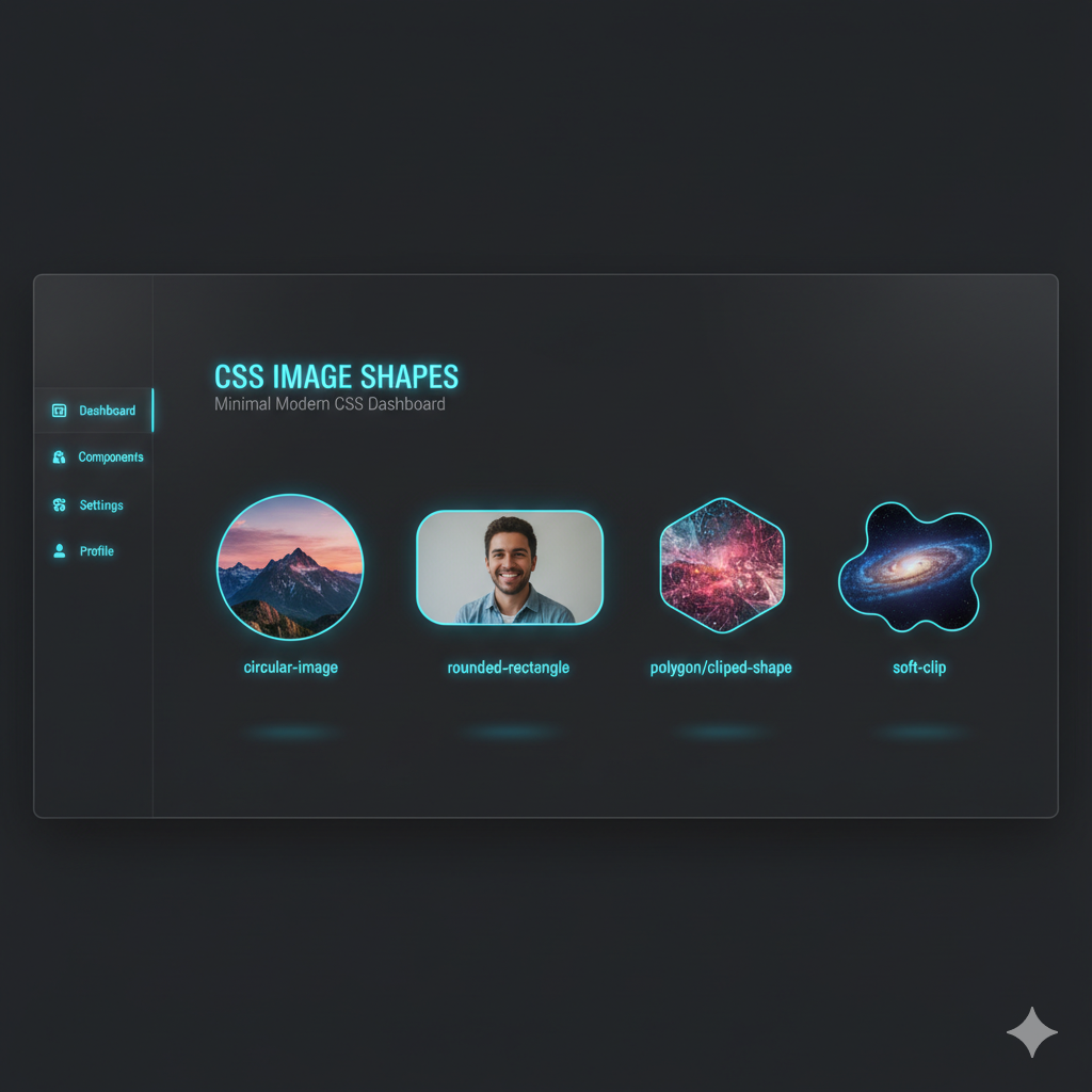
Ditch the Boring Box: A 2025 Guide to CSS Image Shapes
Tired of square images? Learn how to use CSS clip-path and shape-outside to wrap text around circles, polygons, and custom shapes. Level up your web design skills!
Ditch the Boring Box: Your 2025 Guide to CSS Image Shapes
Let's be real. The web used to be a pretty blocky place. Right angles, squares, rectangles... it was like living in a digital Lego set. For the longest time, if you wanted to break out of the box (literally) with your images, you were stuck with basic border-radius or hacking together PNGs with transparent backgrounds. Not exactly a smooth experience.
But what if I told you that CSS has evolved, and now you can make your images circular, star-shaped, or even look like they were torn from a magazine, all with just a few lines of code? And the best part? You can make text flow around these shapes, creating layouts that feel organic, dynamic, and straight out of a high-end magazine.
Welcome to the world of CSS Image Shapes. This isn't just a fancy trick; it's a powerful tool to elevate your design game from "meh" to "whoa." Let's dive in.
The Two Key Players: clip-path and shape-outside
Before we get our hands dirty, it's crucial to understand the two main CSS properties that make the magic happen. People often confuse them, but they have very different jobs.
clip-path: The Cookie Cutter
Think ofclip-pathas a literal cookie cutter for your HTML element. You place the cutter over your image (or any element), and whatever is outside the shape gets clipped away—it becomes invisible and doesn't interact with the layout. It changes the visual appearance of the element itself.shape-outside: The Text Magnet
This property is a bit more subtle but equally cool.shape-outsidedoesn't change the shape of the element itself. Instead, it defines a shape that the surrounding inline content (usually text) will flow around. The element remains a rectangular box in the document flow, but the text acts as if it's not.
The TL;DR: Use clip-path to change how the element looks. Use shape-outside to change how text flows around it. For the most polished effect, you'll often use them together.
Getting Your Hands Dirty with clip-path
Alright, enough theory. Let's code. The clip-path property is your gateway to non-rectangular images. You can define shapes using several basic functions.
Basic Shapes: The Quick Wins
CSS gives you a set of ready-to-use shape functions.
Circle:
clip-path: circle(50%);
That50%is the radius. Using50%on a square image gives you a perfect circle. You can also use pixels (40px). You can even define the center point:circle(40% at 25% 75%);.Ellipse:
clip-path: ellipse(25% 40%);
An ellipse is a squashed circle. The first value is the horizontal radius, the second is the vertical radius.ellipse(25% 40% at 50% 50%)centers it.Inset:
clip-path: inset(20px 30px 20px 30px);
This is like adding padding inside the element and cutting away the outside. The values work like thepaddingproperty (top, right, bottom, left). You can even round the corners:inset(20px round 15px);.Polygon:
clip-path: polygon(50% 0%, 0% 100%, 100% 100%);
This is where the real power is. Thepolygon()function lets you define a series of x/y coordinates to create any shape you can imagine. The example above creates a triangle. The points are: (50% from left, 0% from top), (0% from left, 100% from top), and (100% from left, 100% from top).
The Game Changer: path() for Custom SVG Shapes
Want a custom star, a speech bubble, or your logo's shape? The path() function is your best friend. It uses SVG path syntax inside your CSS.
css
.custom-heart {
  clip-path: path('M10,30 A20,20,0,0,1,50,30 A20,20,0,0,1,90,30 Q90,60,50,90 Q10,60,10,30 Z');
}
This complex-looking string of letters and numbers is what defines a heart shape. The beauty is that you don't have to write this from scratch. You can design your shape in a vector tool like Figma or Adobe Illustrator, export it as SVG, and copy the d attribute from the <path> tag into your path() function.
Pro Tip: Use online tools like Clippy to visually create clip-path polygons. It's a massive time-saver!
Making Text Flow: The Magic of shape-outside
Now, let's make text play nice with our funky shapes. If you just use clip-path on an image and float it left, the text will still flow around the original rectangular box. It looks janky. This is where shape-outside comes in.
To use shape-outside, the element must be floated (float: left; or float: right;) and have a defined width and height.
css
.shaped-image {
  width: 300px;
  height: 300px;
  float: left;
  margin-right: 20px; /* Always add some margin! */
  clip-path: circle(50%);
  shape-outside: circle(50%);
}
In this example, we've used the same circle(50%) value for both properties. The image is visually cut into a circle, and the text now flows around the circular boundary instead of the box. The result is a seamless, professional-looking integration of text and image.
You can use all the same basic shapes and polygon() with shape-outside that you use with clip-path.
Real-World Use Cases: Where This Actually Matters
This isn't just for "pretty" portfolios. Here’s where you can use this power:
Featured Blog Posts: Float a circular author image next to the post excerpt on your homepage. It immediately makes the design feel more personal and less template-y.
Product Showcases: Show a product from an angle? Use a
polygon()to clip it and have the description text flow around the diagonal edge.Testimonials with a Twist: Place a client's quote in a speech bubble (
clip-path: polygon(...)) and have the rest of the content flow around it.Magazine-Style Layouts: This is the big one. Create layouts where text elegantly wraps around the curves of a model's head or the outline of a product, just like in a print magazine.
Best Practices & Things to Keep in Mind
Always Use a Fallback: Not all browsers support these properties perfectly. Ensure your base layout (e.g., a floated rectangular image) is still usable and looks okay if the shapes don't load.
Mind the Margin: When you float an element, always add a
margin.margin-rightforfloat: leftandmargin-leftforfloat: right. This prevents the text from hugging the shape too tightly.Performance is Key: Extremely complex
path()definitions can (in theory) impact performance. Keep your shapes as simple as possible for the desired effect.shape-marginis Your Friend: This property adds a margin specifically to theshape-outsideboundary, giving your text even more breathing room.shape-margin: 1rem;is a lifesaver.
FAQs (Frequently Asked Questions)
Q: Can I animate these shapes?
A: Yes, and it's awesome! You can animate clip-path between two values. For example, you can have an image start as a circle and, on hover, animate to a square. You need to ensure the number of points in the polygon is the same for the transition to work smoothly.
Q: Do these properties work with video or other elements?
A: Absolutely! clip-path can be applied to any HTML element—a <div>, a <section>, even a <video> tag. shape-outside works on floated elements, which are typically images or containers.
Q: What about browser support?
A: It's surprisingly good! For clip-path: basic-shapes and shape-outside, support is excellent across all modern browsers. The clip-path: path() support is a bit newer but is also well-supported in modern browsers. Always check sites like caniuse.com for the latest data.
Q: This is cool, but how do I master the entire CSS ecosystem?
A: Great question! Mastering modern layout techniques like CSS Grid, Flexbox, and advanced properties like these is what separates junior devs from senior ones. To learn professional software development courses such as Python Programming, Full Stack Development, and MERN Stack, visit and enroll today at codercrafter.in. Our project-based curriculum ensures you not only learn syntax but also how to build beautiful, functional, and modern websites.
Conclusion: Stop Thinking Inside the Box
CSS Image Shapes are a testament to how far web design has come. With just a few lines of code, we can inject personality, creativity, and a touch of editorial elegance into our digital products. clip-path and shape-outside are no longer "nice-to-haves" but essential tools for the modern front-end developer.
So go ahead. Experiment. Make circles, stars, and weird abstract shapes. Make your text flow like water. Break the rectangular mold and create web experiences that are genuinely captivating.
And remember, if you're looking to build a rock-solid foundation in all things web development, from the basics of HTML to advanced JavaScript frameworks, check out the comprehensive courses at codercrafter.in. Let's build the future of the web, one beautiful shape at a time.


