CSS Web Safe Fonts: The 2025 Guide to Bulletproof Typography
Stuck with boring fonts? Think again! Our in-depth guide to CSS web safe fonts covers what they are, a definitive list, best practices, and how to use them for a fast, reliable website.
Alright, let's talk about fonts. You're designing a website, you've got this killer vision in your head, and you jump into Figma or your code editor, ready to make magic happen. You pick this gorgeous, unique font that perfectly captures the vibe... and then reality hits. Will this font actually show up on your user's device?
This, my friends, is where the ancient wisdom of CSS Web Safe Fonts comes into play. And before you roll your eyes and think, "Ugh, another boring article about Arial and Times New Roman," hear me out.
Web safe fonts aren't about being boring; they're about being smart, reliable, and performant. In a world of fancy variable fonts and massive font libraries, knowing your web safe fonts is like knowing how to change a tire. You hope you don't always need to, but when you're in a pinch, it's a lifesaver.
So, grab your coffee, and let's deep-dive into the fonts you can actually count on.
What Are Web Safe Fonts, Actually?
In the simplest terms, web safe fonts are a collection of typefaces that are pre-installed on the vast majority of computers and devices across all operating systems (Windows, macOS, Linux, iOS, Android).
Think of them as the universal donors of the typography world. When you specify a web safe font in your CSS, you can be 99.9% sure that it will render exactly as you intended, no matter what device your visitor is using. No weird fallbacks, no layout shifts, no "blank text" moments.
Why Should You Even Care in 2024?
With services like Google Fonts and Adobe Fonts, it's easy to think web safe fonts are obsolete. But that's a rookie mistake. Here’s why they still absolutely matter:
Reliability & No FOIT/FOUT: Ever seen a site where the text is invisible for a second, then pops in? That's a Flash of Invisible Text (FOIT) or a Flash of Unstyled Text (FOUT) caused by a web font loading. Web safe fonts appear instantly. Zero load time. Zero drama.
Performance is King: Every external font file you add is an extra HTTP request. Using a web safe font means one less resource for the browser to download, making your site faster. And a faster site means better SEO and happier users.
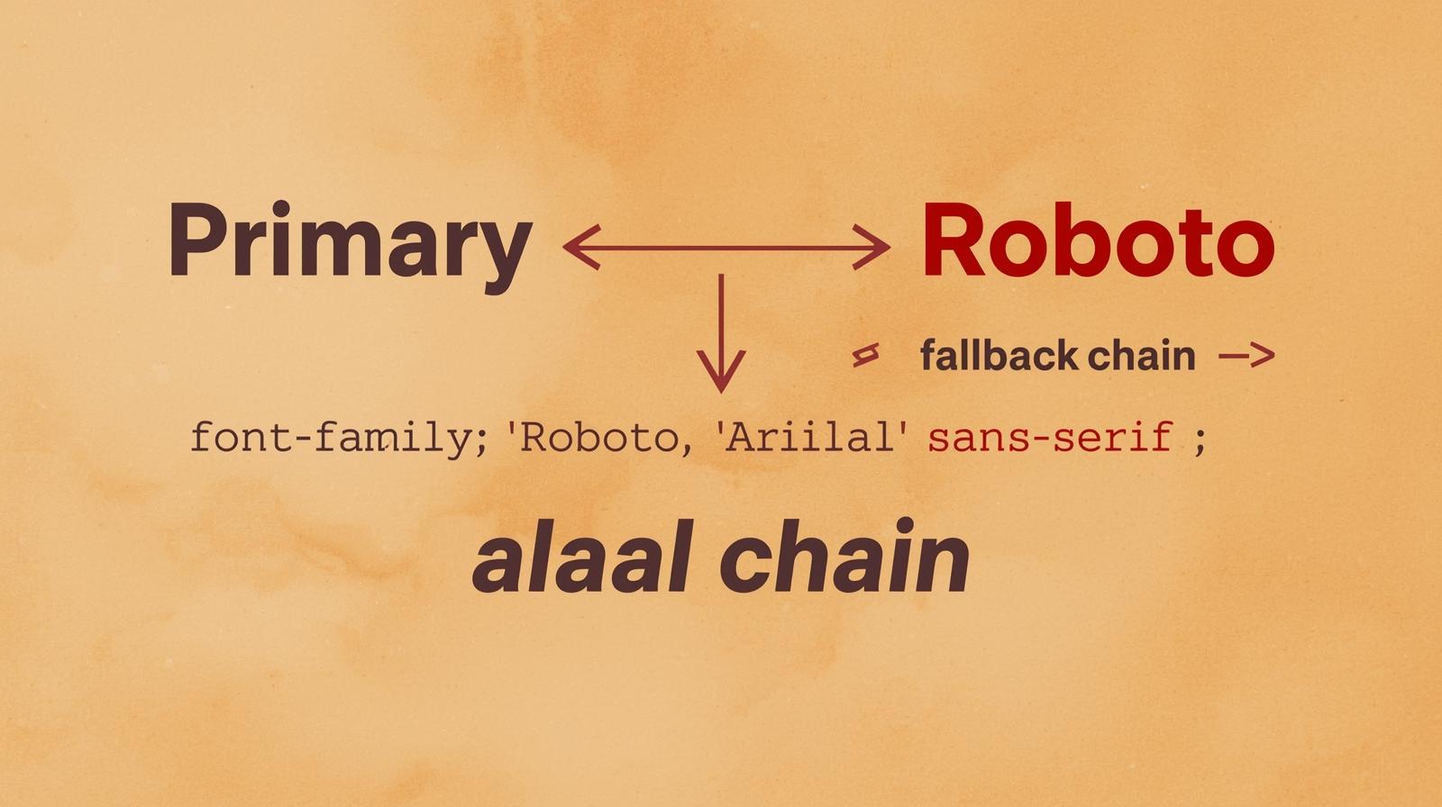
The Fallback Savior: Even when you use a custom Google Font, you must specify a stack of web safe fonts as a fallback. If the custom font fails to load (slow network, blocked CDN, etc.), the browser gracefully degrades to your chosen web safe option.
Accessibility & Familiarity: Many web safe fonts, especially the sans-serif ones, are renowned for their high legibility on screens. Users are also subconsciously familiar with them, leading to a more comfortable reading experience.
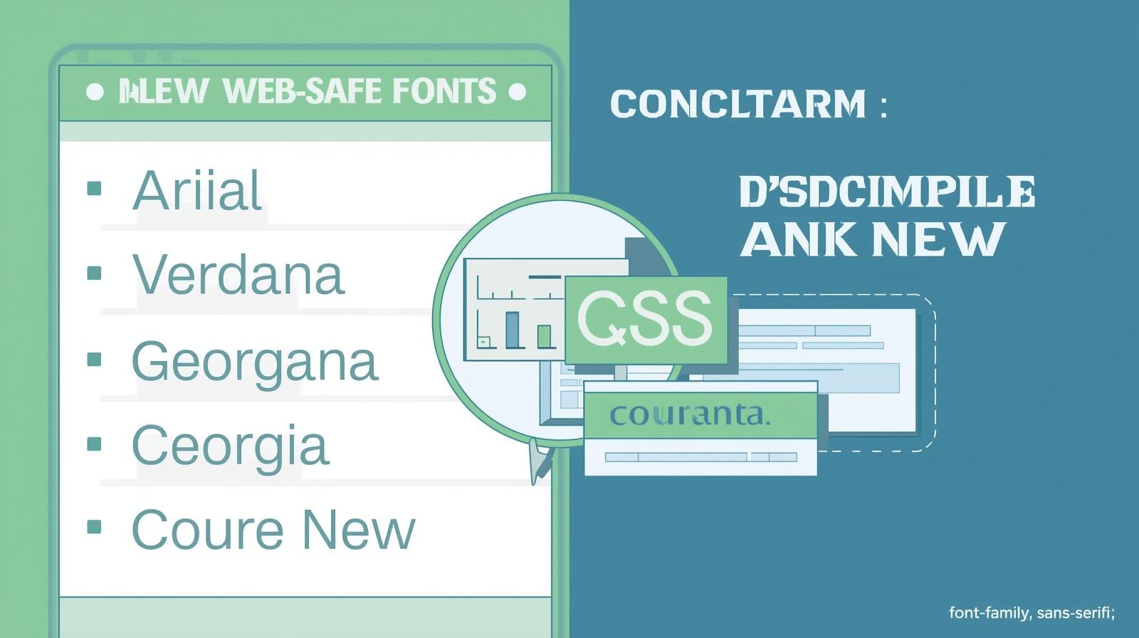
The Go-To List: Your Web Safe Font Cheat Sheet
Let's break down the heavy hitters. These are the fonts you can bank on.
1. The Sans-Serif Squad (The Modern Go-Tos)
Sans-serif fonts (fonts without the little "feet" or serifs) are clean, modern, and the default for most of the web.
Arial: The Windows classic. It's everywhere. It's the Helvetica of the PC world. It's clean, neutral, and a little... corporate. But it gets the job done.
Helvetica: The king of modern typography. Mac's answer to Arial (though designers will fight you on that). Sleek, professional, and widely loved.
Verdana: Designed specifically for on-screen readability. It has a large x-height and wide characters, making it incredibly easy to read even at small sizes. A fantastic choice for body text.
Tahoma: A narrower, more condensed version of Verdana. Great when you need to fit more text into a smaller space without sacrificing readability.
Trebuchet MS: A friendly, slightly more stylized sans-serif. It was hugely popular in the early 2000s and still holds up for headings where you want a bit more personality than Arial.
Georgia: A serif font that is so legible on screens it often hangs out with the sans-serif crew. It's elegant and has a strong presence.
2. The Serif Gang (The Traditionalists)
Serif fonts convey trust, tradition, and authority. Think news websites, blogs, and academic journals.
Times New Roman: The O.G. The default for essays and formal documents for decades. It's a solid, dependable serif.
Georgia: Yes, it's here too! We mentioned it above, but it deserves a second shout-out. It's arguably the best web-safe serif for body text because it was designed for the screen.
3. The Monospace Crew (For the Coders)
These are fixed-width fonts, meaning every character takes up the same amount of space. Essential for code snippets and terminal-style text.
Courier New: The classic typewriter font. The go-to for displaying code in a way that's instantly recognizable.
Lucida Console: A slightly more refined and often more legible monospace option than Courier New.
How to Use Them: Crafting the Perfect CSS Font Stack
This is where the magic happens. You don't just write font-family: Arial;. You create a font stack. A font stack is a prioritized list of fonts you tell the browser to use.
The browser will try to use the first font. If the user doesn't have it, it moves to the second, then the third, and so on, until it finds one that works.
Here’s the syntax:
css
selector {
    font-family: "First Choice", "Second Choice", "Generic Family";
}
Real-World Font Stack Examples
Modern & Clean (Sans-Serif):
css
body {
    font-family: "Segoe UI", Tahoma, Geneva, Verdana, sans-serif;
}
This tries the modern Windows UI font (Segoe UI), then falls back to other excellent, highly readable sans-serifs.
Trustworthy & Editorial (Serif):
css
article {
    font-family: Georgia, "Times New Roman", Times, serif;
}
Georgia is the star here, with Times New Roman as a strong, universal backup.
Code Block:
css
code {
    font-family: "Courier New", Courier, "Lucida Console", monospace;
}
Web Safe Fonts in the Real World: A Practical Use Case
Let's say you're using a beautiful custom font from Google Fonts, like "Poppins". A professional implementation always includes a web safe fallback stack.
The Wrong Way:
css
body { font-family: 'Poppins'; } /* Risky! */The Right Way (The Pro Move):
css
body {
    font-family: 'Poppins', Arial, Helvetica, sans-serif;
}
Here’s what happens:
The browser tries to load 'Poppins'.
If it fails or takes too long, it instantly displays Arial.
If, for some bizarre reason, the user has no Arial, it uses Helvetica.
If all else fails, it uses the system's default sans-serif font.
This ensures your content is always readable and your layout remains stable.
Best Practices & Pro Tips
Always Use a Stack: Never rely on a single font. Always provide a cascade of fallbacks.
End with a Generic Family: Always, always end your stack with a generic family like
sans-serif,serif, ormonospace. This is the final, failsafe fallback.Quote Font Names with Spaces: If a font name has a space (like
Times New Roman), it must be wrapped in quotes.Pair Fonts Wisely: Using a web safe font for body text? Pair it with a more distinctive Google Font for headings to create visual hierarchy. For example, use
font-family: 'Playfair Display', Georgia, serif;for yourh1and keep yourbodyasVerdana, sans-serif.
Mastering these fundamentals of CSS and typography is what separates hobbyists from professionals. If you're looking to build a rock-solid foundation in web development, our comprehensive Full Stack Development course at CoderCrafter.in dives deep into CSS, responsive design, and modern best practices that employers are looking for.
FAQs: Your Questions, Answered
Q1: Are web safe fonts still relevant with Google Fonts?
A: Absolutely. They are your primary fallback mechanism. Relying solely on Google Fonts without a web safe stack is a risk for users with poor connectivity or privacy settings that block external fonts.
Q2: Which web safe font is best for readability?
A: For long paragraphs of body text, Verdana and Georgia are generally considered the champions due to their design for screen legibility.
Q3: Can I use a web safe font for my entire website?
A: You totally can! Many large, high-traffic websites (think news portals, government sites) use web safe fonts exclusively for their unbeatable performance and reliability. It's a perfectly valid and often very smart design decision.
Q4: What's the most "universal" font?
A: Arial is arguably the most universally available sans-serif, while Times New Roman is the most universal serif.
Conclusion: Work Smarter, Not Just Harder
Web safe fonts are the unsung heroes of the internet. They’re the reliable foundation that ensures your content is accessible to everyone, everywhere, all the time. While custom fonts allow for incredible creativity and branding, they should be an enhancement, not a crutch.
By understanding and strategically using web safe fonts in your CSS stacks, you build faster, more resilient, and more professional websites. It’s a core skill for any serious web developer.
Ready to move beyond the basics and become a pro? To learn professional software development courses such as Python Programming, Full Stack Development, and the MERN Stack, visit and enroll today at codercrafter.in. We'll help you build the skills to create robust, beautiful, and user-friendly web applications from the ground up