CSS Units Explained: A No-BS Guide to px, em, rem, vh/vw & More
Confused by CSS units? This ultimate guide breaks down px, em, rem, vh, vw, and more with simple examples and real-world use cases. Master responsive web design today!
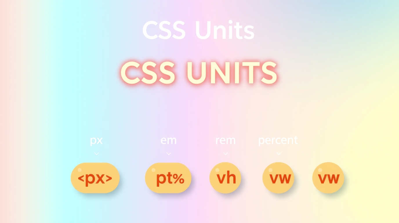
CSS Units Decoded: Your Ultimate Guide to Sizing Things Up in 2024
Alright, let's talk about one of those things in web dev that seems simple at first but can low-key drive you crazy: CSS Units.
You're there, trying to center a div, padding here, margin there, and you suddenly stop. Do I use px? Or rem? My senior dev said em is the way to go, but why does everything keep exploding? 😫
Sound familiar? You're not alone. Choosing the right CSS unit is like picking the right tool from a toolbox. You could use a wrench as a hammer, but it's not gonna be pretty or efficient.
In this no-fluff guide, we're breaking down every major CSS unit, from the absolute classics to the modern relative rockstars. We’ll look at what they are, when to use them (and when NOT to), with real code examples you can actually understand. Let's dive in.
The Two Squads: Absolute vs. Relative Units
First, you gotta know the two teams everyone plays for.
Absolute Units: These are the boomers of the unit world. They are fixed. What you see is what you get (on the same screen). A
1pxline is always a 1-pixel line, and a1inmeasurement is always one inch—at least in theory. They're not big on change.Relative Units: These are the flexible, modern gen-Z folks. Their value is relative to something else—maybe the parent element's font size, the root element's font size, or even the viewport size. This is the key to responsive design.
Breaking Down the Absolute Squad
1. Pixels (px) - The OG
The pixel is the most known, and honestly, overused unit.
css
.element {
  width: 300px;
  font-size: 16px;
  padding: 10px;
}
What it means: One pixel on a screen. It's a fixed unit.
When to use it:
For creating sharp, predictable borders (
border: 2px solid #f00;).For elements that you never want to scale, like a logo image that has a fixed size.
For tiny, non-critical spacing where relative units feel like overkill.
The Catch: Using px for everything, especially font-size, locks your design in place. Users who need to zoom or have default browser font sizes set larger won't see your site adjust accordingly. It's not very accessible.
The Relative Unit Rockstars (This is Where the Magic Happens)
2. em - The Relative Rebel (Based on Parent)
The em unit is relative to the font-size of its parent element. The name comes from the width of the letter "M" in typography.
css
.parent {
  font-size: 20px;
}

.child {
  /* This is now 2 * 20px = 40px */
  font-size: 2em;
  /* This padding is 1 * 40px (its own font-size) = 40px */
  padding: 1em;
}
The Pro: It's fantastic for making components that are internally scalable. Change the parent's font-size, and the children scale proportionally.
The Con (and it's a big one): The compounding effect. If you have nested elements all using em, the sizing can multiply and get out of hand quickly. It requires careful planning.
Real-world use case: A button where you want the padding to scale perfectly with the button's text size.
3. rem - The Smarter, More Predictable Sibling (Based on Root)
rem stands for "root em." It's relative to the font-size of the root element (<html>), not the parent. This is its superpower.
By default, the root font-size is 16px in most browsers.
css
html {
  font-size: 16px; /* This is the baseline */
}

.element {
  /* This will always be 2 * 16px = 32px, regardless of its parent */
  font-size: 2rem;
  padding: 1rem; /* 1 * 16px = 16px */
}
Why rem is a game-changer:
No Compounding: It's consistent throughout your entire stylesheet.
2remis always the same value.Accessibility King: If a user changes their default browser font size, your entire site will scale beautifully because everything is based on that root
font-size.Maintains Proportions: Your layout's proportions remain intact.
Best Practice: Set your root font-size to a percentage (like 62.5%) to make the math easy. This sets 1rem to equal 10px.
css
html {
  font-size: 62.5%; /* 10px */
}

body {
  font-size: 1.6rem; /* 16px */
}

.container {
  padding: 2rem; /* 20px */
  font-size: 1.8rem; /* 18px */
}
When to use rem: For almost everything—font sizes, padding, margin, widths/heights of containers. It should be your default choice for a responsive, accessible layout.
Want to master these concepts and build stunning, responsive websites? This is just the tip of the iceberg. To learn professional software development courses such as Python Programming, Full Stack Development, and MERN Stack, visit and enroll today at codercrafter.in. Our project-based curriculum ensures you understand the 'why' behind the 'how'.
4. Viewport Units - The Big Picture Players
These units are relative to the size of the browser window (the viewport).
vw(Viewport Width):1vw= 1% of the viewport's width.vh(Viewport Height):1vh= 1% of the viewport's height.vmin(Viewport Minimum):1vmin= 1% of the viewport's smaller dimension (width or height, whichever is smaller).vmax(Viewport Maximum):1vmax= 1% of the viewport's larger dimension.
Real-world use cases:
Full-screen hero section:
height: 100vh;to make a section that's exactly the height of the screen.Creating a perfect square:
width: 50vmin; height: 50vmin;This will always be a square that's 50% of the viewport's smaller side.Fluid typography:
font-size: 5vw;makes text that scales directly with the viewport width. (Use with caution, as it can get too big or too small on extreme screen sizes).
The Catch: On mobile devices, 100vh can be tricky because the browser's UI (address bar) slides in and out, changing the visible viewport height.
5. Percentages (%) - The Contextual Player
Percentages are relative to the parent element's same property.
css
.parent {
  width: 500px;
}

.child {
  /* The child's width will be 50% of 500px = 250px */
  width: 50%;
  /* This padding will be 10% of the PARENT'S width (500px) = 50px */
  padding: 10%;
}
When to use it: Primarily for creating fluid layouts that are relative to their container. It's the classic tool for grid systems and responsive widths.
Quick Cheat Sheet: Which Unit When?
Unit | Based On | Best For |
|---|---|---|
px | Screen Pixel | Borders, fixed-size icons, when you need pixel-perfect precision. |
% | Parent Element | Creating fluid layouts, widths, and heights relative to a container. |
em | Parent's Font-Size | Component-level scalability, like buttons or cards. |
rem | Root ( | (Your Go-To) Global layout, spacing, typography. Accessible design. |
vw/vh | Viewport Size | Full-screen sections, typography that scales with viewport. |
FAQs: Stuff You Actually Want to Know
Q1: Should I ever use em for anything other than font-size?
Absolutely! Using em for properties like padding, margin, or border-radius on a button means the spacing around the text scales perfectly with the text size itself. It creates a harmonious component.
Q2: Why is my rem not working?
99% of the time, it's because you've overridden the root font-size somewhere else in your CSS, or a framework (like Bootstrap) has. Check your html selector in the browser's DevTools.
Q3: Are there any new CSS units I should know about?
Yes! Keep an eye on svh, lvh, and dvh (small, large, and dynamic viewport units) which handle the mobile URL bar issue better. Also, container query units like cqw and cqh are the future for component-based responsive design!
Conclusion: Your New CSS Unit Mindset
So, let's wrap this up. Ditch the habit of using px for everything. It's 2024, and our websites need to be flexible and accessible.
Here’s a solid, modern approach:
Set your root font-size (often with the
62.5%trick for easy math).Use
remfor 90% of your work – font sizes, paddings, margins, grid gaps.Use
emfor component-level scaling where the internal proportions matter.Use
%for traditional fluid layouts.Use
vw/vhfor big, viewport-dependent sizing.Use
pxfor tiny, fixed details like borders.
Mastering this flow will level up your CSS from "it works on my screen" to a truly robust, responsive, and professional design.
Ready to move beyond the basics and become a job-ready developer? Understanding core concepts like CSS units is fundamental, and at CoderCrafter, we build your knowledge from the ground up. To learn professional software development courses such as Python Programming, Full Stack Development, and MERN Stack, visit and enroll today at codercrafter.in. Let's build your future in tech, together.


